Monthly Archives: August 2014

Managing really large (and really old) Kanban Boards

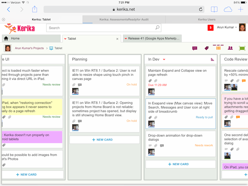
Kerika’s Task Boards are so easy to set up and use that teams sometimes make the mistake of sticking everything on the same board, week after week and month after month, until the board becomes really too big to be useful.

The Kerika software itself doesn’t buckle under the weight of hundreds of cards on a single board (and, to be honest, we are also guilty of sometimes doing very large Scrum iterations that turned over a few hundred cards  -.-), but just because the software works fine doesn’t mean the practice makes sense.

The most common way for a Kanban board to get overcrowded is for it to be used for too long: the Done column gets bigger and bigger, as more work gets completed each week, until you end up with a very lop-sided looking board with perhaps 20-50 items in “To Do”,  and maybe 1,000 items in “Done”.

When presented with a board that contains hundreds or even thousands of items in Done, it’s hard for individual team members to get visual satisfaction from seeing cards move over to the Done column on a regular basis: as work gets done, it seems to vanish into this endless pile of other work that’s already been done.

Teams and, especially, Project Leaders should not underestimate the value of this visual satisfaction of seeing a well-balanced board, with about the same number of items in “To Do” (or Backlog, or Pending, or whatever you choose to call your parking lot) and in the “Done” column, with an even-looking distribution of items in the columns in the middle.

(The simplest Kanban board may just have three columns: To Do, Doing, and Done, but Kerika makes it easy to have far more complex workflows, and to capture your organizations’ best practices as a collection of process templates.)

If a Kanban board is going to be used for an extended period, say several months or more, then we recommend create a parallel History Board that can be used to track the historical achievements and progress of the team. Here’s how this scheme works:

  • Create a board called “History Board 2014”. (The name isn’t particularly important.)
  • Organize this boards with columns that look like this: Jan 2014, Feb 2014, Mar 2014…
An example of a History Board

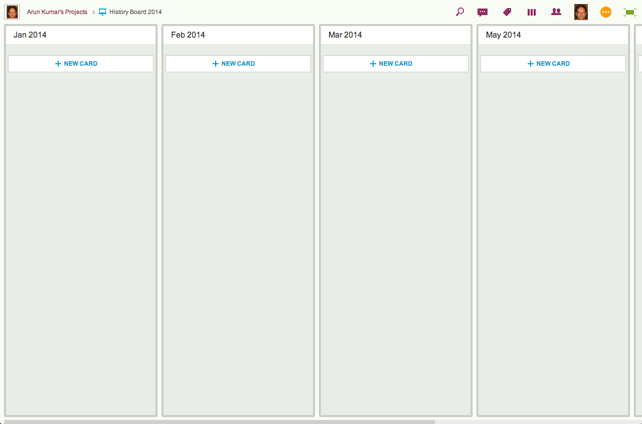
We will use these columns to hold all the cards that were completed in that particular month. So, for example, the Jan 2014 column would contain everything that was completed in January 2014.

  • At the end of every month, pause for a moment to celebrate your team’s accomplishments for that month. (Order in some beer and pizza and maybe pause for longer than a moment…)
  • Move all the items that in Done onto the History Board: use Kerika’s cut-and-paste feature, which will let you move a bunch of cards intact, along with their history, chat, attachments, etc., from the Done column of your main Kanban board to the appropriate column in your History Board.

Laptop users will find their right-mouse click menu handy for this: click on a card in the Done column, do “Select All” from the right-mouse menu, and then do a “Cut”. Once you have cut (or copied) anything into your Kerika Clipboard, a Paste button will automatically appear at the top of each column, on each board where you can make changes.

So, Cut from Done on your active board, go over to your History Board, and then do click on the Paste button at the top of the appropriate column, e.g. the August 2014 column.

This simple method lets you achieve two objectives at the same time:

  • It’s an easy way to trim the size of your active Kanban board: by taking out the “Done” stuff each month you can stop it from ballooning in size over time.
  • It’s an easy way to create a comprehensive historical view of everything your team has achieved over time: go over to the History Board and you can see how work got done over an entire year. (Might be useful at performance review time ;-)

A side-benefit: your active Kanban board will load a lot faster if it doesn’t get overloaded.


Why we haven’t published our API (yet)

We are sometimes asked (usually by our more techie users) whether Kerika has a published API.

The short answer is “No”; the longer answer is “Not yet.”

We do have a server API, of course, that the Kerika front-end client application itself uses, but it is a very proprietary and non-standard API at present.

This is largely because of an early decision we made to use CometD for our real-time client-server communications.

CometD is a form of a long-poll architecture, but our implementation, unfortunately, is not very standard, in part because we built an “API generator” a long time ago that allows us to create new APIs fairly quickly using metadata descriptions of the desired features.

This was helpful when we were first getting started, but, quite honestly, it isn’t an approach that makes a lot of sense any more and we have migrated away from using that API generator.

But, because of our history/legacy code, we currently have a mix of auto-generated APIs and newer API, and this isn’t really something that we want to publish and support for external third-party development.

We plan to redo our API this year to make it more standard and easier for third-party developers to use, at which point we will publish it and start encouraging more platform development around Kerika.

Using Kerika with Git

We often get asked if Kerika has an integration with Git.  The short answer is “No”, but the longer answer is more nuanced…

We use Git ourselves for managing our own source code and other software assets.

Git was designed from the git go (ha!) to be used by distributed teams, having originated with the Linux kernel team, perhaps the most important distributed team in the whole world, so it made perfect sense for us to use it: it works across operating systems, and a number of simple GUIs are now available for managing your various source-code branches.

We simply embed the git references within cards on our project boards: sometimes in the chat conversation attached to a card, but more often within the card’s details.

Here’s an actual example of a bug that we fixed recently:

Example of Git integration

We use multiple Git branches at the same time, because we put every individual feature into a separate branch.

That’s not a fixed rule within Git itself; it’s just our own team’s practice, since it makes it easier for us to stick with a 2-week Sprint cycle: at the end of every 2 weeks we can see which features are complete, and pull these git branches together to build a new release.

So while Kerika doesn’t have a direct integration with Git, it’s pretty easy to use Kerika alongside Git, or other source management systems.


Tall Tales from our users: Kerika as an Agile alternative to PowerPoint

Another note from a user which we wanted to share with you…

Just this week we had a fundraising administrative group meeting where our people collected for a 4-day meeting.

One of my software developers attended the meeting and we were scheduled to do a 1.5 hour presentation in the last slot of the 3rd day at 3 PM.

At 11 AM that morning, while he was in the meeting, I created a Kerika project for our presentation.  I added the cards and attached screen shots and links that I wanted to present.

I messaged him in the meeting to get him to add cards to the project for IT issues that had been discussed in the previous 2.5 days so that we could address them in our session.

While he added cards, I added more screen shots to his cards and we organized and combined the cards while being in separate rooms so that by the time 3 PM rolled around, I showed up for the meeting and we did our presentation together.

It was ‘very agile’ indeed.

It probably wasn’t as polished as a PowerPoint but it was a lot more relevant as we put it together so quickly.

While we presented the different topics, we swiped the cards through the ‘Active’ and into the ‘Done’ column.

As we neared the end of our time limit, we were then able to adjust on the fly the topics that we would present with the time we had left.

Of course, we didn’t finish but it allowed us to present the most meaningful information with the time we had.

sticky-grinch

True Tales from our Customers: Adding Kerika Spice to a presentation

One of our users wrote in last night with this great story, which we wanted to share with you…

I did a one hour webinar for the software company (Software AG) that we develop all of our software with as they were impressed with the way we were using their software development environment (NaturalOne).

I threw a little Kerika spice into my presentation as it has become such an important part of our development environment and I actually used it to prepare my presentation.

Instead of preparing the presentation by myself I used a Kerika project and had my software developers contribute cards and instructions in the areas that they specialized.

While I was doing a live presentation I was referring to the cards on my other monitor and swiping them to the ‘Done’ column as I completed them.

I know you like to hear stories about how people use your software and this worked very well for this presentation.  It was recorded and I will send you a link to it once it is published.  It might put you to sleep at night, except for the Kerika part.

How we work with 2-week Sprints

Here at Kerika, we often get asked how we do Scrum as a distributed team.

Here’s the model we have evolved, which works for us mainly because we are the very essence of a distributed Agile team: we have people working together on the same product from locations that are 10,000 miles apart!

And this means that we are the most enthusiastic consumers of our products: we use Kerika to manage every part of our business and we only build what we would ourselves love to use.

Here’s the basic outline of our Scrum model:

Kerika's model for 2-week Sprints
Kerika’s model for 2-week Sprints

Each Sprint is 2 weeks long: that that works well for us; other folks might find that 3 weeks or 4 weeks i better. Pick what works for you.

Each Sprint begins with Sprint Planning, where the Scrum Team gets together with the Product Owner to decide which cards will be pull from our main Product Backlog into the Sprint Backlog.

Each Sprint is organized as a separate Scrum Board: this makes it really easy for us to concentrate upon needs to get delivered in that particular Sprint, without getting distracted by what was done in the past or what remains to be done.

And Kerika makes it really easy to pull cards (literally!) from the Backlog onto a Scrum Board, and then hide the Backlog from view so it doesn’t distract the Team while the Sprint is underway.

Half-way the Sprint, at the end of the first week, we do a gut-check: does the Sprint look like it is going reasonably well? We don’t ask if it is going perfectly: almost no Sprint does; what we are looking for is any indication that the Sprint is going to severely under-deliver in terms of the Team’s commitments to the Product Owner.

We could do these gut-checks every day during our Daily Standups, but in the first part of a Sprint cycle these can often give us false positives: it’s easy to tell early on if a Sprint is going to be disastrous, but it’s hard to tell for sure that it is actually going to end well. But about midway through the Sprint we start to have a more reliable sense for how things may turn out.

In keeping with the Scrum model, our goal is to complete a potentially shippable set of features and bug fixes with each Sprint, although this doesn’t necessarily mean that we will always ship what gets built after each Sprint. (More on that later.)

For each feature or bug, however large or small, we make sure that we have design and testing baked into the process:

  • The document is often just a few paragraphs long, because we always take cards representing large features (or other big work items) and break them up into smaller cards, so that no card is likely to take more than a day’s work. Kerika makes it really easy to link cards together, so it’s easy to trace work across multiple cards.
  • For bugs, the attached document describes the expected behavior, the actual behavior, and the root cause analysis.  Very frequently, screenshots showing the bugs are attached to the cards.
  • For new features, several documents may be attached, all quite small: there may be a high-level analysis document and a separate low-level design document.
  • For all features and bugs, we do test planning at the time we take on the work: for back-end (server) work we rely primarily on JUnit for writing automated tests; for front-end (UI) work we have found that automated testing is not very cost-effective, and instead rely more on manual testing. The key is to be as “test-driven” in our development as possible.

There are several benefits from doing formal planning, which some folks seem to view as being antithetical to an Agile model:

  • It helps find holes in the original requirements or UI design: good technical analysis finds all the edge cases that are overlooked when a new feature is being conceptualized.
  • It helps ensure that requirements are properly interpreted by the Team: the back-and-forth of analysis and reviewing the requirement helps ensure that the Product Owner and the Team are in synch on what needs to get done, which is especially important for new features, of course, but can also be important to understand the severity and priority of bugs.
  • It deliberately slows down the development pace to the “true” pace, by ensuring that time and effort for testing, especially the development of automated tests, is properly accounted for. Without this, it’s easy for a team to quickly hack new features, which is great at first but leads to unmaintainable and unstable code very soon.

At the end of the 2-week cycle, the Team prepares to end the Sprint…

We like to talk about Sprints as “buses”: a bus comes by on a regular schedule, and if you are ready and waiting at the bus stop, you can get on the bus.

But if you are not ready when the bus comes along, you are going to have to wait for the next bus, which thankfully does come by on a regular 2-week schedule.

This metaphor helps the Team understand that Sprints are time-boxed, not feature-boxed: in other words, at the end of every 2 weeks a Sprint will end, regardless of whether a feature is complete or not.  If the feature is complete, it catches the bus; otherwise it will have to wait for the next bus.

And here’s where the Kerika team differs from many other Scrum teams, particularly those that don’t consume their own products:

  • At the end of each Sprint, we do the normal Sprint Retrospective and Show & Tell for the Product Owner.
  • But, we also then take the output of the Sprint and deploy it to our test environment.
  • Our test environment is the one we actually use on a daily basis: we don’t use the production environment as often, preferring to risk all of our work by taking the latest/greatest version of the software on the test environment.

This forces us to use our newest software for real: for actual business use, which is a much higher bar to pass than any ordinary testing or QA, because actual business use places a higher premium on usability than regular QA can achieve.

(And, in fact, there have been instances where we have built features that passed testing, but were rejected by the team as unusable and never released.)

Kerika's model for 2-week Sprints
Click on this image to see the actual Kerika Whiteboard

This is illustrated above: the version of Kerika that’s built in Sprint 1 is used by the team to work on Sprint 2.

This is where the rubber meets the road: the Kerika Team has to build Sprint 2, while using what was built in the previous Sprint. If it isn’t good enough, it gets rejected.

At the end of Sprint 2, we will release the output of Sprint 1 to production. By this time it will have been used in a real sense by the Kerika Team for at least 2 weeks, post regular QA, and we will have a high confidence that the new features and bug fixes are solid and truly usable.

We could summarize our model by saying that our production releases effectively lag our Sprint output by one Sprint, which gives us the change to “eat our own dogfood” before we offer it to anyone else.

You can see the actual Whiteboard project for this process flow here.


Improving Kerika on iPads

Remember: you don’t need an app to use Kerika on iPads: you can simply use Safari or Chrome — just go to to kerika.com, and login just like you would on a desktop.

Kerika on iPad
Kerika on iPad

What’s great about building a pure HTML5 software like Kerika is that many of these improvements are also going to improve the user experience on desktops and laptops.

Here’s the laundry list:

Big changes:

  • You can add photos from your iPad to cards: you can take existing images from your photo library, or simply take a picture on the go and add it to a card.
  • We worked out a bunch of quirks related to Internet Explorer, which, unfortunately, remains sui generis when it comes to browsers.
  • In general, Kerika is now a lot smarter about dealing with laptops that have both mouse and touch interfaces.
  • We have improved performance and responsiveness, across the board.

Usability improvements:

  • We have redesigned our “Max Canvas” view so that it provides the most useful display, when you need the most space available to view a large board. In particular, you can now access Search even when you are in the Max Canvas view.
  • If a column is partially hidden, e.g. at the left- or right-edge of a Task Board or Scrum Board, clicking on the “+New Card” button at the bottom of the column will make the entire column slide into view, so you can clearly see what you are typing.
  • The Yes/No confirmation buttons on the Workflow dialog have been resized, so they are easier to press (unambiguously) with a finger on a tablet. Which, of course, improves usability for laptop users as well, in keeping with Fitt’s Law.
  • On a related note, we rescaled the calendar control used for setting due dates on cards, to make it easier to use with a finger (without making a mistake).
  • It’s easier to scroll through a long list of attachments on a card without accidentally dragging them with your finger.
  • The user interface makes it clearer how you can slide your view of a board, by swiping.
  • The panning motion, when you swipe left/right, is smoother.
  • Frequently, card history can take more than a few seconds to load if the tablet is slow or the wireless connection is slow: if this happens, the user sees an indication that the system is fetching the history.
  • Particularly on tablets, it’s easier to scroll down through long card details.
  • We have added a subtle animation on drop-down dialogs (e.g. for Workflow, Chat, Tags, etc.) to help people understand how these work.

Bugs fixed:

  • On iPad, it’s easier to edit text: the cursor shows correctly when you press and hold your finger, bringing up the “magnifying glass” that lets you move the cursor to a specific character.
  • The “hint text” shown on text boxes, e.g. “Enter the card’s description…” won’t get included when you copy/paste from the tablet’s clipboard.
  • A one-second delay in showing the list of available colors, for setting the color of a card, has been eliminated. (Yes, we care about one second delays…)
  • A one-second delay in showing the Tab Overflow button — the button that appears to the right-edge of all your open project tabs when there are too many tabs to display — has been fixed.
  • It was difficult to select a name from the list of auto-completed suggestions presented to you when you want to add someone to a project’s team. That’s been fixed.
  • A bug related to selecting the colors at the bottom of the list of available colors has been fixed.
  • If you tried to change the curve of a line on a Whiteboard or canvas, a bug that caused shadows to show up has been fixed.
  • A bug related to how the text box toolbar was displaying (the buttons for this were showing up in an untidy way if there wasn’t enough space) has been fixed.
  • On canvases, the thumbnail images of some files were showing up stretched when viewed in Safari, although they were fine when viewed using the Chrome browser; this has been fixed.
  • Also on canvases, it’s easier to swipe across the canvas without moving stuff accidentally.
  • When you are using an iPad in portrait mode (i.e. holding it vertically), card details show up properly centered.

What remains:

A ton of work on Android, unfortunately… Android tablets vary so much in terms of processor capability that even the same browser, e.g. Chrome, can behave very differently on different Android tablets & even tablets from the same manufacturer.

Some Android tablets will work better, as a result of all this work we have done, but we can’t yet guarantee that all of them will work perfectly.

There’s a similar, albeit smaller, challenge with Windows Surface machines

Windows laptops and desktops generally work fine, and so do “convertibles” (i.e. dual-screen machines where you can use the mouse or touch the screen), but Windows Surface is still causing some issues because of weirdness within Internet Explorer.