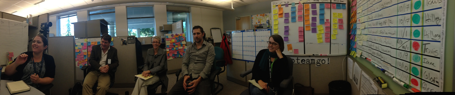
A couple of weeks ago we visited a UX team at the Washington State Department of Licensing, and took a photo of the “Post-It Palace” they had built within their cubicles:
We have a new feature in Kerika: a simple way to add numbers to your cards, for both Task Boards and Scrum Boards.
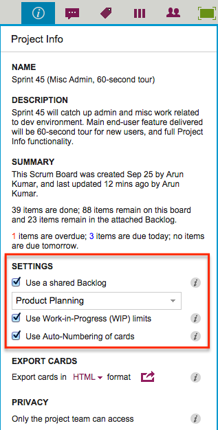
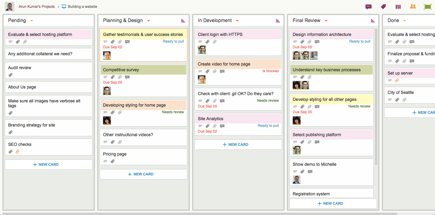
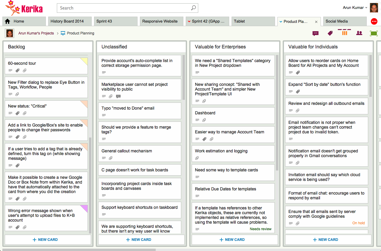
Project Leaders (and, of course, the Account Owner) can access this feature by clicking on the Project Info button, which appears on the top-right area of a Kerika board:
Settings
Auto-Numbering can be turned ON or OFF at any time.
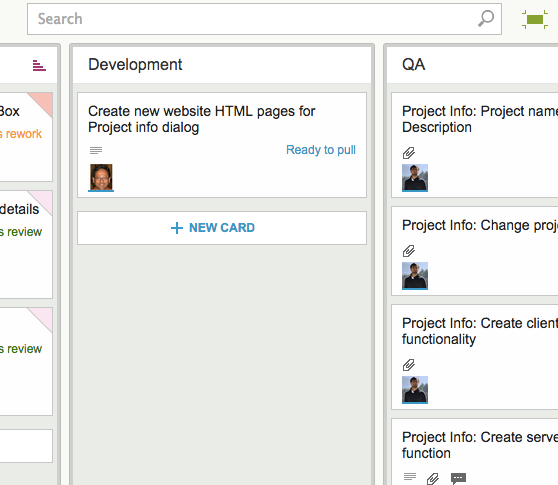
It is a simple feature, intended primarily to help manage large numbers of cards on a single board, e.g. a Help Desk team using Kerika as a ticket management system.
In ticket management or asset tracking scenarios, the titles of many cards may be similar, e.g. “User has trouble logging in”.
A more useful way of distinguishing between cards might be through the card’s numbers, e.g. “104 User has trouble logging in” and “242 User has trouble logging in.”
When Auto-Numbering is turned ON, Kerika will automatically insert a number as a prefix to new cards that are added to that board.
Numbers are sequential: for example, the first card would have “1” added as a prefix, the second card would have “2” added as a prefix, etc.
Auto-Numbering can be stopped at any time, and then new cards added to the board won’t have numbers added to the card titles.
Auto-Numbering can be resumed after a pause, the numbering will intelligently figure out how many cards are on the board by excluding the Backlog and the Trash, as well as looking at the last number used.
The numbers are simple text, added as a prefix: they can be edited by any Team Member, and even removed.
You may know already that Kerika’s patented canvases are a great way to share your ideas and content, like drawing process flow diagrams, flowcharts, etc., and these canvases can also include content from your laptop or the Web.
For example, you can drag-and-drop a file from your desktop, and it will get added to your Kerika canvas, and stored and shared automatically with your team members using Box or Google (depending upon whether you are using Kerika+Box or Kerika+Google).
When you add Web content to a canvas, Kerika is pretty smart about figuring out what that URL is that you just provided.
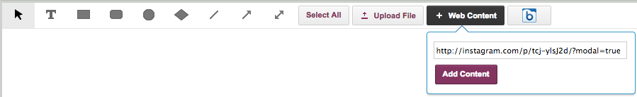
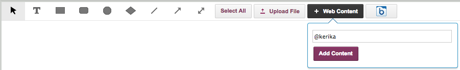
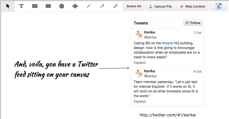
So, for example, Kerika makes it really easy to add a Twitter feed: all you have to do is click on the “+Web Content” button on your canvas toolbar…
Adding Twitter feeds to a canvas, step 1
You can add a Twitter feed simply by using the user’s Twitter handle, e.g. “@kerika” would give you Kerika’s Twitter feed right on your canvas:
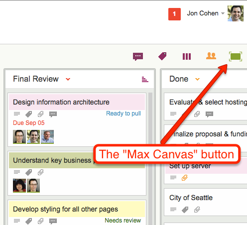
Kerika has had a “Max Canvas” mode for a while: if you click on the green square button at the top of a task board, your view of the board would expand to take up the full browser space:
Max Canvas button
This was handy when you wanted to work on just one board: your view of that board filled up the available browser space, and you weren’t distracted by the rest of the Kerika “chrome” (i.e. the application’s menus and buttons).
What we found, however, is that most of our users work on several boards at the same time: they have boards that they created for themselves, e.g. personal Kanban Boards, as well as Kanban and Scrum Boards that their colleagues had created.
So, in reality, most people need to achieve several goals simultaneously:
They need to be able to have a Max Canvas view that maximized their view of a board.
They need to be able to switch quickly from one board to another.
They need to know when there are new (unread) updates on boards that they are not currently viewing.
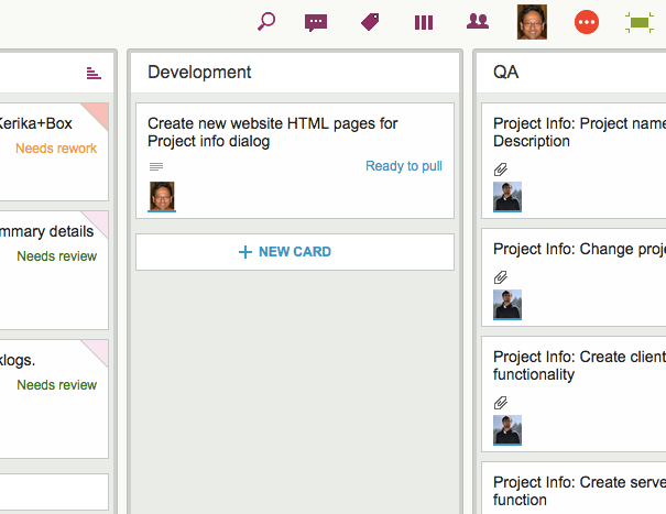
To make all of this possible at the same time, we have improved our Max Canvas view, by adding a button that makes it easy to switch between different boards (including your Home Board):
New Max Canvas view
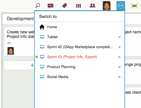
To the left of the Max Canvas button is a new Tab Switch button: clicking on it shows you a list of all the currently open Kerika boards, and this lets you quickly switch to another board without having to leave the Max Canvas view.
New Max Canvas view
This view is smart: if a board has unread updates, it’s entry shows up in orange, consistent with how we let you know that you have unread updates anywhere in Kerika.
And if a board has overdue cards, it’s entry shows up in red, as with “Sprint 43” in the example shown above.
The Max Canvas view also has a Search button built into it, so you can do searches without existing the Max Canvas view:
Search in Max Canvas view
All of this makes the Max Canvas view of Kerika much more useful than it was before, and it’s all part of our grand strategy to make Kerika more useful on iPads!
With our newest update to Kerika, we have introduced a more elegant way to show colors on cards.
The old method we employed filled in the top of each card with a selected color (which was white, by default). Here’s an example:
Old style of colors
There were a couple of design problems with our old approach:
It severely limited the palette of colors we could use, to a small handful of light pastels. Anything darker would make it difficult to read the card’s titles.
And, to be blunt, it was excessive: the colors tended to dominate the board’s view, to the point of being distracting.
Our new design is more subtle: it lets you see the colors without calling too much attention to them:
New styling for colored cards
Now, the colors appear in a “dog-eared” style, which gets them out of the way while still making it easy to see if a card is colored.
This new approach will also make it easy for us to add more color choices in the future and, in particular, to add darker and more vibrant shades, since we will no longer have to worry about having sufficient contrast with black text overlaying the colors.
Our newest update to Kerika serves up a rather long list of changes; the two big areas for improvement were:
We have updated our integration with Google Apps Marketplace to use OAuth 2.0, since Google is retiring its OAuth 1.0 implementation.
We have made a bunch of improvements for using Kerika on iPads, with the Safari or Chrome browsers. (We still need to work on Android tablets, which, unfortunately, present too much variety…)
The OAuth 2.0 upgrade and iPad improvements are described in previous posts; here we want to highlight some of the other changes and improvements we made with this new version:
We have changed the way colors show on cards, on Task Boards and Scrum Boards to make them more usable:
In addition to being less distracting, this new design will enable us to expand the palette of colors we can offer: the old design restricted us to only the lighter pastel colors.
New styling for colored cards
We have redesigned our “Max Canvas” view so that it provides the most useful display, when you need the most space available to view a large board. In particular, you can now access Search even when you are in the Max Canvas view.We have improved security, by implementing secure cookies.
We added some subtle animation effects to improve usability. (So subtle, in fact, that you might not even notice them if you are an existing Kerika user, which is just what we want.)
In terms of infrastructure and other under-the-hood improvements, we have expanded our use of JUnit automated tests and done a bunch of bugs fixes, as usual.
There’s a lot of improvements being done on Kerika, and at a very fast rate. Make sure you subscribe to our blog to keep up!
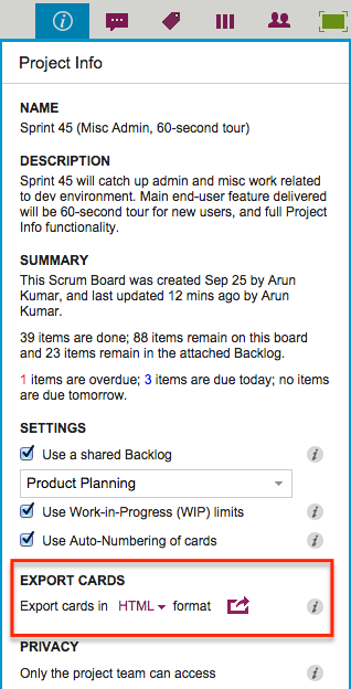
To access this feature, simply click on the Project Info button that’s shown at the top-right of each Kerika Board, and you will see the Project Info display (that we have talked about in an earlier blog post):
Export
CSV format is useful if you want to want to take data from Kerika and put it into Excel or some other analysis tool;
HTML format is useful if you want to print material from Kerika, or insert it into Word, PowerPoint or similar tools.
With both CSV and HTML exports, hidden cards are not exported: this means that if you are currently choosing to hide some columns (by using the Workflow button), or hide some cards (by using the Tags filters), then the cards that you are not viewing right now will not be part of the export.
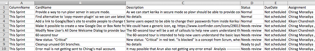
When you export a board in CSV format, you get the following data, for each visible card:
Example of CSV export
Column Name: e.g. Backlog, In Progress, Done, etc.
Card Name: e.g. “Create PR news release”.
Card Description: e.g. “We need to create a PR news release once our latest version is ready…” (Rich text will be converted to plain text, since CSV files can only deal with plain text.)
Status: e.g. Needs Review, Needs Rework, etc. (If the card doesn’t have a special status, “Normal” will be shown.)
Due Date: the date the card is due, if a date has been set. (If the card doesn’t have a Due Date, “Not Scheduled” will appear.)
Assigned To: a list of names of the people the card is currently assigned to. (If the card isn’t assigned to anyone, “Not Assigned” will appear.)
Exporting could take a while: the exported data are put into a file in your Google Drive or Box account — depending upon whether you are using Kerika+Google or Kerika+Box — and when the process completes, you get an email with a link to the file containing your data.
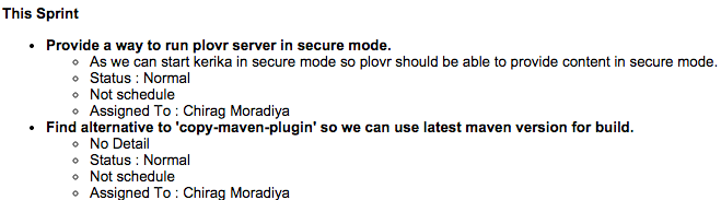
It’s a similar experience if you do a HTML export; however the format of the data is different, giving you an indented set of attributes for each card, like this example from a Kerika+Box project:
Example of HTML export from Kerika+Box
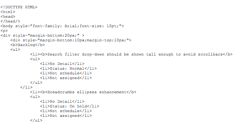
One caveat about exporting HTML: if you open the results in Google Docs, Google shows a preview of the output, and that doesn’t look good: instead of rendering the HTML, Google actually exposes it.
Here’s an example from a Kerika+Google project:
Example of HTML export from Kerika+Google
The export feature can be used for many different purposes, of course: the most common scenario we envision is people wanting to include material from Kerika in their analysis and presentations.
And, of course, one use would be for government agencies that have to respond to Freedom of Information Act (FOIA) requests, or other Sunshine laws.