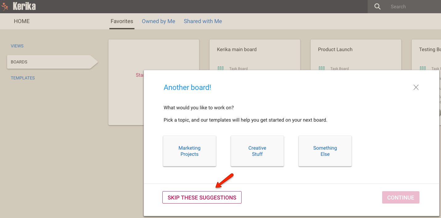
For experienced users who don’t need as much help in starting new boards, we are providing a faster mechanism that skips some steps that are currently shown to new users.
You can access this faster mechanism by clicking on the Skip Suggestions link in the current Start New Board dialog:
Skipping Suggestions
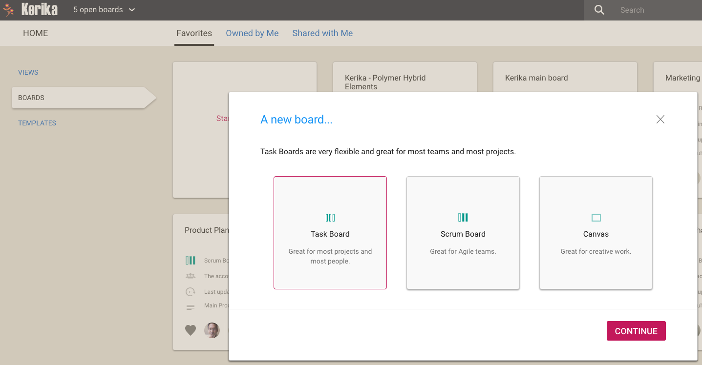
Once you click on Skip Suggestions, Kerika will recognize you as an experienced user who prefers a path like this:
Starting a New Board
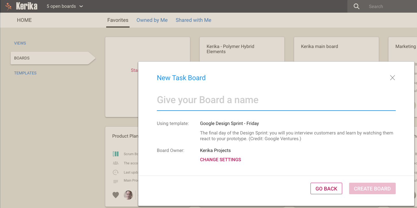
Once you pick the kind of new board you want — Task Board, Scrum Board, or Whiteboard — you can immediately name your new board:
Starting a new Task Board
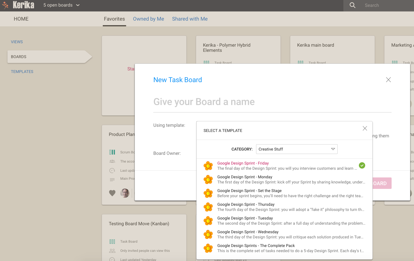
Kerika will assume your new board will use the same template that you last used, but if you like you can change to a different template by clicking on the Change Settings link:
Selecting a Template
This should save our experienced users a few clicks when they want to start a new board…
While fast access to actions is generally a good thing in user interfaces, we think there are some circumstances where it might be a good idea to deliberately slow down users, if they are likely to rush into making a mistake.
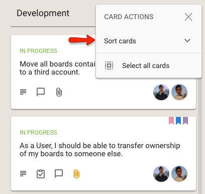
One such tweak we have introduced is to collapse the Move and Sort options for arranging cards within a column into sub-menus:
Collapsed Sort menu
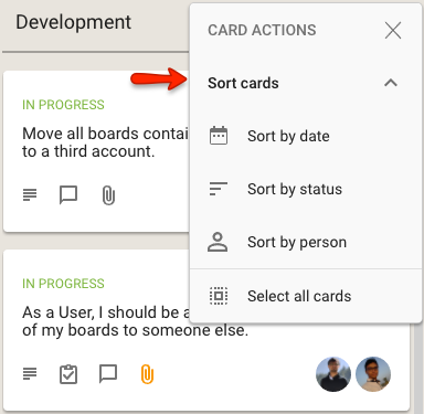
When clicked, the Sort cards option expands to show the different sorts that are available:
Expanded Sort menu
Effectively, this use of a sub-menu within a an already short menu is a deliberate decision on our part to slow you down from rushing into a sorting action.
An inadvertent sort can cause some havoc if the team had previously spent many hours, or even days, carefully grooming the cards on a column (like the Backlog, for example) to arrange them in a precise order.
One rushed sort could wreck all that, so perhaps access to Sort needs to be a little harder?
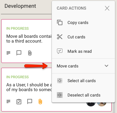
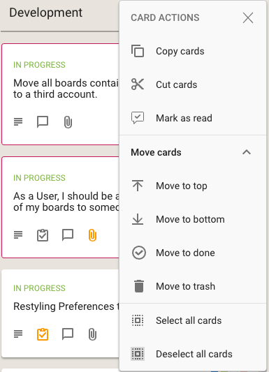
We have done something similar for the Move actions that are available on cards:
Collapsed Move menuExpanded Move menu
What do you think? Smart move on our part, or dumb? Let us know.
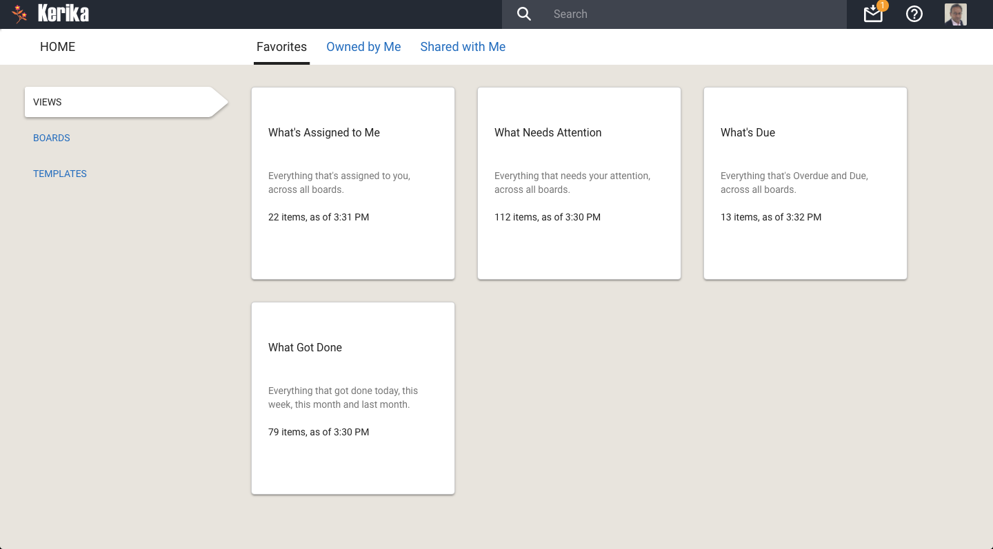
At long last, we have built Views — one of the most commonly requested features, and something that we had been obsessively designing and redesigning over years, trying to figure out the best way to handle this need.
We have done it now. Views has been built, and is automatically available across all your Task Boards and Scrum Boards, whether they are owned by you or shared with you.
We are starting off with four standard Views, and we will built more in the future, and add a way for you to build your own Views as well.
The Views we have built are:
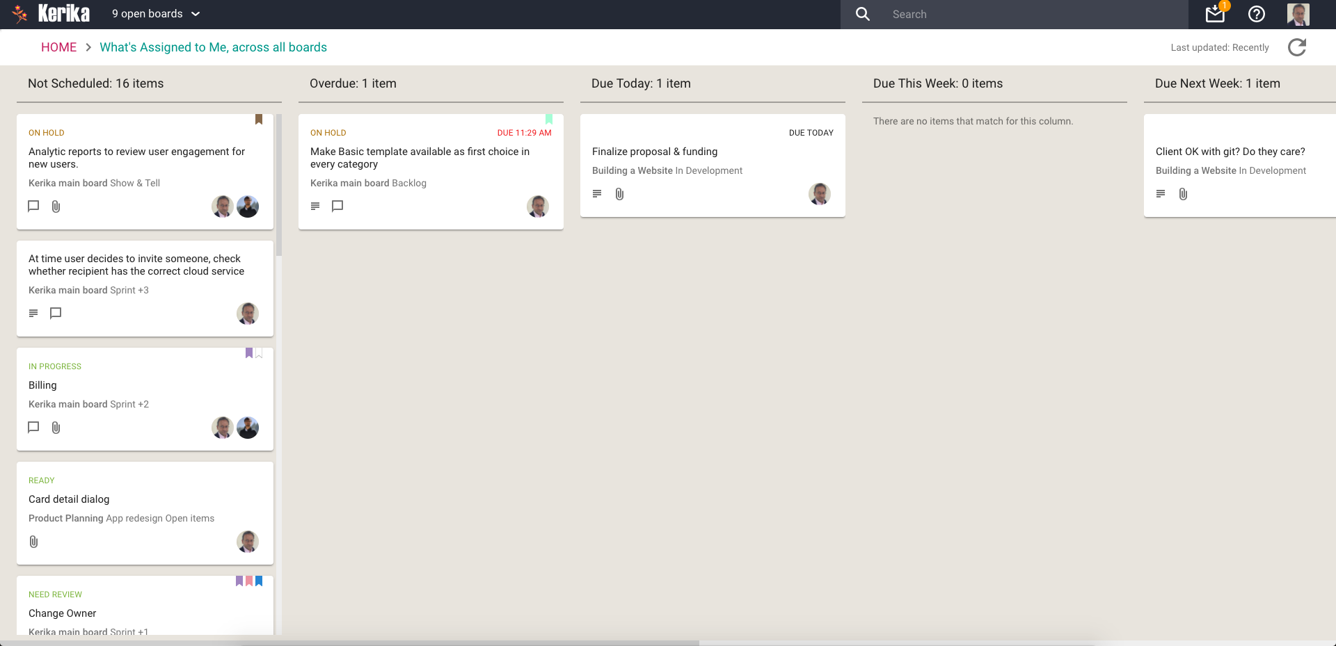
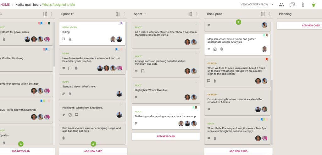
What’s Assigned To Me
The most commonly asked for feature by people who are working on several projects — and, hence, several boards — at the same time. This is what it looks like:
What’s Assigned To Me
Everything that’s currently assigned to, on all boards except for those that are in the Trash or Archive, are collected for you into a single View, where cards are organized as follows:
Not Scheduled
Overdue
Due Today
Due This Week (excluding what’s already included in Due Today)
Due Next Week
Due This Month (excluding what’s already included in Due Today and Due This Week)
Due This Quarter
Due Next Quarter
It is a comprehensive summary of everything you need to get done, and it will be invaluable for managers and anyone else who has to work on multiple projects at the same time.
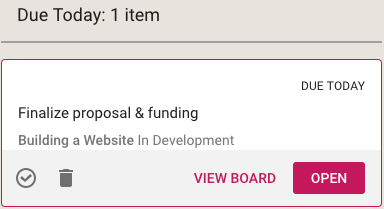
If you select a card in a View, like this
Selecting card from a View
You get quick access to key actions:
Move to Done
Move to Trash
View Board
Open
Open opens the card right there, inside the View itself. View Board, on the other hand, opens the card in the board in which it is located.
Both are useful, depending upon the card and what you want to do: in some cases you just need to update a particular card — e.g. reschedule it, add a comment or file — and opening the card in the View itself, which is very fast, is enough.
In other situations you might want to be sure you are understanding the context of the card, and it is better to see where it is on the board that contains it. This can be helpful for cards that you are not quite sure about.
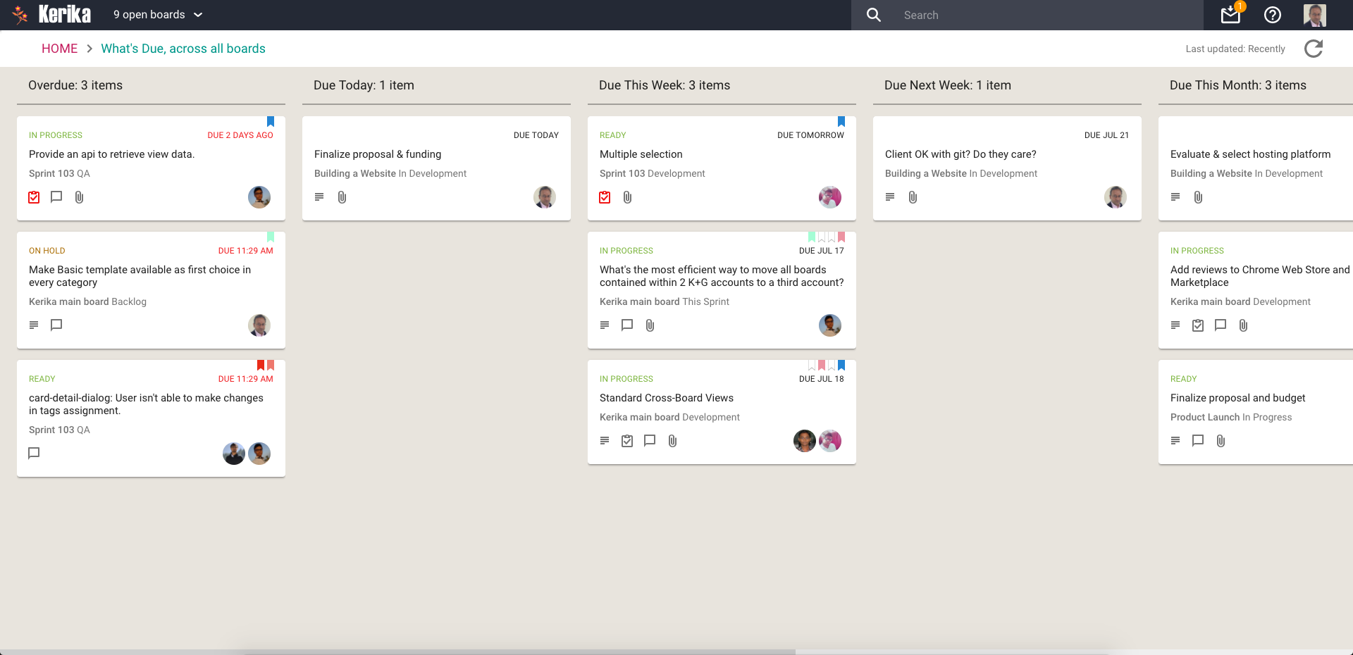
What’s Due
This View will be particularly helpful to managers (Board Admins): it summarizes everything that’s due, on all boards where you are one of the Board Admins:
What’s Due
This basically brings to life everything that you can also (optionally) get in your 6AM Task Summary email.
Cards are organized for you as follows:
Overdue
Due Today
Due This Week (excluding what’s already shown as Due Today)
Due Next Week
Due This Month
Due Next Month
For this View, as with the What’s Assigned to Me View, we try to be smart about not showing duplicate cards: if something is due today, for example, it will show up in the Due Today column, but not get duplicated in the Due This Week or Due This Month column.
This makes it easier for you to plan your schedule: you can see what needs to get right away, and what needs to get done later.
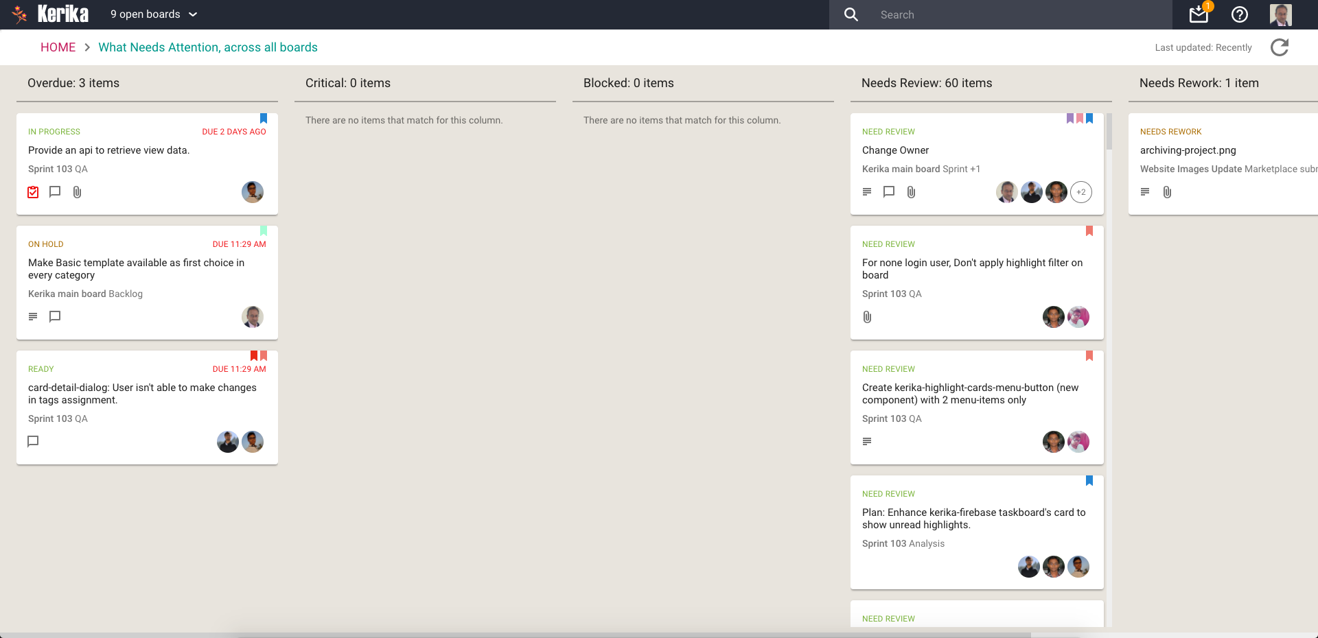
What Needs Attention
Again, a View that will be of particular interest to managers concerned with several ongoing boards:
What Needs Attention
Here, Kerika tries to show everything that needs a little extra attention: things that are
Overdue
Flagged as Critical
Flagged as Blocked
Flagged as Needs Review
Flagged as Needs Rework
Flagged as being On Hold
These items typically represent your risk profile across all your boards, and Kerika brings it all together in a single View.
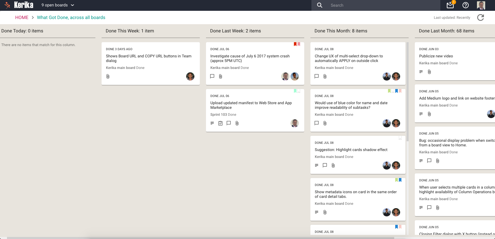
What Got Done
Great for anyone who needs to produce a status report, or any manager who needs to monitor progress across many different projects:
What Got Done
Across all boards where you are a Board Admin, this View summarizes
What got done Today
What got done This Week (excluding items shown in This Week)
What got done Last Week
What got done This Month (again, excluding items shown for Today and This Week)
What got done Last Month
What got done This Quarter
Accessing Views:
All your Views can be accessed from a new tab called Views (naturally) on your Home Page:
All your Views
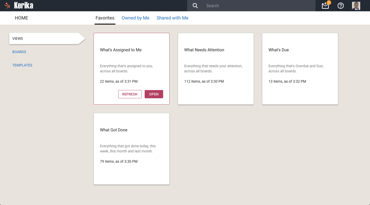
On each View card, Kerika shows how many items are included in that View, and as of when. The Views are automatically refreshed when you open them, but in-between they are not updated because we do not expect the information shown to change on a second-by-second basis.
If you are worried that your View is out of date, you can update it by selecting it on your Home Page:
Refreshing a View
You can also update any View that you currently have open, by clicking on the Refresh button shown on the top-right of the View:
Refreshing a View
We will let you go crazy with these Views, for now. In the future we will add more (we already have some ideas on that front, but would love to hear from you as well!) and also add a Custom View capability.
We really like the Tasks feature that we introduced recently: this has significantly cut down on the number of cards that we have to track on boards, since many items can be easily captured, assigned and scheduled as tasks rather than independent tasks.
This means we have a better, epic-oriented view of our boards; we don’t get lost in the weeds.
However, the first implementation of the styling could do with some improvement, so that’s what we did:
Improved styling for tasks
This makes it easier to see the names of people assigned to cards, and the due dates, more easily.
By the way, it took a surprising amount of experimentation before we settled on these colors: in Kerika’s design every color is supposed to have a particular meaning, so that colors appear in a consistent context in every instance.
For example, if we use blue to indicate a clickable link — like we do on the card details left tab, to let you switch between Tasks, Attachments, Chat, etc. — we can’t use blue anywhere else where it wouldn’t be clickable.
So, if blue is clickable in one place, it must always be clickable everywhere else.
This is easy enough, but we also have rules about using colors consistently across actions or displays that seem related, again to minimize the learning effort needed by new users.
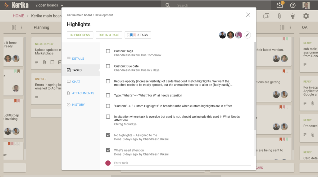
Our green is used for Highlights in a consistent way:
What’s Assigned to Me
The breadcrumbs includes the suffix “What’s Assigned to Me” in green, the Highlights button is green to indicate that it is in use, and a green button is used to indicate that items matching the highlight are out of view.
If we are rigorous about this, there is an internal consistency about the Kerika user experience that makes it easier to learn. But it takes a lot of discipline.
So if consistency applies a bunch of constraints in our choice of colors, so do legibility and color-blindness: we have to be careful to avoid using color combinations like red and green that are difficult for some people to distinguish. (About 8 percent of males, and 0.6 percent of females, are red-green color blind in some way or another, whether it is one color, a color combination, or another mutation.)
All of this means that it isn’t easy to pick a new color when we design!
Our introduction of lazy loading, as part of our recent redesign, was originally limited to just three columns: Backlog (for Scrum Boards), Done, and Trash.
We figured that these columns were most likely to be very long, and would therefore benefit the most from implementing lazy loading.
This worked well; so well, in fact, that we have expanded our use of lazy loading to work with all columns, across all Task Boards and Scrum Boards.
The practical effect of this should be to reduce the time needed by the browser to load large boards, for all users, on all kinds of computers.
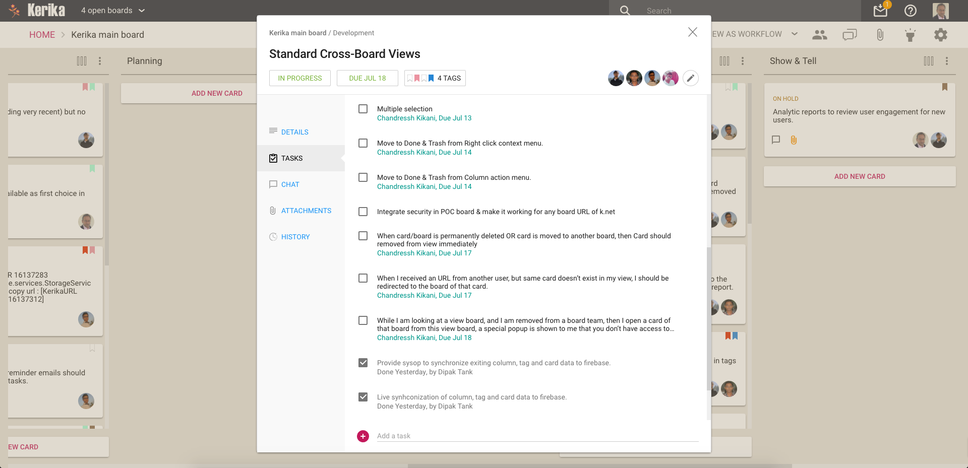
We have added a new feature to our Task Boards and Scrum Boards: you can now manage a list of tasks for each card on a board, like this:
Example of tasks in a card
Every card can have as many tasks as you like, organized in a simple, smart checklist.
Individual tasks can be assigned (to one person at a time) and scheduled, and Kerika is smart about rolling up these assignments and due dates to reflect them on the card as well:
Managing tasks in a card
As you mark off tasks as Done, they slide to the bottom of the list to make it easy to see what remains to be done.
Another great new feature: if you upload a file on any card, canvas or board with the same name as a file that’s already attached to that particular card, canvas or board, Kerika will automatically keep track of these as being different versions of the same file. This makes it even easier to organize all your Kerika project files.
There’s no limit to the number of files you add, nor any limit on the size of these files.
When you add a file, to a card, board or canvas, Kerika automatically uploads that file and shares that with everyone who is part of your board’s team. You don’t have to do anything: Kerika makes sure that all the Team Members have read+write permission, and all the Visitors have read-only permission.
These files are stored in your Google Drive, if you are using Kerika+Google, or in your Box account, if you are using Kerika+Box, or with Kerika if you have signed up directly with an email address.
That’s how Kerika has always worked; what we have added is an automatic versioning feature that checks when you add a new file to see if has the same name, and type, as a file that’s already attached to that particular card, canvas or board.
If the file name and file type match something that you have already added, Kerika automatically treats that new file as a new version of the old file, rather than as a completely different file. This makes it really easy to manage your Kerika project files.
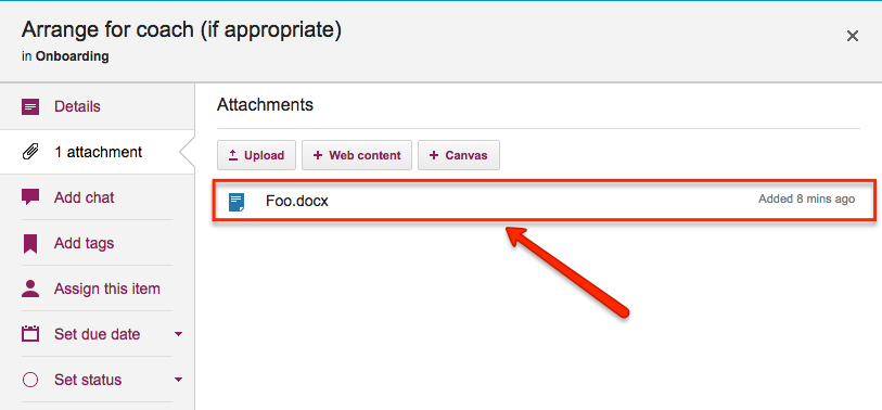
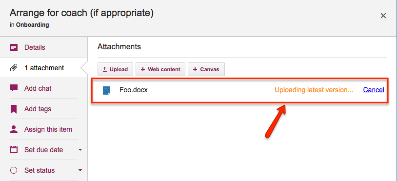
Here’s an example: this card has a file attached to it called “Foo.docx”.
File attached to a card
If a Team Member adds another file to this same card, also called “Foo.docx”, Kerika will treat that new file as a different version of the same Foo.docx, rather than as a completely different file:
Uploading a new version
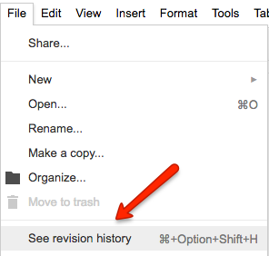
Accessing these older versions is easy: if your Kerika files are in being stored in your Google Drive, you can get the older versions using the Google Docs File menu:
Google revision history
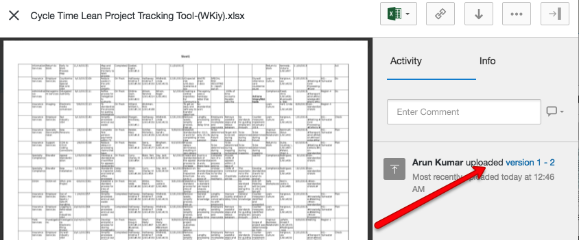
If your files are being stored in your Box account, you can access the older versions from the menu on the right side of Box’s preview window:
Box version history
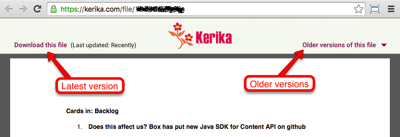
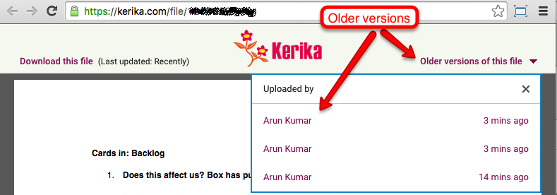
If you signed up directly with Kerika, you can access the older versions from within Kerika’s file preview:
File preview
Clicking on the Older versions of this file link on the top right of this preview will give you a list of all the old versions of this file that Kerika has:
Older versions
So, that’s it: simple, easy, automatic tracking of multiple versions of your project files! Brought to you by Kerika, of course.
Thanks to Steven Thompson, a consultant working with some of our users at the City of Kent, for pointing this out to us:
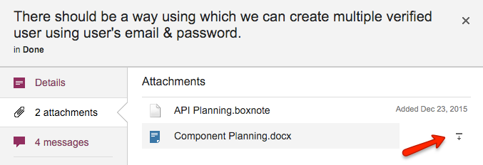
If a card is moved to Done, it preserves all its attachments, of course, but it is a little inconvenient to download these attachments directly from within Kerika itself: you would have to open that file in preview mode, and then download it.
We have simplified that process: now, if you hover over an attachment for a card that’s in Done, a “download” button will appear that will make it easier to download the attachment, without having to preview it first:
We used to refer to “Projects” and “Boards” somewhat interchangeably on our website, our blog and in the Kerika app itself.
There was no special reason for this: in our mind, a Project was clearly a Board, and vice-versa, and it never occurred to us that this might prove a source of confusion to anyone.
Well, we were wrong about that.
In the real world, people are very cautious about “starting a new project”, because this might involve getting formal administrative approval, budget allocation, staff changes, etc.
In other words, in the real world a “project” is a big deal.
Unlike so many other collaboration tools that make it difficult for you to create as many boards as you like, Kerika was always designed to make it very easy for you to redesign your work as needed: start new boards, move cards or canvases from one board to another (using Cut, Copy and Paste), and to move ideas and content from one context to another.
Many of our competitors don’t offer this kind of flexibility: either the software makes it hard, or their billing model actively discourages you from creating multiple boards.
That will never be the case with Kerika: we will always support flexibility in how you organize and manage your boards.
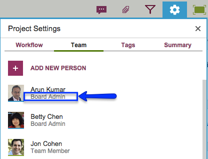
Still, our interchangeable use of “projects” and “boards” was definitely causing some confusion, which we have fixed with our latest release by using the term “Board” consistently and avoiding use of the term “Project”.
So, if you were a Project Leader previously, you are now a Board Admin on that board. Your rights and privileges remain the same, it’s just your title that changed.
Board Admin
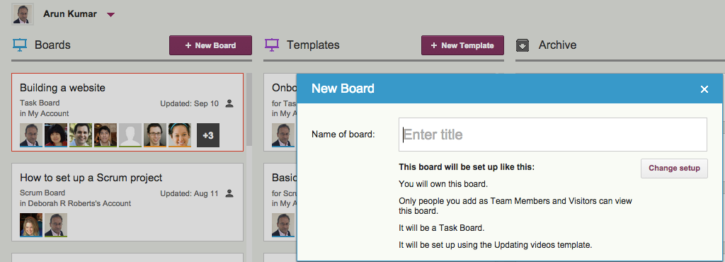
When you start a new board, what used to be called “New Project” is now labeled “New Board” to make it clear what you are doing: