Our latest update to the Kerika software features a bunch of bug fixes and other improvements that are mostly under the covers, as several user interface tweaks to help improve usability.
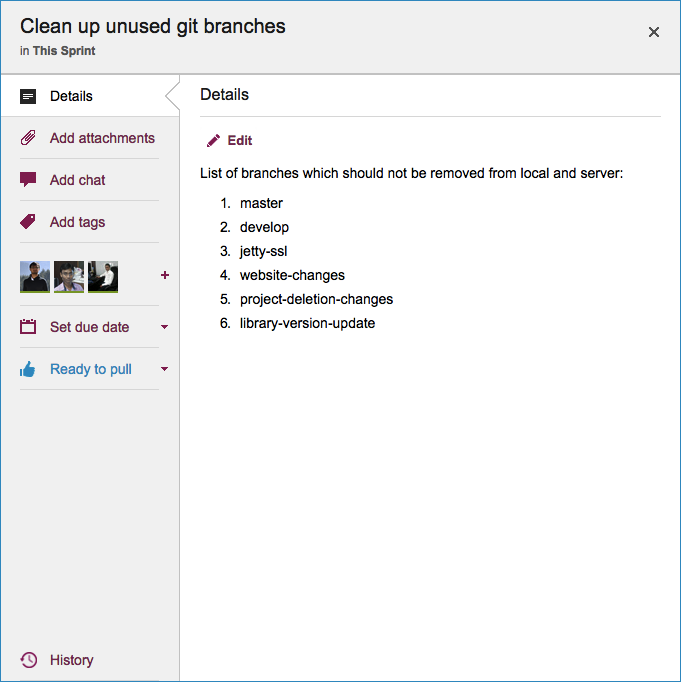
One change you will notice right away is that when you open a card, the details dialog box has new tabs for Tags and History: this was done to make it easier for people to find these functions, which were previously tucked away within the tab for the card’s description.

The History tab is all the way at the bottom now, where it’s easily accessible but not in the way — since History is not a frequently used function.
There are other UI tweaks: icons have been modernized and the overall look is cleaner, and the Trash column of a board now shows you when each card was deleted.