Board Admins can now invite people to join their boards as Team Members or Visitors by simply sharing a unique link that’s created for each board. We added this function because some of latest users include schools that want to add large groups of parents to boards with a single action. Here’s how it works:
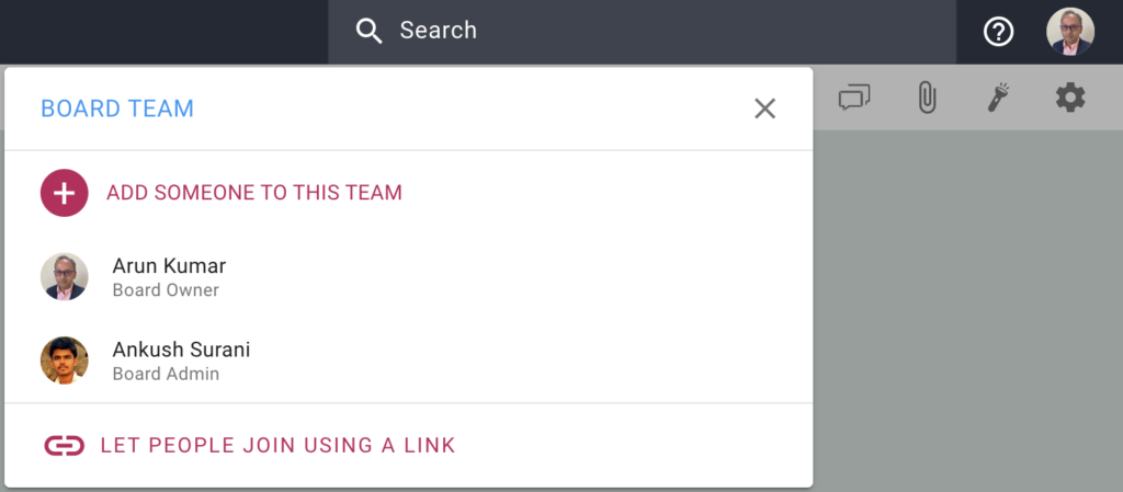
When you open the Board Team dialog (as a Board Admin), you will see a new option at the bottom, called Let People Join Using a Link:
Clicking on this will bring up a dialog that let’s you create links for adding people as Board Admins, Team Members, and Visitors:
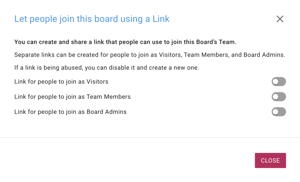
For additional security, separate links are created for each role: Board Admin, Team Member, and Visitor. When you turn on one of these options, Kerika will create a special link that you can then send to a large group of people to join you board.
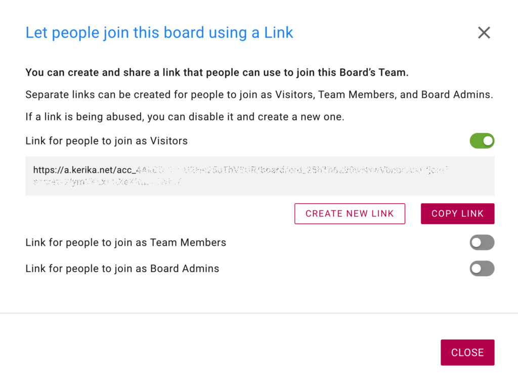
(We obscured the link in the screenshot above, for our own security!)
When you create a link, it’s also automatically copied to your clipboard for easy pasting in an email or chat.
If you are concerned that the link may have been compromised, perhaps because the people you sent it to have carelessly passed it on to others, you can always turn it off: turning off a link will automatically make it useless for future use.
You can then create a new link if you want to.
Try it, and let us know what you think.