A customer journey map is a visualization of the process that a person goes through in order to accomplish a goal. It’s used for understanding and addressing customer needs and pain points.
To understand this concept better, start with this great article from the Nielsen Norman Group: https://www.nngroup.com/articles/customer-journey-mapping/
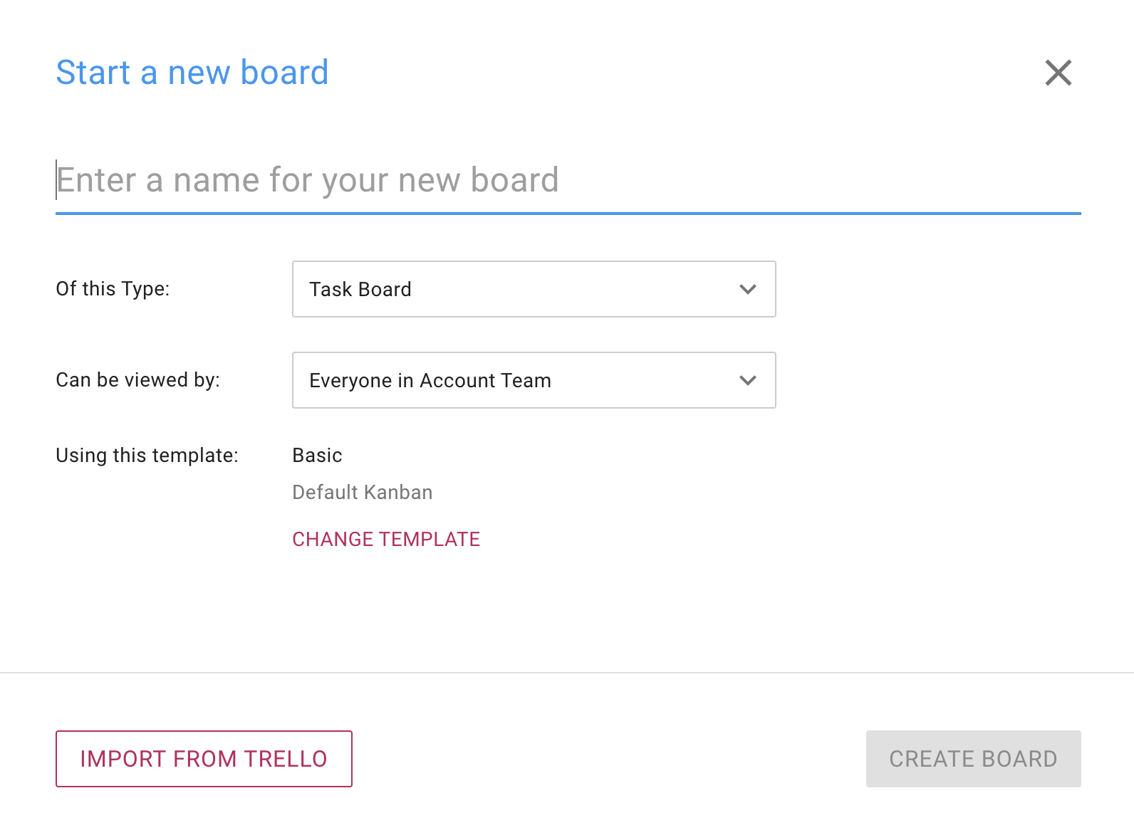
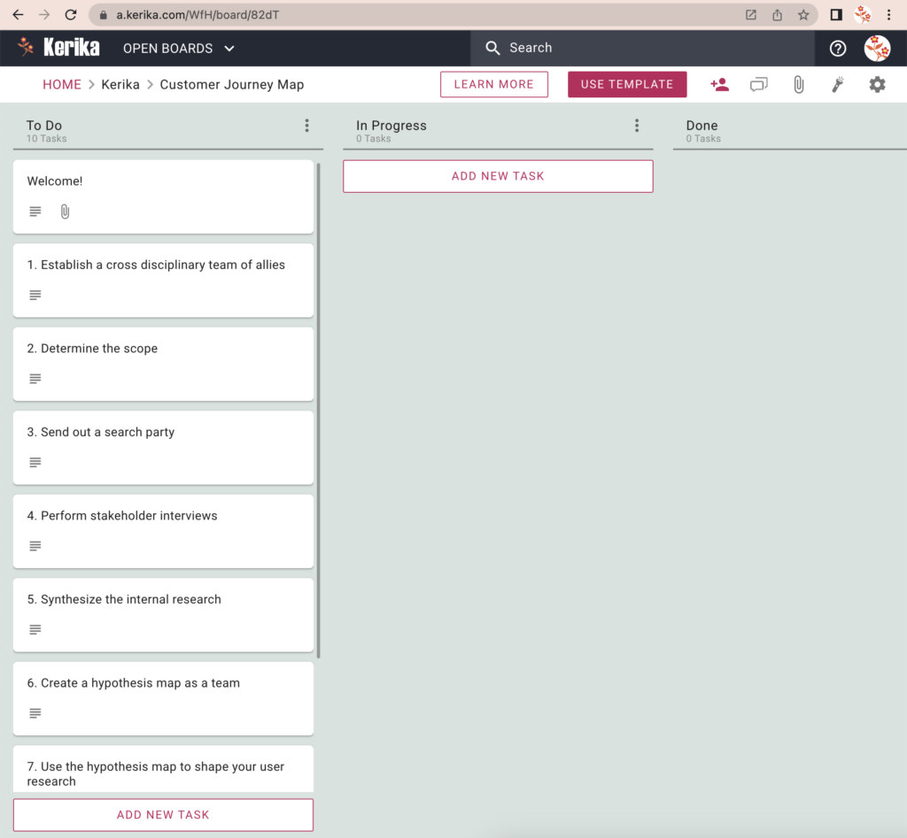
We have distilled this down to a Kanban board with all the required steps that can be set up in just seconds using our free template.
How to use this template:
-
Click on the USE TEMPLATE button and create your own board.
- Next, invite your coworkers to join this board. There’s a lot to get done, so hopefully you are not on your own!
-
If you have stakeholders who need to know what’s going on, add them to this board as Visitors, so they will have a real-time view of progress without messing up anyone’s work.
-
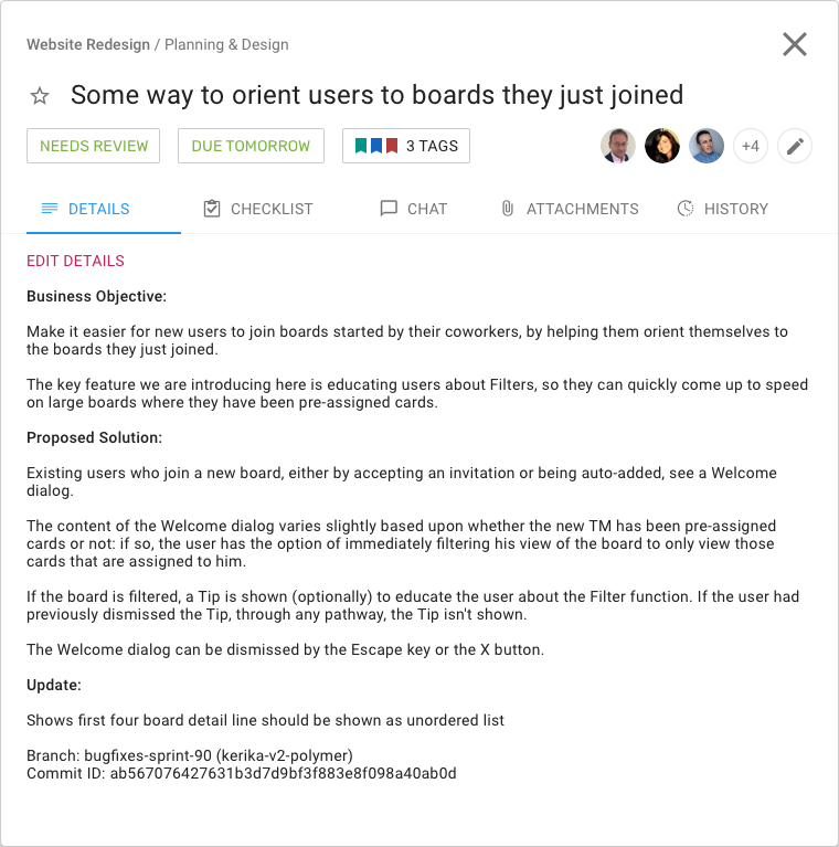
- When you team has joined you, open the tasks one by one, starting at the top of the To Do column.
- Assign the task to yourself, or one of your team members. (A task can be assigned to more than one person.)
-
Mark it as IN PROGRESS so everyone knows the task is underway.
-
As each task gets worked on, people can contribute their ideas and documents right on the task card itself, so nothing gets lost.
- When the task gets completed, mark it as DONE.