Category Archives: Technology

Posts related to technology in general.

Our new version: even better integration with Google Drive, and even better tablet support

Our next release is mostly about improving our Google Drive integration: we are making it a lot easier for you to manage your Google Docs from within Kerika itself, so that your content has a very useful “contextual layer” on top! Here are some of the improvements we be rolling out this weekend:

  • The file organization inside your Google Drive will be a lot more streamlined: a single, top-level folder called “Kerika.com” will have subfolders for each account to which you have access.
  • Better synching between Google Drive and your Kerika projects:
    • If you rename a file that’s attached to a Kerika card, that new name will show up in your Google Drive as well.
    • If you rename a file in Google Drive, that new name will show up in your Kerika cards.
    • If you delete a file that’s attached to a Kerika card, that file will get moved to the Trash in your Google Drive as well.
    • File sharing within your Google Drive will be done at the Kerika project folder level, which means faster performance and a cleaner interface.
    • Duplication of file folders will be eliminated.
  • Content that is attached to cards can be renamed easily: if you rename a file that you attached to a card, this new name will show up in your Google Drive as well, and you will be able to easily rename Web links as well.

We are also improving the Kerika experience on iPads and cellphones: as before, you can access Kerika right from the Safari browser (or Chrome, if you prefer), without having to download any special apps, and we are adding:

  • Better support for “double-tapping”, similar to doing a double click on a desktop.
  • Better support for phones.
  • Improved performance.

General improvements to the user interface will include:

  • A new set of tutorial videos, all under 2 minutes in length, to help you get more out of Kerika.
  • Cut-and-paste of entire projects.
  • Any URLs that are referenced inside cards or on chat messages will appear as clickable links.
  • Content inside chat messages can be easily copied.
  • A cleaner way to customize the workflow for your project.
  • A cleaner layout of icons on cards.
  • Some cool animation effects that make it easier to understand how canvases work, particularly if your projects contain multi-layered canvases (where one canvas contains several others).
  • A new to mark cards as “Needs rework”.

And, a final note: this version has taken quite a bit longer (4+ weeks) that our previous versions, largely because we allowed “feature creep” to happen… We kept adding usability tweaks to the release, particularly with respect to the iPad experience, and that chewed up a whole week. We need to guard more closely against feature creep for our next release.

Coming up: we are adding tagging as a new feature, which will make it easier to create quick filtered views of large projects!
Managing your Account Team

Your Kerika Account Team consists of you (the Account Owner), and all the people you have added as Project Leaders or Team Members, across all your projects. Each person is counted just once, regardless of how many projects that person works on, and Visitors are not counted at all.

When you sign up as a new Kerika user, you get set up with a free Standard Account, which lets you have up to 3 people in your Account Team — and that includes you, as the Account Owner.

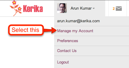
As your projects get larger and you add more people to your teams, you will need to upgrade your account to a paid Professional Account, which you can do within the application itself. Here’s how you can manage your account team, and the type of account you have with Kerika: click on your name or photograph, which appears in the top-left corner of the Kerika application.

Accessing your Kerika Account

This will show you a menu of actions:

Getting to your Account details

From this menu, select Manage my Account and you will see your Account screen, right inside the Kerika application. It looks like this:

Your Account status and Account Team

If your account is currently over its allowed size, you will see an alert here. (In the example above, the account shown is authorized for 3 users, as a free Standard Account, but is currently hosting 13 users).

Below this alert is a list of everyone who is part of your Account Team. If you want to reduce the size of your Account Team, perhaps to account for changes in your organization, or perhaps simply to reduce your use of the Kerika service, you can remove people easily by selecting them from this list.

Your Account Team
Your Account Team

Hover your mouse over that entry in the list of Account Team members, and you will see a full list of all the projects that person is working on:

All the projects someone is working on

To remove someone from your Account Team, click on the “x” button at the right end of the listing:

Removing someone from Account Team

Before the person is actually removed, you will see a warning message that reminds you which projects will be affected:

Warning before removing someone from Account Team

If you are sure, go ahead and click on the Remove user from my Account button on the bottom left of this warning. (We have deliberately put it there, so you don’t click on it by accident.)

Removing someone from your Account will remove that person from every project where they are working, and this is will immediately affect your Account Team size.


The best lines from Tim Cook’s Q&A at Goldman Sachs Conference

The transcript at the Wall Street Journal is extensive, and makes for great reading. Here are some of our favorite bits:

On whether Apple is too frugal:

My definition of a depression-era mentality wouldn’t be of a company investing a pair of tens over two years. [“tens” refers to $10 billion.]

On Einhorn’s lawsuit and Apple’s Proposal 2:

You’re not gonna see us do campaign mailing, you’re not gonna see a “yes on 2” in my front yard. This is a waste of shareholder money, it’s a distraction, and it’s not a seminal issue for Apple.

On innovation:

If there was a formula, a lot of companies would have bought their ability to innovate…

Consumers want an elegant experience where the technology flows to the background

These skills, this isn’t something you can just go write a check for. This is decades of experience

On specs:

Do you know the speed of an AX processor? You probably don’t. Does it matter? You want a fantastic experience

On iPad market share:

I have no idea what market share is, we’re the only company that really reports the units we sell.

On cannibalization:

I think if a company ever begins to use cannibalization as a primary or even a major factor of what products to go to, it’s the beginning of the end.

On iPad Mini:

I think this is gonna be the mother of all markets.

On the value of Apple Stores:

The tablet was ingrained in their mind as this heavy thing the Hertz guy held. But our store is the place to go and discover and try it out and see what it can do.

On being a good corporate citizen:

I’m very proud that we’re out front, that we have a spine on supply responsibility.


It seems older browsers simply won’t go away

Kerika uses a ton of Javascript, and by the word “ton”, we mean “well over a hundred thousand lines of Javascript”. It is one of the most sophisticated user interfaces ever developed for the browser, and it delivers a fantastic, real-time, desktop-like experience right inside the browser. And it does so on Internet Explorer, Safari, Chrome and Firefox.

The problem has always been with Internet Explorer: versions before IE9 have very poor support for Javascript and HTML5 in general. In years past Microsoft gave lip-service to the idea of supporting the (then-emerging) HTML5 standards, but their pre-IE9 versions did a very halfhearted job of supporting Web standards. Too many people at Microsoft were still fixated on the idea of maintaining a proprietary lock-in by encouraging their users to stick with the Microsoft-specific extensions that ran only on IE Server and the IE browsers. Things turned around only with IE9, spurred, no doubt, by the surprising inroads that were being made by Firefox and Chrome. Now, happily, the thinking at Microsoft has really come around to supporting Web standards!

Well, Kerika doesn’t run on pre-IE9 versions of Internet Explorer. This was a critical design decision we made when we first started coding in 2010, based on the assumption that IE9 — which was then in beta form but already looking reasonably robust — would be quickly launched and vigorously promoted by Microsoft, and as quickly adopted by the IE user base.

That doesn’t seem to have happened, at least not as far and as widely as we had hoped, and a call this afternoon with a user who was stumped trying to make Kerika work on his office PC, which still runs IE8, prompted us to look at NetApplications data on browser market share and adoption curves. The data are, frankly, dismal.

First of call, let’s look at overall browser market share, as of Dec 2012:

Browser market share on Dec 2012

Overall, Microsoft is in a position to say they are still the most common browser out there, but not by much: total market share for Internet Explorer, across all versions, is 54.77%. The following graph, however, really puzzles us: it suggests that browser market share hare remained essentially static for most of 2012, which doesn’t quite jive with anecdotal evidence we have been getting from users suggesting that Chrome is making surprising inroads among both Mac and Windows users:

Browser market share in 2012

Looking at specific versions of Internet Explorer shows some data that matches our intuition and general market understanding:

IE10 Market Share
IE10 Market Share

But there’s other data that are really puzzling: why would IE6’s market share rise in mid-2012? Were a bunch of old laptops suddenly taken out of storage and donated? No new machines could have come into the market with IE6, nor could many machines have downgraded to IE6 (unless everyone has been saving their installation disks for Windows XP and decided to collectively reinstall their desktop operating systems in July…)

Browser market share in 2012
IE6 Market Share
IE6 Market Share

Perhaps the data aren’t so reliable after all, although NetApplications has long been the most highly cited source for data on browser market share.

We need some of those curves to start bending soon…


When prosecutorial misconduct lurches from farce to tragedy

Aaron Swartz didn’t have to be driven to suicide by the horrific prospect of spending decades of life in prison for the “crime” of publishing taxpayer-funded research. There’s a petition at the White House to fire Assistant US Attorney Steve Heymann, who proudly put out this press release on July 9, 2011 to pat himself in the back:

If convicted on these charges, SWARTZ faces up to 35 years in prison, to be followed by three years of supervised release, restitution, forfeiture and a fine of up to $1 million.

That’s 35 years in prison for publishing taxpayer-funded research — yes, that’s right: we are talking about research funded with your tax dollars. And the farce that’s wrapped up inside this tragedy is that JSTOR, which housed the research that Aaron downloaded, has already decided to make all these documents available free to the public.

When someone screws up this badly in the private sector, he is fired, fast, and deservedly so. Why not in the public sector as well?

60 usability improvements (and we are not done yet!)

Kerika got updated today, with around 60 usability improvements based upon feedback from our early adopters. Many of the changes are quite small, but you should notice that now it is even easier to:

  • Add people to projects.
  • See who is part of each project.
  • Chat about cards.
  • Work with templates.
  • Catch up on updates from coworkers.
  • Use Kerika’s unique canvas feature.

There’s also a simpler and easier welcome experience for new users, and improved performance with faster downloads.

And speaking of performance, that’s our next focus: we want to kick that up quite a bit, so it’s even easier to use Kerika with public WiFi networks like coffee shops.

Giving real thanks, this Thanksgiving

This Thanksgiving holiday, we have good cause to be grateful to all the folks who gave us detailed feedback on our new task management software, and helped us identify about 25 different improvements that we plan to make over the next week covering areas such as:

  • Eliminating any confusion that might exist regarding project privacy;
  • Making it easier to edit card titles;
  • Making it easier to chat on individual cards;
  • Improving the emails that are sent when people are added or removed from projects;
  • Improving the overall performance, by at least by 50%;
  • Simplifying the experience for new users;
  • Simplifying the use of canvases and whiteboards;
  • Adding helpful hints throughout the product; and
  • Eliminating references to “Kanban” which some people find confusing (without eliminating any functionality).

We will be updating Kerika next week, and will continue to release new versions every two weeks, and over the next month we plan to market and publicize the software more.

Task management comes to Kerika

At long last, task management comes to Kerika!

We are launching a brand-new version of Kerika this weekend: the fruits of over 8 months of intense research and design of the only taskboard that’s designed specially for distributed teams. There’s a short video that we urge you to watch: it provides a good overview of Kerika’s new capabilities:

  • You can organize your work using cards on a virtual task board: the interface is easy to understand and delightful to use.
  • Each card can contain details of the work, and, of course, you can add content from your laptop or the Web to each card.
  • Each card can be assigned to one or more people from your project team: Kerika lets you see at a glance who is working on what.
  • Chat is integrated directly with your work: you can send messages that are attached to your cards, or the entire taskboard.
  • You can get started with one of our standard project templates, or create your own process templates to reflect your organization’s best practices and proprietary methodologies.
  • Kerika’s unique whiteboard capabilities are integrated with the new task management: you can add a canvas to each card for sharing ideas, and everything updates in real-time as usual.
  • And our special focus continues to be the challenges faced by teams that are distributed over different locations — it could be that you are working with people offshore, or simply working from home: Kerika makes it easy for you to see, at a glance, exactly what’s changed on each work item in each project.

As usual, we look forward to your feedback! (Contact us by email.)

A new user interface, with much improved usability

We are launching a brand-new version of Kerika, with a completely reworked user interface and a ton of new features including support for iPads and other full-sized tablets.

The new UI is different enough that we have put together a 2-minute video that we recommend you watch before you sign in next; it will really help you get the most out of the new software. The interface is new, but all your old projects and data are all intact!

The new interface is part of a larger transformation we are undertaking that will add project management capabilities to our existing collaboration features: we want to provide support for Kanban-style projects, Agile/Scrum projects, and customized workflows. We have finished designing the new features and if you would be willing to take a look at our mockups and give us your opinion, it would be greatly appreciated!

Meanwhile, please enjoy the new version, particularly if you have an iPad or other full-sized tablet. To access Kerika on your tablet, just log into the kerika.com site using your tablet’s browser: there is no need to download any app because we have rebuilt the user interface to work just fine inside your tablet’s browser.

How to tell if a file has been updated

The first version of Kerika was written as a peer-to-peer (p2p) application, so one challenge we faced was detecting when files that are being shared as part of a project were changed by a user, so that we could send the latest version to everyone else on the team.

Our first attempt at a solution was to simply examine the Last Modified time for files. However, this proved to be very unreliable for a rather odd reason: whenever you open a spreadsheet using Microsoft Excel, it automatically updates the Last Modified time to be the current time – even before you had made any changes.

And when you close Excel, without having made any changes, it resets the Last Modified time back to its original value. So, whenever you opened a Excel files for viewing, we would erroneously identify it as an updated file.

We then tried looking at the size of files, to see if these had changed since we last examined them. We knew, of course, that this would be error prone in its own way: if you change some text within a file such that it contains the same number of characters as before, the overall size of that file would not change.

But this approach failed for another reason altogether: Microsoft Word allocates disk space in chunks at a time, rather than as exact amounts. This means that any edits to Word files that do not require Word to grab another chunk, or give up a chunk, would never be reflected in the reported size of the file.

Eventually, we decided to take the MD5 hash of files, which is a more reliable way of detecting if a file has been modified. We were concerned about how much CPU overhead this would take, but it proved to not be a problem after all.