Category Archives: Usability

Posts related to product design, user experience and usability.

Adding cards while your Tags filter is turned on

The Tags filter button, which appears on the top-right corner of your Task Boards and Scrum Boards, lets you filter your view of a crowded board by showing just those cards that match a particular tag that you are using (or a particular color coding):
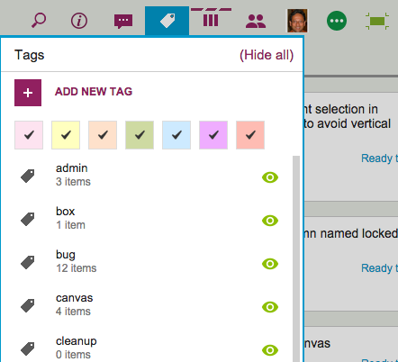
Tags button
Tags button

It used to be that when you were filtering your view of the board, you couldn’t add any new cards.

The reason made sense from a technical, geeky perspective, but it proved confusing and frustrating for our users, so we have added more flexibility by letting you add new cards even while you are using filtering.

The new cards will appear as you add them to the board, and stay there until you refresh your view of the board. At that point, whether the new cards continue to appear or not will depend upon whether they meet your tags filtering criteria or not.

That sounds complicated, we know, so let’s take a look at the original logic behind not letting users add cards while using tags filtering…

In the example screen shown above, the board has a bunch of tags defined, like admin, box, bug, canvas, and cleanup.

Suppose we were using filtering, to only show those cards that are tagged bug and box. With this filtering in effect, you are going to see only a small subset of all the cards that exist on the board — only those cards that have either bug or box as a tag. (Or both.)

So, what should happen if you add a new card to the board, which isn’t tagged bug or box?

From a strictly logical perspective, this new card shouldn’t be displayed, because it doesn’t match the filter criteria you are currently using — it should be displayed only if the new card had bug or box as one of its tags.

We originally dealt with this problem by saying that you couldn’t add new cards while using tags filtering, because the new cards would disappear immediately after you had added them, which we felt would make for a very confusing user experience.

(People would likely think they failed in their attempt to add a new card, and keep trying. Eventually they might turn off tags filtering, and then find they had added many copies of the same new card.)

So, that was one solution to the problem, but it still presented a user experience challenge because many folks would forget that they had turned on tags filtering, especially if they were bouncing around between multiple boards. (Yes, Barb, we are looking at you!)

If a user returned to a board and didn’t realize that they had tags filtering turned on, they would get confused as to why they were unable to add new cards.

We thought of a couple of different solutions to this problem, including the use of callouts (those balloon-like bubbles that appear to give you hints about how a page works) but we aren’t generally a fan of callouts — too many apps misuse them to excess these days.

So we have come up with what we think is a better solution: if you are using tags filtering, go ahead and add new cards. They will show up, but if you refresh your page, your tags filtering will be re-applied, and the new cards will be displayed only if they match the tags you want to show.

Kerika, now with less Kudzu

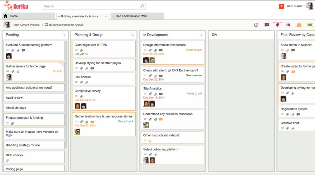
We have been hacking away at the application chrome within Kerika, removing some of the purely decorative elements that were starting to crowd out the user’s critical view of data.

Application chrome is like Kudzu: if you are not careful, what seemed like a nice-looking decoration on one part of the screen can quickly grow to overwhelm the application.

Kudzu
Kudzu

Here’s a before-and-after view of Kerika:

Kerika with column chrome

And here’s the same board, viewed with less application chrome, which allows the cards on the boards to stand out more:

Kerika with less chrome

This wasn’t just an aesthetic decision, although we are pleased with the new, cleaner appearance of Kerika: it was actually essential for our development of the new Planning View in Kerika, which lets you easily view a Task Board or Scrum Board from the perspective of Due Dates.

For the Planning View to work with workdays, it became essential to show more columns at a time, more of the time: showing at least 5 columns on most laptops became an essential requirement, and we could not achieve that solely by shrinking the width of cards — we also needed to remove the column chrome so that the board would not appear so crowded.

How long things stay in the Clipboard

When you copy or cut an item on a Kerika board — a set of cards, or may be some things sitting on a Canvas — these objects are placed in a special Clipboard that sits on the Kerika server, not in your browser.

This is important to note for several reasons:

  • Because the Clipboard is on the server, you won’t lose the items if your network connection breaks before you have a chance to paste whatever you cut.
  • The Clipboard will hold on to the items for 20 minutes, to give you time to think about where you want to put them. (And, to recover from any network problems you may have experienced.)
  • If you don’t paste something that you had previously cut, the Clipboard “releases” it back to where it was originally, after waiting 20 minutes to go by while you ponder. But, if you are impatient, you can reverse your cut action sooner simply by clicking on the cut items, which continue to appear in a faded (greyed-out) appearance on your board.
  • Because the Clipboard is on the Kerika Server, other team members won’t see the change until you actually do the paste. So, for example, if you have cut some cards from a Task Board or Scrum Board and haven’t pasted them yet, your project team members will continue to see the items on the old board until you complete the paste.
  • And, finally, here’s a great feature, thanks to the Server Clipboard: one of your team members can be making changes to a card while you are in the process of cutting-and-pasting it, and those changes aren’t lost. That’s because the object is stored on the server rather than your browser, making it possible for your team members to make changes even as you are in the process of doing a cut-and-paste.

Exporting just a subset of a Task Board or Scrum Board

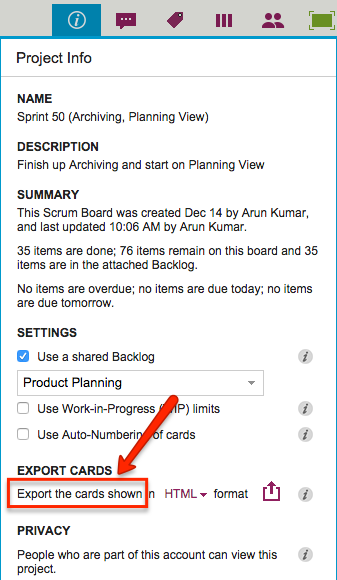
A tiny change in labeling in our latest version will, we hope, make it clear that Kerika’s Export feature is actually pretty smart about managing the amount of data that you export from a board:

Exporting subset of board

What used to say “Export cards” now says “Export the cards shown”.

“Cards shown” means just what it says: if you are hiding some columns from view, or filtering your view of the board to show just those cards that match particular colors or tags, then only the cards currently shown are going to be exported.

This makes it really easy for you to manage what information goes into an export: if you don’t want the Backlog of a Scrum Board to be included, for example, just hide the Backlog from view before clicking on the Export button.

Cards that are in Done or Trash are frozen

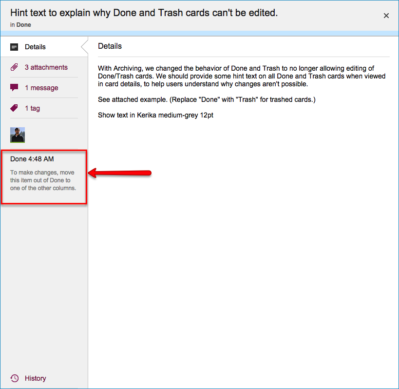
Cards in the Done or Trash column, of a Task Board or Scrum Board, cannot be modified without first moving them out of Done or Trash: this is different from how boards worked before, and we made this change as part of our recent update where we introduced the concept of Archives.

Done cards
Done cards

There are a couple of reasons why we did this:

  • It seems like common-sense: if you have deleted a card, or marked it as Done, why would you be making changes to it? If the card needs changes, or someone wants to do chat or any other updates, that card isn’t really deleted or done, is it?
  • It matches the behavior of Archived Projects: when you move a project into the Archive in your account, that project is frozen in its current state, and remains frozen while it is in the Archive.For symmetry and ease of understanding of the concepts of “Done” and “Archive”, it made sense that Done cards should also be frozen.


When Projects Get Done: Archive Them

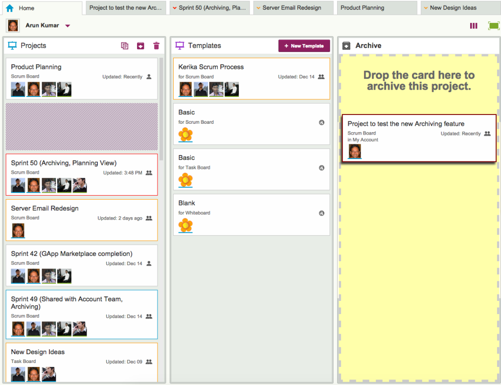
Here’s another new feature with our latest update: when a project is done, you can drag it to the Archive column on your Home page.

Archiving Projects
Archiving Projects

Archiving a project freezes it: no one can make any changes to it while it is in the Archive, so if you change your mind and want to make some changes to an archived project, you need to drag it back out of the Archive and into your Projects column.

All the documents attached to an Archived Project are frozen: the goal here is to preserve the final/completed state of a project and all its assets, so that later on if you need to investigate a problem — or deal with a FOIA request or some other legal disclosure requirement — you can do so with confidence.

All dates, status, chat and teams are also frozen: if someone was part of an Archived Project’s team at the time the project was moved to the Archive, they will continue to show up on that project team.

If a task had a due date and hadn’t yet been completed (i.e. the card hadn’t yet been moved to the Done column), that due date stays intact.

If the project was a Scrum Board, it will continue to stay attached to the Backlog it was using at the time the board got archived: when you view an archived Scrum Board, it will show that Backlog in it’s current state.  This makes it easy to archive Scrum Boards that represent different Sprints that work off the same shared Backlog!

You can change your mind: If you need to work again on a previously archived project, just drag it out of the Archive column and drop it into the Projects column on your Home Page, and that will “un-archive” (restore) your project.

You can create templates from archived projects: if you drag an archived project and drop it into the Templates column on your Home Page, that will create a template based upon that project, while leaving the project in your Archive.

Our latest update: a minor facelift…

Our latest update to the Kerika software features a bunch of bug fixes and other improvements that are mostly under the covers, as several user interface tweaks to help improve usability.

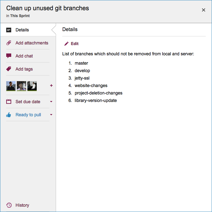
One change you will notice right away is that when you open a card, the details dialog box has new tabs for Tags and History: this was done to make it easier for people to find these functions, which were previously tucked away within the tab for the card’s description.

Card Details
Card Details

The History tab is all the way at the bottom now, where it’s easily accessible but not in the way — since History is not a frequently used function.

There are other UI tweaks: icons have been modernized and the overall look is cleaner, and the Trash column of a board now shows you when each card was deleted.

Sorting cards in a column just got easier

You used to be able to sort all the cards in a column by Due Date, now you can also sort them by person and by status!

Sort By
Sort By

This makes it even easier than before to manage large boards:

Sorting By Status organizes cards as follows:

  • Critical
  • Is Blocked
  • Needs Review
  • Needs Rework
  • Ready to Pull
  • Hold

This makes it easy to organize your day: all the most important stuff, e.g. the cards that are Critical or Blocked, come to the top of the column where they are not likely to be overlooked.

Sort by Person organizes cards so that you can see all the items that are assigned to individuals: all the cards assigned to Arun, for example, will show up together within the column.

And where cards are assigned to several people, a simple alphabetical sort is applied on the names.

You still have Sort by Date: Kerika is smart about showing you only those sorting options that are relevant to your situation, and if a particular column doesn’t have any Due Dates, this sort option is not shown.

We just made it easier for you to manage very large boards 🙂