Category Archives: Technology

Posts related to technology in general.

Vimeo makes for better embedding (than YouTube)

We post our tutorial videos on both YouTube and Vimeo, and get far more traffic on YouTube than we do on Vimeo.

But, as we go through a review/refresh of our website, we are switching over to Vimeo for embedding these tutorials, because Vimeo provides a cleaner look that seems to be less intrusive within our own design.

Here’s the same video, embedded from YouTube (on top) and Vimeo (on bottom):

The YouTube video has a weird grey shadow on the top part of the thumbnail, like it was deliberately trying to provide a retro, cathode-ray-tube (CRT) look.

(We are not fans of CRTs; don’t own vinyl any more…)

The same video on Vimeo has a cleaner framing:


Google doesn’t seem to like client-side compilation of less.css

Less is a CSS pre-processor: it extends  CSS by adding variables, mixins, functions and many other techniques that allow easier maintenance of your browser stylesheets.

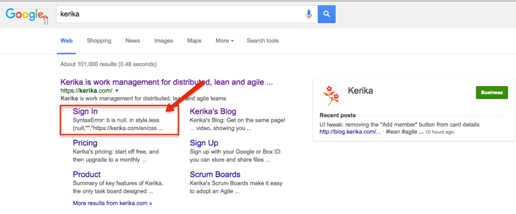
You can compile Less either on the client side, or on the server.  We thought it didn’t matter; but it turns out that Google search engine crawler doesn’t like the client-side compilation:

less.css compilation


If you are using Less on your website, you might want to also avoid client-side compilation so that Google doesn’t barf on it…

Attaching content to the board itself, not just to cards

We have added a new feature that should prove handy for a lot of folks: you can now add content — files from your laptop, images from your mobile or tablet, Web links from your Intranet or the Internet, or canvases — to a Task Board or Scrum Board itself.

If this sounds like something that was always there, maybe we need to say that differently: you used to have the ability to add content to a card, now you can add it to the board itself.

There are many situations we have encountered where we want to share content or a canvas with a team, but there wasn’t any obvious place to still it — no single card on the board that seemed like the right place to attach that content.

And that’s because the content we wanted to add was applicable across the entire board, not just relevant to a single card.

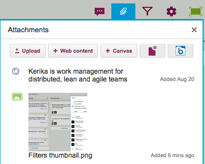
This was getting frustrating, so we decided to scratch our itch: a new button on the top-right area of your Kerika app will let you add files, Web links and canvases to the board itself:

Board Attachments
Board Attachments

This should make some of you as happy as it has made us!

Adding a Google Map to your Kerika canvas

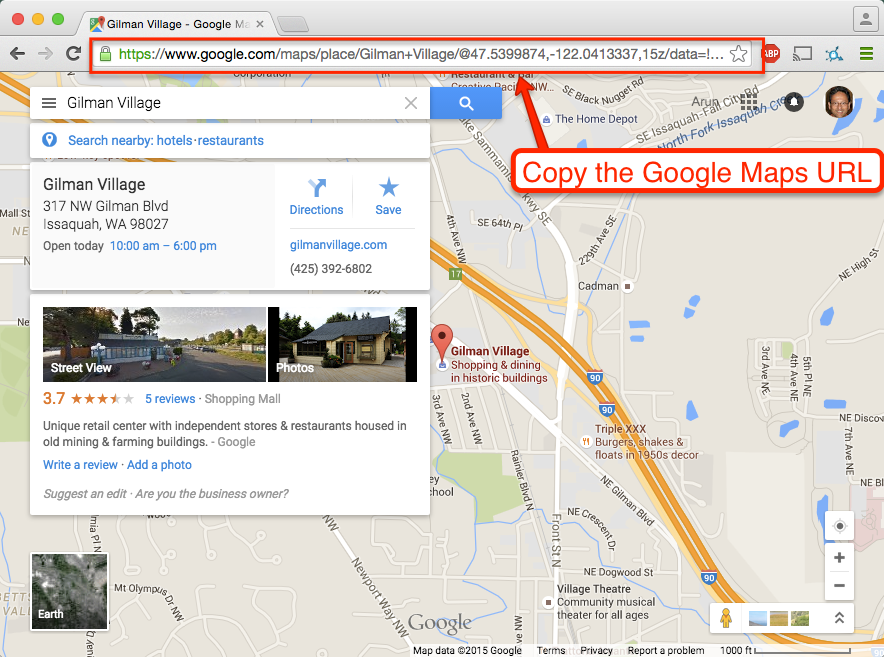
Did you know that you can embed a Google Map in your Kerika Whiteboards? It’s easy: just copy the Google Map’s URL:

Adding a Google Map to Canvas

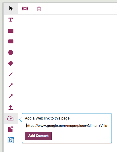
And paste it into the dialog box that appears when you click on the “Add Web Content” button on your canvas toolbar:

Add Web Content
Add Web Content

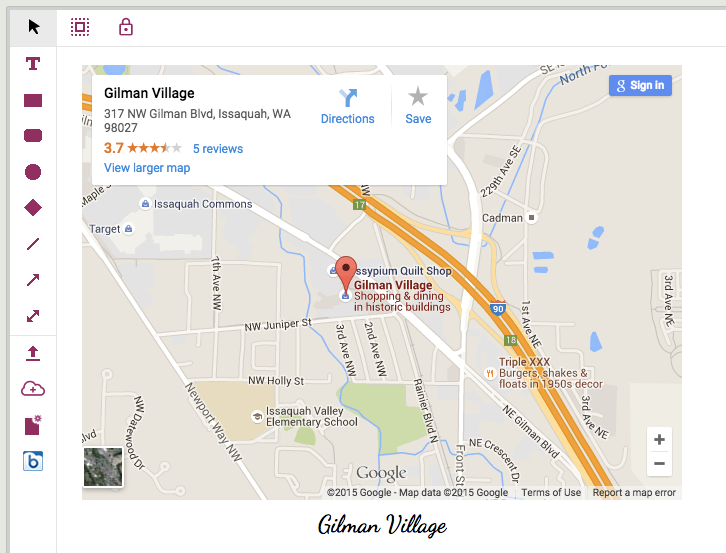
Kerika automatically figures out the URL refers to a Google Map, and shows you an embedded map on your canvas:

Example of embedded Google Map

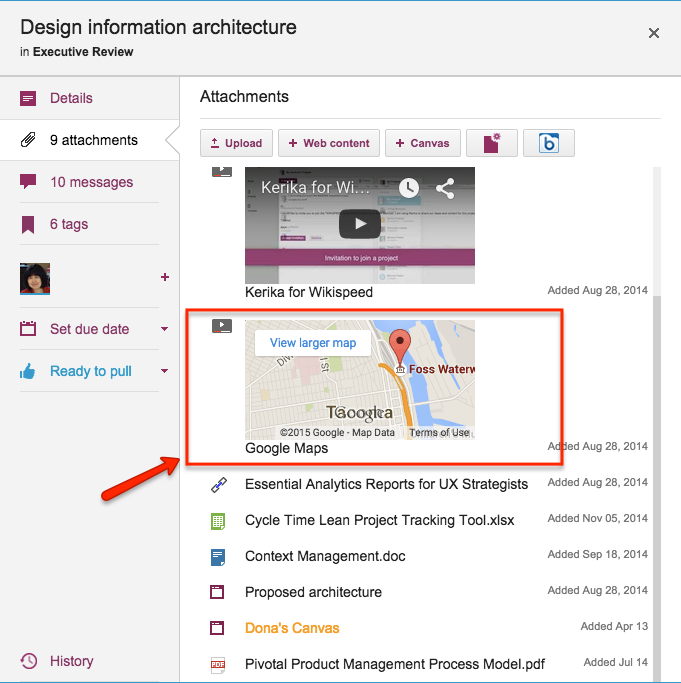
You can do the same thing with card attachments, for your Task Boards and Scrum Boards: Kerika shows a small thumbnail of the map in the list of attachments on your card:

Example of attached Google Map


UI tweak: removing the “Add member” button from card details

As part of our work on combining tags and colors, we have been cleaning up parts of the Kerika user interface that had minor inconsistencies.

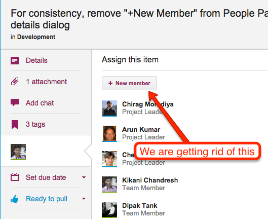
One such inconsistency — in our view — was that you were able to add people to a project team from within the card details dialog itself:

Adding people to a team

This button has been there in Kerika for a very long time, but it doesn’t really make sense to have this capability within the card details dialog: it just isn’t the best place to decide to add someone to a project team.

Instead, in our new layout the Project Settings dialog consolidates all the board management in one place, including adding people to a team, changing someone’s role within a team, and removing someone from a team:


UI tweak: showing attachments in chronological order

It used to be that when you added content to a card — files from your laptop or Web content from your Intranet or the Internet, or a canvas — the newest content was added at the top of the list.

Of course, you could always rearrange them, by grabbing and dragging them up or down the list, but this it not a feature that many users discovered on their own 🙁

Rearranging attachments on a card

Well, for greater consistency with how the chat and history are shown within a card’s details, we are now going to show attachments in chronological order as well — the latest files and URLs that you added to a card will appear at the bottom of the list, and the view of these will be automatically scrolled to show the latest items:


Using Chat in Kerika

A new tutorial video, showing you how Kerika’s Chat combines the best of instant messaging and email, and lets you have very focused conversations on your Task Boards, Scrum Boards and Whiteboards:


Using animation to provide a “sense of place”

Animation often gets a bad reputation, and often this reputation is well deserved because too many designers and developers use animation gratuitously: just because they can, or just because they want to show off their technical skills.

At Kerika we have been very cautious about using animation, and have generally restricted its use to scenarios where it can help give users a “sense of place”: providing transitions from one display to another, so that a user has a sense of having journeyed from one part of the system to another.

Animations are particular useful when returning to where you come from: an effective animation can help users understand that they have returned from their journey.

Using animation to unfold drop-down dialogs helps the user understand that the dialogs are literally unfurling on top of the Task Board or Scrum Board: in other words, the user isn’t going anywhere different, just unfolding another display for temporary use.

With our latest version, we added some more animation: now, when you open a card on your Task Board or Scrum Board, it will appear to literally open in front of your eyes.

Animation is also used when you close a card: it appears to collapse in front of you in a way that draws your eye to its position within a crowded column.

This kind of animation, we believe, is useful rather than gratuitous: it helps the user understand what is happening when she opens or closes a card.

(We may consider some other touches of animation where we think it could help provide useful transitions, but we have to be mindful of the performance hit of animations as well…)
An improvement to Card History

Every card, on every Kerika Task Board or Scrum Board, contains within it a full history: a log of all the changes that have been made to it.

(A few actions are ignored because they can occur so often, and are often inconsequential, e.g. moving a card up/down within the same column. In contrast, moving a card across columns is considered consequential, and is therefore logged in the card history.)

We recently made a usability improvement in the way the Card History appears: the log of changes is now shown in chronological order, rather than reverse chronological as was the case before.

This makes history look more like chat, and should make it more usable!