Category Archives: Usability

Posts related to product design, user experience and usability.

Trying to be less obscure: why we show the Trash column now

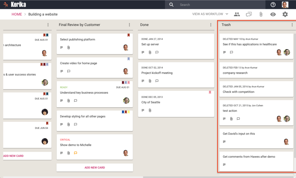
With our latest release we have made a change to all Task Boards and Scrum Boards: the Trash column will now show automatically if it contains anything:

Showing the Trash column

We made this change because the old design was too subtle: most of our users never even discovered the Trash feature, which was a really pity.

Now, the Trash column will automatically display whenever it has anything in it.  We are using lazy loading for the Trash, so performance is not affected for people who have very large Trashes. (Some people, who have been using the same board for years, have hundreds or even thousands of items in their Trash.)

If you don’t want to see the Trash, you can hide it using the Filter button that appears on the top right of each board:

Hiding Trash
Hiding Trash


A transition to “lazy loading”

With our big UI redesign, launched a couple of weeks ago, we have started using lazy loading of cards in an effort to improve performance, particularly with very large boards.

Background:

Most Kerika boards tend to be small, or moderate: up to 100-200 cards in size.  A few users, however, have very large boards: several thousand cards in size!

And this is not because we have users who are tracking thousands of work items simultaneously; it’s just that some users have been continuously using the same board for years to track all their work.

For people who use the same board over several years, the number of items in the Done or Trash columns can eventually number in the thousands.  Displaying such large boards was already difficult in our old architecture: we had underestimated how many cards some boards might contain, so our old design downloaded all the cards on a board every time it was opened, and then created a DOM for each card!

This meant that, for very large boards, the browser had to create thousands of DOMs before it could even display the board.  This was obviously not a sustainable model.

What we did:

With our redesign, we have laid the groundwork for a better architecture using two related concepts in lazy loading:

  • For columns that we anticipate being very large — the Done, Trash and Backlog columns for Task Boards and Scrum Boards — the browser now fetches only a small number of cards, say 10-20, from the server.  (With our old design the browser would fetch every card, for every column.)
  • Fetching fewer cards means the amount of traffic between the browser and the server decreased dramatically, but it didn’t solve the performance problem by itself. We also changed our browser code to reuse DOMs instead of creating new DOMs.  By reducing the total number of DOMs created and maintained within the browser by the Kerika app, we are able to reduce Kerika’s overall browser footprint while significantly improving performance.

Here’s an example of lazy loading of the Done column:

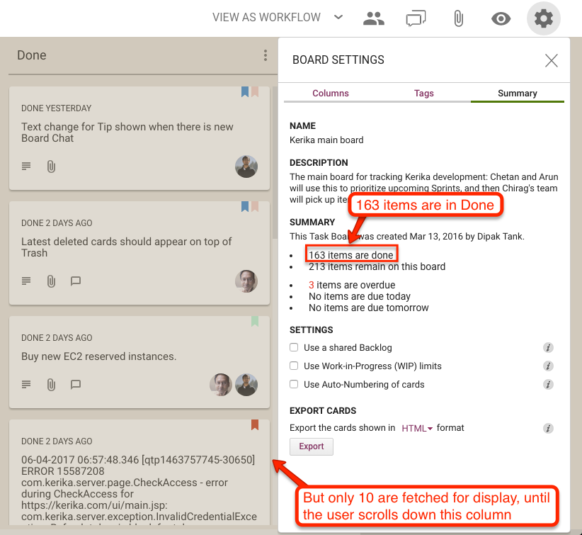
Lazy loading of Done column

On this board, the Done column contains 163 cards, but when the board is opened only 10 are shown.  Since these are the 10 most recently done cards, this works great for most users, most of the time.

If the user really wanted to see something that was done a long time ago, they can simply scroll down the Done column, as they would have with our old design as well.

As a user scrolls down, more cards are fetched automatically from the server.  Slightly more cards are fetched from the server than are likely to be displayed, e.g. the browser may fetch 15 cards from the server even when it expects to display only 10.

This helps avoid the perception of delay when the browser needs to fetch more cards, since it will already have 5 more cards stored in memory to show as the user begins scrolling, giving it time to fetch another 15 before the user has finished scrolling.

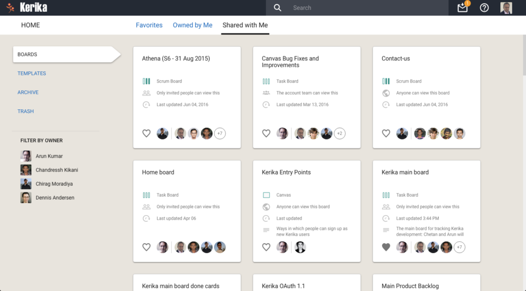
We also decided to use lazy loading on the Home page: with our new design we display more information about the state of each board than we did previously, and the cards themselves are much larger than before.  This means we are unlikely to show the full set of boards to any user at any time, so lazy loading is a natural choice for this view.

Lazy loading of Home

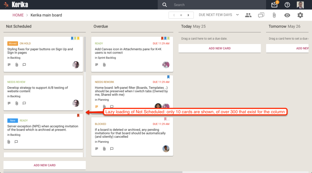
Finally, with our most recent update (launched two days ago), we have extended our use of lazy loading to include the Not Scheduled column in the Planning Views, where you can pivot your view of a Task Board or Scrum Board to see all the cards organized in terms of due dates.

Here’s an example of a board where there are a very large number of unscheduled cards:

Lazy loading of Not Scheduled

The Not Scheduled column only fetches and displays 10 cards at a time even though there are over 200 cards that are not scheduled.  Since the browser (on this laptop) can only show 3-4 cards at a time, there isn’t any point in fetching all 200 cards: just fetching and displaying 10-15 at a time does the trick!

The design effort behind our new version

For our extensive redesign of Kerika we used the Sketch design app for the first time, transitioning way from our earlier use of Adobe’s Creative Suite.

Here’s our design effort, by the numbers:

  • We created a total of 937 individual screen layouts, all of which were high-resolution and pixel-perfect.
  • Each screen was designed for 1680×1050 pixels, which is the resolution of a 21″ desktop monitor although each design was subsequently tested on a 1400×800 laptop screen as well.
  • Every element on every screen was laid out to its precise final size and spacing, to create a photo-realistic view of the design.
  • We exclusively used vector graphics so we could scale our views for different devices and resolutions without any loss of resolution.
  • Every screen was mocked using real data, rather than lorem ipsum-style fake text, so we could get a more realistic idea of how much space actual cards, columns, etc. would take.
  • We used realistic storylines for all scenarios: user personas were developed and used consistently, so that, for example, the same person appeared as Board Admin on all screens.
  • Every interaction between different features was considered simultaneously, so that we could guard against edge cases where the design might clash or fail when multiple user conditions were true at the same time.

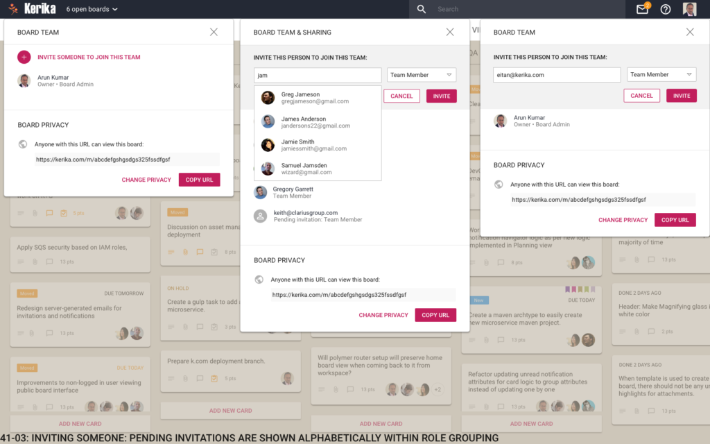
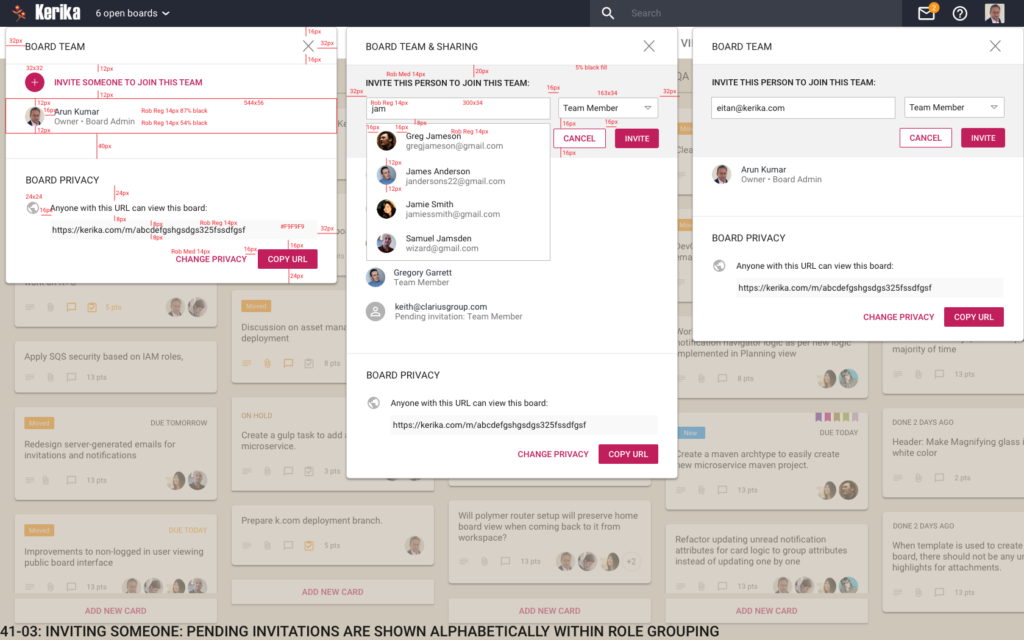
Here’s an example of a screen mockup:

Inviting someone
Inviting someone

Here’s the same screen design, with dimensions marked as redlines:

Inviting someone (Markup)

Extensive use of symbols (repeating objects in Sketch) helped us ensure that we had consistency across all 937 designs, simultaneously.

We exported our icons using the Scalable Vector Graphics (SVG) format, rather than PNG or JPEG, to ensure there was no loss of resolution when we used these icons in the Kerika app.

Over 1.5 years, we went through 35 complete iterations of the design, where nearly all 937 screens were changed as we explored different concepts.

And, no, we aren’t done yet…

Preferences

New options for the 6AM Task Summary Email from Kerika

Welcome to 2017! We have a big bunch of goodies lined up for release in the coming weeks and months, and we are going to start off with some nice improvements to the 6AM Task Summary email that you can (optionally) get from Kerika:

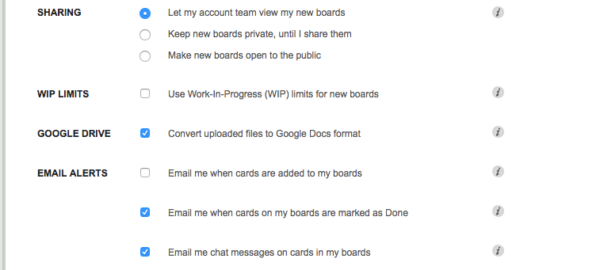
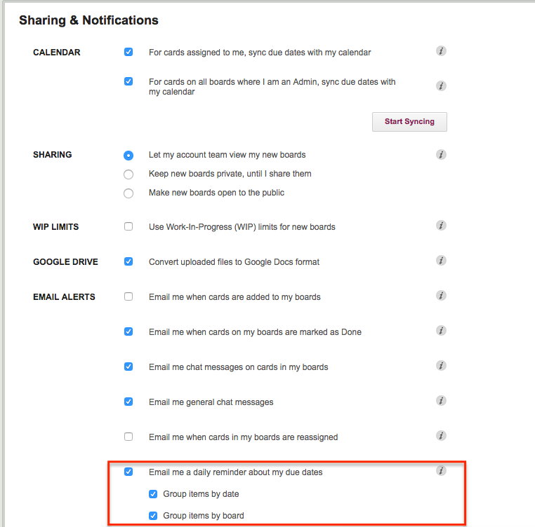
You now have two options: you can get all your overdue and due items sorted by date, or by board. Or both.

To turn this on, go to https://kerika.com/preferences, and check these boxes:

Preferences
Preferences

We have also improved the “group items by date”: instead of showing what’s due today and tomorrow, this email now includes What’s Due This Week and What’s Due Next Week.

“This Week” is adjusted automatically as the week progresses to keep track of what’s left for the current week, which always ends on Sunday.

Enjoy.

Bug, fixed: Apparently 40 characters wasn’t enough for a name

Unexpected bug we encountered recently: an attempt to sign up as a Kerika user, using our direct sign up process, failed.

When we looked into the error logged on our server, we discovered that this user was trying to enter a first+last name combination that came to 42 characters; our code assumed that no name would exceed 40 characters in length.

Digging a little further into the user scenario, we discovered that these were accounts that were being opened in the name of organizations, or departments within an organization, rather than actual people.

So while 40 characters may have been enough for most “real people” names, it wasn’t enough for department names, e.g. something like “Kerika Marketing Communications Team”.

Live and learn.

Learning to live with email sandboxing

We spent hours recently trying to understand why a particular user wasn’t able to join her coworkers boards, before finally figuring out that it was her company’s “email sandboxing” that was messing up Kerika’s invitation flow

The problem was a real nuisance to debug, and we fear it will affect more of our users in the future so we are going to make a change to our invitation process to make sure it continues to work well for everyone.

Some background:

“Email sandboxing” refers to a process that tries to trap malicious URLs that are included in emails.  While the exact implementation varies by security vendor, the basic process is the same: use a virtual machine as a sandbox, and click on every URL contained within an email.

This can trap a lot of malware emails.  If the URLs are designed to be single-use only, i.e. the URL is unique and intended to be clicked upon just once, the sandbox will “explode” the mine before the user gets to it.

More sophisticated implementations of sandboxing will handle multi-use URLs by watching for return traffic from the sender’s machine, which would indicate (potential) attempts to download malicious software onto the recipient’s computer.

The problem with sandboxing:

The sandboxing approach takes the same brute force approach to all links, in all emails, without trying to understand the context of the email itself.

One consequence may be that “Unsubscribe” links contained in newsletters are clicked on automatically by the email sandbox virtual machine, so the recipient gets just one copy of a newsletter that she signed up for.

To get around this, systems that generate emails automatically, like a newsletter, have to move from a one-click unsubscribe (which would be more user-friendly) to a two-step unsubscribe process (which is more annoying to the user.)

You will have seen the two-step unsubscribe process more and more often in your own newsletters and other mass mailings: you click on the “Unsubscribe” link in a newsletter, and you land on a web page where you are asked to, once again, confirm that you want to unsubscribe.

The user might think this is a last-ditch attempt by the newsletter publisher to hold on to their readers, but it might actually be an attempt to safeguard the newsletter’s subscribers from their own brute force security implementations!

How this affected Kerika:

When you invite someone to join your Kerika board, as a Team Member, Board Admin or Visitor, the invitation gets sent to them by email as well from within the Kerika app.  The emailed invitation looks like this example:
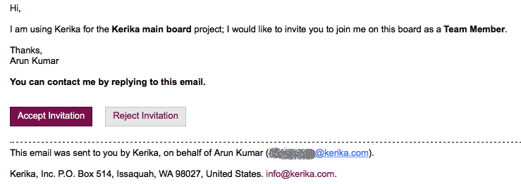
Example of invitation email

Example of invitation email

The email contains two links: the most prominent is the Accept Invitation, but there’s also the Reject Invitation.

Email sandboxing plays havoc with this sort of email invitation: there is an equal possibility that a particular sandbox will click on the Reject Invitation link before it clicks on the Accept Invitation link, which leads to a completely random experience for users who are being invited by the coworkers to join Kerika boards, since Kerika lets you act just once upon an invitation: once you accept it, or reject it, you can’t act upon it a second time.

How we discovered this problem:

One of our users, based in California ,was trying — repeatedly and unsuccessfully — to invite another user, based in Taiwan, to join one of her boards, and the process kept failing.

And for the longest time we couldn’t figure out why!

Our debugging seemed to suggest Kerika itself was somehow auto-rejecting invitations on the user’s behalf, which had us really worried about a serious bug in the server before one of our developers got the idea that perhaps the problem was with the user’s email system, and not Kerika.

When he examined the headers on an email we got from the affected user, he found references like these:

Received: from mail1.bemta12.messagelabs.com (mail1.bemta12.messagelabs.com [216.82.251.10])

A little more sleuthing led us to Symantec’s “threat protection” service, which is one of the common email sandboxing systems out there.

How we are fixing this:

We are moving to a two-step process for people who want to reject invitations that come to them by email: clicking on the Reject Invitation will now take you to a Web page where you will be asked to confirm that you want to reject the invitation.

It’s one more step for users, and not the kind of superb user experience we aim for, but without this there’s no way for us to make sure that the best intentions of security vendors don’t end up crippling our own business!
Bug, fixed: now the Board Summary excludes cards in Trash

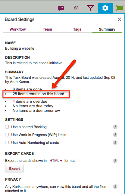
Thanks to one of our users from Washington State’s Administrative Office of the Courts for pointing this out: it turned out that the count of “remaining” cards in the Board Summary was including items that were in the Trash, which was misleading.

This has now been fixed: the count shown in the Board Summary gives you a better idea of what work remains.

To access the Board Summary on any Task Board or Scrum Board, click on the Board Summary button shown on the top-right of the Kerika app:

Board Settings is highlighted

Clicking on this button will show a summary of the board, like in this example:

Remaining work
Remaining work

In the example above, the count of “28 items remain” now properly excludes any items that are in the board’s Trash.

How we manage your document versions

Kerika helps you (and your team) manage multiple versions of a document, and it does this so smoothly that you might not even have noticed…

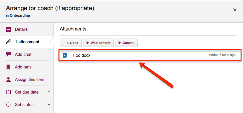
Here’s how it works: when you add a file to a Kerika card or canvas, it shows up in the list of attachments, like this:

File attached to a card

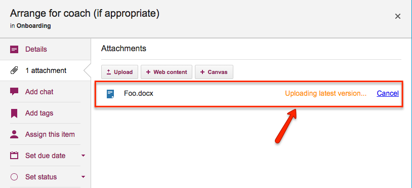
If you then attach another file to the same card or canvas that has the same name and file type, Kerika automatically treats it as a new version of the same file, rather than a completely different file:

Uploading a new version

In the example above, when a Team Member adds another document called Foo.docx to a card that already has a file attached to it with the same name and file type, Kerika treats the new document as a new version of the old Foo.docx rather than as two documents called Foo.docx.

How you access all these old versions depends upon how you set up your Kerika account:

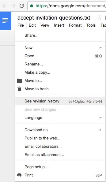
If you are using Kerika+Google, these files are being stored in your Google Drive, and Google will manage the versions for you: you can find this under the File menu in Google Docs

Google Docs versions

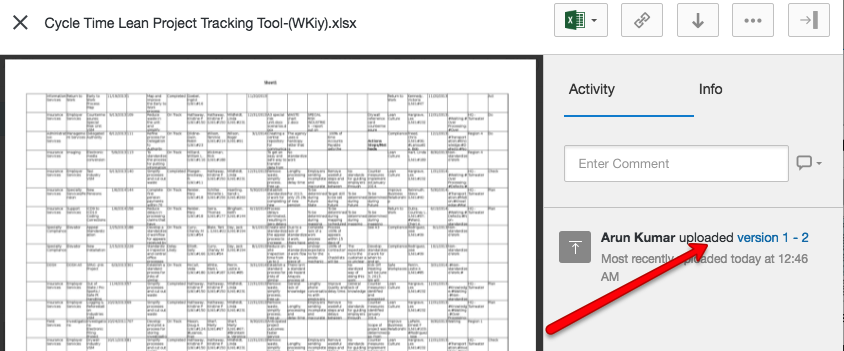
And pretty much the same thing is true if you are using Kerika+Box: Box will take care of the older versions automatically, although their user interface is slightly different

Box version history
Box version history

And what if you signed up directly with Kerika, without using a Google or Box ID?

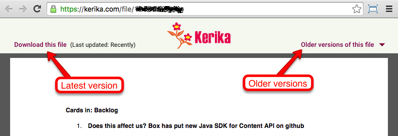
We provide an easy way to get to older versions of a file for users who signed up directly: when you are previewing a file, click on the Older versions of this file link on the top-right.

File preview
File preview

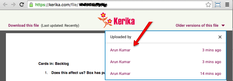
Kerika will show you a list of all the old versions that are available for that file, along with details on who uploaded those versions, and when:

Older versions
Older versions