Category Archives: Technology

Posts related to technology in general.

How we work with 2-week Sprints

Here at Kerika, we often get asked how we do Scrum as a distributed team.

Here’s the model we have evolved, which works for us mainly because we are the very essence of a distributed Agile team: we have people working together on the same product from locations that are 10,000 miles apart!

And this means that we are the most enthusiastic consumers of our products: we use Kerika to manage every part of our business and we only build what we would ourselves love to use.

Here’s the basic outline of our Scrum model:
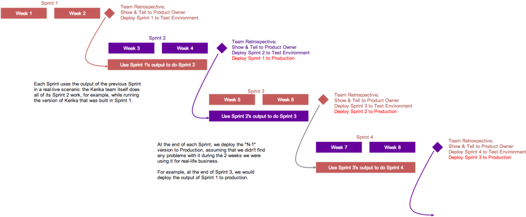
Kerika's model for 2-week Sprints
Kerika’s model for 2-week Sprints

Each Sprint is 2 weeks long: that that works well for us; other folks might find that 3 weeks or 4 weeks i better. Pick what works for you.

Each Sprint begins with Sprint Planning, where the Scrum Team gets together with the Product Owner to decide which cards will be pull from our main Product Backlog into the Sprint Backlog.

Each Sprint is organized as a separate Scrum Board: this makes it really easy for us to concentrate upon needs to get delivered in that particular Sprint, without getting distracted by what was done in the past or what remains to be done.

And Kerika makes it really easy to pull cards (literally!) from the Backlog onto a Scrum Board, and then hide the Backlog from view so it doesn’t distract the Team while the Sprint is underway.

Half-way the Sprint, at the end of the first week, we do a gut-check: does the Sprint look like it is going reasonably well? We don’t ask if it is going perfectly: almost no Sprint does; what we are looking for is any indication that the Sprint is going to severely under-deliver in terms of the Team’s commitments to the Product Owner.

We could do these gut-checks every day during our Daily Standups, but in the first part of a Sprint cycle these can often give us false positives: it’s easy to tell early on if a Sprint is going to be disastrous, but it’s hard to tell for sure that it is actually going to end well. But about midway through the Sprint we start to have a more reliable sense for how things may turn out.

In keeping with the Scrum model, our goal is to complete a potentially shippable set of features and bug fixes with each Sprint, although this doesn’t necessarily mean that we will always ship what gets built after each Sprint. (More on that later.)

For each feature or bug, however large or small, we make sure that we have design and testing baked into the process:

  • The document is often just a few paragraphs long, because we always take cards representing large features (or other big work items) and break them up into smaller cards, so that no card is likely to take more than a day’s work. Kerika makes it really easy to link cards together, so it’s easy to trace work across multiple cards.
  • For bugs, the attached document describes the expected behavior, the actual behavior, and the root cause analysis.  Very frequently, screenshots showing the bugs are attached to the cards.
  • For new features, several documents may be attached, all quite small: there may be a high-level analysis document and a separate low-level design document.
  • For all features and bugs, we do test planning at the time we take on the work: for back-end (server) work we rely primarily on JUnit for writing automated tests; for front-end (UI) work we have found that automated testing is not very cost-effective, and instead rely more on manual testing. The key is to be as “test-driven” in our development as possible.

There are several benefits from doing formal planning, which some folks seem to view as being antithetical to an Agile model:

  • It helps find holes in the original requirements or UI design: good technical analysis finds all the edge cases that are overlooked when a new feature is being conceptualized.
  • It helps ensure that requirements are properly interpreted by the Team: the back-and-forth of analysis and reviewing the requirement helps ensure that the Product Owner and the Team are in synch on what needs to get done, which is especially important for new features, of course, but can also be important to understand the severity and priority of bugs.
  • It deliberately slows down the development pace to the “true” pace, by ensuring that time and effort for testing, especially the development of automated tests, is properly accounted for. Without this, it’s easy for a team to quickly hack new features, which is great at first but leads to unmaintainable and unstable code very soon.

At the end of the 2-week cycle, the Team prepares to end the Sprint…

We like to talk about Sprints as “buses”: a bus comes by on a regular schedule, and if you are ready and waiting at the bus stop, you can get on the bus.

But if you are not ready when the bus comes along, you are going to have to wait for the next bus, which thankfully does come by on a regular 2-week schedule.

This metaphor helps the Team understand that Sprints are time-boxed, not feature-boxed: in other words, at the end of every 2 weeks a Sprint will end, regardless of whether a feature is complete or not.  If the feature is complete, it catches the bus; otherwise it will have to wait for the next bus.

And here’s where the Kerika team differs from many other Scrum teams, particularly those that don’t consume their own products:

  • At the end of each Sprint, we do the normal Sprint Retrospective and Show & Tell for the Product Owner.
  • But, we also then take the output of the Sprint and deploy it to our test environment.
  • Our test environment is the one we actually use on a daily basis: we don’t use the production environment as often, preferring to risk all of our work by taking the latest/greatest version of the software on the test environment.

This forces us to use our newest software for real: for actual business use, which is a much higher bar to pass than any ordinary testing or QA, because actual business use places a higher premium on usability than regular QA can achieve.

(And, in fact, there have been instances where we have built features that passed testing, but were rejected by the team as unusable and never released.)

Kerika's model for 2-week Sprints
Click on this image to see the actual Kerika Whiteboard

This is illustrated above: the version of Kerika that’s built in Sprint 1 is used by the team to work on Sprint 2.

This is where the rubber meets the road: the Kerika Team has to build Sprint 2, while using what was built in the previous Sprint. If it isn’t good enough, it gets rejected.

At the end of Sprint 2, we will release the output of Sprint 1 to production. By this time it will have been used in a real sense by the Kerika Team for at least 2 weeks, post regular QA, and we will have a high confidence that the new features and bug fixes are solid and truly usable.

We could summarize our model by saying that our production releases effectively lag our Sprint output by one Sprint, which gives us the change to “eat our own dogfood” before we offer it to anyone else.

You can see the actual Whiteboard project for this process flow here.
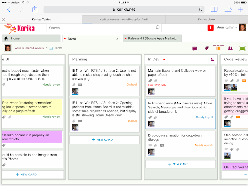


Improving Kerika on iPads

Remember: you don’t need an app to use Kerika on iPads: you can simply use Safari or Chrome — just go to to kerika.com, and login just like you would on a desktop.

Kerika on iPad
Kerika on iPad

What’s great about building a pure HTML5 software like Kerika is that many of these improvements are also going to improve the user experience on desktops and laptops.

Here’s the laundry list:

Big changes:

  • You can add photos from your iPad to cards: you can take existing images from your photo library, or simply take a picture on the go and add it to a card.
  • We worked out a bunch of quirks related to Internet Explorer, which, unfortunately, remains sui generis when it comes to browsers.
  • In general, Kerika is now a lot smarter about dealing with laptops that have both mouse and touch interfaces.
  • We have improved performance and responsiveness, across the board.

Usability improvements:

  • We have redesigned our “Max Canvas” view so that it provides the most useful display, when you need the most space available to view a large board. In particular, you can now access Search even when you are in the Max Canvas view.
  • If a column is partially hidden, e.g. at the left- or right-edge of a Task Board or Scrum Board, clicking on the “+New Card” button at the bottom of the column will make the entire column slide into view, so you can clearly see what you are typing.
  • The Yes/No confirmation buttons on the Workflow dialog have been resized, so they are easier to press (unambiguously) with a finger on a tablet. Which, of course, improves usability for laptop users as well, in keeping with Fitt’s Law.
  • On a related note, we rescaled the calendar control used for setting due dates on cards, to make it easier to use with a finger (without making a mistake).
  • It’s easier to scroll through a long list of attachments on a card without accidentally dragging them with your finger.
  • The user interface makes it clearer how you can slide your view of a board, by swiping.
  • The panning motion, when you swipe left/right, is smoother.
  • Frequently, card history can take more than a few seconds to load if the tablet is slow or the wireless connection is slow: if this happens, the user sees an indication that the system is fetching the history.
  • Particularly on tablets, it’s easier to scroll down through long card details.
  • We have added a subtle animation on drop-down dialogs (e.g. for Workflow, Chat, Tags, etc.) to help people understand how these work.

Bugs fixed:

  • On iPad, it’s easier to edit text: the cursor shows correctly when you press and hold your finger, bringing up the “magnifying glass” that lets you move the cursor to a specific character.
  • The “hint text” shown on text boxes, e.g. “Enter the card’s description…” won’t get included when you copy/paste from the tablet’s clipboard.
  • A one-second delay in showing the list of available colors, for setting the color of a card, has been eliminated. (Yes, we care about one second delays…)
  • A one-second delay in showing the Tab Overflow button — the button that appears to the right-edge of all your open project tabs when there are too many tabs to display — has been fixed.
  • It was difficult to select a name from the list of auto-completed suggestions presented to you when you want to add someone to a project’s team. That’s been fixed.
  • A bug related to selecting the colors at the bottom of the list of available colors has been fixed.
  • If you tried to change the curve of a line on a Whiteboard or canvas, a bug that caused shadows to show up has been fixed.
  • A bug related to how the text box toolbar was displaying (the buttons for this were showing up in an untidy way if there wasn’t enough space) has been fixed.
  • On canvases, the thumbnail images of some files were showing up stretched when viewed in Safari, although they were fine when viewed using the Chrome browser; this has been fixed.
  • Also on canvases, it’s easier to swipe across the canvas without moving stuff accidentally.
  • When you are using an iPad in portrait mode (i.e. holding it vertically), card details show up properly centered.

What remains:

A ton of work on Android, unfortunately… Android tablets vary so much in terms of processor capability that even the same browser, e.g. Chrome, can behave very differently on different Android tablets & even tablets from the same manufacturer.

Some Android tablets will work better, as a result of all this work we have done, but we can’t yet guarantee that all of them will work perfectly.

There’s a similar, albeit smaller, challenge with Windows Surface machines

Windows laptops and desktops generally work fine, and so do “convertibles” (i.e. dual-screen machines where you can use the mouse or touch the screen), but Windows Surface is still causing some issues because of weirdness within Internet Explorer.


Box vs. Google: what’s different, if you are a Kerika user?

We got an email this morning from a user that we decided to answer here, because the topic is relevant to many of our old users…

We are wondering what the differences between Box vs Google are going to be. Also, if we move over to a Kerika+Box account, will we have to rebuild what we have set up in Kerika+Google?

To answer the first question: the Kerika user interface is the same, whether you use Kerika+Box or Kerika+Google.

And, we fully intend to keep the user interface the same across these two cloud storage platforms — and any others that we might support in the future.

That said, the Kerika user experience, which is more than just the user interface, is a little different due to the quirks of Box vs. Google.

For example, Box makes it really easy to sign up as a new user, and keep your old email account.  You can do that with Google, too, but it’s a lot more cumbersome.

Box also works really well with Microsoft Office files: Box doesn’t try to convert your files into it’s own proprietary format, i.e. it doesn’t have its version of Google Docs, so if you like working with Microsoft Office, Kerika+Box is probably the better choice.

(Note: it’s possible to use Kerika+Google and not have your files converted to Google Docs, by setting a user preference, but that kind of misses the point of using Kerika+Google in the first place…)

If you like to view and edit your files right in the browser, then Kerika+Google is the better choice because Google Docs is getting better all the time.

For both Kerika+Google and Kerika+Box, we try to make sure all your Kerika-related files are neatly stored within your own cloud platform, but that’s a little better on Kerika+Google than with Kerika+Box:

Google allows Kerika to create as many nested folders as we need, which means that you only see a top-level folder called “Kerika.com” when you view your Google Drive, and all your projects, across all the accounts you work with, are all stored inside here.

Box doesn’t allow us to create nested folders in the same way, so you will see a lot more top-level folders in your Box account as your Kerika collaboration network grows.

So, the same user interface for both Kerika+Google and Kerika+Box, but a slightly different user experience with pros and cons for both Google and Box.

And the user interface will remain the same in the future: we have no intention of adding features that will only work with Google or Box — only features that will work well with both.

Now, for the second question: if you create a new Kerika+Box account, you will need to create new projects in this account because it is not connected in any way to your Kerika+Google account.

This may be a bummer for some of our old users who have a lot of projects built up using their Kerika+Google accounts, and now want to switch over to using Kerika+Box.

The reason this limitation exists is that the underlying cloud platforms are completely different, and come from two companies that are competing with each other rather than collaborating in any way.

This makes is impossible for us to move content from a Kerika+Google account over to a new Kerika+Box account, even if they are owned by the same user, since even if we tried to move over all the cards, boards and canvases, we wouldn’t be able to automatically move over any related files.

Sorry about that 🙁

Partial searches just got easier in Kerika

Thanks to feedback from users at Washington State’s Department of Fish and Wildlife (hat-tip to Ryan Koval & team!) we improved our Search feature to make it easier to do wild-card searches.

Wildcard searches let you easily find anything, anywhere in Kerika, by just typing in a little bit of text — as little as a single character — and get back results that match on that text.

(Of course, typing in just a single character will return too many results to be useful… 🙂 )

In general, there are two ways to do partial searches:

  • By implementing wildcards in the query that the Kerika user interface delivers to the Solr search engine that we have implemented.
  • By using a NGram Filter or an EdgeNGram filter.

Using filters could result in a huge increase in disk space utilization, and a significant drop in performance, so we opted for the wildcard approach instead.

To implement the wildcard query, we manipulate two variables in Solr: PARTIAL_MATCH_BOOST and EXACT_MATCH_BOOST.

  •  If you search with just one keyword, we show you the exact matches first, and then partial matches: we use PARTIAL_MATCH_BOOST and don’t use EXACT_MATCH_BOOST.
  • If you search with multiple keywords, we show you the results that match across all keywords first, using EXACT_MATCH_BOOST, and don’t use PARTIAL_MATCH_BOOST.

There are more ways of fine-tuning search, of course, but for now we seem to have made enough of an improvement to keep our users happy!

Internet Explorer remains the odd man out on tablets

We have been putting in a ton of effort to improve the Kerika user experience on tablets: while Kerika runs OK in the Safari and Chrome browsers on iPads, the experience is somewhat uneven across other tablets, particularly Android and Windows tablets and “convertibles”.

It’s a little frustrating to find so many oddities about Internet Explorer 11 (the latest, greatest version from Microsoft) when it comes to Windows 8.1 tablets and convertibles.

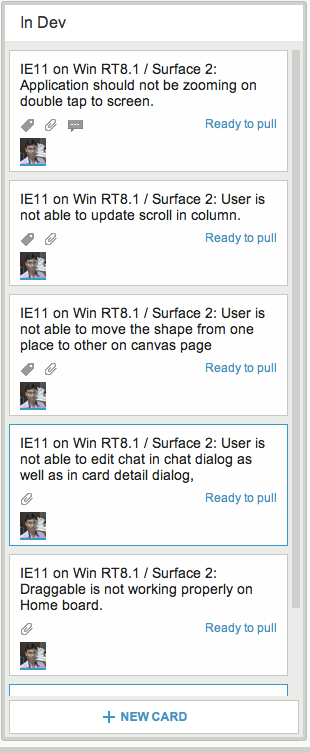
Looking at our internal Scrum Board for our tablet work, we are struck by the many ways in which the touch and swipe gestures in Internet Explorer are different from the Webkit-based browsers (Safari and Chrome):

IE11 problems

I met my old lover
On the street last night
She seemed so glad to see me
I just smiled
And we talked about some old times
And we drank ourselves some beers
Still crazy after all these years
Oh, still crazy after all these years

Microsoft Project for Agile?

On LinkedIn’s Scrum Alliance group someone recently posed this question:

Which is more effective agile software project management tool MS Project or a agile software project management tool for implementing scrum?

Here’s my response:

I started using MS Project around 1989 — must have been close to v1.0, I imagine — and even back then, when it was a relatively simple tool, it never delivered enough utility to warrant the immense hassle of trying to keep it updated so that it actually reflected the reality of a fast-moving project.

The phrase that came to mind often was “I have to feed the beast again“, i.e. I have to spend hours each day trying to map all the real-time changes that were happening in the real-world to the fake world modeled in MS Project.

The MS Project world wasn’t fake because I was incompetent: it was fake because it was always instantly out-of-date.

And as MS Project has gotten larded with more bells and whistles, it has never been able to address its fundamental shortcoming: it is a theoretical model of what you would like your project to be, rather than a practical/actual reflection of what your project is.

So, even back in the 1980s, before people were talking about Agile and Scrum, we were all actually living in an Agile/Scrum world; we just didn’t have that realization, and we didn’t have the appropriate tools to deal with a fast-changing project environment.

At  Kerika, we live and breathe in a distributed Agile world: our team is spread out between Seattle and India, which means we never have any overlapping time, but by using Kerika scrum boards we are in perfect synch with each other.

We know exactly what everyone else is up to, and we are able to process, on average, 10-12 cards per week, per person, on a sustained basis.

Kerika also has a whiteboard capability so we are able to do brainstorming and design work.

Is MS Project useful for anything at all? Yes, if your project…

a) Is considered immutable from the very start.

An example would be a government contract which is negotiated up-front in painful detail, and your success is defined only in terms of whether you delivered exactly what was specified, not whether the final product was useful. (Business-as-usual for most Federal contracts.)

b) Every aspect of the technology has been prototyped, tested, and proven already, so uncertainties are minimized.

This is an interesting use-case of mixing Scrum and Waterfall that’s not explored very often, where you use Agile to do your R&D and figure out workable solutions to your biggest uncertainties, and then use Waterfall to build the final version.

How can you handle defects that are found after a user story has been accepted and released to Production?

In a recent post on the Scrum Alliance forum at LinkedIn, a member asked this question:

How do teams handle defects that have been found after a user story has been accepted and released to Production?

My first thought was to just log a defect against the user story, but that screws up reporting as it removes the Accepted status. Executives do not want to see that. I am thinking we should just create a new user story and slate it for the next Sprint. ?

My answer:

Defects are bound to be found after a story has been accepted and released to production; that’s just a very normal part of software development, so it makes sense to add them to the Product Backlog to prioritize for a future Sprint.

There isn’t any need to take the “Accepted” status off a story that was already considered done within an older Sprint: “Accepted” doesn’t mean “super-excellent and done for all time”; it just means it was considered good enough by the Product Owner at the conclusion of the Sprint, and therefore accepted.

To “un-accept” stories post facto would not just screw up your reporting; it would start to create an unhealthy dynamic between the Scrum team and the Product Owner, where the Product Owner starts to believe he can reject stories post facto.

For Scrum to work well as a process, you need to get everyone to buy into the core idea that stuff gets done in iterations; new stuff gets done in new iterations; old stuff gets improved in future iterations.

On a more tactical level, Kerika lets you link together individual cards or even entire Scrum Boards, because every board, every card, every canvas has a unique URL that you can reference anywhere in the system to create dynamic links between stories and boards.

So, if we find a bug in a previously accepted story, we create a new card for that and simply reference the old card in the new card’s details.  Here’s a video that shows how that’s easy with Kerika.

Consider killing some of your bright ideas

Something that we have learned in the course of making Kerika the best designed tool for work management: don’t rush to implement all of your bright ideas!

When we observe a usability problem, we tend to get riled up rather quickly because we take such pride in our work.

The result is a bunch of really good ideas about how to fix the problem.

And to improve the fix.

And to make the fix even better.

(You can probably see where this is going…)

It’s really easy to over-fix a usability problem, by applying too many fixes, too fast.

Here’s another approach you can try:

  • Collect all your bright ideas.
  • Sort them, so you have only really good ideas.
  • Now, implement the smallest change that you think will fix the problem.
  • And then, eat your dogfood: use the improved product for a week at least, and see if the small change was sufficient.

We have found this is a good remedy to the more common problem of over-designing a solution: rather than build an unnecessarily complex change, or one that creates its own usability problem — often by making a subtle change in the UI metaphors that the user has already learned by mastering other parts of the product.