Category Archives: Usability

Posts related to product design, user experience and usability.

Emails and notifications in Kerika

Kerika always sends emails to users in two scenarios:

  • Someone assigns a card to you. The system waits 2 minutes, to ensure that the person who made the change doesn’t change her mind, and then sends you an email that an item has been assigned to you.

    We figured that if someone expects you to do a piece of work, it would be good to know that sooner rather than later.

  • Someone chats on a card assigned to you. Any Team Member can write a message on any card, regardless of whether they are assigned that card or not.

    If someone chats on a card that you own right now, an email gets pushed to you (again, after a 2-minute wait.) We figured that if someone has something to say about a work item that you are responsible for, you would want to know that sooner or later.

Kerika optionally sends emails to users in a bunch of other scenarios, all of which are determined by your user preferences (which you can set at https://kerika.com/preferences).

  • If someone chats on the board itself (as distinct from chatting on an individual card), you can get this sent to you as email.
  • If there are cards assigned to you that have due dates, at 6AM you can get an email that lists everything that is overdue, due today, or due tomorrow.

    If you are a Project Leader on any board, this email includes all cards on those boards that are overdue, due today, or due tomorrow, regardless of whether they are assigned to you or not. (We figured that as a Project Leader you would care about overdue items even if you weren’t personally responsible for them.)

  • If new cards are added to a board where you are a Project Leader, you can get notification emails if you want to keep track of all new work items.
  • If cards are moved to Done on a board where you are a Project Leader, you can get notification emails if you want to keep track of completed work.
  • If a card is reassigned from one person to another on a board where you a Project Leader, you can get notification emails if you want to keep track of how work is being handed off from one person to another.

So that’s emailed notifications in Kerika: just two types of emails are always sent, and they relate only to cards that you are personally responsible for; all the other emails are optional and can be turned on/off as you like.

What happens if people make changes to cards while you weren’t looking? (If you were looking at the board, you would see the changes in real-time, but even then, with a very crowded board, you might not notice that a card has changed in some way.)

Kerika uses the orange color as a way to alert you of changes. You can learn more about this on our website, but the basic concept is simple: Kerika highlights, in orange, any card that has changed in any way since you last looked at it, and by “look at it” we mean that you opened up the card and looked at the specific details that changed.

For example, if someone adds new files to a card, the attachments icon (the small paper-clip) appears in orange. After you open the card and look at the list of attachments, the orange highlight disappears.

These orange highlights are very smart about making sure you know exactly what changed on a board; they even let you find changes that are outside your immediate visibility: e.g. changes on cards that are way down below the scrolled view of the board, or changes in columns that you have chosen to hide.
Changing passwords got a little easier

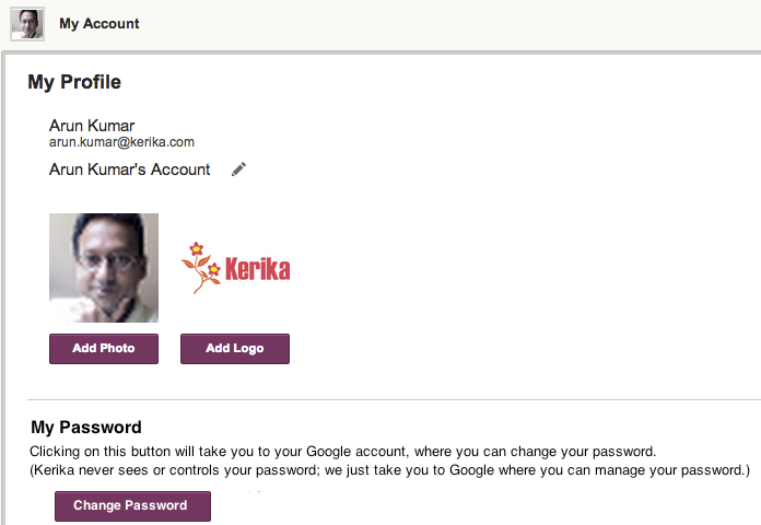
Since we use OAuth 2.0 to let people sign up (and sign-in) using their Box or Google IDs, Kerika never actually sees any user’s password.

But, a lot of our users don’t quite understand how OAuth works, and they expect that when they go to the My Account screen in Kerika, they should be able to change their password right there.

Well, we aren’t going to move away from OAuth because we believe that’s a far more secure arrangement than having Kerika manage your password, but with our new release we are making it easier for people to figure out where they should go to change their passwords:

Change Password
Change Password

If you go to your Kerika account (http://kerika.com/my-account) and click on the Change Password button, it will take you to either Box or Google website where you can change your password.

A small “feature”, but one which we know will help smooth the way for at least some of our users 🙂

Revisiting the (deserted) Post-It Palace

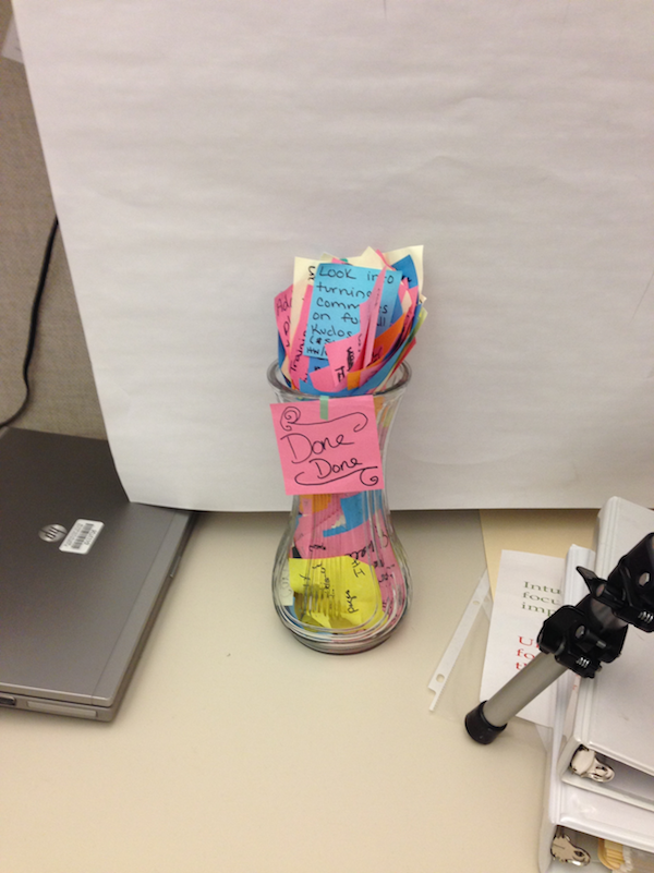
A couple of weeks ago we visited a UX team at the Washington State Department of Licensing, and took a photo of the “Post-It Palace” they had built within their cubicles:

Post-It Palace
Post-It Palace

2 weeks later, this is what we saw:

Revisiting the Post-It Palace

Everything is now inside a set of Kanban Boards powered by Kerika+Box!

All done
All done

Switching a board between Kanban and Scrum: a new Kerika feature

When we first started working on Kerika, it seemed to us that everyone who wanted to use an online project board fell into one of two camps that didn’t overlap:

  • Kanban users, who wanted a simple Task Board, perhaps with nothing more than To Do, Doing, and Done columns.
  • Scrum users, who wanted to share Backlogs across multiple Scrum Boards, with each Scrum Board representing a different Scrum iteration (i.e. “Sprint”).

Folks who wanted to work in Kanban-style – typically business users – seemed to have little use for Scrum, and people who wanted to work in Agile-style – typically IT folks – didn’t show much interest in Kanban.

So, we built Kerika with support for Task Boards, for Lean/Kanban users, and Scrum Boards, for Agile users.

What we are seeing more recently, however, is spectrum of usage patterns and styles within organizations:

  • A project that starts off as a Kanban Board might need to become a Scrum Board in the future: as the team works on the project, it may conclude that a series of Sprints/iterations is a better model than a continuous flow/Kanban model, and they may need to transform their Kanban Board to a series of Scrum Boards.
  • A team might start off working with Scrum Boards, thinking that Agile is the ideal model for their work, and then find that a Kanban model of continuous flow is better suited for their needs, in which case they may need to change from a Task Board to a Scrum Board.
  • A Scrum team may need to pull items from multiple Backlogs: there may be items from a Marketing Backlog and from a Product Development Backlog that need to get worked on in the same Sprint, so the team may need to switch from one Backlog to another.

This kind of flexibility wasn’t available in Kerika before — and is certainly not available in Trello, Asana, Basecamp or any other tools that compete with Kerika — and that’s exactly the problem that we have fixed with the new release!

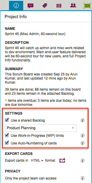
Use the Project Info button, on the top-right of the Kerika menu bar, to switch a board from Kanban to Scrum, or vice versa:

Settings
Settings

If you check the “Use a shared Backlog” box, you can then select the Backlog you want to use for your board: if you had been working in a Kanban board, it automatically switches over to a Scrum Board.

At any time you can switch between any of the Backlogs that exist in the Account, that you have permission to access.

If you want to go back to working in Kanban-style, just uncheck the “Use a shared Backlog” box and the Backlog will disappear from view.

It’s now that simple to choose between Kanban and Scrum!

Adding a Twitter feed to your Kerika canvas

You may know already that Kerika’s patented canvases are a great way to share your ideas and content, like drawing process flow diagrams, flowcharts, etc., and these canvases can also include content from your laptop or the Web.

For example, you can drag-and-drop a file from your desktop, and it will get added to your Kerika canvas, and stored and shared automatically with your team members using Box or Google (depending upon whether you are using Kerika+Box or Kerika+Google).

When you add Web content to a canvas, Kerika is pretty smart about figuring out what that URL is that you just provided.

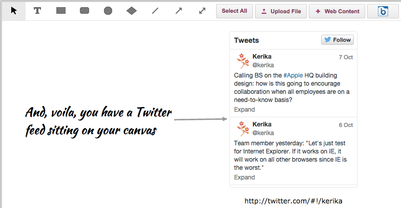
So, for example, Kerika makes it really easy to add a Twitter feed: all you have to do is click on the “+Web Content” button on your canvas toolbar…

Adding Twitter feeds to a canvas, step 1

You can add a Twitter feed simply by using the user’s Twitter handle, e.g. “@kerika” would give you Kerika’s Twitter feed right on your canvas:

Adding a Twitter feed to a canvas, part 2

And that’s all it takes!


More screen space to work with, in the “Max Canvas” mode

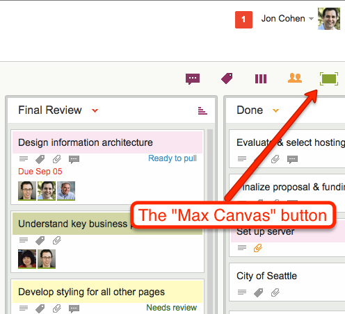
Kerika has had a “Max Canvas” mode for a while: if you click on the green square button at the top of a task board, your view of the board would expand to take up the full browser space:

Max Canvas button
Max Canvas button

This was handy when you wanted to work on just one board: your view of that board filled up the available browser space, and you weren’t distracted by the rest of the Kerika “chrome” (i.e. the application’s menus and buttons).

What we found, however, is that most of our users work on several boards at the same time: they have boards that they created for themselves, e.g. personal Kanban Boards, as well as Kanban and Scrum Boards that their colleagues had created.

So, in reality, most people need to achieve several goals simultaneously:

  • They need to be able to have a Max Canvas view that maximized their view of a board.
  • They need to be able to switch quickly from one board to another.
  • They need to know when there are new (unread) updates on boards that they are not currently viewing.

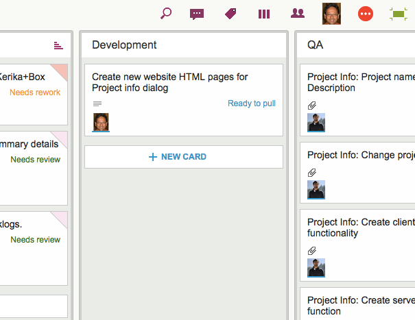
To make all of this possible at the same time, we have improved our Max Canvas view, by adding a button that makes it easy to switch between different boards (including your Home Board):

New Max Canvas view
New Max Canvas view

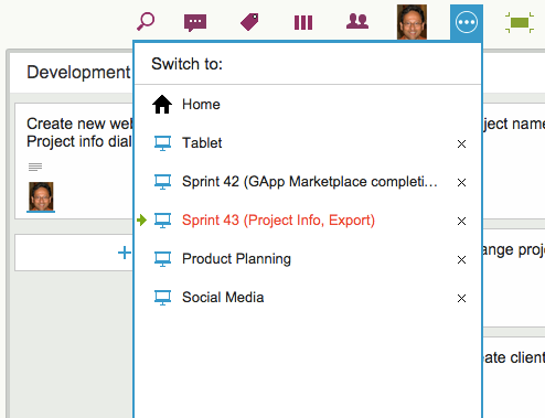
To the left of the Max Canvas button is a new Tab Switch button: clicking on it shows you a list of all the currently open Kerika boards, and this lets you quickly switch to another board without having to leave the Max Canvas view.

New Max Canvas view
New Max Canvas view

This view is smart: if a board has unread updates, it’s entry shows up in orange, consistent with how we let you know that you have unread updates anywhere in Kerika.

And if a board has overdue cards, it’s entry shows up in red, as with “Sprint 43” in the example shown above.

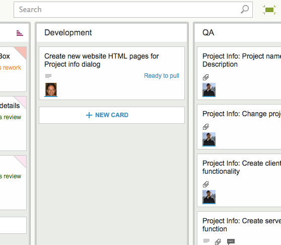
The Max Canvas view also has a Search button built into it, so you can do searches without existing the Max Canvas view:

Search in Max Canvas view

All of this makes the Max Canvas view of Kerika much more useful than it was before, and it’s all part of our grand strategy to make Kerika more useful on iPads!

A more elegant way of coloring cards

With our newest update to Kerika, we have introduced a more elegant way to show colors on cards.

The old method we employed filled in the top of each card with a selected color (which was white, by default). Here’s an example:

Old style of colors
Old style of colors

There were a couple of design problems with our old approach:

  • It severely limited the palette of colors we could use, to a small handful of light pastels. Anything darker would make it difficult to read the card’s titles.

And, to be blunt, it was excessive: the colors tended to dominate the board’s view, to the point of being distracting.

Our new design is more subtle: it lets you see the colors without calling too much attention to them:

New styling for colored cards

Now, the colors appear in a “dog-eared” style, which gets them out of the way while still making it easy to see if a card is colored.

This new approach will also make it easy for us to add more color choices in the future and, in particular, to add darker and more vibrant shades, since we will no longer have to worry about having sufficient contrast with black text overlaying the colors.

Our newest version: tablet improvements, Google Apps Marketplace upgrade

Our newest update to Kerika serves up a rather long list of changes; the two big areas for improvement were:

  • We have updated our integration with Google Apps Marketplace to use OAuth 2.0, since Google is retiring its OAuth 1.0 implementation.
  • We have made a bunch of improvements for using Kerika on iPads, with the Safari or Chrome browsers.  (We still need to work on Android tablets, which, unfortunately, present too much variety…)

The OAuth 2.0 upgrade and iPad improvements are described in previous posts; here we want to highlight some of the other changes and improvements we made with this new version:

In addition to being less distracting, this new design will enable us to expand the palette of colors we can offer: the old design restricted us to only the lighter pastel colors.

New styling for colored cards


  • We have redesigned our “Max Canvas” view so that it provides the most useful display, when you need the most space available to view a large board. In particular, you can now access Search even when you are in the Max Canvas view.We have improved security, by implementing secure cookies.
  • We added some subtle animation effects to improve usability. (So subtle, in fact, that you might not even notice them if you are an existing Kerika user, which is just what we want.)

In terms of infrastructure and other under-the-hood improvements, we have expanded our use of JUnit automated tests and done a bunch of bugs fixes, as usual.

There’s a lot of improvements being done on Kerika, and at a very fast rate. Make sure you subscribe to our blog to keep up!


Managing really large (and really old) Kanban Boards

Kerika’s Task Boards are so easy to set up and use that teams sometimes make the mistake of sticking everything on the same board, week after week and month after month, until the board becomes really too big to be useful.

The Kerika software itself doesn’t buckle under the weight of hundreds of cards on a single board (and, to be honest, we are also guilty of sometimes doing very large Scrum iterations that turned over a few hundred cards  -.-), but just because the software works fine doesn’t mean the practice makes sense.

The most common way for a Kanban board to get overcrowded is for it to be used for too long: the Done column gets bigger and bigger, as more work gets completed each week, until you end up with a very lop-sided looking board with perhaps 20-50 items in “To Do”,  and maybe 1,000 items in “Done”.

When presented with a board that contains hundreds or even thousands of items in Done, it’s hard for individual team members to get visual satisfaction from seeing cards move over to the Done column on a regular basis: as work gets done, it seems to vanish into this endless pile of other work that’s already been done.

Teams and, especially, Project Leaders should not underestimate the value of this visual satisfaction of seeing a well-balanced board, with about the same number of items in “To Do” (or Backlog, or Pending, or whatever you choose to call your parking lot) and in the “Done” column, with an even-looking distribution of items in the columns in the middle.

(The simplest Kanban board may just have three columns: To Do, Doing, and Done, but Kerika makes it easy to have far more complex workflows, and to capture your organizations’ best practices as a collection of process templates.)

If a Kanban board is going to be used for an extended period, say several months or more, then we recommend create a parallel History Board that can be used to track the historical achievements and progress of the team. Here’s how this scheme works:

  • Create a board called “History Board 2014”. (The name isn’t particularly important.)
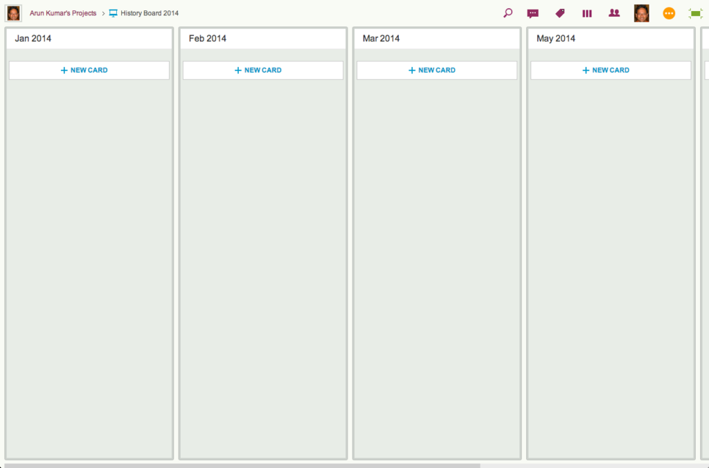
  • Organize this boards with columns that look like this: Jan 2014, Feb 2014, Mar 2014…
An example of a History Board

We will use these columns to hold all the cards that were completed in that particular month. So, for example, the Jan 2014 column would contain everything that was completed in January 2014.

  • At the end of every month, pause for a moment to celebrate your team’s accomplishments for that month. (Order in some beer and pizza and maybe pause for longer than a moment…)
  • Move all the items that in Done onto the History Board: use Kerika’s cut-and-paste feature, which will let you move a bunch of cards intact, along with their history, chat, attachments, etc., from the Done column of your main Kanban board to the appropriate column in your History Board.

Laptop users will find their right-mouse click menu handy for this: click on a card in the Done column, do “Select All” from the right-mouse menu, and then do a “Cut”. Once you have cut (or copied) anything into your Kerika Clipboard, a Paste button will automatically appear at the top of each column, on each board where you can make changes.

So, Cut from Done on your active board, go over to your History Board, and then do click on the Paste button at the top of the appropriate column, e.g. the August 2014 column.

This simple method lets you achieve two objectives at the same time:

  • It’s an easy way to trim the size of your active Kanban board: by taking out the “Done” stuff each month you can stop it from ballooning in size over time.
  • It’s an easy way to create a comprehensive historical view of everything your team has achieved over time: go over to the History Board and you can see how work got done over an entire year. (Might be useful at performance review time 😉

A side-benefit: your active Kanban board will load a lot faster if it doesn’t get overloaded.