Category Archives: Usability

Posts related to product design, user experience and usability.

Why the files in your Kerika+Box folder have random characters appended to their names

If you are using Kerika+Box, we store your Kerika files in your Box account: you can always go to Box.com, login using your Box ID, and see for yourself.

(But, please, don’t move them around!)

What you might notice is that the filenames in Box have some random characters appended to them. For example, a file that you might see listed inside Kerika as “Alternative Home Page” actually shows up with some random characters appended, like this:

URL appended to file names

The reason we do this with files we store in Box — and not for files we store in Google Drive, for our Kerika+Google users, is that Box doesn’t allow for several files within a single folder to have the same name.

(Google does, which is why we don’t need to append any random characters to the files we store in Google Drive.)

It’s very common for our users to have several files within the same board that have the same name: for example, our developers always attach an analysis document to each card that describes exactly what they are doing. (Yes, we are fairly fanatical about documenting our software!)

These documents are often the same for many cards: Analysis.docx or Results.xlsx or Mockup.png might show up hundreds of times within a single board.

Since all the files related to a single Kerika board are stored in the same folder in your Box account, this presents a problem: Box won’t allow for more than one file called Analysis.docx within a folder.

We get around this limitation by appending these random characters, so that effectively every Analysis.docx file has a unique name.

But, we also try to avoid confusing our users, so when we show a list of files attached to a card, we strip out the random characters:
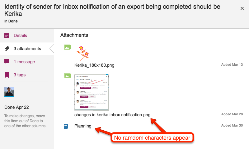
Displaying files as attachments

And the same goes for downloading files: we strip out the random characters and give you a clean-looking file.
Bug, fixed: handling situations where drag-and-drop of content won’t work

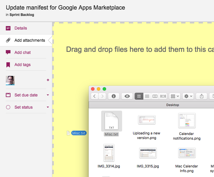
The easiest way to attach files to a Kerika card, canvas or board is to simply drag and drop it onto Kerika, like this:

Dragging and dropping files onto cards

This works with nearly all kinds of files, but we sometimes hit a limitation, like we discovered when a user tried dragging and dropping an email directly from his Outlook onto Kerika.

This operation used to fail, but in a confusing way: Kerika made it look like it was possible to drop the email onto a card, but the email never showed up.

We have fixed this by checking the kind of content that someone is trying to drop onto Kerika, and if the content isn’t something that can be directly dropped, we don’t show the “drop zone”: the yellow area in the image above that encourages you to drop something onto a card.

And, by the way, if you need to attach an email to a Kerika file, here’s a good workaround: first drag and drop the file onto your computer’s desktop.  That will create a regular file out of the email, which you can then drop onto Kerika.

Kerika+Google users can decide whether to use Google Docs, or stay with Microsoft Office

If you are a Kerika+Google user — you signed up for Kerika using your Google ID (like a Gmail address) — your Kerika files will be stored in your own Google Drive.

Most Kerika+Google users prefer to have their files converted to the Google Docs format when they upload them their Kerika cards, canvases or boards: this makes it easy for them to edit these files from inside a browser.

A small minority of our Kerika+Google users, however, prefer to keep their files in their original Microsoft Office format.

(The most common reason for this is if you are working with complex spreadsheets: Microsoft Excel is still far better than Google’s Spreadsheets!)

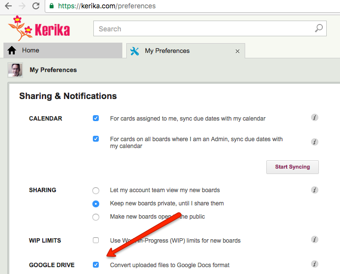
If you are a Kerika+Google user, you have a choice of using Google Docs or not: just go https://kerika.com/preferences and select this option:

Google Docs format
Google Docs format

Either way your files will still be stored in your Google Drive; the only difference is whether they are stored in the Google Docs format or kept in their original Microsoft Office format.

Better looking emails

The emails you get from Kerika, e.g. when someone assigns you to a card on a Task Board or Scrum Board, have gotten better:

  • The formatting is better: neater, cleaner, and there’s less verbose junk.
  • They are all sent from the same Sender Email — notifications@kerikamail.com — so your mail clients (like Gmail) do a better job of clustering them in your Inbox.
  • They all have better footers, explaining why you are getting the email, and how to contact us. (In other words, they are better at conforming to the CAN-SPAM Act.)
  • They look better on mobile devices: the subject headers are easier to scan, so if the email is something you expected, it is easier to delete it unread.
  • We eliminated the use of our logo, which saves (every so slightly) on bandwidth, especially on mobile devices.


Bug, fixed: handling references to websites that redirect to HTTPS

Some sites like Kerika.com use HTTPS all the time: every URL reference, whether to our website, within our application, or even to any article on this blog is automatically converted to a secure HTTPS session.

(We are not the only ones doing this: type in “facebook.com” in your browser’s address bar, for example, and you will be automatically redirected to “https://www.facebook.com/” even though you didn’t type in “https”.)

Always using HTTPS is good security practice, but it can sometimes lead to problems for users: unless you are very familiar with a particular site, and also the type of person who plays close attention to these things, you might not understand this process.

And even if you did, you would still find it convenient to make short references to “kerika.com” (or “facebook.com”) instead of typing out “https://kerika.com”.

When you include a URL in any part of a Kerika board’s contents, e.g. in a card’s details, it’s chat or its attachments (and the same goes for canvases), Kerika tries to get the title of that Web page so the URL reference is easier to read.

We found and fixed a bug related to this: in situations where the URL, as typed by the user, actually resulted in a redirect from the referenced website (typically a “301 permanent redirect” rather than a “302 temporary redirect”), Kerika wasn’t properly showing the Web site’s page title.

All fixed now.

Apologies for the long absence…

Sorry for not having posted in a while; we have been swamped with a new UI design that has consumed all of our time.

The new UI, by the way, is all about making Kerika more accessible, particularly to people who are new to visual collaboration.

Our user feedback had revealed a couple of uncomfortable truths that we needed to address:

  • Very few users were aware of all the functionality that already exists in Kerika. Which means that we didn’t need to focus so much on building new functions as we did on making sure people understand what Kerika can already do.
  • Our new users aren’t just new to Kerika; in most cases, they are new to visual collaboration altogether.  Even though there has been a proliferation in recent months of all sorts of companies trying to recast old, tired products as exciting new visual collaboration (hello, Smartsheet!), our new users aren’t converting away from our competitors as much as converting away from paper, email, and SharePoint.

This, then, is the goal of our new UI: to make it easier for people to adapt from paper and email to visual collaboration, and to make it easier for all users to exploit all the great functionality that we have already built.

We will have more on this in the coming months, as we get closer to releasing our new user interface, but in the meantime we have queued up a bunch of blog posts to make sure you know about all the other great stuff we have been working.

Yeah, our biggest problem is we don’t tell people what we have already done…

Calendar syncing

We quietly released a new feature a couple of weeks ago that we now want to announce to the world: you can have all your Kerika due dates appear automatically on your Mac, Outlook or Google Calendar!

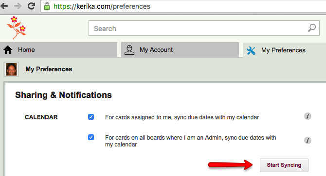
All you have to do is go to https://kerika.com/preferences (or click on the Preferences link that shows up under your photo in the top-right of the Kerika app), and then click on the Start Syncing button on that page:

Calendar syncing
Calendar syncing

You can sync to your Apple/Mac calendar, your Microsoft Outlook calendar, or your Google Calendar.

Pick your preference, and Kerika will show you detailed instructions on how to start syncing.

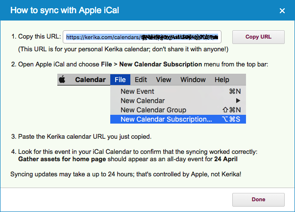
Here, for example, are the instructions for syncing to your Apple/Mac calendar:

Apple Mac Calendar synching instructions
Apple Mac Calendar syncing instructions

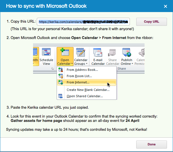
And here are the instructions for syncing to your Microsoft Outlook calendar:

Microsoft Outlook synching instructions
Microsoft Outlook syncing instructions

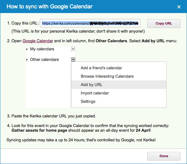
And, finally, here are the instructions for syncing to your Google calendar:

Google Calendar synching instructions
Google Calendar syncing instructions

You will notice that we have deliberately obfuscated the actual calendar URL for this particular user, in all three images above.

That’s important: your calendar URL is unique and precious — don’t share it with anyone!

As your cards on your Kerika Task Boards and Scrum Boards get new due dates, Kerika will automatically feed these updates to your personal calendar: you don’t need to do anything.

Kerika due dates always appear as “all day” events.

Please note that it’s up to  Apple/Microsoft/Google to determine how quickly these updates show up on your calendar.

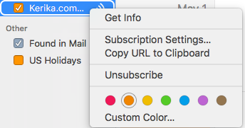
On your Mac Calendar, for example, you can set the frequency with which these updates appear by doing a right-click with your mouse on the calendar and selecting Get Info:

Mac Calendar Info
Mac Calendar Info

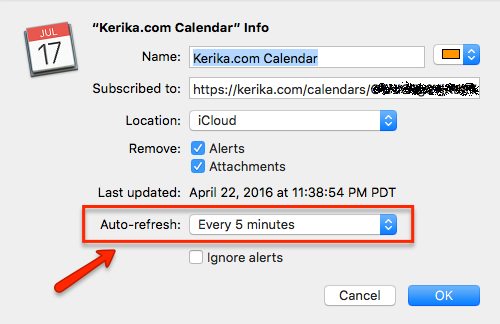
And then setting the “Refresh time” for that particular calendar. (On Macs, the fastest that iCloud allows is every 5 minutes.)

Setting calendar auto-refresh time


Making it easier to download files from “Done” cards

Thanks to Steven Thompson, a consultant working with some of our users at the City of Kent, for pointing this out to us:

If a card is moved to Done, it preserves all its attachments, of course, but it is a little inconvenient to download these attachments directly from within Kerika itself: you would have to open that file in preview mode, and then download it.

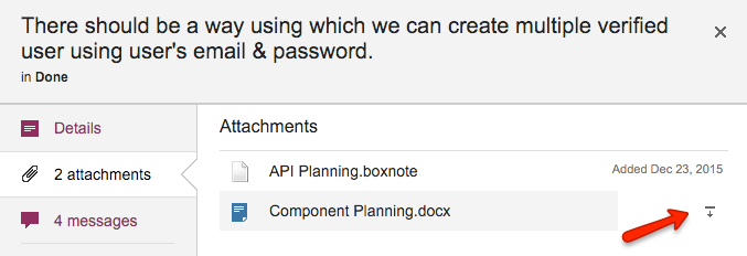
We have simplified that process: now, if you hover over an attachment for a card that’s in Done, a “download” button will appear that will make it easier to download the attachment, without having to preview it first:

Downloading attachments from Done cards