With our new user interface we made it easy to see how many tasks (cards) there are in a single column: the count appears at the top of each column.

With our new user interface we made it easy to see how many tasks (cards) there are in a single column: the count appears at the top of each column.
We have added an Undo option for all Sort actions on Task Boards, to make it easier for you to use the sorting function without worrying about making a mistake.
Enjoy.
We have added tablet support for iOS and Android devices, as you can see:

The tablet experience is like that of the desktop, not the phone.
For the phone app we had to redesign a lot of the user interface to accommodate the limited screen space, but with most tablets today there is enough screen resolution to support the more extensive desktop experience.
We have made it easy for you to preview documents that are attached to cards or whiteboards, regardless of how you sign up for Kerika.
You could have signed up using a Google ID, a Box ID, or just your email: it doesn’t matter how you signed up, nor how other members of your team signed up.
Previewing documents just became really easy.
When you click on a link to a Kerika board or card in an email, that link will now automatically open in the Kerika Mobile App instead of opening in a browser tab.
This makes it a lot easier to respond to emails sent when your team members do chat on boards that concerns you: you can either do a quick reply as email itself, or, if you need more context, click on the link to open the card inside the Kerika app and see all it’s details before deciding upon your reply.
We fixed a problem that was stopping embedded videos from resizing on Kerika’s Whiteboards.
You can add any video, from anywhere, to a Kerika Whiteboard and then resize it by simple dragging it’s corners:


We have added action buttons for the two most common actions that users perform with cards, especially when they are viewing them using one of the mobile views: Move to Done and Move to Trash:

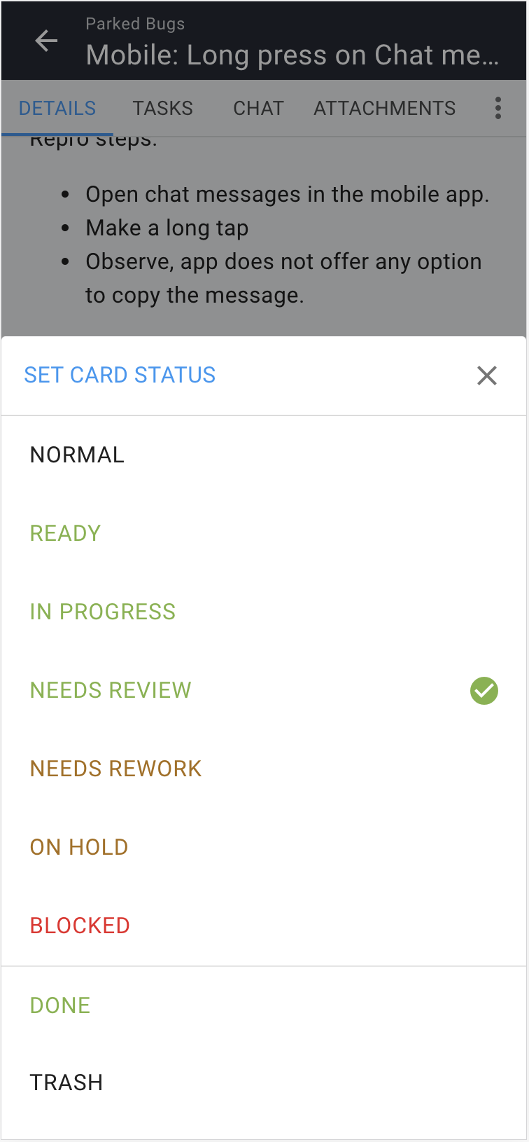
We have also added Done and Trash to the set of Status Values you can assign a card when viewing it’s details, on desktop and mobile:

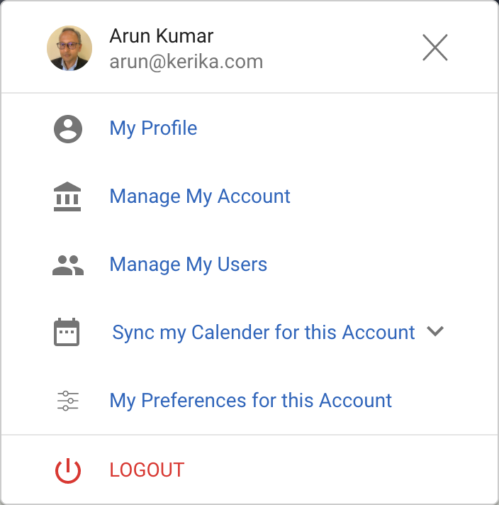
A new feature that we recently introduced will let you choose a background color: one for the desktop app, and one for the mobile app. (Oops, did we just talk about the mobile app?)
To select a color: click on your user profile photo, which appears on the top-right of Kerika:
Select My Preferences for this Account from this dialog, and you will land on a revamped Preferences page that now includes options for selecting a background color:
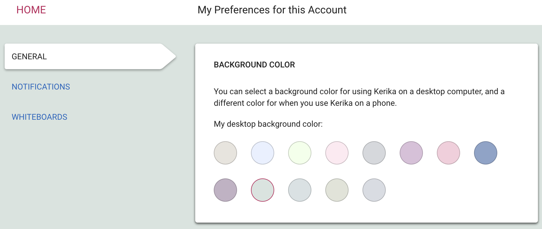
We are offering a range of light and dark backgrounds; in our own testing we found that the darker backgrounds look better on the desktop, while the lighter backgrounds look better on phones. But, of course, that’s just our opinion — try this out and select what you like best!
We have been lax in updating this blog, sorry, but not lax at all in working on improving Kerika, especially for mobile browser users. We are also getting close to releasing our mobile app, which will contain the same functionality as you get today when you access Kerika on a phone, but it will be packaged as a traditional-looking app for folks that want an icon on their desktop.
Here’s a short list of things that have been improved and added in the past few months:
There’s more of the desktop functionality now available on phones as well, including:
We just updated Kerika today, and along with the usual bug fixes and other behind-the-scenes stuff we have made an improvement to the way Views are shown on your Home Page:
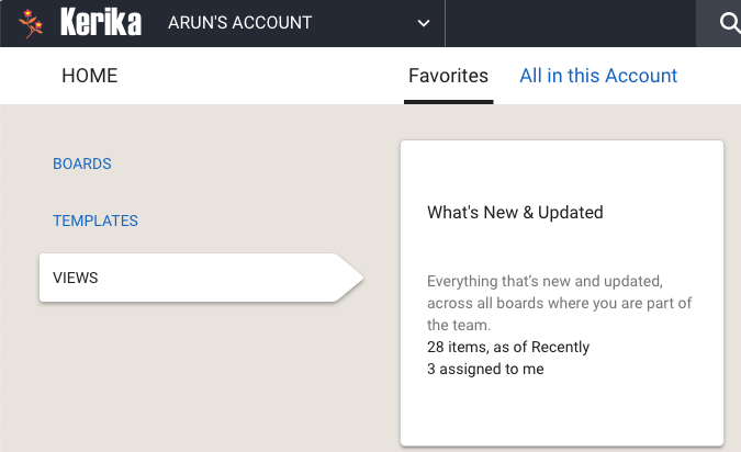
Some of our users have dozens of boards in active use at the same time, with large (and sometimes overlapping) teams, and as a result their Views counts are nearly always high.
As you can see from the screenshot above, the Home page now shows two counts for each View:
This makes it easier to see if you need to go back to a View to catch up on something that’s directly related to you, i.e. is assigned to you.