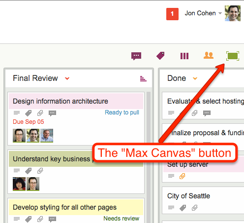
Kerika has had a “Max Canvas” mode for a while: if you click on the green square button at the top of a task board, your view of the board would expand to take up the full browser space:

This was handy when you wanted to work on just one board: your view of that board filled up the available browser space, and you weren’t distracted by the rest of the Kerika “chrome” (i.e. the application’s menus and buttons).
What we found, however, is that most of our users work on several boards at the same time: they have boards that they created for themselves, e.g. personal Kanban Boards, as well as Kanban and Scrum Boards that their colleagues had created.
So, in reality, most people need to achieve several goals simultaneously:
- They need to be able to have a Max Canvas view that maximized their view of a board.
- They need to be able to switch quickly from one board to another.
- They need to know when there are new (unread) updates on boards that they are not currently viewing.
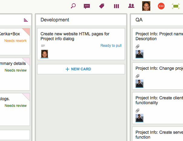
To make all of this possible at the same time, we have improved our Max Canvas view, by adding a button that makes it easy to switch between different boards (including your Home Board):

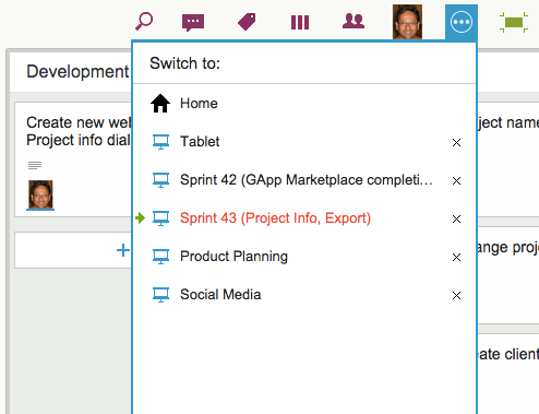
To the left of the Max Canvas button is a new Tab Switch button: clicking on it shows you a list of all the currently open Kerika boards, and this lets you quickly switch to another board without having to leave the Max Canvas view.

This view is smart: if a board has unread updates, it’s entry shows up in orange, consistent with how we let you know that you have unread updates anywhere in Kerika.
And if a board has overdue cards, it’s entry shows up in red, as with “Sprint 43” in the example shown above.
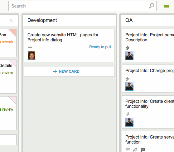
The Max Canvas view also has a Search button built into it, so you can do searches without existing the Max Canvas view:

All of this makes the Max Canvas view of Kerika much more useful than it was before, and it’s all part of our grand strategy to make Kerika more useful on iPads!