Something that we didn’t finish as part of our year-long redesign of Task Boards and Scrum Boards: moving to Material Design-style icons and dialog box layouts for our Whiteboards.
Well, we are caught up now: the Whiteboard toolbars and dialog boxes have been redesigned to be conformant with Material Design guidelines.
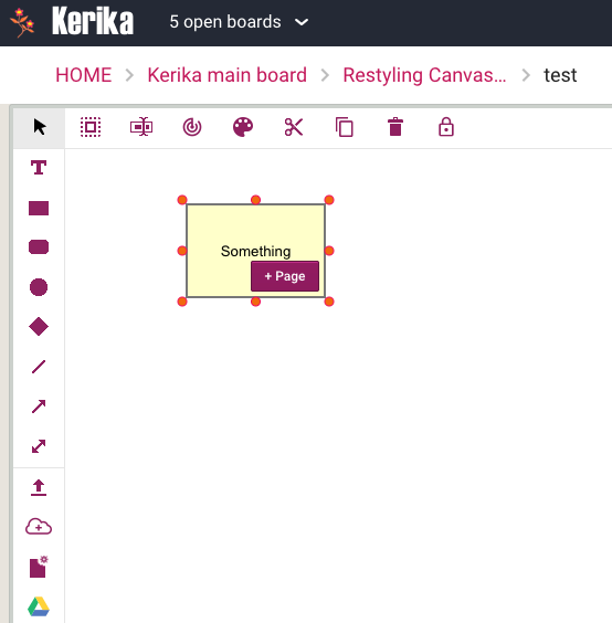
The basic toolbars for Whiteboards used to look like this:

This is how it looks now:

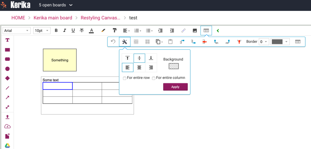
The old table formatting toolbar used to look like this:

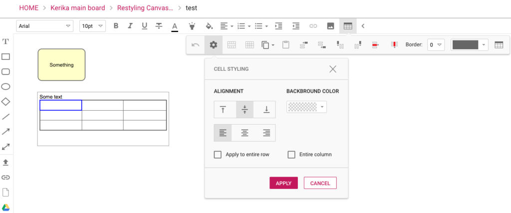
Now this looks cleaner and more modern:

The larger icons and buttons make for a more touch-friendly user interface as well.