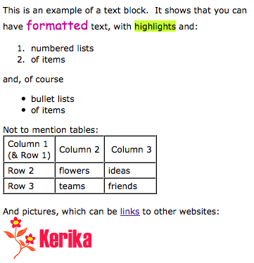
We have been toiling away for the past 4 weeks on our latest version of Kerika, with the vast majority of time consumed with a complete rewrite of the Text Block feature. This is the feature that lets you place blocks of richly formatted text, including Web links, pictures and tables, onto your Kerika page. (What we termed, in an earlier post, “glassbox documents”.)
Here’s a simple example of a text block:

Having realized just how important this feature is for our users, we decided to do a complete rewrite of all the code, abandoning the open-source library called Whyzziwig that we had been using previously in favor of our own implementation. We did all this work because it was clear that we needed to be in greater control of this particular feature’s destiny: something that’s impossible when you are using an open source library. As a result of all our hard work, you will now have a bunch of great new functionality!
- An Undo button: at long last! We still need to create a broader Undo function that works across all of Kerika’s operations, but this particular button works nicely when you are editing a text block.
- A strikethrough button: great for marking up requirements and discussions.
- A new color picker: a simple palette of 84 colors with a cleaner user interface. Along with this comes an easier way to set the font, highlighting and background colors.
- More options for numbered lists: including using alphabetic and Roman numerals.
- More options for bullet lists.
- A clear formatting button: this can be particularly helpful if you are importing content from Microsoft Office. (See our earlier post on just how much junk HTML is carried over if you copy material from a Microsoft Office document.)
- Easier ways to add, edit and remove Web links: we have considerably simplified the user interface for attaching a Web link to some text (or to a picture that you have embedded inside your text block).
- Easier way to embed pictures in text block: a simpler, cleaner user interface.
We also have reatly improved capabilities for creating and managing tables: this was where the bulk of the work was done! We have added a number of features that our users asked for, such as:
- Setting Cell, Row and Column Properties: you can set horizontal and vertical alignment, as well as the background (fill color) for a single cell, an entire row, or an entire column.
- Resizing column widths by dragging: something that we have wanted for a long time, and which took a lot of effort to build… Now you can re-size a column simply by dragging its edges, as you would with Word or Excel.
- Copy and Paste: you can now copy and paste a single cell, an entire row, or an entire column. Great for moving stuff around inside tables!
- Border color: easier to set, with our new Color Picker. And, to improve the usability and appearance of tables, we automatically make the outer border of tables twice as thick as the inner borders (that separate individual cells).
That’s not all that’s new in this release, but this particular blog post is long enough, so we will talk about other goodies in our next posting… Here’s a Kerika page that shows these changes: it’s open to the public to visit, so come on over!