Sometimes you have to admit that your bright ideas just didn’t turn out as well as you liked…
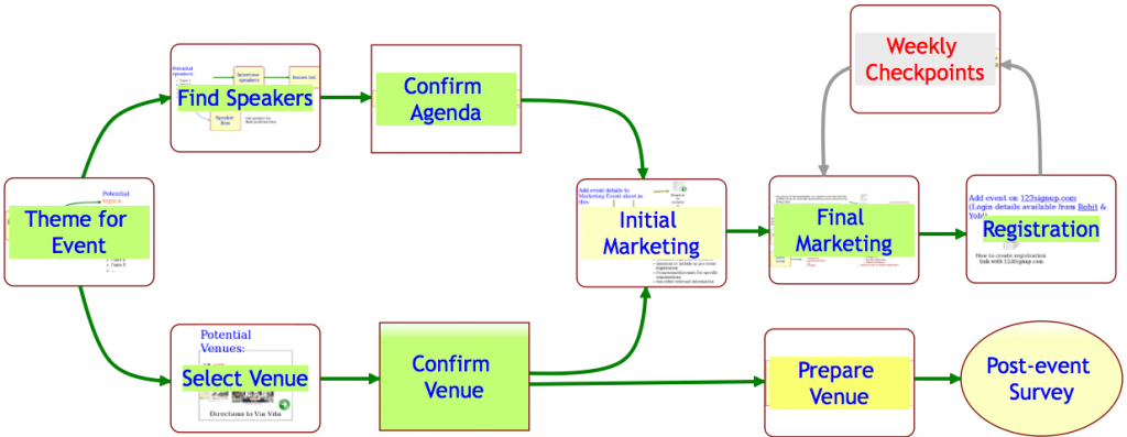
One such bright idea was to have Idea Pages show thumbnails of their contents when viewed from their parent pages. Here’s an example of this works in practice:

A great idea in theory; not so great in practice…
The original goal was two-fold:
- To let users know quickly which items on an Idea Page contained other pages;
- To give users a quick visual sense for what was contained in those pages;
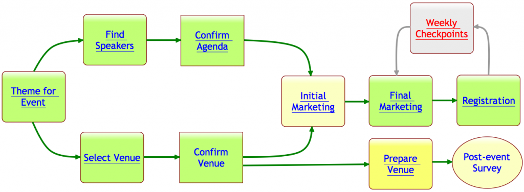
In practice, however, the effect of these thumbnails showing through all the time was a splotchy, rather ugly effect. To remedy this, we are adopting a new mechanism that we hope will continue to meet our two goals: with our latest version, any item on an Idea Page that contains another page will appear with it’s text/label underlined, like this:

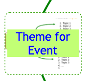
As you can see, items that contain pages now appear with their text labels underlined. If you move your mouse over a shape that has underlined text in its label, you see a thumbnail appear as before:

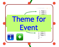
Selecting the shape now provides a green “+” button: this lets you open the page contained within that shape.

This new green “+” button also appears on shapes that don’t contain any pages within them: in that case, clicking on the “+” button lets you create a new page that is contained within that shape.
In effect, the old double-click mouse operation has been replaced with a green “+” button that appears when you select a shape with a single mouse click.
We hope you find these changes helpful; we earnestly seek your feedback!