All posts by user

How to tell if a file has been updated

The first version of Kerika was written as a peer-to-peer (p2p) application, so one challenge we faced was detecting when files that are being shared as part of a project were changed by a user, so that we could send the latest version to everyone else on the team.

Our first attempt at a solution was to simply examine the Last Modified time for files. However, this proved to be very unreliable for a rather odd reason: whenever you open a spreadsheet using Microsoft Excel, it automatically updates the Last Modified time to be the current time – even before you had made any changes.

And when you close Excel, without having made any changes, it resets the Last Modified time back to its original value. So, whenever you opened a Excel files for viewing, we would erroneously identify it as an updated file.

We then tried looking at the size of files, to see if these had changed since we last examined them. We knew, of course, that this would be error prone in its own way: if you change some text within a file such that it contains the same number of characters as before, the overall size of that file would not change.

But this approach failed for another reason altogether: Microsoft Word allocates disk space in chunks at a time, rather than as exact amounts. This means that any edits to Word files that do not require Word to grab another chunk, or give up a chunk, would never be reflected in the reported size of the file.

Eventually, we decided to take the MD5 hash of files, which is a more reliable way of detecting if a file has been modified. We were concerned about how much CPU overhead this would take, but it proved to not be a problem after all.
When techies turn libertarian, neither Democrats nor Republicans will win

The Wall Street Journal’s editorial page contains a bemusing article called Keeping the Spirit of Steve Jobs Alive that concludes that

Thanks to Washington, the liberal politics of Silicon Valley may now be tilting toward the libertarian right.

The WSJ is, of course, a Republican mouthpiece, which probably explains the writer’s smug assumption that when techies turn libertarian, they will all start voting Republican, which is absurd on two counts:

  • It is based upon what is essentially “non-news” in the first place: many techies have long tilted libertarian in their political views because of the very nature of their profession: information technology itself is based upon the free flow of information, so respect for the First Amendment runs deep within the tech world, and the business itself is relentlessly meritocratic and brutally disruptive, which supports neither the collective approach of the left, nor the deference to authority of the right.
  • Libertarianism may be to the “right” of liberalism, but in its emphasis on personal liberty, it could just as easily be described as being to the “left” of conservatism. In any case, libertarianism forms a 3-D point with respect to classic liberalism and conservatism, so any mapping of a 3-D topography of political views to a 2-D spectrum will necessarily be misleading.

And because libertarianism confounds the simple soundbites and clear definition of the “enemy” that both Democrats and Republicans find convenient, neither party would really welcome libertarians in their midst.

If the WSJ had understood the difference between Republicans and libertarians (with a small “l”) in the first place, they would have noticed a long time ago that a lot of techies are social liberals and economic conservatives…

Running Java on the Lion operating system

Having gotten a new Mac laptop that came packaged with Apple’s newer Lion operating system, and having successfully moved all files from an older laptop running Snow Leopard, we learned the hard way that Lion doesn’t come with Java bundled in by default!

The problem surfaced when we tried to run the Kerika server software on our new laptop: since we wrote all of the backend/server code in Java, we can run the entire Kerika software on pretty much any computer. So, with our new laptop all set up, apparently configured with everything we need once we got our SuperDuper backup restored, we tried to build the Kerika source code using Maven.

That’s when things went in a surprising direction: running “mvn -install” generated error messages about Java not being found. We followed the symbolic links for the Java executables, which had been copied over to the new laptop along with everything else from the SuperDuper backup, and found that there was nothing there: no Java to be found on the machine.

OK, so we need to get Java installed. No problem, we will just run the Mac Software Update: maybe something got missed along the way.

No good: Mac’s Software Update didn’t pull in Java.

Finally, we talked to Apple and found out that they deliberately don’t include Java (or Flash) with Lion. The ostensible reason is that Java programs (and Flash programs) take up too much battery power. This argument sounds rather dubious: Flash’s excessive power consumption is well known, but Java…?

We think a truer explanation might be that Apple views Java programs as a long-term competitive threat to their App Store, and are therefore starting to subtly discourage its use without actually banning it – which would create a huge stink.

If this sounds like Microsoft’s deliberately crippled support of Java on Windows XP, Apple should perhaps pause and consider how well that strategy worked out for Microsoft…

Meanwhile, here’s the download link to get Java for Lion!

A new version, with more goodies..

We have released yet another version of Kerika, packed with useful features and bug fixes that will improve your experience with the product.

A lot of the improvements we made are “under-the-hood”, but here are a few changes that you can benefit from directly:

  • Snap-to-grid will make it easier for you to lay out shapes, documents, pictures, etc. on your Kerika pages. You can turn this on or off as you like, and adjust the size of the grid spacing, by setting your preferences: while you are using Kerika, click on your picture near the top edge of the browswer window and you can get to your user preferences.
  • Google Docs will always open in a new browser tab: this change makes for a more consistent and better user experience for everyone. Different browsers handle Google Docs differently, so to provide a more consistent experience for everyone your Google Docs will now alway open in a new browser tab rather than inside the Kerika canvas.
  • Easier ways to invite people: based upon very useful feedback from one of our users, we have added an “auto-acceptance” feature to invitations, and also redesigned the emails that get sent when people are invited to join your projects. These changes make it easier for you to invite people, and handle situations where the invitation emails get caught up in spam filters.
  • Custom colors: mix and match colors as you like, if you don’t like the 84 colors that come with the Kerika palette. If you need to use specific colors, e.g. to match your company’s branding, you can use hex codes to get the exact shade you want.
  • Faster tab switching: we improved this in a several ways, and one of them is to make sure your tabs show the page exactly as you had been viewing it previously before you switched to another tab.
  • The old “Magic Plus” button is now split into two: separate buttons to add Web content and to upload files from your computer. These buttons remain as magicky as ever, in terms of figuring out what kind of content you are adding to your Kerika pages and taking care of all the details, but now the buttons are separated out to improve usability.
  • Upload multiple files with the Upload File button: you could always add multiple files to your Kerika pages by dragging and dropping them onto the canvas; now you can grab multiple files using the Upload File button as well.
  • Merging cells in tables: a cool new feature allows you to merge cells within tables that you create. This makes it even easier to create great-looking content on your Kerika pages, with our text formatting tools.
  • Select multiple cells within the same column and apply formatting to all of them: another cool new feature for those of you who like creating formatted tables. You can select multiple cells within a text table by simply dragging your mouse across them. And, then, you can apply formatting (e.g. text color) to all of them with a single action.
  • Removing multiple rows and columns is easier: drag your mouse across several rows and columns of a table and remove them all with a single mouse click.
  • Easier to navigate large Kerika pages: if you want to drag something into a new part of the canvas, away from the current view, the canvas scrolls automatically to give you more space.

Thanks again for all your useful feedback; we have tons of improvements and new features coming up: our next version will include a number of improvements to our integration with Google Docs.

An easier way to share Web-versions of your project pages

Our new version will have an easier way for you to share Web-versions of your Kerika project pages.

“Web-versions” are automatically generated for every Kerika page: they can be viewed as regular Web pages, and easily embedded inside your own website or blog.

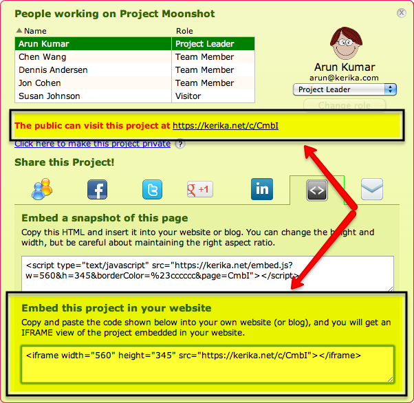
For a great example of how an embedded Kerika page can look inside your own website or blog, check out Ogden Murphy Wallace’s “Startup Action Kit” which provides an online resource for entrepreneurs interested in starting healthcare IT ventures. This page contains a Web version of a Kerika page that has been inserted into OMW’s microsite as an IFRAME, something that’s easily done by using the “Share!” button inside Kerika:

How to embed your Kerika project inside your website or blog


With our latest version, getting the URL of the Web-version of your project pages is easier than before: just click on the Share! button, and when the dialog box shown above opens, you can grab the URL from either of the two places indicated above.

An even easier way to get the URL of the Web-version of your project: all Kerika project pages have URLs of the form “kerika.com/m/XYZ“; just change the “m” to a “c”, as in “kerika.com/c/XYZ“, and you have the Web-version of your project.

Remember: the Web version gets updated in real-time as you update your Kerika project pages, which means you are publishing on the Web in real-time!


A completely rebuilt text block capability in our latest version

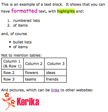
We have been toiling away for the past 4 weeks on our latest version of Kerika, with the vast majority of time consumed with a complete rewrite of the Text Block feature. This is the feature that lets you place blocks of richly formatted text, including Web links, pictures and tables, onto your Kerika page. (What we termed, in an earlier post, “glassbox documents”.)

Here’s a simple example of a text block:

A simple example of a text block


Having realized just how important this feature is for our users, we decided to do a complete rewrite of all the code, abandoning the open-source library called Whyzziwig that we had been using previously in favor of our own implementation. We did all this work because it was clear that we needed to be in greater control of this particular feature’s destiny: something that’s impossible when you are using an open source library. As a result of all our hard work, you will now have a bunch of great new functionality!

  • An Undo button: at long last! We still need to create a broader Undo function that works across all of Kerika’s operations, but this particular button works nicely when you are editing a text block.
  • A strikethrough button: great for marking up requirements and discussions.
  • A new color picker: a simple palette of 84 colors with a cleaner user interface. Along with this comes an easier way to set the font, highlighting and background colors.
  • More options for numbered lists: including using alphabetic and Roman numerals.
  • More options for bullet lists.
  • A clear formatting button: this can be particularly helpful if you are importing content from Microsoft Office. (See our earlier post on just how much junk HTML is carried over if you copy material from a Microsoft Office document.)
  • Easier ways to add, edit and remove Web links: we have considerably simplified the user interface for attaching a Web link to some text (or to a picture that you have embedded inside your text block).
  • Easier way to embed pictures in text block: a simpler, cleaner user interface.

We also have reatly improved capabilities for creating and managing tables: this was where the bulk of the work was done! We have added a number of features that our users asked for, such as:

  • Setting Cell, Row and Column Properties: you can set horizontal and vertical alignment, as well as the background (fill color) for a single cell, an entire row, or an entire column.
  • Resizing column widths by dragging: something that we have wanted for a long time, and which took a lot of effort to build… Now you can re-size a column simply by dragging its edges, as you would with Word or Excel.
  • Copy and Paste: you can now copy and paste a single cell, an entire row, or an entire column. Great for moving stuff around inside tables!
  • Border color: easier to set, with our new Color Picker. And, to improve the usability and appearance of tables, we automatically make the outer border of tables twice as thick as the inner borders (that separate individual cells).

That’s not all that’s new in this release, but this particular blog post is long enough, so we will talk about other goodies in our next posting… Here’s a Kerika page that shows these changes: it’s open to the public to visit, so come on over!


How to say “Hello, World!” in 1,287 words using Microsoft Word

People using Kerika love the text block feature – the one that lets you create richly formatted text blocks on a Kerika page that contain pictures, tables, lists and links – but all too often they try to create these text blocks by copying and pasting text from a Microsoft Word document.

The problem with doing this is that Microsoft Word produces a gigantic amount of HTML junk, even with the simplest text.

Here’s an example: create a new Microsoft Word document and type in the words “Hello, World!”. That’s it: just two words, a total of 13 characters including spaces and punctuation, using your default font. Nothing fancy – no colors, bold or italics, no lists, nothing at all. Just two words.

Now try to copy and paste this text into something that will display the HTML generated by Microsoft Word. One option is to paste this text into a Kerika text block, and then use the “View as HTML” option to see all the HTML that comes with these two words, but we will be temporarily removing the “View as HTML” feature in our next version as part of our rewrite of the text block feature. (More on that later…)

You will find that Microsoft Word produces an astonishing 1,287 words, which add up to 18,008 characters of HTML, just to represent a total of 13 characters of content. In other words, your simple bit of Microsoft Word text exploded by a factor of 1,385.

(If you look at the HTML, you can see, of course, that this expansion factor doesn’t stay constant: a lot of the HTML is simply a dump of a lot of styling information that wouldn’t change proportionately as you increased the size of the original Microsoft Word content, but still…!)

Here’s how you can say “Hello, World!” using 1,287 word of HTML:

We sell donuts. It would have been great if Google+ had let us advertise when they first launched.

Some numbers out today from comScore suggesting that Google+ users are spending just 3 minutes per month using the service have grabbed a lot of attention, mostly because of the direct comparison being made to how much time users spend on Facebook (6-7 hours per month). No word on how many hours people are spending on Lamebook.

Unfortunately, these numbers sound about right. Fellow entrepreneurs who were initially psyched about G+ seem to have turned much cooler about the service, and we think it may be because of our own bewilderment that businesses were banned from creating Google+ profiles when G+ launched.

To use a wonderfully succinct comparison of social media, startups sell donuts:

Source: douglaswray on Instagram


Google made a strategic error in actively prohibiting businesses from creating Google+ pages last summer when the service launched. (To quote a Google manager, “we are discouraging businesses from using regular profiles to connect with Google+ users. Our policy team will actively work with profile owners to shut down non-user profile.” In other words: get lost.)

So, what lies ahead? Not necessarily doom and gloom, if Google sticks with its long-term strategy as described by Bradley Horowitz in the Wall Street Journal today:

Google+ acts as an auxiliary to Google services — such as Gmail and YouTube — by adding a “personal” social-networking layer on top of them.

This comment is consistent with what we have heard from the Google rank-and-file as well in recent months; to quote one local Googler: “Now that we have built Google+, we need to rebuild Google around Google+.”

As of now, the WSJ article has approximately 1,000 Facebook “likes”; 337 G+s; and 3,210 Tweets. Go figure.

Not so smart money: how to produce a Web page with just 15% content

Smartmoney.com, the personal finance website that is owned by Dow Jones (i.e. by Rupert Murdoch’s News Corp.) offers a singular example of how one can design a website so that chrome, fluff and advertising overwhelms the content.

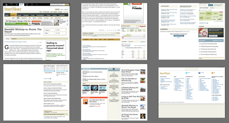
Here are some screenshots from a single page of a SmartMoney article today: we needed 6 screenshots to show you the page because it is around 3,900 pixels in height.

Screen captures of a single Smartmoney.com page

One might assume that a page that long would be filled with content, but in fact, it is filled with advertising, page design elements (also known as “chrome”), links to various News Corp services and other pages (i.e. “fluff”), and even just blank screen space.

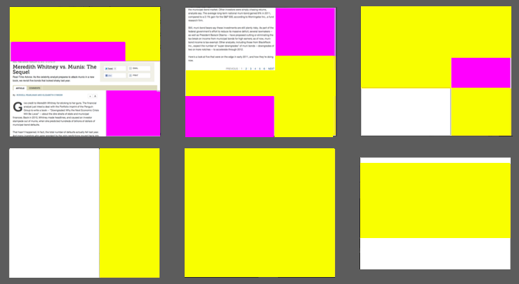
To get a better idea of just how much crap there is on this screen, consider this color coding of the page, with purple denoting advertising, yellow denoting chrome or other fluff, and white indicating blank screen space:

The same Smartmoney.com page, color-coded to show what it contains

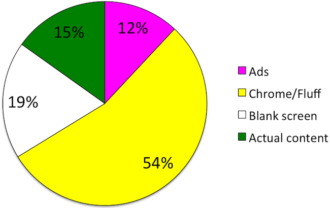
You can see at a glance just how little of the page is actually devoted to the article. In fact, by counting pixels we figured that just 15% of the page is devoted to the article:

Pie chart showing composition of Smarmoney.com article
What's on this single Smartmoney.com page

This is not entirely accidental, of course: Smartmoney.com relies upon advertising, so it will try to stretch out an article over multiple pages so that it can show you more advertising as you plow through page after page.

(This particular article has been stretched over 6 separate Smartmoney.com pages, each of which contains the same pitiful 15%, or even less, of pixels devoted to actual content.)

Yet, even if advertising is the laudable goal here, one simply can’t overlook the bad page design: the largest component of this page (54%) is either page decoration or other fluff – a desperate attempt to get people to stay on the site. And considering that more than half of the crap is “below the fold”, why would Smartmoney.com even expect users to wade through it?

Murder, “lessons learned”, and Service Level Agreements

“We really look at the service delivery with the case. Was there anything we can learn about what happened? It’s not necessary to see what went wrong, but how were services delivered. Is there something we can learn?” said Sharon Gilbert, deputy director for field operations at Children’s Administration, which is part of DSHS.

No, let’s not.

Let’s not view the horrific murder of two children as a SLA problem with a contracted vendor. Too much blood has been spilled to take such a bloodless view of “lessons learned” about “service deliveries”.