We have been cautiously adding animation to the Kerika app — as noted previously — where we think it helps people understand the results of their actions, and why a visual context just changed as a result of something they did.
One such place is when you add a canvas to a card: we added a “blow-up” animation effect to help users understand that they are opening up a new canvas.
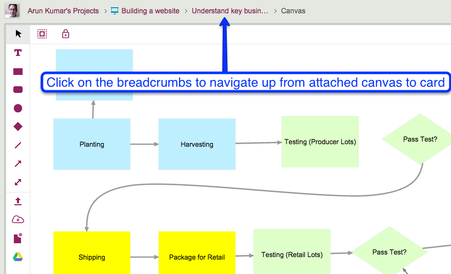
To complement this, we added a “collapse” animation when you navigate up from a canvas to the card that contains it, whether you do that by clicking on your browser’s Back button or by using the Kerika breadcrumbs that appear just above the canvas:

This collapsing animation effect helps reinforce the idea that the canvas you just left was attached to a particular card, and now you are back up a level and viewing all the attachments on that card, including the canvas you were just viewing.