A new feature that we recently introduced will let you choose a background color: one for the desktop app, and one for the mobile app. (Oops, did we just talk about the mobile app?)
To select a color: click on your user profile photo, which appears on the top-right of Kerika:

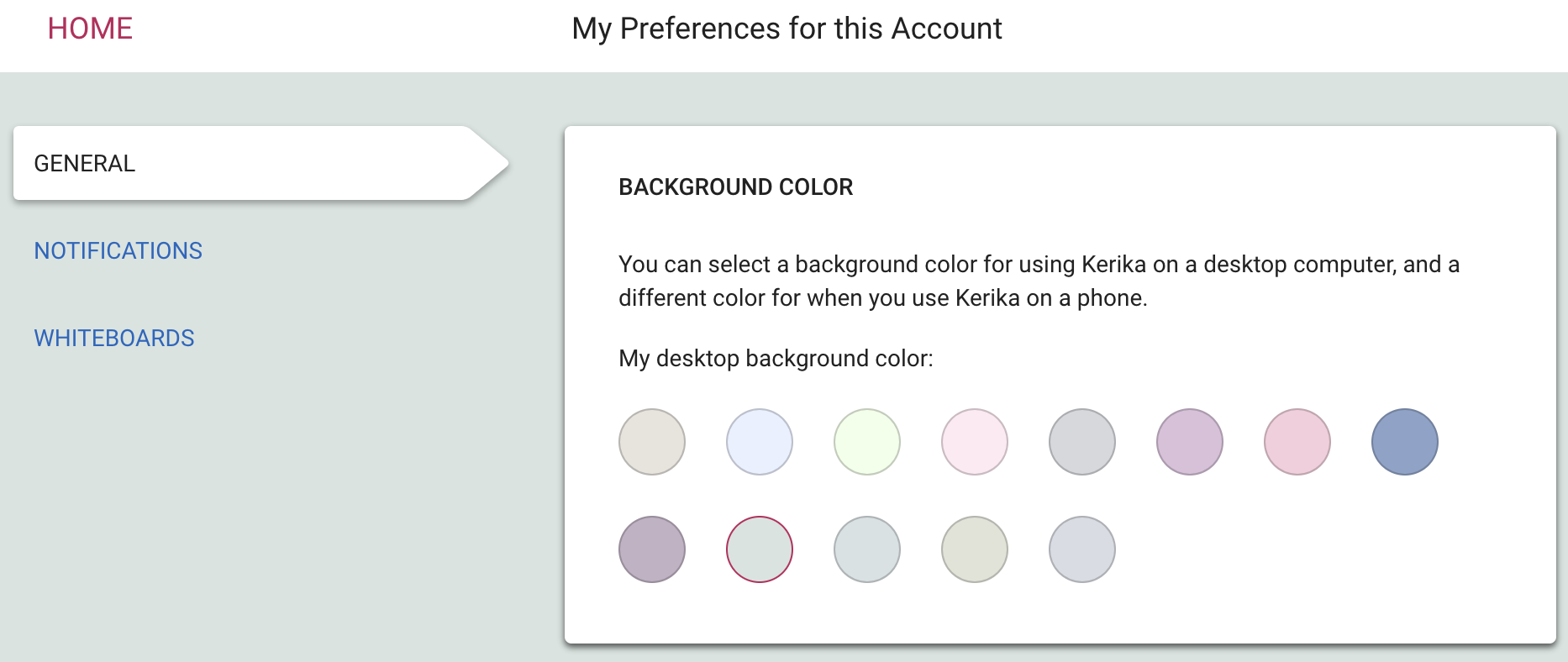
Select My Preferences for this Account from this dialog, and you will land on a revamped Preferences page that now includes options for selecting a background color:

We are offering a range of light and dark backgrounds; in our own testing we found that the darker backgrounds look better on the desktop, while the lighter backgrounds look better on phones. But, of course, that’s just our opinion — try this out and select what you like best!