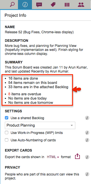
We have made a small layout change to the Project Info dialog to make it easier to read: now the summary data on cards and dates are organized in a bullet list instead of being laid out as a sentence:

This isn’t a big deal, of course, so why are we bothering to blog about it?
Well, for one thing it shows our obsession with details, which is probably a good thing — right? And, for another, it highlights the influence of one of our favorite researchers on Web usability: Jakob Nielsen who has consistently emphasized that on the Web people scan text, not actually read.
All hail the master!