We have updated the toolbar for canvases to provide a better user experience for folks working on standalone Whiteboards or when attaching canvases to cards on Task Boards and Scrum Boards.
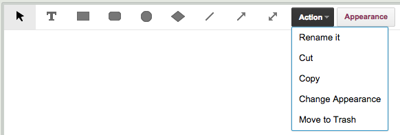
What used to look like this:

Now looks look this:

- The Upload File and +Web Content buttons have been replaced with simple icons that take up less space.
- On the left, there is a new Select All button: this function was kind of buried before, inside the old “Action” button, but now it is more visible and easier to access.
- There is a new Lock button on the far right: this is a new function that we will talk about more in a separate blog post, but we can summarize it here as a way to freeze canvases to prevent people from making changes.
When a shape, e.g. a rectangle is selected, you used to see something like this:

Now, you will see this:

- When a shape (or other object is selected, all the other drawing buttons are temporarily hidden, because they can’t be used. (You can’t draw a shape while you have a shape selected.) This makes the toolbar far less cluttered, by not displaying useless buttons.
- A new button lets you Rename a shape. This is old functionality that you can still access by simply double-clicking on the title of an object, or by using the right-mouse button menu, but this new design makes that function more explicit and easier to access.
- A new button lets you Change a Shape: this is new functionality. You can change a rectangle to an ellipse, for example, without modifying any other aspect of the shape.
- A new button makes it easier to change the Appearance of an object: it’s color, fonts, etc. Again, this is old functionality, but made more explicit and easier to understand.
- New buttons make it clear that you can Copy, Cut and Paste objects. This functionality was buried under the old Action button; now it is more explicit and easier to access.
- And finally, a simple Move to Trash button makes it clearer how you can delete an object. This removes some confusion that Mac users would experience: on a Mac, deleting is normally done using the Backspace key, but within browsers this would take you back to the previous page because that’s how Macs work.
When you select an image that’s on your canvas, your toolbar used to look like this:

Now, it looks like this:

This is a major improvement: the toolbar is not only less cluttered, but all the functions are more explicit and easier to access and understand, especially:
- Download file: same function as before, new button. This will let you download any file on your Canvas, from your Box or Google account.
- Link to website: again, an old function that let you link an image on your canvas to an external website.
DESIGN STANDARDS
For the buttons we are mainly using icons from Google’s Material Design standards because that was already in line with our styling, although in some cases we thought Google’s designs were too “blah” and went for something a little punchier.
BACKSTORY
We haven’t updated the Canvas features in a while — we had been concentrating on improving the Kanban and Scrum aspects of Kerika — but lately some of our users have been telling us about the amazing collaborative spaces they have built using Kerika (check out the folks working on the Ebola challenge at OpenIDEO) and this inspired us to try to improve the Canvas!
Other very cool users include the folks at the Foundation for Common Good, who are working on a variety of social good projects, and the teachers at the Iowa Mennonite School who have been using Kerika for art projects and other learning activities.