Category Archives: Usability

Posts related to product design, user experience and usability

Our latest version: better integration with Google, and more UI coolness

You will have a new version of Kerika tomorrow, with a bunch of great new features. One big improvement is in Kerika’s integration with Google: we are upgrading to Google’s newer, better authentication system, so you will be asked to sign-in through Google again as if you were a brand new user — but don’t worry, none of your old projects or data are affected in any way by this change! The new sign-in process consolidates in one place all the permissions that Kerika requests with respect to your Google account; they include:

  • Access to your basic information: name, email address and photograph, which we use to make sure your Kerika account is set up properly. Now, the photo you use on Google will be used automatically for your Kerika projects as well.
  • Access to your Google Docs account, which, as before, we use to store the files you upload to your Kerika projects. Now, when you upload files to a Kerika project, they will be stored in the Google Docs account of the Account Owner. This makes it easier for Account Owners to manage all the content assets related to their projects.
  • Access to your contacts: this will be used in our next release (look for it in a couple of weeks) which will have auto-completion of names and email addresses when you invite people to join your projects.

There’s a long list of benefits that come with the new version of Kerika:

  1. When you add a URL to a Kerika page, that web site will show up as an embedded page within your Kerika page (i.e. as an IFRAME): you can customize the size and the display, so that only the content you are interested in is shown. Which means that Kerika lets you literally cut-and-paste the Internet.
  2. When you add Web content to Kerika pages, the system automatically gets the title of the Web content, so you don’t have to enter that by hand. And, of course, you can always rename it if you like.
  3. When you upload files to Kerika projects, they will now be stored in sub-folders within your Google Docs that are named for the Kerika projects. This means your Google Docs account doesn’t get cluttered with files in the same way as it did before.
  4. If you use Google Drive, you will find that your Kerika documents are available across all your computers. Kerika is well integrated with Google Drive.
  5. When someone joins a project that already has a bunch of Google Docs, they won’t get a bunch of emails any more from Google letting them know that they have access to each of these files. (These emails were kind of annoying ;-)
  6. If someone is removed from a project team, they will no longer have access to the Google Docs that were part of that project.
  7. On Firefox, Chrome and Safari (but not IE9), you will see thumbnails of the documents on your Kerika projects, which makes it easier for you to quickly distinguish between several files.
  8. When you make a project open to the public, its documents are available only to people who know the URL of the documents. We feel this is a better approach to privacy when you considering making a project open to the public.
  9. When you are uploading a large file to your Kerika project, you don’t have to wait for the uploading to finish in order to do other work inside Kerika.
  10. When you copy a project, or use someone’s public project as a template, you will get your own copies of all the documents in that project.
  11. Switching between different Kerika pages is now much faster since images are now retrieved from your browser cache instead of from the server.
  12. A long-awaited bug fix: when you have images (pictures) on your Kerika pages, they will be shown properly on Internet Explorer 9 and Safari. (We had to fix a problem with the way these browsers dealt with Google Docs.)
  13. Text blocks can now have a border color as well.
  14. The emails sent when you invite people have been improved.
  15. And, finally, the thumbnails of Kerika pages — which you can post to Facebook, LinkedIn, Google+, etc. — are much improved.

Thanks for your continued support of Kerika, and for providing feedback on how we can improve the product. There’s more good stuff coming your way, so keep collaborating…
A new version, with more goodies..

We have released yet another version of Kerika, packed with useful features and bug fixes that will improve your experience with the product.

A lot of the improvements we made are “under-the-hood”, but here are a few changes that you can benefit from directly:

  • Snap-to-grid will make it easier for you to lay out shapes, documents, pictures, etc. on your Kerika pages. You can turn this on or off as you like, and adjust the size of the grid spacing, by setting your preferences: while you are using Kerika, click on your picture near the top edge of the browswer window and you can get to your user preferences.
  • Google Docs will always open in a new browser tab: this change makes for a more consistent and better user experience for everyone. Different browsers handle Google Docs differently, so to provide a more consistent experience for everyone your Google Docs will now alway open in a new browser tab rather than inside the Kerika canvas.
  • Easier ways to invite people: based upon very useful feedback from one of our users, we have added an “auto-acceptance” feature to invitations, and also redesigned the emails that get sent when people are invited to join your projects. These changes make it easier for you to invite people, and handle situations where the invitation emails get caught up in spam filters.
  • Custom colors: mix and match colors as you like, if you don’t like the 84 colors that come with the Kerika palette. If you need to use specific colors, e.g. to match your company’s branding, you can use hex codes to get the exact shade you want.
  • Faster tab switching: we improved this in a several ways, and one of them is to make sure your tabs show the page exactly as you had been viewing it previously before you switched to another tab.
  • The old “Magic Plus” button is now split into two: separate buttons to add Web content and to upload files from your computer. These buttons remain as magicky as ever, in terms of figuring out what kind of content you are adding to your Kerika pages and taking care of all the details, but now the buttons are separated out to improve usability.
  • Upload multiple files with the Upload File button: you could always add multiple files to your Kerika pages by dragging and dropping them onto the canvas; now you can grab multiple files using the Upload File button as well.
  • Merging cells in tables: a cool new feature allows you to merge cells within tables that you create. This makes it even easier to create great-looking content on your Kerika pages, with our text formatting tools.
  • Select multiple cells within the same column and apply formatting to all of them: another cool new feature for those of you who like creating formatted tables. You can select multiple cells within a text table by simply dragging your mouse across them. And, then, you can apply formatting (e.g. text color) to all of them with a single action.
  • Removing multiple rows and columns is easier: drag your mouse across several rows and columns of a table and remove them all with a single mouse click.
  • Easier to navigate large Kerika pages: if you want to drag something into a new part of the canvas, away from the current view, the canvas scrolls automatically to give you more space.

Thanks again for all your useful feedback; we have tons of improvements and new features coming up: our next version will include a number of improvements to our integration with Google Docs.

A simpler way to deal with thumbnails

Sometimes you have to admit that your bright ideas just didn’t turn out as well as you liked…

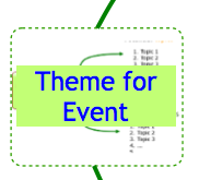
One such bright idea was to have Idea Pages show thumbnails of their contents when viewed from their parent pages. Here’s an example of this works in practice:

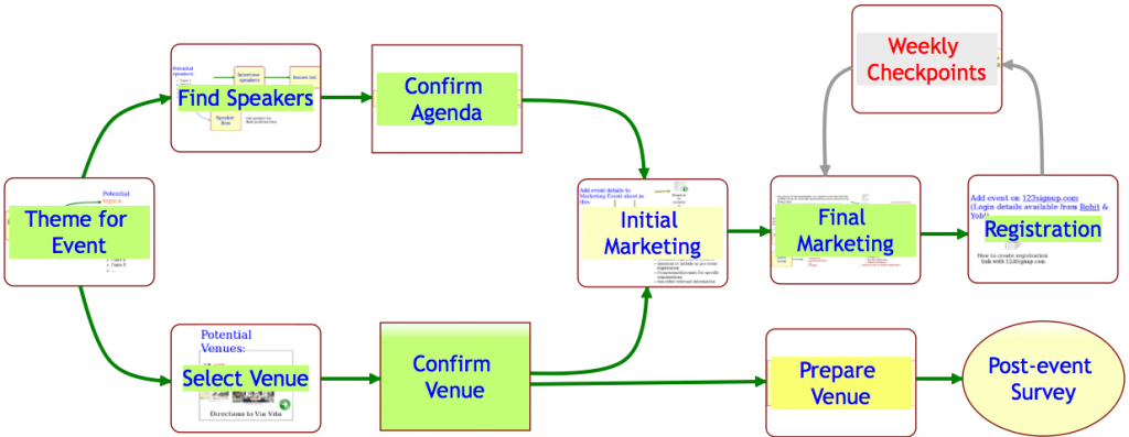
Old thumbnails implementation
How thumbnails of Idea Pages used to look

A great idea in theory; not so great in practice…

The original goal was two-fold:

  1. To let users know quickly which items on an Idea Page contained other pages;
  2. To give users a quick visual sense for what was contained in those pages;

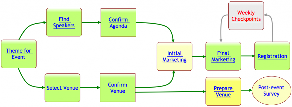
In practice, however, the effect of these thumbnails showing through all the time was a splotchy, rather ugly effect. To remedy this, we are adopting a new mechanism that we hope will continue to meet our two goals: with our latest version, any item on an Idea Page that contains another page will appear with it’s text/label underlined, like this:

What thumbnails look like now

As you can see, items that contain pages now appear with their text labels underlined. If you move your mouse over a shape that has underlined text in its label, you see a thumbnail appear as before:

A thumbnail appears on mouseover

Selecting the shape now provides a green “+” button: this lets you open the page contained within that shape.

Thumbnail on selection

This new green “+” button also appears on shapes that don’t contain any pages within them: in that case, clicking on the “+” button lets you create a new page that is contained within that shape.

In effect, the old double-click mouse operation has been replaced with a green “+” button that appears when you select a shape with a single mouse click.

We hope you find these changes helpful; we earnestly seek your feedback!

A completely rebuilt text block capability in our latest version

We have been toiling away for the past 4 weeks on our latest version of Kerika, with the vast majority of time consumed with a complete rewrite of the Text Block feature. This is the feature that lets you place blocks of richly formatted text, including Web links, pictures and tables, onto your Kerika page. (What we termed, in an earlier post, “glassbox documents”.)

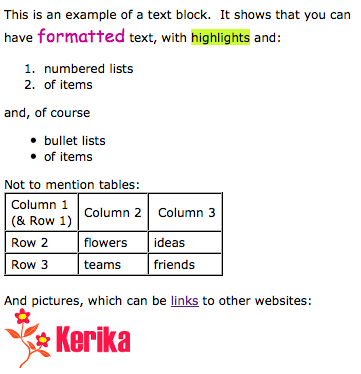
Here’s a simple example of a text block:

A simple example of a text block


Having realized just how important this feature is for our users, we decided to do a complete rewrite of all the code, abandoning the open-source library called Whyzziwig that we had been using previously in favor of our own implementation. We did all this work because it was clear that we needed to be in greater control of this particular feature’s destiny: something that’s impossible when you are using an open source library. As a result of all our hard work, you will now have a bunch of great new functionality!

  • An Undo button: at long last! We still need to create a broader Undo function that works across all of Kerika’s operations, but this particular button works nicely when you are editing a text block.
  • A strikethrough button: great for marking up requirements and discussions.
  • A new color picker: a simple palette of 84 colors with a cleaner user interface. Along with this comes an easier way to set the font, highlighting and background colors.
  • More options for numbered lists: including using alphabetic and Roman numerals.
  • More options for bullet lists.
  • A clear formatting button: this can be particularly helpful if you are importing content from Microsoft Office. (See our earlier post on just how much junk HTML is carried over if you copy material from a Microsoft Office document.)
  • Easier ways to add, edit and remove Web links: we have considerably simplified the user interface for attaching a Web link to some text (or to a picture that you have embedded inside your text block).
  • Easier way to embed pictures in text block: a simpler, cleaner user interface.

We also have reatly improved capabilities for creating and managing tables: this was where the bulk of the work was done! We have added a number of features that our users asked for, such as:

  • Setting Cell, Row and Column Properties: you can set horizontal and vertical alignment, as well as the background (fill color) for a single cell, an entire row, or an entire column.
  • Resizing column widths by dragging: something that we have wanted for a long time, and which took a lot of effort to build… Now you can re-size a column simply by dragging its edges, as you would with Word or Excel.
  • Copy and Paste: you can now copy and paste a single cell, an entire row, or an entire column. Great for moving stuff around inside tables!
  • Border color: easier to set, with our new Color Picker. And, to improve the usability and appearance of tables, we automatically make the outer border of tables twice as thick as the inner borders (that separate individual cells).

That’s not all that’s new in this release, but this particular blog post is long enough, so we will talk about other goodies in our next posting… Here’s a Kerika page that shows these changes: it’s open to the public to visit, so come on over!


Kerika’s blocks of richly formatted text: an example of “glass box documents”

Our next release will primarily focused around the text block feature, which is turning out to be perhaps the single most popular feature of Kerika.

When we first built Kerika, the ability to put formatted text on Idea Pages was viewed as an incidental feature: we figured that people would want to draw flowcharts, and in doing so they would need to put small bits of text on the canvas to use as labels and markers. Nothing more.

So, we considered a variety of open-source programs that provided HTML editing capabilities for our initial versions of Kerika , before settling on Whyzziwig which appeared to have more functionality than we thought we would ever need…

However, as we started using Kerika ourselves, and talked extensively to our helpful users, we slowly realized that text blocks were a very helpful feature indeed: perhaps the most important feature in Kerika’s bag of tricks.

We have dubbed this the “glassbox documents” phenomenon: if you are sharing user requirements or collaborating on a design, you don’t need the full capabilities that come with Microsoft Word or Google Docs. Instead, what you really need is the ability to quickly write relatively small bits of text, perhaps a few paragraphs long, with a table or some links and pictures, and use these to mark up an Idea Page.

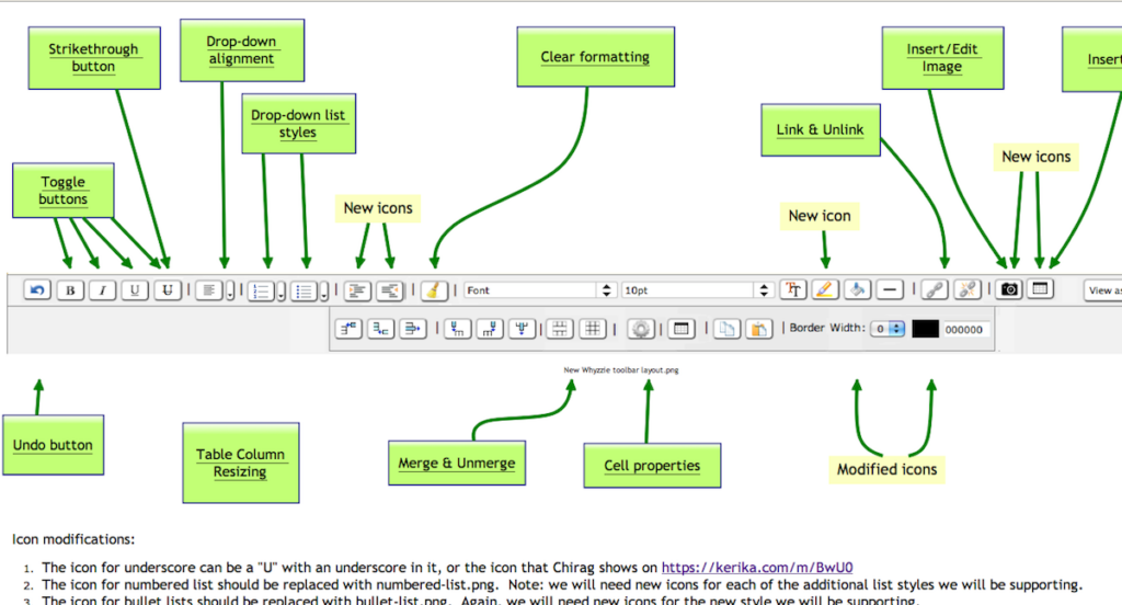
Here’s an example of how we used these text blocks for developing the next version of Kerika, which will contain a hugely improved text block feature:

Example of using Kerika to design a user interface


This picture shows an Idea Page that we used to share ideas between the designers, users and developers about how the text block feature could be improved.

  • In the middle of the Idea Page, we have a mockup of a new text block toolbar, to replace the existing Whyzziwig toolbar.
  • Above it are various pages that define the working of each button: inside each of these sub-pages we have small blocks of text that provide the detailed requirements for a particular button, as well as design notes from the developers and test data from the QA team.
  • Towards the bottom you can see a larger text block contain additional notes about the design.

Using text blocks in this manner, to capture and share our ideas and designs, we have reached that ultimate state of perfect collaboration: even though the Kerika team is distributed between Bellevue and Issaquah in Washington State, and Gujarat and New Delhi in India, we have zero emails being sent within the team!

This is the power of a glassbox document: the ability to sharply increase productivity and shared understanding of requirements and design, by putting text directly on an Idea Page instead of hiding it inside a conventional document (which we would call a “blackbox document”).

How to say “Hello, World!” in 1,287 words using Microsoft Word

People using Kerika love the text block feature – the one that lets you create richly formatted text blocks on a Kerika page that contain pictures, tables, lists and links – but all too often they try to create these text blocks by copying and pasting text from a Microsoft Word document.

The problem with doing this is that Microsoft Word produces a gigantic amount of HTML junk, even with the simplest text.

Here’s an example: create a new Microsoft Word document and type in the words “Hello, World!”. That’s it: just two words, a total of 13 characters including spaces and punctuation, using your default font. Nothing fancy – no colors, bold or italics, no lists, nothing at all. Just two words.

Now try to copy and paste this text into something that will display the HTML generated by Microsoft Word. One option is to paste this text into a Kerika text block, and then use the “View as HTML” option to see all the HTML that comes with these two words, but we will be temporarily removing the “View as HTML” feature in our next version as part of our rewrite of the text block feature. (More on that later…)

You will find that Microsoft Word produces an astonishing 1,287 words, which add up to 18,008 characters of HTML, just to represent a total of 13 characters of content. In other words, your simple bit of Microsoft Word text exploded by a factor of 1,385.

(If you look at the HTML, you can see, of course, that this expansion factor doesn’t stay constant: a lot of the HTML is simply a dump of a lot of styling information that wouldn’t change proportionately as you increased the size of the original Microsoft Word content, but still…!)

Here’s how you can say “Hello, World!” using 1,287 word of HTML:

Not so smart money: how to produce a Web page with just 15% content

Smartmoney.com, the personal finance website that is owned by Dow Jones (i.e. by Rupert Murdoch’s News Corp.) offers a singular example of how one can design a website so that chrome, fluff and advertising overwhelms the content.

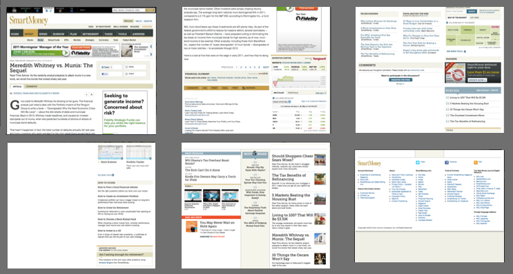
Here are some screenshots from a single page of a SmartMoney article today: we needed 6 screenshots to show you the page because it is around 3,900 pixels in height.

Screen captures of a single Smartmoney.com page

One might assume that a page that long would be filled with content, but in fact, it is filled with advertising, page design elements (also known as “chrome”), links to various News Corp services and other pages (i.e. “fluff”), and even just blank screen space.

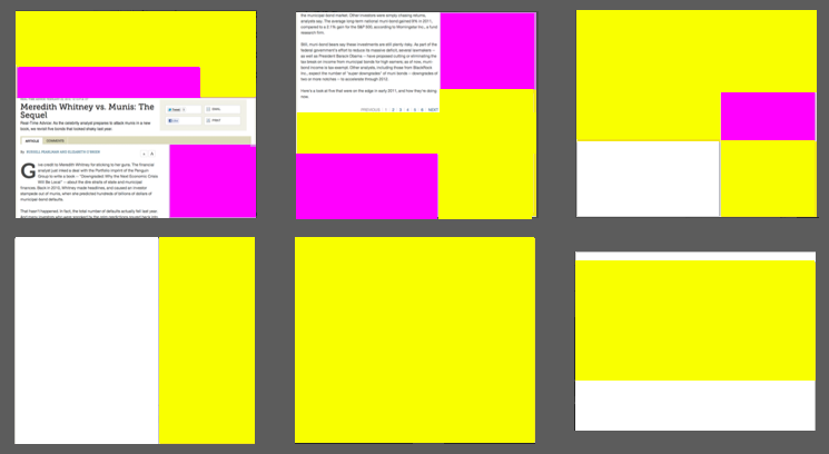
To get a better idea of just how much crap there is on this screen, consider this color coding of the page, with purple denoting advertising, yellow denoting chrome or other fluff, and white indicating blank screen space:

The same Smartmoney.com page, color-coded to show what it contains

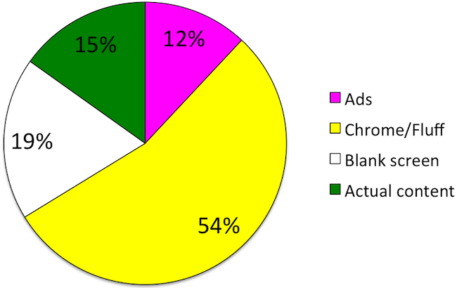
You can see at a glance just how little of the page is actually devoted to the article. In fact, by counting pixels we figured that just 15% of the page is devoted to the article:

Pie chart showing composition of Smarmoney.com article
What's on this single Smartmoney.com page

This is not entirely accidental, of course: Smartmoney.com relies upon advertising, so it will try to stretch out an article over multiple pages so that it can show you more advertising as you plow through page after page.

(This particular article has been stretched over 6 separate Smartmoney.com pages, each of which contains the same pitiful 15%, or even less, of pixels devoted to actual content.)

Yet, even if advertising is the laudable goal here, one simply can’t overlook the bad page design: the largest component of this page (54%) is either page decoration or other fluff – a desperate attempt to get people to stay on the site. And considering that more than half of the crap is “below the fold”, why would Smartmoney.com even expect users to wade through it?

Googleusercontent.com can trip you up, if you disable third-party cookies

Most browsers allow third-party cookies, by default. And, most of the time, these cookies are used by advertising networks to track users as they move across different websites.

Some folks take the trouble of disabling third-party cookies, which can be done using your browser’s “Preferences” settings: the actual mechanism varies based upon which browser you are using.

If you do turn off third-party cookies, you may find that images that you upload to your Kerika pages do not appear correctly. That’s because all files that you upload to your Kerika pages are stored in your own Google account, so when you are viewing a Kerika project page, some of that content is coming from your Google Docs account.

Recently, Google has started storing images in a new domain, called googleusercontent.com. This domain is used for a variety of purposes, including cached copies of websites visited by the Google search engine, but the general purpose of this domain appears to be to store static content: i.e. content that is not expected to change.

So, if you have turned off third-party cookies in your browser, you may find that images are not shown when you visit your Kerika page. And, the whole process may be something of a mystery to you, although our latest version includes a new warning message when we detect that this problem might exist.

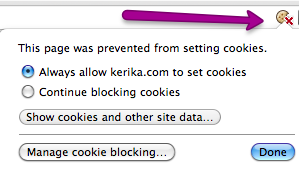
It’s easiest to spot this problem if you are using the Google Chrome browser because that shows you, at the far right end of the address bar, that there is a potential problem with cookies on the page you are currently viewing. Here’s an example:

Cookie warning from Google Chrome

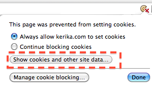
The address bar shows a broken cookie image, and when you click on that cookie image you get a dialog box that tells your page is having problems with cookies. When you see this, click on the “Show cookies and other site data…” button

Click on this button

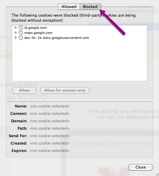
And this will then show you details of the cookies that are being allowed, and the ones that are being blocked:

Blocked cookies
Blocked cookies

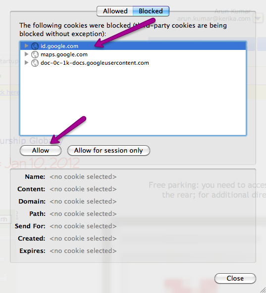
You need to allow cookies from googleusercontent.com in order for your images to show up correctly on your Kerika pages.

Unblocking individual cookies

However, the problem with googleusercontent.com may not end here: when you enable cookies from somewhere.googleusercontent.com, you are only permitting cookies from that particular sub-domain! In the example above, we are allowing cookies from doc-0k-0c-docs.googleusercontent.com.

Allowing cookies from somewhere.googleusercontent.com doesn’t mean that you have also allowed cookies from somewhere-else.googleusercontent.com: in other words, allowing cookies from one sub-domain of googleusercontent.com doesn’t automatically mean you are allowing cookies from all other sub-domains of googleusercontent.com.

And this can cause repeated problems when you are using Kerika, because when you upload images to your Kerika page, Google may place these on entirely different sub-domains of googleusercontent.com. We have no control over which sub-domain Google chooses at any point, so you could have one page show images correctly – after you have permitted cookies from that sub-domain – and another sub-domain get blocked when you navigate to another Kerika page, even a page that’s part of the same Kerika project.

It’s a tricky problem, and the solution doesn’t lie in our hands since it is entirely up to Google as to where they choose to store your documents within the hundreds of domains and the thousands of sub-domains that they control. The easiest bet, of course, is to allow third-party cookies – which you may already be doing, unless you have changed your browser defaults – but if that’s not acceptable to you, you might want to look at using the Chrome browser and watching out for that broken cookie image in your address bar.

UPDATED NOV 11, 2016:

A reader, Carey Dessaix from Australia, offers a better solution to just allowing all third-party cookies:

Adding “[*.]googleusercontent.com” is a solution.

Just go to Chrome settings > Advanced Settings > Privacy > Content settings.

Click “Manage exceptions” and add the following as allowed which will allow allow subdomains including the actual domain as well.

[*.]googleusercontent.com

(Thanks, Carey!)

Big improvements in usability with our latest version!

We rolled out our latest version over the weekend, and it features some big improvements in usability. As usual, feedback has come in from all sources, and is always welcome, but for this particular version we need to acknowledge the particular contributions of Alexander Caskey, Barry Smith, Seaton Gras, Andrew Burns, and Travis Woo.

We were able to incorporate most of the improvements that were identified, although one significant one couldn’t make it in this particular release. (That’s to do with providing a project-centric view, and we will talk about that in a separate blog post.)

So, here’s the bundle of goodness that is Kerika today:

  1. There are fewer buttons on the Toolbar, and we have made them more clearly visible.
  2. We combined the old Team and Share buttons into a single Share! button, since “sharing” and “managing a team” are very closely related activities.
  3. We have also dropped the old Join! button that let people ask to join projects owned by other users. This button apparently had little practical use, and dropping it helped simplify the overall user interface.
  4. The Preferences button has been moved: it is now part of the “Manage Account” drop-down menu. We have also implemented something we call “implied preferences”: now, when you set a particular style preference, such as a font style or color, Kerika assumes that this is your new preference going forward (until you change it something new in the future).
  5. We simplified the user interface by completely hiding buttons and menu options that are unavailable. For example, if you are viewing a page where you don’t have permission to make changes, the drawing toolbar on the left disappears.
  6. We have made some extensive improvements to the formatted text feature (the one that you access with by pressing the “T” button on the drawing toolbar). When you are creating or modifying a block of formatted text, the toolbar for this now appears above the canvas area, where it doesn’t get in your way, and the drawing toolbar is temporarily hidden.
  7. We have hugely expanded the selection of fonts and colors that are available, and made it much easier to change the appearance of several items on a page at the same time.
  8. A “help bar” appears when you are viewing an account to help guide you.
  9. We have added more pricing levels to support smaller teams.
  10. We have made numerous fixes to the feature that produces snapshots (thumbnail pictures) of your project pages. We got most of the kinks out; there are a small handful that we are working on this week.

We will be continuing to work on usability: over the next several weeks we will be making some changes to support a “project-oriented view” for you, as well as improvements that will make Kerika more tablet-friendly.

Why it took so long to get the Back Button working

We finally got the browser Back button working (along with the keyboard backspace key) to help you navigate back and forwards through your Kerika pages and other websites that you may be browsing at the same time.

You might be wondering why it took so long; after all, the Back button has existed in browser since the very beginning, and “breaking the Back button” is one of Jakob Nielsen‘s cardinal sins of Web usability.

The story is somewhat complicated, and it helps to understand two critical features of Kerika:

  • Kerika lets you have multiple projects open at any time, each within its own tab. In other words, Kerika lets you create tabs within a browser tab. Since all of these Kerika tabs are within a single browser tab, in some sense they all share the same URL as far as the browser is concerned. This makes things tricky for us, since each Kerika page actually has its own unique URL. So, how can we map several URLs, for several Kerika pages, to a single browser tab? Hmm…
  • Kerika offers super-fast updates when somebody on your project team makes a change to a project page that you are viewing: we aim for sub-second responsiveness in terms of letting you know that something has changed in your project. You don’t get that kind of speed using AJAX, which is what most people think means “real-time Web”. (That’s just so Web 2.0…) Instead, we use a newer technology called Comet, which is based upon the concept of “long polling”.

These constraints made it tricky for us to get the Back button working: we had to be able to “load” the browser’s Back button with a new URL every time you switch between Kerika tabs, and we had to do this fast enough to not compromise our exacting standards for delivering real-time performance.

We were finally able to do this because modern browsers are now offering Web applications easier ways to load the Back button stack in each browser tab. This is relatively new, and now supported across enough modern browsers for us to be able to offer this (seemingly routine) feature!