Smartmoney.com, the personal finance website that is owned by Dow Jones (i.e. by Rupert Murdoch’s News Corp.) offers a singular example of how one can design a website so that chrome, fluff and advertising overwhelms the content.
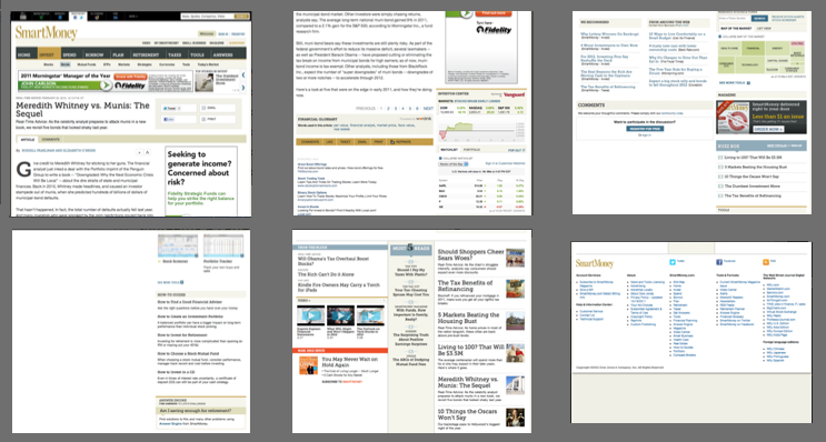
Here are some screenshots from a single page of a SmartMoney article today: we needed 6 screenshots to show you the page because it is around 3,900 pixels in height.

One might assume that a page that long would be filled with content, but in fact, it is filled with advertising, page design elements (also known as “chrome”), links to various News Corp services and other pages (i.e. “fluff”), and even just blank screen space.
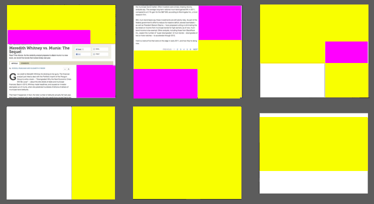
To get a better idea of just how much crap there is on this screen, consider this color coding of the page, with purple denoting advertising, yellow denoting chrome or other fluff, and white indicating blank screen space:

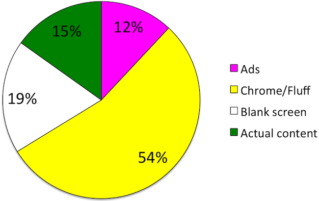
You can see at a glance just how little of the page is actually devoted to the article. In fact, by counting pixels we figured that just 15% of the page is devoted to the article:

This is not entirely accidental, of course: Smartmoney.com relies upon advertising, so it will try to stretch out an article over multiple pages so that it can show you more advertising as you plow through page after page.
(This particular article has been stretched over 6 separate Smartmoney.com pages, each of which contains the same pitiful 15%, or even less, of pixels devoted to actual content.)
Yet, even if advertising is the laudable goal here, one simply can’t overlook the bad page design: the largest component of this page (54%) is either page decoration or other fluff – a desperate attempt to get people to stay on the site. And considering that more than half of the crap is “below the fold”, why would Smartmoney.com even expect users to wade through it?