Jakob Nielsen, of the Nielsen-Norman group, is an old hand at Web usability – a very old hand, indeed, and one whose popularity and influence has waxed and waned over the last two decades.
(Yes, that’s right: Mr. Nielsen has been doing Web usability for 2 decades!)
Kerika founder, Arun Kumar, had the good fortune of meeting Mr. Nielsen in the mid-90s, when he was just embarking upon his career as an independent consultant. The career choice seemed to have come from necessity: Mr. Nielsen has been working in the Advanced Technology Group at Sun Microsystems, and they had recently, with their usual prescience, decided to disband this group entirely leaving Mr. Nielsen unexpected unemployed.
(This was before Sun concluded there was money to be made by re-branding themselves as the “dot in dot com“. As with so many opportunities in their later years, Sun was late to arrive and late to depart that particular party.)
It must have seemed a treacherous time for Mr. Nielsen to embark upon a consulting career in Web usability, back in the mid-90s, when despite Mosaic/Netscape’s success a very large number of big companies still viewed the Internet as a passing fad. And Mr. Nielsen, from the very outset, opposed many of the faddish gimmickry that Web designers, particular Flash designers, indulged in: rotating globes on every page (“we are a global company”, see?) and sliding, flying menus that made for a schizophrenic user experience.
Despite the animus that Flash designers and their ilk have directed towards Mr. Nielsen over the past decade – an animus that is surely ironic given how Flash has been crumbling before HTML5 – his basic research and their accompanying articles have stood the test of time, and are well worth re-reading today.
Here’s one that directly matches our own experience:
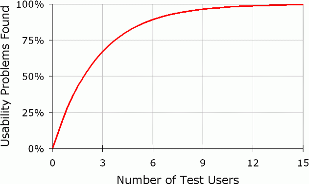
Elaborate usability tests are a waste of resources. The best results come from testing no more than 5 users and running as many small tests as you can afford.
And here’s the graph that sums is up:
