When working with a crowded Task Board or Scrum Board, you want to be sure that you haven’t missed any updates on cards that are out of view: for example, updates that are out of the scroll area because a particular column of cards is very crowded.
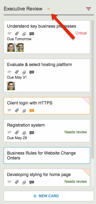
Kerika makes sure you don’t miss anything, and it does this will a handy little button in the form of a downward pointing caret that appears at the top of every column where there is at least one card that needs your attention:

Clicking on this button will help you quickly find the next updated card in the column, and then the next, and so on.
The color of this caret (button) depends upon what sort of updates are present in a column:
- If the column contains any overdue cards, the button is red, to alert you to the overdue problem. (We figured this is the most important information we could show you, particularly if the overdue card is out of sight.)
- If the column contains any new cards, the button is blue. Unless, of course, the column also contains overdue cards, in which case the overdue condition is considered more critical than the fact that you have new cards, and so we show the red button.
- If the column simply contains updated cards, and nothing that is new or overdue, the button shows in orange.
Regardless of the color, the button works the same way: clicking on it will help you find the next card of interest within that column, and then the next, and so on. The column will automatically scroll as necessary to show you updates that would normally be out of sight.
And when you have caught up on all the updates, the button goes away automatically. Neat, huh?