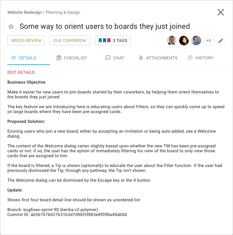
We have redesigned the Task/Card details dialog to provide a more space-efficient layout, so you can see more of what you need without having to scroll:

What used to be vertical tabs for Details, Chat, etc., is now a compact horizontal tab; this frees up a lot of space to see the details of the tags.
The other big change we made is to make the Priority setting separate from other Tags:

Clicking on the star will bring up your task priority options:
