All posts by Kerika

About Kerika

Kerika is the only task management tool that's designed specially for global, remote teams.

If Google is innovating like crazy, why aren’t Android users benefiting?

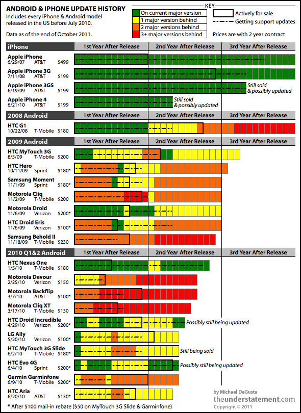
There’s a remarkable graphic over at the theunderstatement.com that shows how infrequently updates to Androids have made it into the hands of end-users. Here’s the graphic and the money quote:

Android and iPhone update history
Android and iPhone update history from theunderstatement.com

Other than the original G1 and MyTouch, virtually all of the millions of phones represented by this chart are still under contract today. If you thought that entitled you to some support, think again:

  • 7 of the 18 Android phones never ran a current version of the OS.
  • 12 of 18 only ran a current version of the OS for a matter of weeks or less.
  • 10 of 18 were at least two major versions behind well within their two year contract period.
  • 11 of 18 stopped getting any support updates less than a year after release.
  • 13 of 18 stopped getting any support updates before they even stopped selling the device or very shortly thereafter.
  • 15 of 18 don’t run Gingerbread, which shipped in December 2010.
  • In a few weeks, when Ice Cream Sandwich comes out, every device on here will be another major version behind.
  • At least 16 of 18 will almost certainly never get Ice Cream Sandwich.

Also worth noting that each bar in the chart starts from the first day of release – so it only gets worse for people who bought their phone late in its sales period.

It’s well worth reading the entire blog post, which is one of the most detailed analyses we have seen in a while. While Google has done a great job of rapidly innovating on the Android platform, they have completely neglected the job of getting these innovations into the hands of end-users.

A new pricing structure, reflecting a mature product

Now that we are well and truly out of beta, we have updated our pricing structure to reflect the maturity and unique features of the Kerika software.

We still have the same great freebies as before:

  • Everyone starts with a free Standard Account, which lets them create an unlimited number of projects, and have an unlimited number of visitors to these projects, so long as they keep the overall Account Team size limited to the Account Owner and two other Team Members.
  • People working in academia, which includes schools, colleges, universities and research institutions get free Accounts, which can include up to 20 Team Members.
  • People involved in open-source or advocacy projects also get free Accounts, which can include up to 20 Team Members.

For people working in commercial settings, the new pricing is as follows:

  • Once your Account Team size gets past 3 (i.e. you Account includes more than just you and two of your colleagues or friends), you need to upgrade to the Professional Account, which give you an Account Team of 20 people. This now costs $66.67 per month, which works out to just $3.33 per user per month.
  • If your team grows even larger, you can upgrade to the Premium Account which gives you an Account Team of 200 people. This now costs $333.33 per month, which works out to just $1.67 per user per month.

If you are an enterprise customer, give us a call.

Kerika adds Social Media Links

Finally… yes, we know we should have done this a while ago, but we were busy making the core Kerika software more robust and polishing away some of the usability friction that users had reported, but now we have done it: we added social media links to Kerika!

The old “Share!” button at the top of the Kerika UI is still there:

The Share! button
The Share! button is on the toolbar, just above the canvas

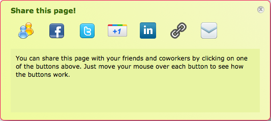
Clicking on this button brings up a whole bunch of new possibilities:

The Share! options for a project that's open to the public

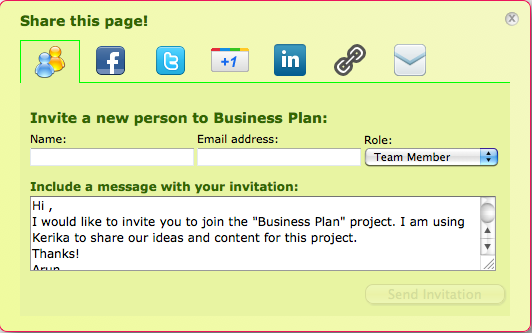
The first option, from the left, is the “People” action: you can use the Share! button to quickly add people to your project team. (This is an alternative to using the Team button to manage your project teams.) Here’s how you can add people using the Share! button:

Using the Share! button to add someone to the project team

You can also use the Share! dialog to:

  • Post to your Facebook wall
  • Tweet about your project. (Your tweet will include a link to the project page.)
  • Post it as an update to your LinkedIn profile page. (That will include a link to the project page as well.)
  • Share it with your Google circles by doing a Google +1 on the page.

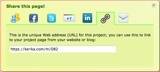
And, you can simply grab the URL of the page it you want to share it with someone:

Grab the URL for your project page

And, finally, you can email a friend or coworker about the project, and include a link to the page in your email message.

There’s more to come: in the near future we will be making it possible for you to embed a picture of your project page in your own website or blog!

So, why are we still learning typesetting?

Many, many years ago, as a young boy living in Delhi I had the good fortune of being a neighbor and friend to the then-elderly, since deceased, M. Chalapathi Rau, the publisher and editor of the newspaper National Herald which had been founded by Jawarharlal Nehru himself during India’s freedom struggle. (“M.C” or “Magnus” as he was known to his friends was a man of many talents and a true eminence grise who unobtrusively operated the levers of power in India.)

To help me research a school project, M.C. took me to his newspaper’s printing press, a vast, clanking space where I watched with great fascination the painstaking process of laying out moveable type by hand: a craftsman’s job that had remained essentially unchanged, at least in India, since the 19th century. I did my school project, thinking that this would be my first and last experience with typesetting…

At college, however, typesetting reappeared: in order to get a job, one had to have a beautifully laid out resume, particularly if one had no “professional experience” to list other than the insalubrious qualification of having toiled in the scullery of a campus dining hall for minimum wage. So, I dutifully learned the obscure commands that helped set fonts and margins using troff, the first document preparation software for Unix computers.

I prepared and padded my resume, bluffed my way into my first job, and assumed that that would be my last encounter with typesetting. Ironically, my first job was at AT&T Bell Labs, working on Unix-based applications.

Typesetting is closely tied to the history of Unix, and, indeed, provided the raison d’etre for Unix’s existence. In 1971, when Ken Thompson and Dennis Ritchie (and others) at Bell Labs wanted to get funding for developing the Unix operating system, their business case was based upon the rather tenuous argument that developing this new operating system (Unix) would help them develop a better typesetting program (troff), which could be used by Bell Labs to file patents.

In those halcyon days, Bell Labs generously recognized and encouraged geniuses to explore their ideas, and, more mundanely, Bell Labs actually did need a better typesetting programs: since it’s inception in 1925 the organization had averaged one patent per business day (and collected about nine Nobel Prizes by the time I showed up as a very junior programmer).

So troff, the typesetting program, is responsible for the creation of Unix, which means that typesetting is the reason why Linux, cloud computing, Google, Facebook, Twitter, etc. all exist today!

Typesetting occupied a relatively small part of my workday until I started moving into management roles, which coincided with the widespread adoption of Microsoft’s Word software. Suddenly, most of my day was spent typesetting memos, performance appraisals, proposals, etc. I emphasize “typesetting”, rather than “writing”, because Microsoft Word remains, at heart, a typesetting program, not a writing program. It requires you to learn the same obscure catechism of tab settings, kerns and serifs, character and line spacings that those ancient typesetters at the National Herald had mastered as a craft.

And, yet, no one considers it strange that all of us highly trained, highly paid “knowledge workers” are required to master a craft that was first invented in China in 1040 AD!

The advent of the modern Web, starting with the release of the Netscape browser in 1995, has provided little relief: we exchanged one set of obscure keystroke combinations for another, equally opaque set of symbols (i.e. HTML). It is only in recent years that blogging tools, like the excellent WordPress software I use to pen this essay, has helped hide the typesetting and allow users to focus on the writing.

Between the release of the Netscape browser and the current robustness of WordPress came the advent of Google Docs. Google Docs’ primary innovation (or, more precisely, Writely’s primary innovation — remember Writely?) was to offer online editing; Google Docs did nothing to fundamentally alter the typesetting nature of word processing.

Google Docs continues to evolve, but as a persistent shadow of Microsoft Office. This makes sense from a business perspective, of course: it is easier for Google to get customers signed up if they can state simply that Google Docs works like the familiar Microsoft Office, and is a lot cheaper and easier to access. It would be much harder to get people to sign up for a Google Docs that seemed to fundamentally alien in comparison to that reliable reference, Microsoft Office.

And, so it continues… Centuries after the invention of moveable type, we remain trapped in its formatting conventions. At Kerika, we are starting to think seriously about making our embedded text editor (which is based upon Whizzywig) be the primary way for people to write for the Web. Kerika is all about creating and sharing pages stuffed with your greatest ideas and coolest content, and it’s high time we put aside typesetting. For good.

Up next: a replacement for the Google Docs Gadget

The current version of Kerika uses an embedded Google Docs Gadget, that’s part of the Sidebar within the application. There’s no polite way to describe this software, which comes in four different flavors from the mighty Google itself; let’s just say that the technical term for it is “p.o.s. software”.

A Google Docs Gadget is supposed to be something that you can easily embed within a website or application: it supposed to provide easy, direct access to your Google Docs from within your site or Web App. There are at least four official Google Docs Gadgets out there:

  • There’s this one from “Claudia C. and Ted C.“, both employees at Google – as you can easily see by viewing the XML code for this Gadget. It doesn’t work, which probably explains why Claudia and Ted are coy about revealing their last names. And when we say it doesn’t work, we don’t mean that it has some subtle bugs that are unlikely to surface for most users: just visit this Gadget, at Google’s own official website, and try setting the number of documents to show in the list. It doesn’t work.
  • Here’s another one: presumably a later one than the first, since it’s authorship is attributed to “Claudia C. and Ted C. Modified by Gordon Bunker”. We don’t know who Mr. Bunker is, but he couldn’t get Claudia and Ted’s Gadget to work properly either.
  • Here’s a third one: also the work of Claudia C and Ted C. This one is hilariously broken: just visit the link that says “Add to your home page” and you see the helpful message “Error parsing module spec: Not a properly formatted file missing xml header”. So, here we have an example of two Google employees, hosting an official Google Gadget, on Google’s own website, that is completely broken…
  • Finally, we have this one, attributed to “Claudia C., Ted C., and Sam B.”. Sam, like Claudia and Ted, found it wiser not to disclose his last name given he somehow managed to reduce the utility of the original Gadget.

So, there you have it: four different, official versions of the embeddable Google Docs Gadget, none of which work… The situation became untenable for us because with the latest version of Google’s Chrome browser, the drag-and-drop function stopped working altogether. No small irony here, that Google’s own browser doesn’t work with their own Gadgets, when Firefox’s drag-and-drop continues to work.

We can’t fix these Gadgets because they were built by Google employees; instead, we are building our own replacement for this Gadget which we expect to release this weekend. It’s simple, functional and reliable. It will let you perform a search across all your Google Docs, and drag-and-drop results from this search straight onto your Kerika pages. And, it will work on all browsers.

First, we kill all the managers. (Or, maybe not.)

In earlier posts we described our decision to chose Amazon’s EC2 over Google App Engine in recent days, and as part of the business perspective we noted that:

Amazon is accessible: both Amazon and Google have engineering centers in our neighborhood, and Amazon’s is, of course, the much larger presence, but the real issue was which company was more accessible? Amazon does a lot of outreach to the startup community in the Seattle area – Jeff Barr is everywhere! – whereas Google is a lot more aloof. It’s much easier to find an engineer or product manager at Amazon who will talk to you, and that really makes a difference for a startup. Real people matter.

Events in the past week have reassured us that we made the right choice. The very end of that post on choosing EC2 included a passing grumble about some long-standing problems with Amazon’s Elastic Load Balancer.

What happened following that blog post was a pleasant surprise: an old colleague saw the post on LinkedIn and forwarded it to someone at Amazon, who promptly contacted Jeff Barr, the peripatetic and indefatigable evangelist for Amazon Web Services.

And within just one day after our griping, Jeff asked for a meeting with us to see how Amazon could make things better for us. This level of responsiveness was, frankly, astonishing when one considers the size of Kerika (rather tiny) and the size of Amazon (rather Amazonian).

We met Jeff today, and are happy to report that this ELB issue will soon go away for us and everyone else. But that was a minor aspect of the meeting: much of our discussion was a wide-ranging conversation about Kerika, collaboration platforms and the many uses for cloud computing in different market segments.

And the best part was finding out that Jeff had taken the trouble, earlier in the day, to try out Kerika for himself.

Returning from the meeting, we couldn’t help but reflect upon cultures of the two companies that we are relying upon for our business model: Amazon and Google. Amazon is providing the cloud computing infrastructure, and Google is providing the OpenID authentication and, more importantly, the Google Docs suite that is integral to the Kerika product offering. Both sets of technologies are essential to Kerika’s success.

But the cultures of these two companies are clearly different: Amazon relies on both technology and people, whereas Google, it would appear, is purely an online presence. (To be fair, we must note that while both companies have engineering centers in the Seattle area, Amazon’s footprint is many times larger than Google’s.)

But, still: who could we have tried to reach at Google? Who is the public face of Google’s App Engine? Or, of Google Docs, for that matter? There are two substantial Google engineering centers nearby, but Google the company remains a cloud of distributed intelligence – much their servers – accessible only via HTTP.

A recent article at All Things D speculates that Larry Page may eliminate Google’s managers in large amounts, in order to free the animal spirits of the engineers, and a similar article on TechCrunch notes that “Page famously has a low opinion of managers, especially product managers who try to tell engineers what to do.”

There can be no gainsaying Google’s engineering talents, or its remarkable achievements, but will Google 3.0 be an organization that has even less human contact with its customers and partners?

Jakob Nielsen’s Power of Ten Principle

We like to think that we have done a fairly good job in terms of designing our user interface. A major influence was the writings of Jakob Nielsen: Kerika’s CEO had the good fortune to meet Mr. Nielsen at a conference in the mid-90s, when corporate America was slowly waking up to the reality – and permanence – of the Web, and Mr. Nielsen just been laid off from Sun Microsystems, which, in its infinite wisdom, decided to get rid of their entire Advanced Technology Group as a cost-savings measure.

Mr. Nielsen fast became a popular speaker at the few Web conferences that were held in the early days, and one could listen to his speeches practically for free. (Now, we understand, it costs about $15,000 to get Mr. Nielsen’s attentions for a single day…). Mr. Nielsen went on to found the Nielsen Norman Group, with Donald Norman who had done pioneering work on product design, and he created a simple newsletter-based website (www.useit.com) that remains a wonderful source of research on Web usability.

What was remarkable about Mr. Nielsen’s approach then, and which we think still is a relatively rare ability among the many design pundits today, is a rigorous emphasis on scientific observation and testing. Mr. Nielsen has never given the impression of being someone who has relied very much on his instincts when it comes to design; he has always emphasized the need for usability testing.

Too many other “pundits” – and here we use that phrase in the American sense of a talking head, rather than the Indian sense of a priest or wise man – rely upon what they believe, often erroneously, to be a superior design aesthetic which they deftly package with enough jargon to make it appear more like fact than opinion.

(Today, we have a beta version of Kerika that we are using to gather usability data: we are sitting down with our initial users, directly observing their reactions – their many sources of confusion and occasional moments of delight – to see fine-tune our user interface. We believe we have done a good job on the main aspects of the design, but there are many rough edges that we still need to sand over, to get the “fit-and-finish” just right. So, while we are immensely proud of what we have accomplished – and the tens of thousands of lines of Javascript and Java code we have written in a remarkably short period of time – we are only too aware of our shortcomings as well…)

Mr. Nielsen writes mostly about website usability, but his observations and principles are very apropos to the design of Web applications as well. We have tried to incorporate his suggestions on perceived affordance and information scent in the various elements of our user interface, but when we expand the discussion from UI to UX – from user interface to user experience – it is clear that performance is a key contributor to an overall good experience.

In his article on the “Powers of Ten” principle, Mr. Nielsen points out that 0.1 second is the response time limit if you want users to feel like their actions are directly causing something to happen on the screen. If a system responds within 0.1 seconds, the system essential disappears from view: the user believes he or she is directly manipulating the objects on the screen.

(A simple analogy is the mouse: when one moves the mouse, the cursor moves immediately on the screen, which is why it is so easy to learn to use a mouse: one quickly forgets its presence altogether, and concentrates upon looking at the screen instead. We often see people who hunt-and-peck at their keyboards; when was the last time you saw someone look down at their mouse to make sure they were moving it correctly?)

To that end, we have tired to ensure that most user interactions when using Kerika fall within the 0.1 seconds time limit: when you add an item to a page, or move it, or delete it, it happens instantly.

Next up is the 1 second time limit, and here we quote Mr. Nielsen:

When the computer takes more than 0.1 second but less than 1 second to respond to your input, it feels like the computer is causing the result to appear. Although users notice the short delay, they stay focused on their current train of thought during the one-second interval.This means that during 1-second response times, users retain the feeling of being in control of the interaction even though they notice that it’s a 2-way interaction (between them and the computer). By contrast, with 0.1 second response times, users simply feel like they’re doing something themselves.

In the Kerika user interface, there are moments when a user will experience a 1 second response time, although not very often: most commonly, this happens when we are waiting for an external website to respond. For example, if you have built a “video wall” of YouTube videos, you may have to wait a second (or two or three) for YouTube to respond when you decide to play a video. This, regrettably, is out of our control. But for the parts of the user interface that are within our control, we have tried to stay within the 1 second time limit.

After 1 second, users get impatient and notice that they’re waiting for a slow computer to respond. The longer the wait, the more this impatience grows; after about 10 seconds, the average attention span is maxed out. At that point, the user’s mind starts wandering and doesn’t retain enough information in short-term memory to easily resume the interaction once the computer finally loads the next screen. More than 10 seconds, and you break the flow.

Nothing, in Kerika, breaks the flow.

The development environment that’s worked for us

In our last post, we referred to our “dogfooding” Kerika by using for our testing process. Here’s some more information about how we set up our software development environment…

Our Requirements:

  • We needed to support a distributed team, of course. And our distributed team had a variety of preferences when it came to operating systems: there were folks that liked using Windows, folks that had only Macs, folks that used only Linux, and folks that liked using Linux as virtual machines running inside Windows… Since we were were developing a Web application, it didn’t make sense – neither from a philosophical perspective nor from a business strategy perspective – to insist that everybody use the same operating system. If we were going to build for the browser, we should be able to use any operating system we preferred: our output was, after all, going to be Java, Javascript and SVG.
  • We needed to deploy our software “in the cloud”, and that meant making sure our software could run well in a Linux environment. Microsoft’s Azure service was still relatively new, and, in any case, our back-end developers were more comfortable with Java than ASP.Net, so that fixed Java on Linux as a back-end requirement.
  • Our software had to run in all browsers: that effectively meant “modern browsers”, that happy euphemism for browsers that would conform to HTML5 standards. When we started development, we were uncertain about how Internet Explorer 9, which is still in beta, would evolve, but we have been very pleasantly surprised by the evolution of that product. (And a discussion in December with Ziad Ismail, IE9’s Director of Product Management, has since further reinforced our belief that Microsoft is very serious about standards compliance in IE9.)
  • We decided early on to build our front-end in Javascript and SVG, rather than Flash. We know of very few applications, even today, that attempt to deliver the kind of user interface combined with real-time networking that Kerika does using Javascript, and it’s not that we like crazy challenges because we are crazy people –we just didn’t want to get caught in the crossfire between Apple and Adobe over Flash. Having to choose between Caradhras and the Mines of Moria, like Gandalf we choose to brave the Mines…

Our choices:

  • Amazon’s EC2 and RDS for creating test and production environments; A2 hosting for our development environment. The choice was between EC2 and Google App Engine, and we will talk more in a separate blog post about why we chose Amazon over Google.
  • Eclipse for the developer’s IDE: it was cross-platform, and since everyone wanted to stick with their favorite operating system, it was Eclipse that straddled them all.
  • Jetty for web server: the choice was between Apache and Jetty, and we went with Jetty. Why? Well, that’s a blog post in itself…
  • Git for source code control: we looked at Subversion, but Git is better suited for distributed teams.
  • Maven for build management: once we decided on Eclipse, Git and Jetty, Maven kind of fell in place as a natural choice, since it worked well with all of the above.
  • Bugzilla for bug tracking: it’s a great tool, with a simple, flexible interface and it has matured very nicely over the past decade.

All of this has worked out quite well, and we would recommend this stack for other startups that are looking to develop Web applications.