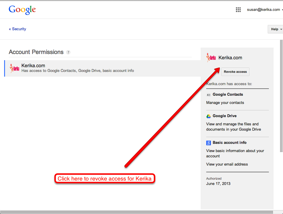
If you want to get rid of an old Kerika account, the easiest way is to simply de-authorize it from your Google account.
First, some background: when you sign up as a Kerika user, we use Google to figure out who you are, and what your email address is. (And to get permission to put Kerika project files in your Google Drive).
This means that Kerika becomes an authorized app, as far as Google is concerned.
And, it also means that you can de-authorize Kerika any time you want, from your Google account itself. Without authorization, you can’t use your old Kerika account, and neither can anyone else (assuming no one stole your Google password!)
Here, you will all the third-party applications, including Kerika, that are currently authorized to use your Google credentials. Simply Revoke Access to Kerika, and you will disable your Kerika account:
Click here to revoke access for Kerika
Note: you need to make sure you are logged out of Kerika as well. If you leave yourself logged into Kerika on someone else’s computer, they will be able to continue to view your old projects, although they won’t be able to access any of the files that are stored in your Google Drive, or add any new files.
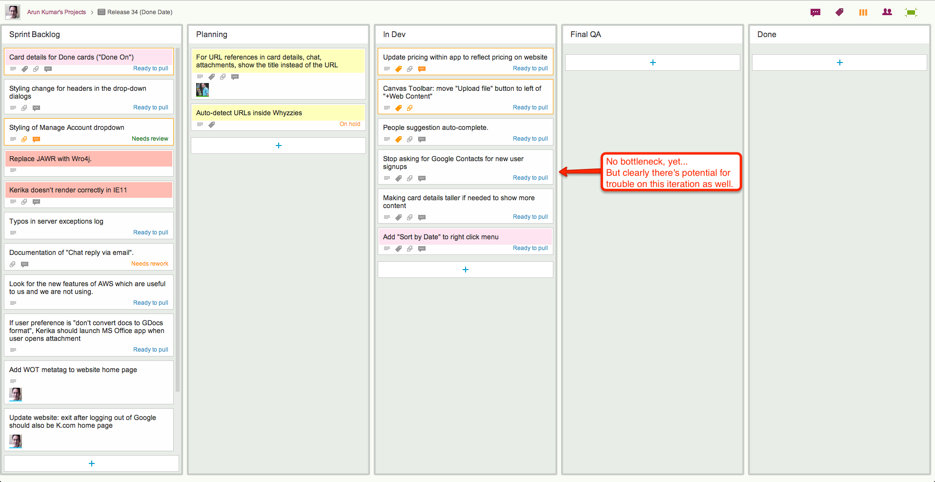
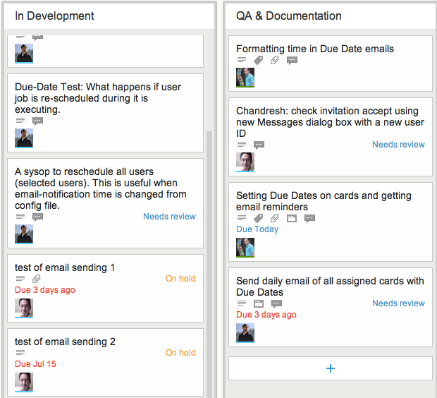
One great advantage of a visual task board like Kerika is that it is a really fast and easy way to identify bottlenecks in your workflow, far better than relying upon burndown charts.
Here are a couple of real-life examples:
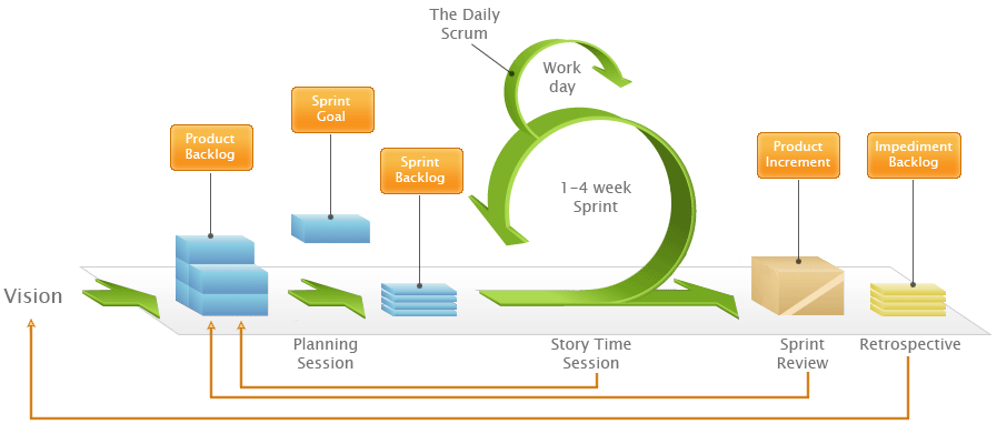
Release 33 and Release 34 are both Scrum iterations, known as “Sprints”.
How Scrum works
Both iterations take work items from a shared Backlog – which, by the way, is really easy to set up with Kerika, unlike with some other task boards ;-) And for folks not familiar with Scrum, here’s a handy way to understand how Scrum iterations progressively get through a backlog of work items:
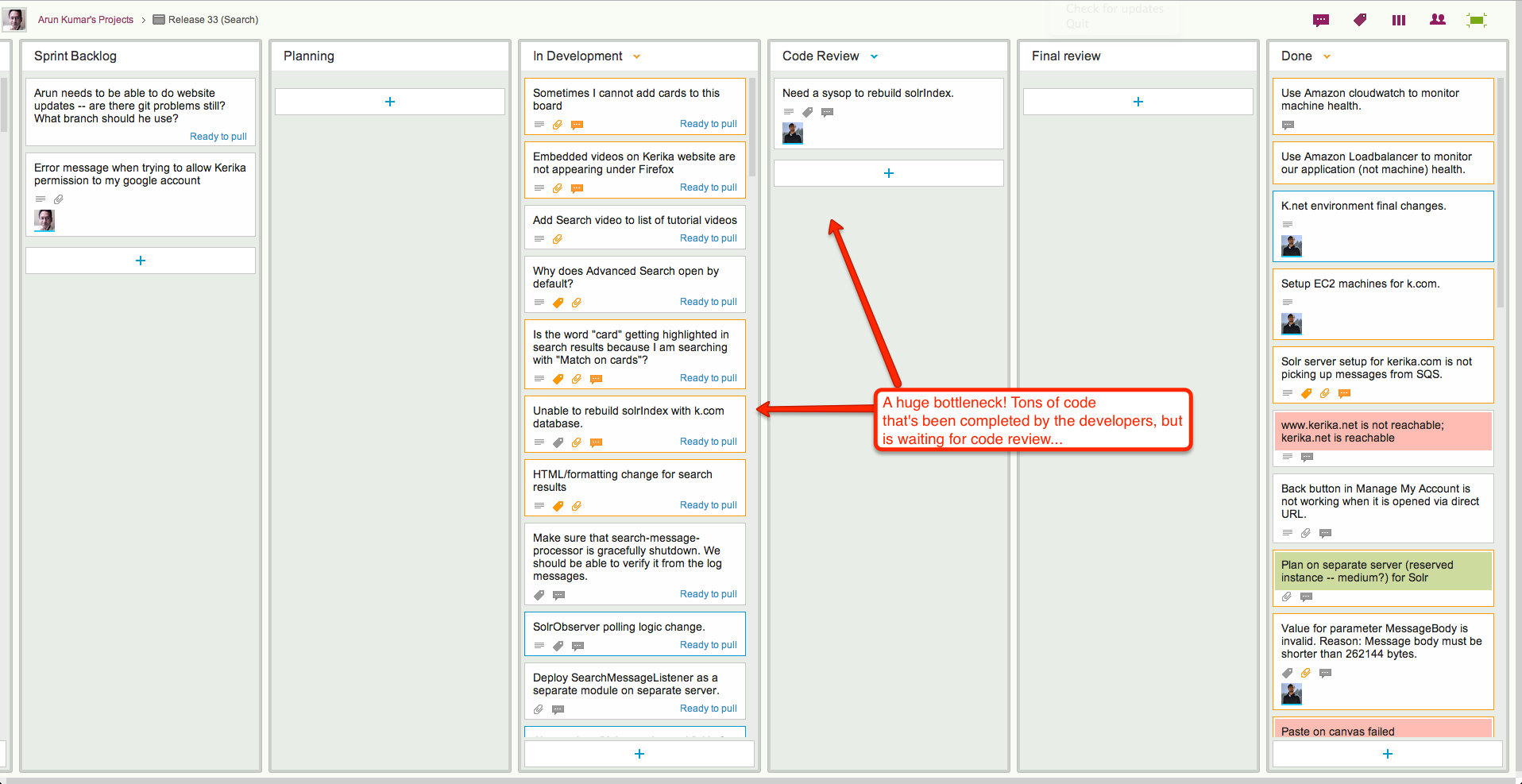
We could rely upon burndown charts to track progress, but the visual nature of Kerika makes it easy to identify where the bottlenecks are:
In Release 33, the bottleneck is obviously within the Development phase of the project:
Release 33: a bottleneck in Development
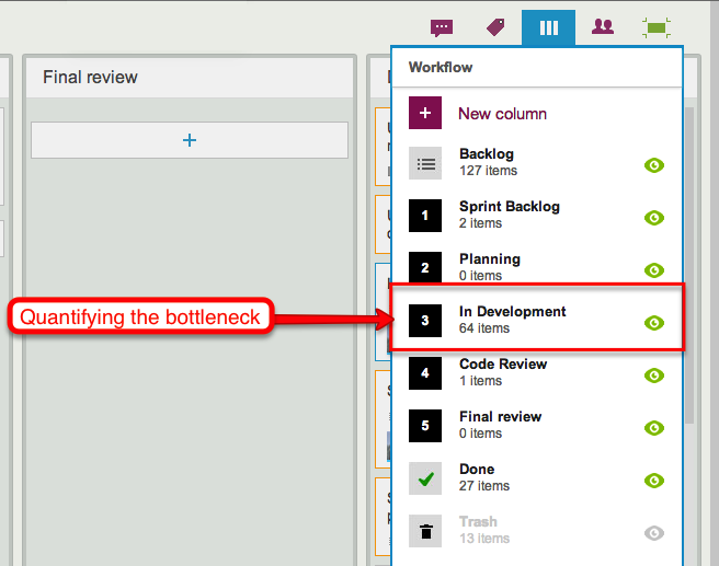
When we take a look at the Workflow display, it’s easy to quantify the problem:
Quantifying the bottleneck in Release 33
By way of contrast, here’s Release 34, another Scrum iteration that’s working off the same Backlog:
Release 34: a smaller bottleneck
This iteration doesn’t have the same bottleneck as Release 33, but warning signs are clear: if we can’t get our code reviews done fast enough, this version, too, will have a develop a crunch as more development gets completed but ends up waiting for code reviews.
In both cases, Kerika makes it easy to see at a glance where the bottleneck is, and that’s a critical advantage of visual task boards over traditional Scrum tools.
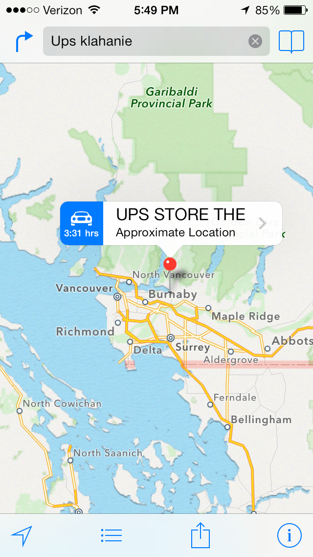
Here’s a simple screenshot that shows why Apples iOS 7 Maps is more beautiful than ever, but still slightly insane… Here’s what happens if you search for “Ups klahanie”, while standing on Klahanie Boulevard in Issaquah, Washington: Apple suggests you go to a UPS store in Vancouver, British Columbia. In other words, it finds a suitable destination for you that’s in another country altogether.
Searching for the nearest UPS store
The basic flaw with iOS Maps, as we have noted before, is that it makes no effective use of GPS data even though the software was created for use only with iPhones, all of which, always, have had GPS capabilities. This has been
But this particular search provides a clue to what’s actually going in Apple’s servers: the word “Klahanie” means “outdoors” in the Chinook language, and the Chinook people can be found across several places in the Pacific Northwest region, beyond their origins in the lower Columbia River region (where Washington State borders Oregon).
So, somewhere in Vancouver the Chinook influence has also resulted in a local street being named Klahanie, and that’s triggered Apple’s Maps to serve up that absurd result (instead of the UPS store that was less than a mile away from where the search was being done).
We are improving our “smart display” of dates and times, to make sure they are as easy for users to comprehend as possible.
(At this point you might well be wondering: “why is this a problem in the first place? Don’t people know how to read dates or times?”)
The underlying problem we are trying to solve is that “relative time” is more useful than absolute time, if you are dealing with a short time span.
For example, the word “Yesterday” has much more cognitive value than July 19, 2013 (which is also “yesterday”, as of the time this blog post is being written). “Yesterday”, “today”, “tomorrow”, “two hours ago”, “recently”, etc. are all very powerful ways to convey a sense of how far away a particular event is from the current moment.
But, as one of users – Carlos Venegas, from Lean Office Innovation – recently pointed out, this works best for short periods of time: for example, it is helpful to know something that happened “2 days ago”, but much less helpful to be told that something happened “12 days ago”. In the latter case, the cognitive advantage of using relative time disappears and quickly becomes a burden for the user: 12 days ago is too far in the past, and now the user has to do some mental calculation to arrive at the more useful value of “June 10, 2013”.
This issue became more pressing when we built the Due Dates feature, because time doesn’t have an absolute value when you are dealing with a distributed team. For example, the Kerika team is distributed between Seattle and India: a time difference of 12.5 hours in the summer, and 13.5 hours in the winter.
This time difference is large enough to make terms like “today” ambiguous: depending upon when you are talking with your cross-border colleagues, you may have very different ideas of when “today” ends.
To address this, we made our Due Dates feature smart: it automatically adjusts for timezone differences, so that when someone in India marks an item as due “today”, Kerika ensures that people in Seattle understands what that means in terms of Pacific Time.
We also are improving our display of relative time, using a more detailed algorithm:
First of all, any time reference that is more than 3 days away is shown in absolute values: e.g. “July 15”, rather than “7 days ago”.
The concepts of today, tomorrow, and yesterday are preserved: the system figures out what timezone you are located in, and uses these terms in a smart way.
If an item is due by the end of the day, the time is shown using your current timezone: e.g. “11:30AM PST” rather than just “today”, for an item that is supposed to be done by the end of that day in India. This removes misunderstandings that would otherwise exist across timezones.
As you get closer to a time, the display gets more precise: anything due within the next hour is displayed in minutes, e.g. “45 minutes”.
As you get very close, the display gets a little vaguer, because of the greater uncertainty about when something might actually happen. So anything that’s two minutes away is marked as recently.
All of this makes for a very smart display of time, while keeping the user interface very simple: users set dates using a simple calendar control, without having to worry about the details of where others on the team are currently located, and how they might perceive these values!
With our next release (next week), you will have the ability to set Due Dates on cards; this is how it’s done:
Example of setting a Due Date on a card
The concepts are very simple, yet very elegant and powerful:
By default, all cards are “Not scheduled”, which means no Due Date has been set. Of course.
When you open up a card, you will find a new menu/button that lets you set a Due Date.
Due Dates are presented using words where possible, e.g. “Due Today”, “Due 2 days” ago”, etc., since these are easier for people to grasp than actual numbers.
When you set a Due Date, Kerika automatically takes into account your location, so that coworkers in other timezones understand exactly what you mean by “Due Today” or “Due Tomorrow”.
For example, if someone in India sets a Due Date for July 19, they expect the task to complete by midnight, July 19, Indian Standard Time.
When someone in Seattle looks at that card, they will see that it is due by 11:30AM July 19, Pacific Daylight Time. In other words, Kerika automatically adjusts for the 12.5 hours timezone difference that exists (during the summer) between Seattle and India.
Due Dates are presented right on the card when you are looking at a task board, and hovering over the date with your mouse will show the exact time:
Seeing the Due Date time on a card
In this example, the card was due three days ago, at 5PM Pacific Daylight Time.
All of this is done automatically and behind the scenes, in keeping with Kerika’s unique focus on making collaboration easy for distributed teams.
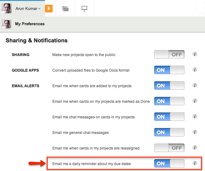
Daily Email Summary
We are introducing a new user preference, set to ON by default, that lets you get a daily summary of your most pressing tasks:
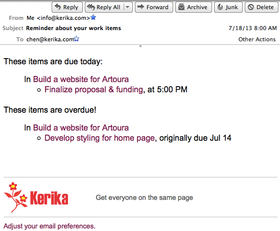
The daily email that you get looks like this example:
Example of a daily email summary of your tasks
This daily email summary will get sent to you at 6AM every day, no matter where you are: Kerika figures out which timezone you are in, and sends you the email so that it’s the first thing you look at when you wake up!
When you are looking at a task board, you can easily spot the cards that are overdue – they are marked in red – and the cards that are due today – they are highlighted in blue. Here’s an example:
Due Dates are highlighted on task boards
This next release is an important step on our way to implementing a Dashboard! Stay tuned…
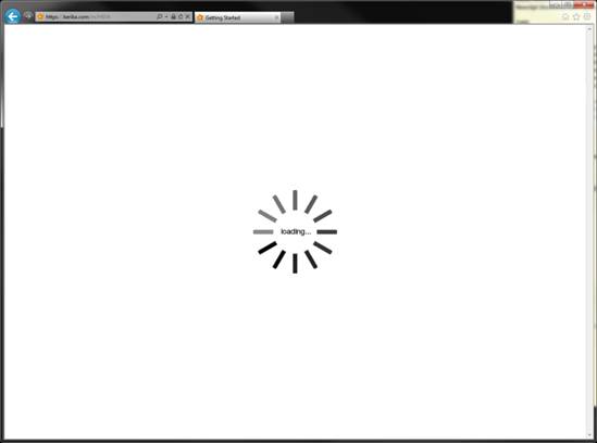
We finally tracked down a weird problem that had been affecting some Internet Explorer (IE9): Kerika wouldn’t load properly. This is what users saw:
Kerika not loading with IE compatibliity mode
The “loading…” image would just stay on the screen, forever.
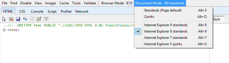
It really puzzled us when a few users started reporting the problem because we weren’t experiencing it ourselves, no matter how much we tried testing Kerika on Internet Explorer. Finally, one of our users reported the problem in a way that gave us a very valuable clue: for some reason he had inadvertently made his Internet Explorer 9 switch to “compatibility mode”. With Internet Explorer running in compatibility mode, Kerika won’t work, and neither will much of the modern Web.
Internet Explorer’s compatibility mode
The fix to this problem is simple: if any users have toggled their Internet Explorer browsers into compatibility mode by mistake (i.e. hit Alt+8 inadvertently), then please turn your IE9 back to “regular mode”.
How easy is it for users to inadvertently switch their IE browser to IE8 mode? Too damn easy! If you are trying to use the asterisk (“*”) key, you need to type Shift-8. A little carelessness on your part, and you will end up typing Alt-8 instead and switching to IE8 mode! Talk about bad UX design…
Meanwhile, we are going to make a change to Kerika in the next version that will redirect users to an explanation page on our website if the server detects that they are running in IE8 or older.
In case you are wondering what “compatibility mode” is all about, here’s the unhappy history: starting around Internet Explorer 5, which was launched in 1999 at the height of the dot-com boom and amid the fierce battle for browser supremacy with Netscape (remember them?), Microsoft adopted a strategy of getting their largest enterprise customers to create web sites that were based upon Microsoft standards, which differed substantially from what were already emerging as more open, global standards for web sites and browser behaviors.
This was based upon the old model of “owning the platform“: a strategy that had worked brilliantly for Microsoft for many years, helping them dominate one market after another, and for a long while it seemed to work well with browsers as well. Large enterprises built their pages using Active X and ASPX, and while these pages rendered just fine as long as you were inside Microsoft’s walled garden, they were not great long-term investments for these enterprises because the open Web moved onto standards like Javascript and other components of HTML5.
The walls of the garden started crumbling when Firefox came on the scene. At first, Firefox was considered an interesting hobby and Microsoft certainly paid it no attention at all — by around 2005, however, Firefox’s market share was very noticeably growing and Microsoft found that it had effectively dismantled its own browser team, having concluded prematurely that they had already won the browser war. In other words, they hung out the “Mission Accomplished” banner a little too soon.
By the time Firefox started gaining momentum, Microsoft’s IE team was down to a program manager and a couple of developers: in other words, it was the tiniest maintenance team you could imagine. Things did start to change in 2006 when Microsoft belatedly woke up to the Firefox threat, and scrambled to put the band back together again by transferring back all the old IE developers to build IE7. (The old IE team was now all over the place, with a bunch of folks having moved to Xbox which was a particularly hot place to work just then.)
When the newly reconstituted IE team tried to regain momentum in the browser market, they were stuck with Microsoft’s legacy: a large number of enterprises had built up Intranet sites and applications that were increasingly divergent from the emerging HTML5 standards. And so, the next few releases of Internet Explorer (IE7, IE8 and IE9) had to straddle the old, Microsoft-specific world and the new, HTML-5 compliant world.
Internet Explorer 8 never quite made it, but IE9 was definitely better. However, Microsoft still isn’t completely free of the past, as this chart shows:
Internet Explorer Market Share
There’s still a lot of old IE out there, which is scary when one considers that these old versions are not even getting security patches any more. (The 6.21% of the world that’s running IE6, for example, must be fueling all sorts of botnets!)
Until Microsoft can get free from its own past, “compatibility mode” is likely to stick around.
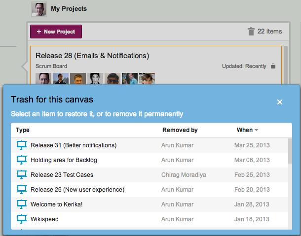
We have always had a Trash (or Recycle Bin) at every level of Kerika: anything that you delete goes into a Trash that’s associated with that view, so that if you make mistakes you can easily recover from them.
But, the way to retrieve deleted projects was not very clear: the functionality was there, but it was kind of buried so we are making that easier to find and use:
Projects Trash
The Trash icon shows you how many deleted projects you can retrieve: this includes all projects that you, or anyone else deleted, where you were a Project Leader or Team Member.
This means that you can retrieve projects that were deleted by mistake by other Team Members!
It’s a pretty neat feature, and it works as you would expect:
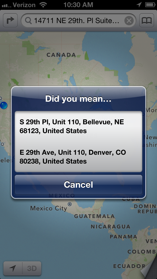
Of all the many shortcomings of Apple’s Maps program, the one that we find most baffling is that it doesn’t seem to use GPS for its most basic function: looking up an address.
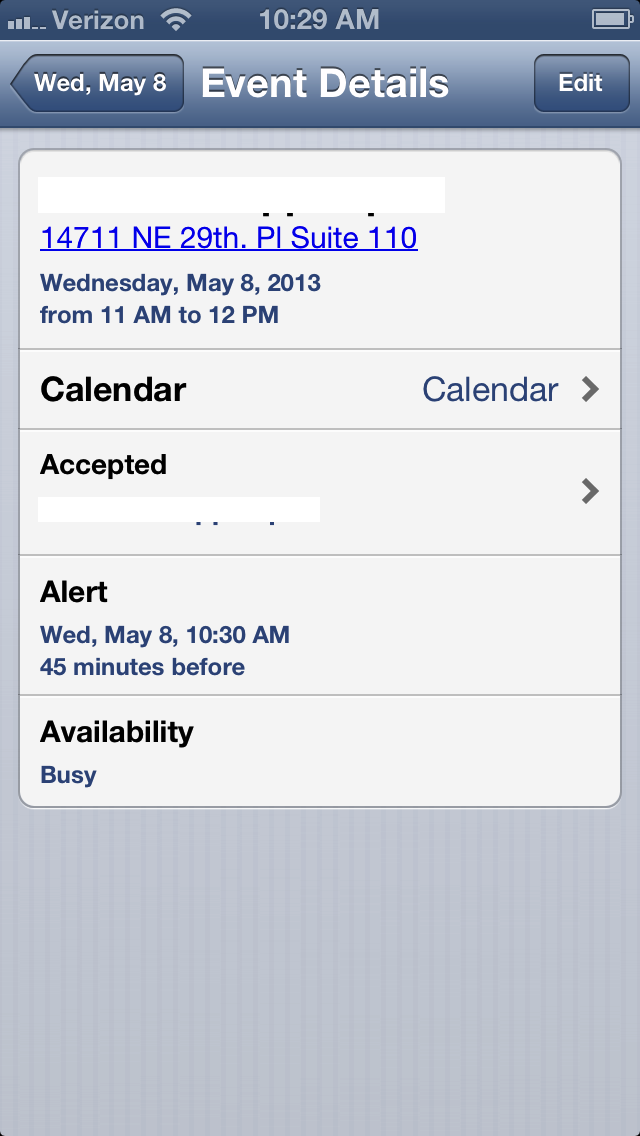
Here’s an example: we make an appointment in our (Apple-made) Calendar program on our (Apple-made) iPhone, that references the local office of one our users.
In King County, Washington, every address is based upon a giant coordinate system, so it isn’t really necessary to specify the city of an address. The “NE” in the street name refers to “North East”, not Nebraska, and no one in King County would ever think of looking up a street address by first considering Nebraska as a possibility. And, yet, that’s precisely what Apple’s Maps program suggest: rather than using the GPS that’s built into every Apple iPhone ever made, it assumes that our next appointment is probably 15 states away, rather than 15 minutes away by car:
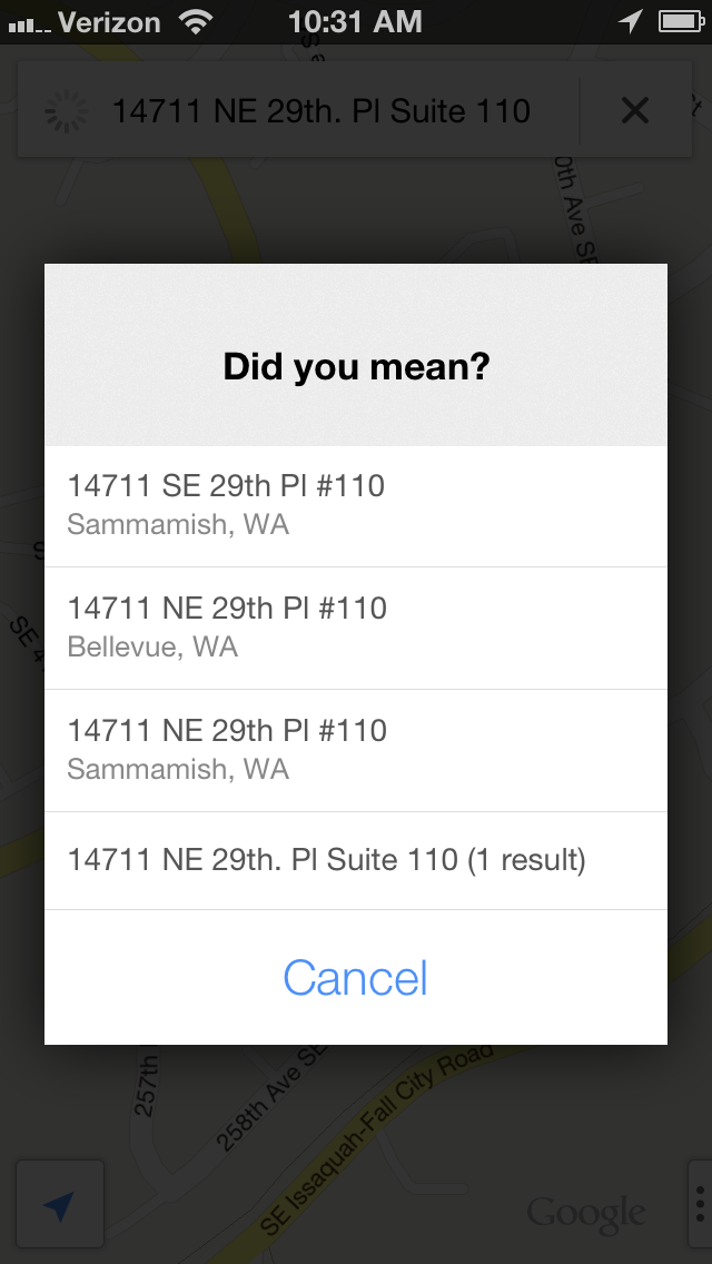
Google’s Maps program, on the other hand, is very much GPS-aware, and the suggestions it offers are locations that are closest to where the phone is, not furthest away:
Why on earth (no pun intended) would Apple produce a map program for its phones that doesn’t make use of the phone’s most important feature — it’s ability to know where it is?