We have replaced the old Filters feature for our Task Boards and Scrum Boards with a new Highlights feature that we think is better in every way!
Click on the Flashlight icon on the top right corner of the Kerika app:

And you will see this menu of actions:
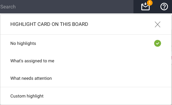
The default is No highlights. We have a couple of built-in highlights that we know you will find useful right away:
- What’s assigned to me: very useful if you are working on a large board, or with a large team, and you focus on just what you need to get done.
- What needs attention: this highlights all the cards on the board that we think need to pay attention too — items that are overdue, on hold, or flagged as needing review.
Here’s how the Highlights work:
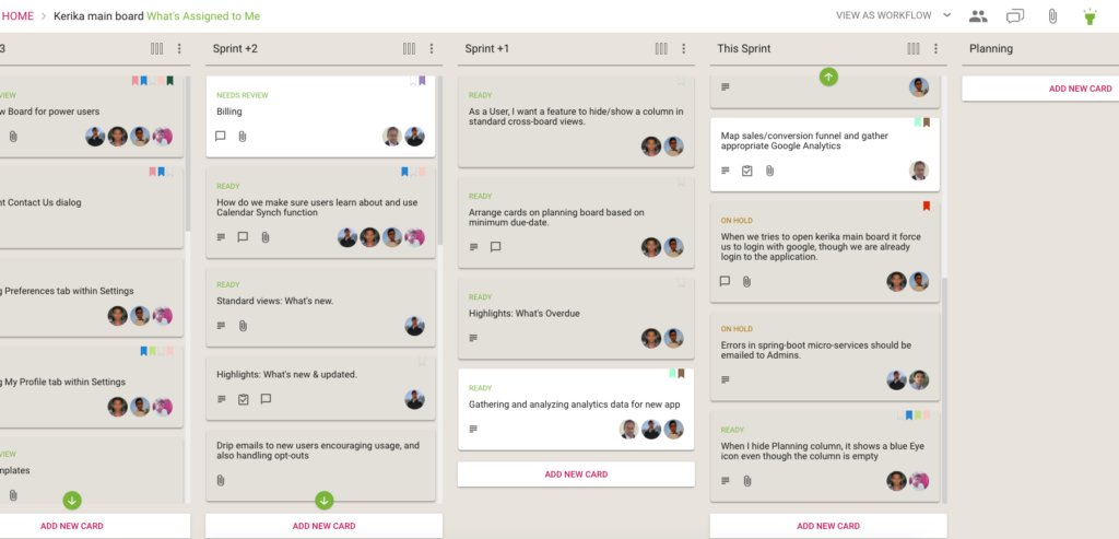
A shadow effect helps spotlight all the cards that match the highlight, making them literally pop out of the screen!
If you are working on a board with a lot of columns, there’s always a chance that something that is being highlighted is currently out of view — if, for example, it is near the bottom of a long column.
Kerika takes care of that as well: if a card that matches your highlight choice is currently out of view, a green button appears at the top or bottom, as needed, of each column to indicate that there are cards out of view that match your highlight.
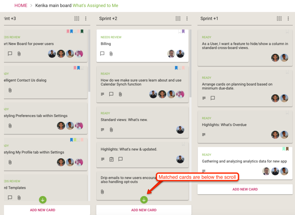
The green arrow acts as more than just an indication that you need to scroll: it is also a button that will scroll the column to show you the next card that you need to see.
(Pretty cool, huh?)
We will be adding more smart highlights in the coming weeks, but in the meantime you can also create your own custom highlights:
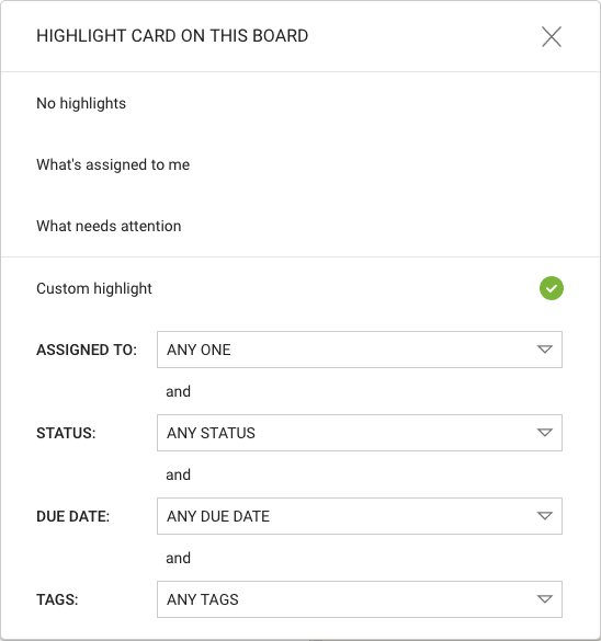
A Custom Highlight can include any combination of people assigned to cards, status, due dates and tags.
For the due dates, we have offered several smart options that are a lot easier to use than standard date pickers:
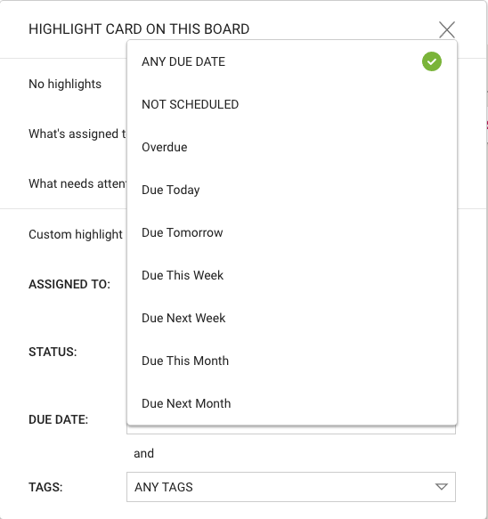
These ways of specifying due dates — like “Due Next Week” or “Next Month” — make it even easier to set up a custom highlight.
Enjoy.
