In addition to the styling changes we have made, we have also been working to make sure you always have easy access to your project updates, by improving and extending the onscreen notifications you get from Kerika. There are a whole bunch of improvements in our newest version:
- Kerika reminds you when you are hiding a column on a task board: using the Workflow button, you can always personalize your view of a task board, hiding some columns if they are not of interest. Now, Kerika makes sure you don’t forget that you have some columns hidden, by showing a small indicator above the Workflow button:

Indicator that you are hiding some columns on your task board - And, if there are updates to cards on columns that you are hiding, these will never get missed:

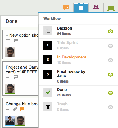
Updates on cards that I am not viewing Clicking on the Workflow button will show you clearly which hidden columns have updates:

Updates on hidden cards In the example above, the “This Sprint” and “In Development” columns are currently hidden from view, and there are updates to cards on the “In Development” column.
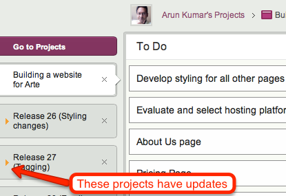
- If you have several projects underway, Kerika makes it easier than ever to know which of them have updates that you haven’t seen. This is done in two places in the user interface: first, your project tabs show orange indicators when there are unread notifications:

Updates are highlighted on project tabs And, when you are browsing your list of projects, you see orange highlights on the project cards as well, to let you know there are unread updates:
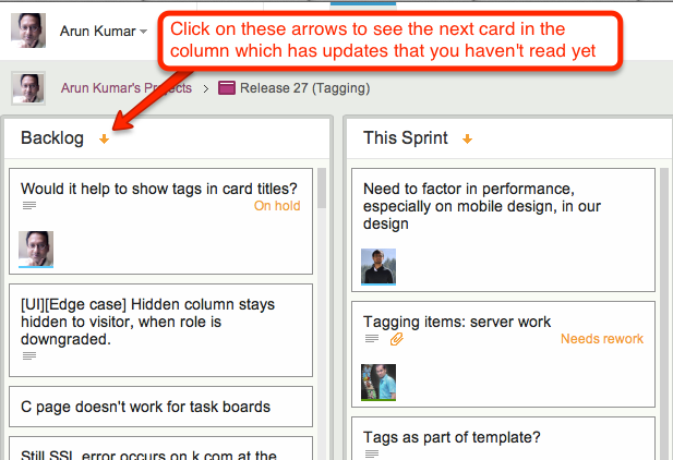
- And, finally, a new feature makes it easy for you to find updated cards within columns, which is especially useful when you are dealing with a lot of cards, e.g. in a Product Backlog:
As with all our product improvements, the Kerika team has been testing the changes extensively by “dogfooding” the software: we use Kerika for all of our work, and we have been very pleased with these improvements which have really improved our own team productivity!

