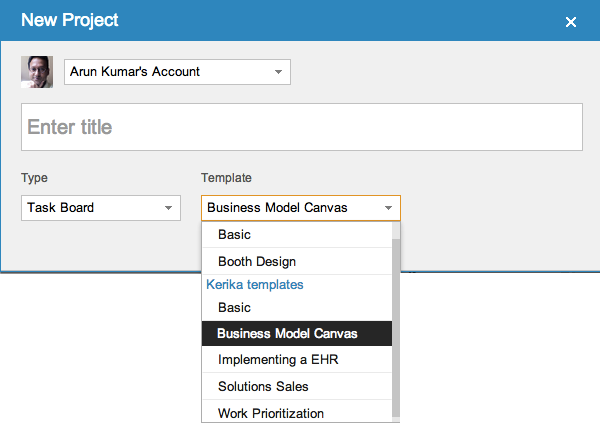
Card history on project boards in Kerika

The next release of Kerika will include a bunch of bug fixes and usability improvements, as usual, but a big new feature that we hope you will find useful is Card History: every card will contain a succinct history of everything that’s happened to it, since it was created.

Here’s an example:

Card history
Card history

Our implementation of this new feature is actually kind of clever, under the covers (of course!): rather than log every action immediately we wait a little to see if the user changes her mind about the action.

So, for example, if a user moves a card to Done, and then moves it back to another column soon afterwards, the Card History doesn’t show the intermediate action since the user clearly changed her mind about whether that work item was actually done or not. In other words, the system is forgiving of user errors: an important design principle that we have tried to adopt elsewhere as well.

Because the Kerika user interface makes it so easy to make changes to your task board, a built-in delay in the history is necessary to avoid creating a “noisy” or “spammy” history.

From a technical perspective, the most interesting aspect of creating this new feature was that we expanded our infrastructure to include Amazon’s DynamoDB.

DynamoDB is a fast, fully managed NoSQL database service that makes it simple and cost-effective to store and retrieve any amount of data, and serve any level of request traffic. This is our first foray into using NoSQL databases; up to now we had been exclusively using MySQL.


Shock, horror: Harvard divests 0.03% of its equity portfolio; Apple must be going out of business?

It isn’t hard to see example of “Apple-bashing” in the press these days: just take a look at Bloomberg’s website where the top headline in its Personal Finance section, for the past three days running, is entitled “Harvard Liquidates Apple Stake After IPhone Sales Lose Steam”.

If you read past the headline, the second paragraph lays it all out in devastating detail: Harvard has sold a grand total of $304,000 in Apple shares (about 571 shares at a price of $573), which represents 0.03% of its equity portfolio (and about 0.1% of its total endowment).


The most baffling shortcoming of Apple’s Maps

Of all the many shortcomings of Apple’s Maps program, the one that we find most baffling is that it doesn’t seem to use GPS for its most basic function: looking up an address.

Here’s an example: we make an appointment in our (Apple-made) Calendar program on our (Apple-made) iPhone, that references the local office of one our users.

The original calendar entry

In King County, Washington, every address is based upon a giant coordinate system, so it isn’t really necessary to specify the city of an address. The “NE” in the street name refers to “North East”, not Nebraska, and no one in King County would ever think of looking up a street address by first considering Nebraska as a possibility. And, yet, that’s precisely what Apple’s Maps program suggest: rather than using the GPS that’s built into every Apple iPhone ever made, it assumes that our next appointment is probably 15 states away, rather than 15 minutes away by car:

Apple Maps

Google’s Maps program, on the other hand, is very much GPS-aware, and the suggestions it offers are locations that are closest to where the phone is, not furthest away:

Google Maps

Why on earth (no pun intended) would Apple produce a map program for its phones that doesn’t make use of the phone’s most important feature — it’s ability to know where it is?

Security screening of new employees: a new process template, brought to you by HISPI

We are exploring a collaboration with the Holistic Information Security Practitioner’s Institute (HISPI) to create Kerika process templates focused on best practices in security.

The first of these is now available: how to do a security screening for new employees.

This template is available to all Kerika users, of course, and will be improved in the future as we continue to work with HISPI.


Our new version adds Tagging

As Kerika gets adopted by larger teams, working on larger and more complex projects, we have seen an increasing need to create filtered views of projects.

To make this easy, in the usual Kerika style, we are adding Tagging as the main new feature in our next release. This video will give you a quick overview of how tagging works in Kerika:

The concepts behind tagging are simple:

  • Every project board can have its own set of tags, and tags can also be added to templates if you want them to be part of your regular workflow.
  • Every Project Leader and Team Member can add new tags, apply tags, or remove tags.
  • A quick filter capability lets you easily see which items on a board match specific tags.
  • If you are working on a Scrum board, tags are integrated with your Backlogs: bringing a card in from a Backlog will automatically add the tags for that card to your current project board.
  • Tags are always converted to lower-case, and are not case-sensitive: i.e. “Server” becomes “server”. You cannot add duplicate tags to a board, so, for example, you can’t have “Server” and “server” as tags within a board since they are both considered the same.

There are a bunch of other improvements in the new version, of course, but tagging is the one you will see right away! Let us know what you think…


Facebook Home on Android: a great way to monetize the addicts

In many industries, a small proportion of the users will consume a disproportionate amount of the product, and will provide the vast bulk of a company’s profit.

This is true in the beer business for example: the beer companies have long known that a small percentage of their customers will drink a vast amount of beer every day. (This factoid used to be a staple of marketing classes in the 1980s, when it was offered as an example of the 80:20 rule — 20% of the consumers will drink 80% of the beer. Which actually amounts to about a case of beer a day…)

It is also true for Software-as-a-Service (SaaS) businesses: Forbes reported in 2011, for example, that just 4% of Dropbox’s users pay for the service, and yet Dropbox is a growing, profitable company! The other 96% contribute indirectly, by adding to the network effect and recruiting others who have a 4% probability of becoming a paid-up subscriber of Dropbox.

These percentages can seem small, but they can quickly add up when you have millions of users.

Facebook has a similar profile of users: a small number of people are logged in obsessively, and these will provide the bulk of their advertising revenues — not just because they are more like to see the advertisements, but because they are more likely to view Facebook as a trusted source of useful content.

In this context, creating Facebook Home on Android makes a lot of sense: it doesn’t matter whether a very large proportion of your user base never uses it, if you can get the addicted segment to be logged in all the time. These people will drink all the beer you are selling.

How Kerika integrates with your Google Contacts

When you sign up for Kerika, using your Google ID, you get sent to an authorization screen where Google asks whether it is OK for Kerika to access some of your Google-related information. One part of this involves access to your Google Contacts.

We often get queries about this, so we thought we would clarify something that’s really important: we don’t use your Google contacts to spam your friends and coworkers!

The Google Contacts are used for one reason only: to provide an auto-completion of names and email addresses when you are adding people to a project team. Here’s a simple illustration:

Adding people to a project team

To add people to a project team, you would click on the People button, which appears on the top-right corner of the Kerika application, and this would show a display similar to the example above, where all the members of your project team are listed (along with their roles). To add a new person, you would click on the +Member link at the top, and then start typing in a name or email address:

Enter a name or email address

As you type in a name or email address, we pass on this string to Google which tries to match it up with entries in your Google contacts. These entries start showing up immediately, and get filtered progressively as you type in more characters:

Matching names against your Google Contacts

This matching of names and emails is done by Google, which means Kerika never has direct access to your Google Contacts!

This auto-completion is a handy feature: it eliminates a major source of errors, which is mistyping email addresses. This means that the chances of you inviting the wrong person to your project are much lower!


Making sure you never miss a project update

In addition to the styling changes we have made, we have also been working to make sure you always have easy access to your project updates, by improving and extending the onscreen notifications you get from Kerika. There are a whole bunch of improvements in our newest version:

  • Kerika reminds you when you are hiding a column on a task board: using the Workflow button, you can always personalize your view of a task board, hiding some columns if they are not of interest. Now, Kerika makes sure you don’t forget that you have some columns hidden, by showing a small indicator above the Workflow button:

    Indicator that you are hiding some columns on your task board
    Indicator that you are hiding some columns on your task board
  • And, if there are updates to cards on columns that you are hiding, these will never get missed:
    Updates on cards that I am not viewing
    Updates on cards that I am not viewing

    Clicking on the Workflow button will show you clearly which hidden columns have updates:

    Updates on hidden cards
    Updates on hidden cards

    In the example above, the “This Sprint” and “In Development” columns are currently hidden from view, and there are updates to cards on the “In Development” column.

  • If you have several projects underway, Kerika makes it easier than ever to know which of them have updates that you haven’t seen. This is done in two places in the user interface: first, your project tabs show orange indicators when there are unread notifications:
    Updates are highlighted on project tabs
    Updates are highlighted on project tabs

    And, when you are browsing your list of projects, you see orange highlights on the project cards as well, to let you know there are unread updates:

    Updates are highlighted on project cards
    Updates are highlighted on project cards
  • And, finally, a new feature makes it easy for you to find updated cards within columns, which is especially useful when you are dealing with a lot of cards, e.g. in a Product Backlog:

    Finding the next updated card in a column
    Finding the next updated card in a column

As with all our product improvements, the Kerika team has been testing the changes extensively by “dogfooding” the software: we use Kerika for all of our work, and we have been very pleased with these improvements which have really improved our own team productivity!


A cleaner look to Kerika: more open, more fun, and with clearer highlights

We have some styling changes in our latest version of Kerika, which we think makes the user interface seem more open and inviting, and makes it even easier to see highlights and notifications.

The new styling is something that we had been mulling over for a while: a number of users had said that the old styling was a little “too grey” (our thanks to Yakup Trana for being among the earliest to provide this feedback). The new styling essentially reverses the old look of grey cards on a white background.

The new look for your project cards is like this:

New look for project cards

The cards are easier to read, and more clearly defined. (We have also tweaked the color of the grey border around the cards, to make it slightly darker which makes for a crisper look.) A lot of the old horizontal lines have been removed as well, which makes for a cleaner look. By contrast, this is the old styling:

Old view of project cards

The contrast between the two is quite dramatic: the new Kerika is a lot cleaner and more inviting!

The new look for your task cards is like this:

New view of task cards

Task cards are easier to read, and the important highlights and notifications are also more crisply delivered. Here, by contrast, is the old Kerika styling:

Old view of task cards

Once again, a dramatic contrast, and clearly for the better! We have been testing this new styling within the Kerika team for the past 3 weeks, and have been continually tweaking it on a daily basis. We now feel it is the best we can do! Let us know what you think.