We have been working for months now on our new mobile app, and it has been a tough slog! We are building it entirely using React (a Javascript framework) to make it possible to have a single code base across both desktop and mobile devices, and across all operating systems.
We took some time learning to be good with React: previously we had used Polymer, and before that we used JQuery, so there was some learning curve to traverse while we figured out the right way to code in React. But we are beyond that now.
For the past couple of months, it is really performance that has been our bugbear. In the spirit of “eat your own dogfood before trying to sell it”, we are using the emerging mobile app for our own work on a daily basis.
The trouble is: our main Kerika board is huge: it has usually around 600 cards, and 26 columns. This isn’t best practice, by the way, and we are not recommending you create boards like this, but we are talking here about our main board that tracks many different ideas and initiatives, not just product development.
So, when using our mobile app for our own board, we hit performance problems that few of our users are likely to encounter. We could, of course, have written us off as an edge case and ignored the performance issues, because for smaller boards (e.g. with around 20-30 cards), these performance problems completely disappear.
But, we decided to bite the bullet and get our mobile app to be good even with boards that are as wide and deep as our main board. And we have learned a lot from that experience: for example, it wasn’t the number of cards, but the number of columns that had the bigger performance impact.
We have another board with over 2,500 cards in just 2 columns (essentially a historical record of old work items) and we didn’t experience performance problems in the same way as we did with 500-600 cards over 26 columns. In fact, we found that 2,500 cards in 2 columns was much easier to handle than the latter case!
So, a lot of our efforts over the past few months have been trying to handle performance for scenarios that are out of the norm.
We are doing our testing on both iOS and Android at the same time, to catch browser-specific issues early. (We have been less diligent about Firefox testing, to be frank, but we expect clearing iOS and Android issues will effectively cover Firefox as well, making our final testing easier.)
Our end goal is a single code base that runs on any device. Right now that’s not true: our desktop experience is still using (mostly) Polymer, while our mobile is entirely in React, but we are trying to make sure we design all of the new code to work well on the desktop as well, so that we can slowly replace parts of the desktop code as we build the new mobile app.
(It’s not that our desktop code has any problems today — we are very confident about the quality of our desktop user experience — it’s just that we are too small a team to be able to split ourselves into multiple sub-teams to support every platform.)
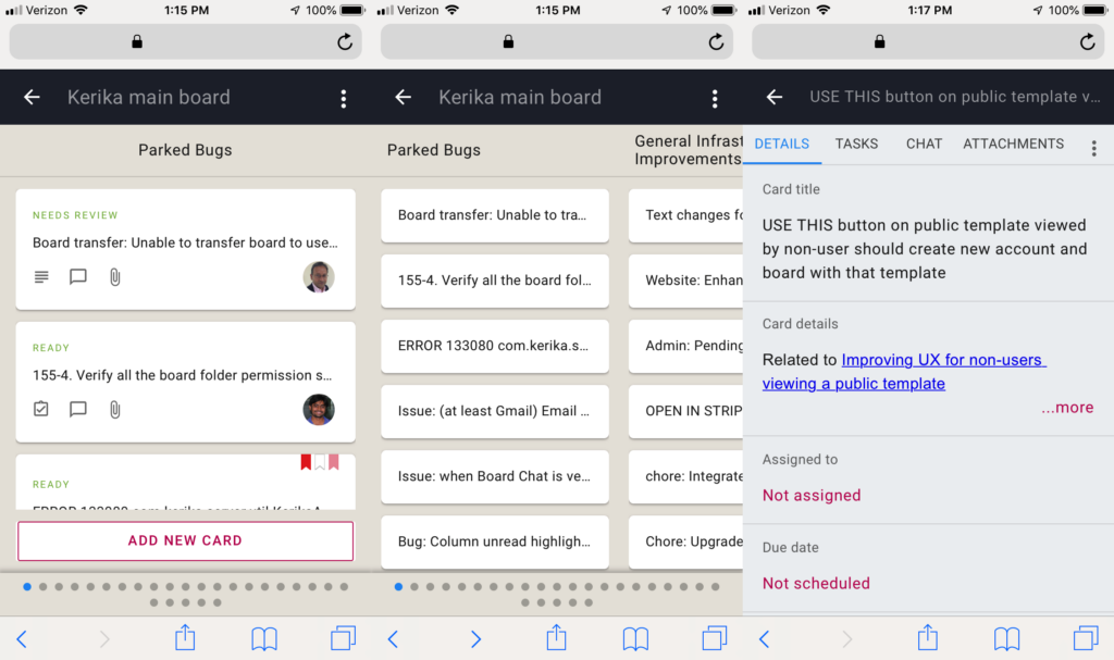
Here’s a composite view of what our mobile app looks like now: in “zoomed-in” view, in “zoomed-out” view, and card details:

Onwards!