Tag Archives: Whiteboard

About Kerika’s Whiteboards and Canvases.

Improving Kerika on iPads

Remember: you don’t need an app to use Kerika on iPads: you can simply use Safari or Chrome — just go to to kerika.com, and login just like you would on a desktop.
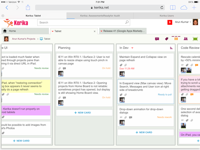
Kerika on iPad
Kerika on iPad

What’s great about building a pure HTML5 software like Kerika is that many of these improvements are also going to improve the user experience on desktops and laptops.

Here’s the laundry list:

Big changes:

  • You can add photos from your iPad to cards: you can take existing images from your photo library, or simply take a picture on the go and add it to a card.
  • We worked out a bunch of quirks related to Internet Explorer, which, unfortunately, remains sui generis when it comes to browsers.
  • In general, Kerika is now a lot smarter about dealing with laptops that have both mouse and touch interfaces.
  • We have improved performance and responsiveness, across the board.

Usability improvements:

  • We have redesigned our “Max Canvas” view so that it provides the most useful display, when you need the most space available to view a large board. In particular, you can now access Search even when you are in the Max Canvas view.
  • If a column is partially hidden, e.g. at the left- or right-edge of a Task Board or Scrum Board, clicking on the “+New Card” button at the bottom of the column will make the entire column slide into view, so you can clearly see what you are typing.
  • The Yes/No confirmation buttons on the Workflow dialog have been resized, so they are easier to press (unambiguously) with a finger on a tablet. Which, of course, improves usability for laptop users as well, in keeping with Fitt’s Law.
  • On a related note, we rescaled the calendar control used for setting due dates on cards, to make it easier to use with a finger (without making a mistake).
  • It’s easier to scroll through a long list of attachments on a card without accidentally dragging them with your finger.
  • The user interface makes it clearer how you can slide your view of a board, by swiping.
  • The panning motion, when you swipe left/right, is smoother.
  • Frequently, card history can take more than a few seconds to load if the tablet is slow or the wireless connection is slow: if this happens, the user sees an indication that the system is fetching the history.
  • Particularly on tablets, it’s easier to scroll down through long card details.
  • We have added a subtle animation on drop-down dialogs (e.g. for Workflow, Chat, Tags, etc.) to help people understand how these work.

Bugs fixed:

  • On iPad, it’s easier to edit text: the cursor shows correctly when you press and hold your finger, bringing up the “magnifying glass” that lets you move the cursor to a specific character.
  • The “hint text” shown on text boxes, e.g. “Enter the card’s description…” won’t get included when you copy/paste from the tablet’s clipboard.
  • A one-second delay in showing the list of available colors, for setting the color of a card, has been eliminated. (Yes, we care about one second delays…)
  • A one-second delay in showing the Tab Overflow button — the button that appears to the right-edge of all your open project tabs when there are too many tabs to display — has been fixed.
  • It was difficult to select a name from the list of auto-completed suggestions presented to you when you want to add someone to a project’s team. That’s been fixed.
  • A bug related to selecting the colors at the bottom of the list of available colors has been fixed.
  • If you tried to change the curve of a line on a Whiteboard or canvas, a bug that caused shadows to show up has been fixed.
  • A bug related to how the text box toolbar was displaying (the buttons for this were showing up in an untidy way if there wasn’t enough space) has been fixed.
  • On canvases, the thumbnail images of some files were showing up stretched when viewed in Safari, although they were fine when viewed using the Chrome browser; this has been fixed.
  • Also on canvases, it’s easier to swipe across the canvas without moving stuff accidentally.
  • When you are using an iPad in portrait mode (i.e. holding it vertically), card details show up properly centered.

What remains:

A ton of work on Android, unfortunately… Android tablets vary so much in terms of processor capability that even the same browser, e.g. Chrome, can behave very differently on different Android tablets & even tablets from the same manufacturer.

Some Android tablets will work better, as a result of all this work we have done, but we can’t yet guarantee that all of them will work perfectly.

There’s a similar, albeit smaller, challenge with Windows Surface machines

Windows laptops and desktops generally work fine, and so do “convertibles” (i.e. dual-screen machines where you can use the mouse or touch the screen), but Windows Surface is still causing some issues because of weirdness within Internet Explorer.


More fonts for Whiteboards

We have expanded the selection of fonts that are available for Whiteboards and canvases:

New fonts
New fonts

The list of available fonts now includes:

  • Arial
  • Armata
  • Audiowide
  • Calligraffiti Regular
  • Cinzel
  • Dancing Script
  • Indie Flower
  • Josefin Sans
  • Kaushan Script
  • Lato
  • Lobster
  • Montserrat
  • Nothing you could do
  • Oswald
  • Pacifico
  • Permanent Marker
  • Pinyon Script
  • Raleway
  • Rock Salt
  • Shadows into light
  • Times New Roman
  • Verdana


Dropping the “Render Server” feature

One of our oldest features has outlived it’s usefulness…

(No, we didn't shoot this dog. Or any other dog.)
(No, we didn’t actually shoot this dog. Or any other dog.)

We have something we call the “Render Server”: it’s a separate server from the rest of Kerika, and it’s sole purpose has been to create thumbnail images of Whiteboard projects.

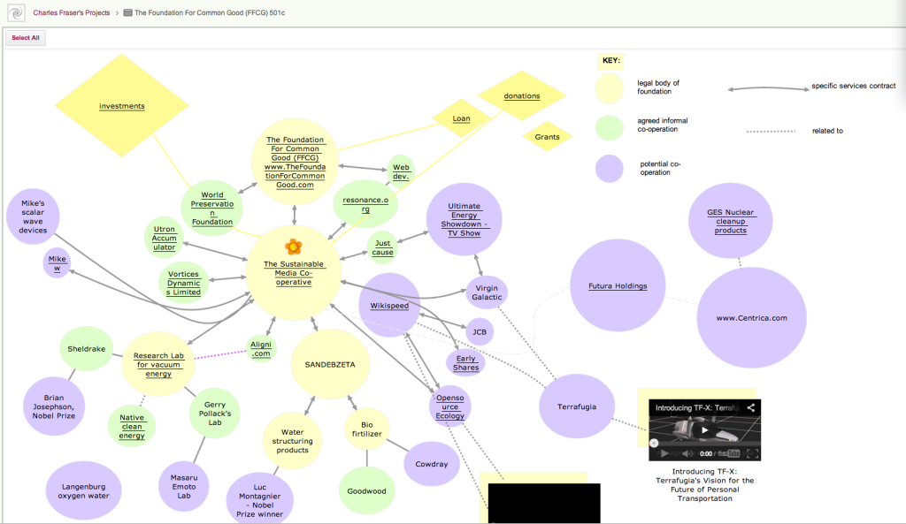
This feature was originally built to make it easier for people who created rich, layered Whiteboards — boards where canvases are contained with other canvases, like the amazing Foundation for Common Good Whiteboard project created by Charles Fraser‘s team (in the UK, and worldwide) which looks something like this:

Foundation for Common Good

This is just a partial view of the top-level of a series of canvases, layered within each other to create a rich, multi-media world.

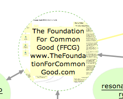
The Render Server helped people understand that some shapes on a canvas contain other canvases within them: for example, if you hovered your mouse over one of the circles on this canvas, you could see — somewhat dimly — a thumbnail of the canvas that was contained within that page:

Showing layered pages

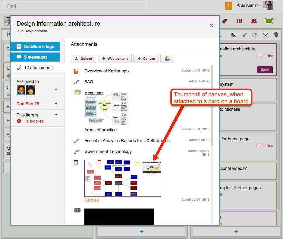
This feature was also used when you added canvases to cards on Task Boards and Scrum Boards: the card details dialog would show a thumbnail of the canvas, like this

Thumbnail image of a canvas attached to a card

This feature was cool, and made for great demos, but it was ultimately not all that useful in a practical sense.

(And that’s true for a lot of cool ideas: things that make for great demos don’t always provide great utility in regular use.)

The thumbnails were too small to be of much use on Whiteboards, and when shown on card details for Task Boards and Scrum Boards they just took up too much space.

So, it’s buh-bye to the Render Server: a cool idea, whose time seems to have passed.

(No, really: we didn’t shoot the dog! We promise!)


Our use of data stores and databases

A question we are asked fairly often: where exactly is my Kerika data stored?

The answer: some of it is in Amazon Web Services, some of it is in your Google Drive.

Here are the details: your Kerika world consists of a bunch of data, some of which relate to your account or identity, and some relate to specific projects and templates.

Your account information includes:

  • Your name and email address: these are stored in a MySQL database on an Amazon EC2 virtual server.Note: this isn’t a private server (that’s something we are working on for the future!); instead, access is tightly controlled by a system of permissions or Access Control Lists.
  • Your photo and personalized account logo, if you provided these: these are stored in Amazon’s S3 cloud storage service.These are what we call “static data”: they don’t change very often. If you have a photo associated with your Google ID, we get that from Google – along with your name and email address – at the time you sign up as a Kerika user, but you can always change your photo by going to your Kerika preferences page.

Then, there’s all the information about which projects and templates you have in your account: this information is also stored in the MySQL database on EC2.

  • There are projects that you create in your own account,
  • There are projects that other people (that you authorize) create in your account,
  • There are projects that you create in other people’s accounts.
  • And, similarly, there are templates that you create in your own account or in other people’s accounts.

Within each project or template you will always have a specified role: as Account Owner, Project Leader, Team Member or Visitor – Kerika tracks all that, so we make sure that you can view and/or modify only those items to which you have been given access.

Projects and templates can be Task Boards, Scrum Boards or Whiteboards:

  • In Task Boards and Scrum Boards, work is organized using cards, which in turn could contain attachments including canvases.
  • In Whiteboards, ideas and content are organized on flexible canvases, which can be nested inside each other.

With Whiteboards, and canvases attached to cards on Task Boards and Scrum Boards, all the data are stored in MySQL.

With cards on Task Boards and Scrum Boards:

  • Files attached to cards are stored in your Google Drive,
  • The title, description, URLs, tags, people and dates are stored in MySQL,
  • Card history is stored in a Dynamo database on AWS.

So, our main database is MySQL, but we also use Dynamo as a NoSQL database to store history, and that’s because history data are different from all other data pertaining to cards and projects:

  • The volume of history is essentially unpredictable, and often very large for long-living or very active projects.
  • History data are a continuous stream of updates; they aren’t really attributes in the sense of relational data.
  • History data is accessed infrequently, and then it is viewed all at once (again, an aspect of being a continuous stream rather than attributes).

It’s also important to note what we don’t store:

  • We never store your password; we never even see it because of the way we interact with Google (using OAuth 2.0)
  • We never store your credit card information; we don’t see that either because we hand you off to Google Wallet for payment.

Adding files to cards and canvases: in Internet Explorer 9, and other browsers

Adding files from your desktop to a card or canvas in Kerika is now easier than before: providing you are using Firefox, Chrome or Safari…

Internet Explorer 9, however, remains less elegant. And that won’t change until folks start moving off IE9 to IE10 (or, at a minimum, stop running IE9 in the dreaded “compatibility mode” which Kerika won’t support at all!)

There are several ways you can add files to your cards or canvas, all of which result in the files being uploaded to your Google Drive and shared automatically, seamlessly with your project team members:

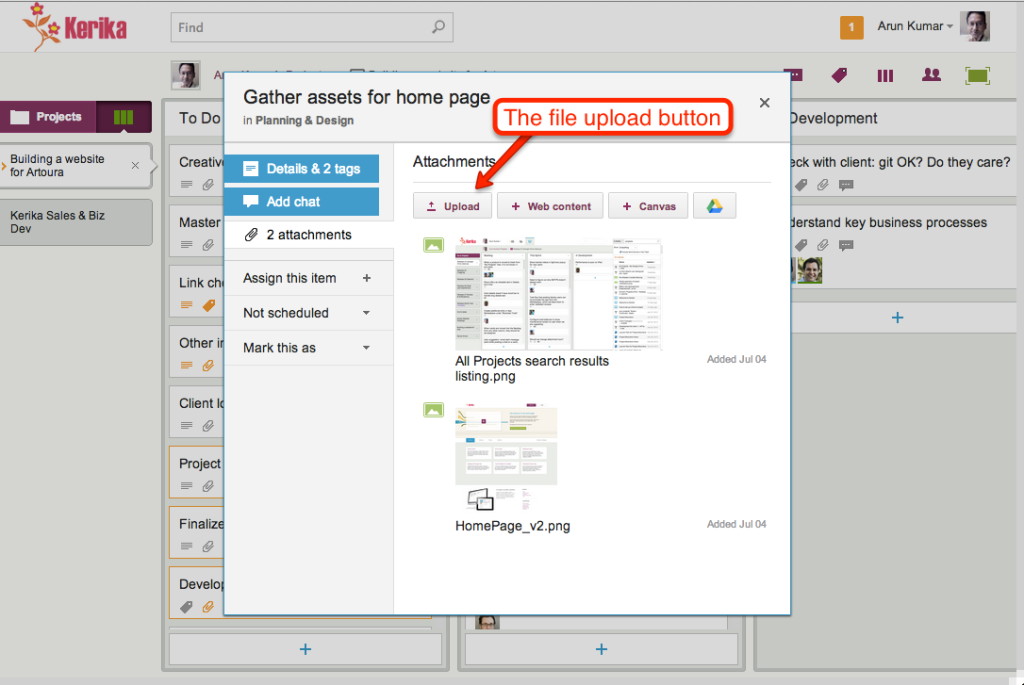
Use the upload button inside the card details display, like this:

Adding files using the File Upload button

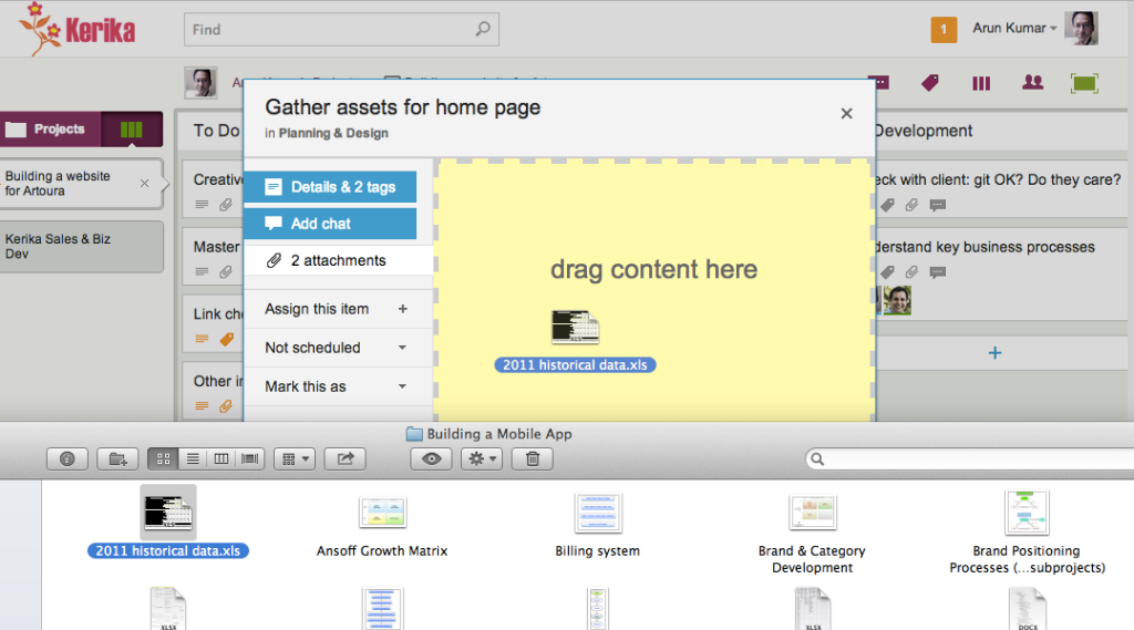
Drag and drop a file onto a card details display, like this:

Dragging and dropping onto card details

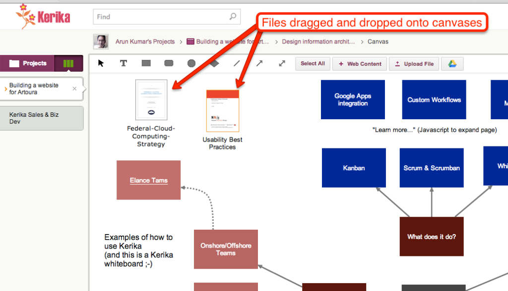
Drag and drop a file onto a canvas, like this:

Files dragged and dropped onto canvases

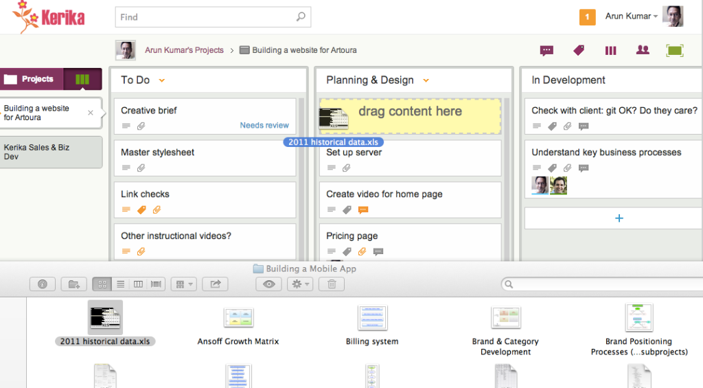
Drag and drop a file onto a card on the task board itself, like this:

Dragging and dropping a file onto a task board

All of these work on Firefox, Chrome and Safari, but with Internet Explorer 9 only the first method works: you have to click on Upload button.

There isn’t much we can do about it, since Internet Explorer’s implementation of the HTML5 standard was so erratic… Sorry.

A new template for our users: The Business Model Canvas

We have added a new template for our users: The Business Model Canvas.

The Business Model Canvas is an increasingly popular tool for startups to systematically analyze their proposed business model by identifying:

  • Key Partners
  • Key Activities
  • Key Resources
  • Value Propositions
  • Customer Relationships
  • Channels
  • Customer Segments
  • Cost Structure
  • Revenue Streams

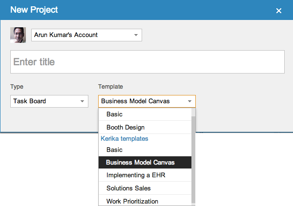
Using this template is easy: when you start a new project, you will find “Business Model Canvas” among the choices for Task Board projects:

Selecting the Business Model Canvas as the template

You can also access the template directly at https://kerika.com/m/GFXC, and click on the “Use this template” button on the upper-right corner to get started fast.

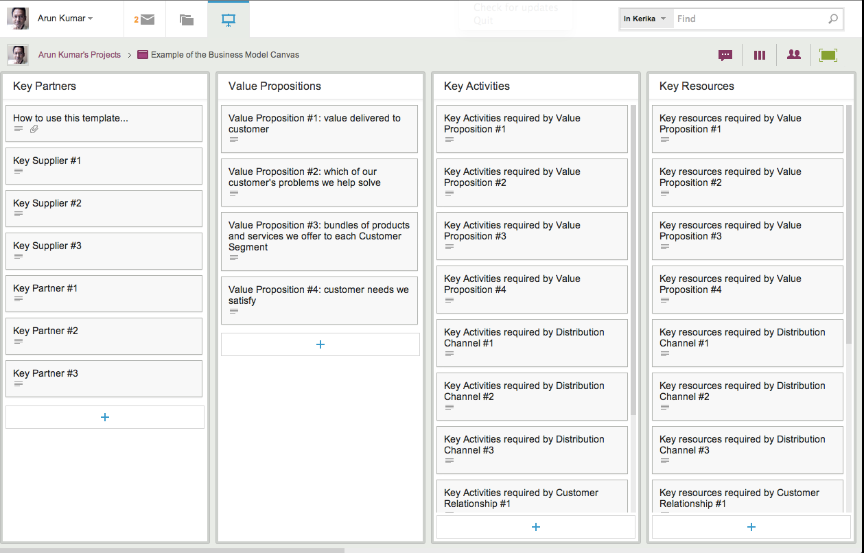
Once you start your new project using this template, your task board looks like this:

Using the Business Model Canvas
Using the Business Model Canvas (Click to enlarge)

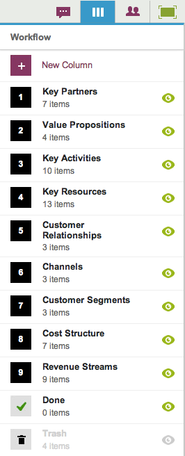
Each of the main sections of the Business Model Canvas are presented as columns on this task board, and you can customize this as you like:

Customizing the Business Model Canvas

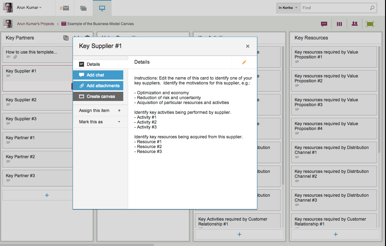
Individual cards on this task board are setup and ready for you to fill in; here’s an example:

Individual cards for the Business Model Canvas
Individual cards for the Business Model Canvas (Click to enlarge)

The card shown above, as an example, can be used to identify one of your key suppliers. For this supplier (and for all of your other key suppliers), you should identify the motivations of this supplier: why this supplier would want to do business with you? Motivations could include:

  • Supplier is seeking optimizations and economies of scale
  • Supplier is seeking to reduce risk and uncertainty
  • Supplier is looking to acquire particular resources and activities.

For each supplier, you should identify the key activities that will be performed: this can added to a simple Google Doc, and attached to this card. (We have provided Google Docs templates for individual cards.)

And, finally, for each supplier you should identify the key resources that will be acquired; this can be added to the same Google Doc, or listed separately.

In this way you can easily work through the business model canvases various steps.

Using a process template like Kerika’s is vastly superior to simply printing out a large poster of the canvas, because the cards in the Kerika process template can be used to support conversations, manage content, track status, and collaborate across multiple locations: and that’s just not possible with a paper canvas!

The Business Model Canvas is also gaining popularity within larger organizations that are seeking to adopt (and adapt?) lean startup principles, so we expect that this new template will be of interest to a wide variety of users. And, by the way, creating this template is just part of an ongoing process here at Kerika, to capture and present best practices for a variety of professions and industries!

Creating a picture board as an example of a Whiteboard project

Here’s a really great example of how you can easily create rich Web pages using Kerika:

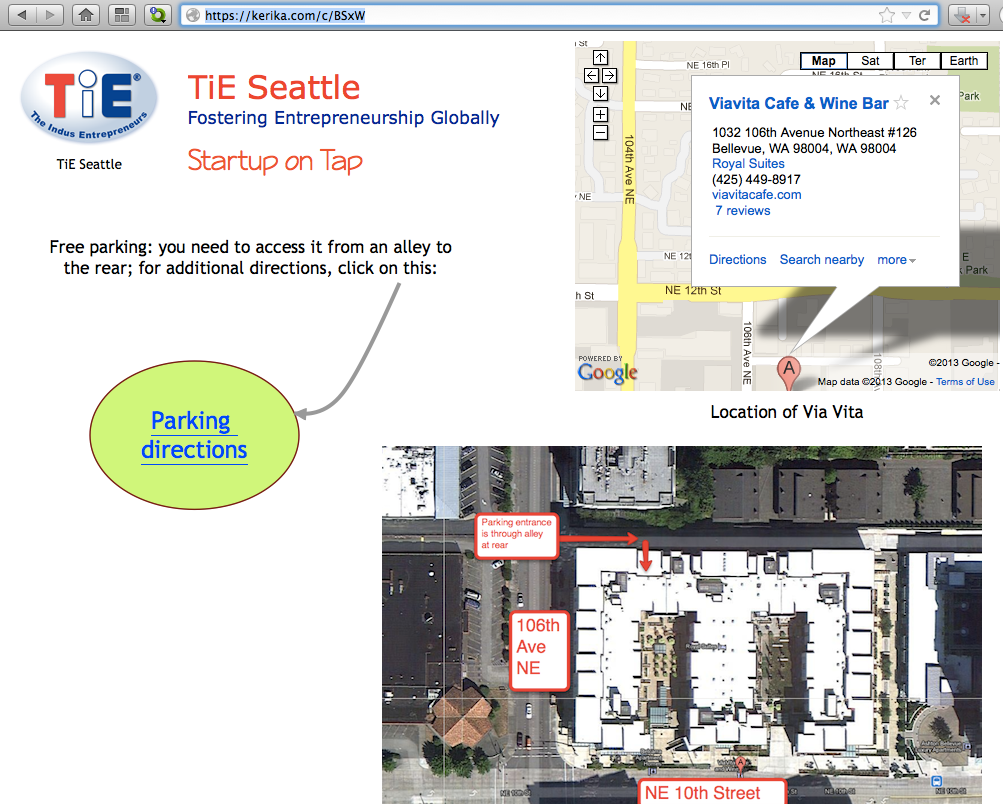
Example of a Whiteboard project

This page was created in just minutes, and can be changed in real-time. The page is an example of Kerika’s Whiteboard projects, being used by the Seattle chapter of The Indus Entrepreneurs (TiE).

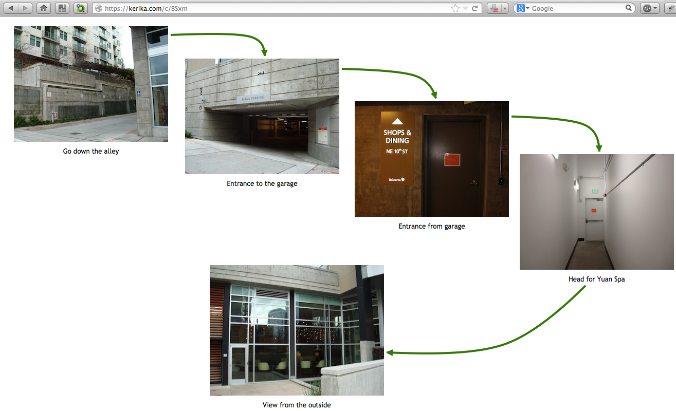
This page is also a great example of you can create pages within pages: just click on the “Parking Directions” shape, and you get taken to another page that’s organized as a picture board:

Example of a picture board

Publishing these web pages is easy and instantaneous: just take the URL of your Kerika project page, and replace the “/m/” in the middle with “/c/” and you will have a real-time Web page that anyone can access, from anywhere, even if they don’t use the Kerika software.

(In this example, the project page is at kerika.com/m/BSxW, and the published page is at kerika.com/c/BSxW)

Want to learn more about how to create these great canvases? Check out this video.

A new version, with more goodies..

We have released yet another version of Kerika, packed with useful features and bug fixes that will improve your experience with the product.

A lot of the improvements we made are “under-the-hood”, but here are a few changes that you can benefit from directly:

  • Snap-to-grid will make it easier for you to lay out shapes, documents, pictures, etc. on your Kerika pages. You can turn this on or off as you like, and adjust the size of the grid spacing, by setting your preferences: while you are using Kerika, click on your picture near the top edge of the browswer window and you can get to your user preferences.
  • Google Docs will always open in a new browser tab: this change makes for a more consistent and better user experience for everyone. Different browsers handle Google Docs differently, so to provide a more consistent experience for everyone your Google Docs will now alway open in a new browser tab rather than inside the Kerika canvas.
  • Easier ways to invite people: based upon very useful feedback from one of our users, we have added an “auto-acceptance” feature to invitations, and also redesigned the emails that get sent when people are invited to join your projects. These changes make it easier for you to invite people, and handle situations where the invitation emails get caught up in spam filters.
  • Custom colors: mix and match colors as you like, if you don’t like the 84 colors that come with the Kerika palette. If you need to use specific colors, e.g. to match your company’s branding, you can use hex codes to get the exact shade you want.
  • Faster tab switching: we improved this in a several ways, and one of them is to make sure your tabs show the page exactly as you had been viewing it previously before you switched to another tab.
  • The old “Magic Plus” button is now split into two: separate buttons to add Web content and to upload files from your computer. These buttons remain as magicky as ever, in terms of figuring out what kind of content you are adding to your Kerika pages and taking care of all the details, but now the buttons are separated out to improve usability.
  • Upload multiple files with the Upload File button: you could always add multiple files to your Kerika pages by dragging and dropping them onto the canvas; now you can grab multiple files using the Upload File button as well.
  • Merging cells in tables: a cool new feature allows you to merge cells within tables that you create. This makes it even easier to create great-looking content on your Kerika pages, with our text formatting tools.
  • Select multiple cells within the same column and apply formatting to all of them: another cool new feature for those of you who like creating formatted tables. You can select multiple cells within a text table by simply dragging your mouse across them. And, then, you can apply formatting (e.g. text color) to all of them with a single action.
  • Removing multiple rows and columns is easier: drag your mouse across several rows and columns of a table and remove them all with a single mouse click.
  • Easier to navigate large Kerika pages: if you want to drag something into a new part of the canvas, away from the current view, the canvas scrolls automatically to give you more space.

Thanks again for all your useful feedback; we have tons of improvements and new features coming up: our next version will include a number of improvements to our integration with Google Docs.

Kerika’s blocks of richly formatted text: an example of “glass box documents”

Our next release will primarily focused around the text block feature, which is turning out to be perhaps the single most popular feature of Kerika.

When we first built Kerika, the ability to put formatted text on Idea Pages was viewed as an incidental feature: we figured that people would want to draw flowcharts, and in doing so they would need to put small bits of text on the canvas to use as labels and markers. Nothing more.

So, we considered a variety of open-source programs that provided HTML editing capabilities for our initial versions of Kerika , before settling on Whyzziwig which appeared to have more functionality than we thought we would ever need…

However, as we started using Kerika ourselves, and talked extensively to our helpful users, we slowly realized that text blocks were a very helpful feature indeed: perhaps the most important feature in Kerika’s bag of tricks.

We have dubbed this the “glassbox documents” phenomenon: if you are sharing user requirements or collaborating on a design, you don’t need the full capabilities that come with Microsoft Word or Google Docs. Instead, what you really need is the ability to quickly write relatively small bits of text, perhaps a few paragraphs long, with a table or some links and pictures, and use these to mark up an Idea Page.

Here’s an example of how we used these text blocks for developing the next version of Kerika, which will contain a hugely improved text block feature:

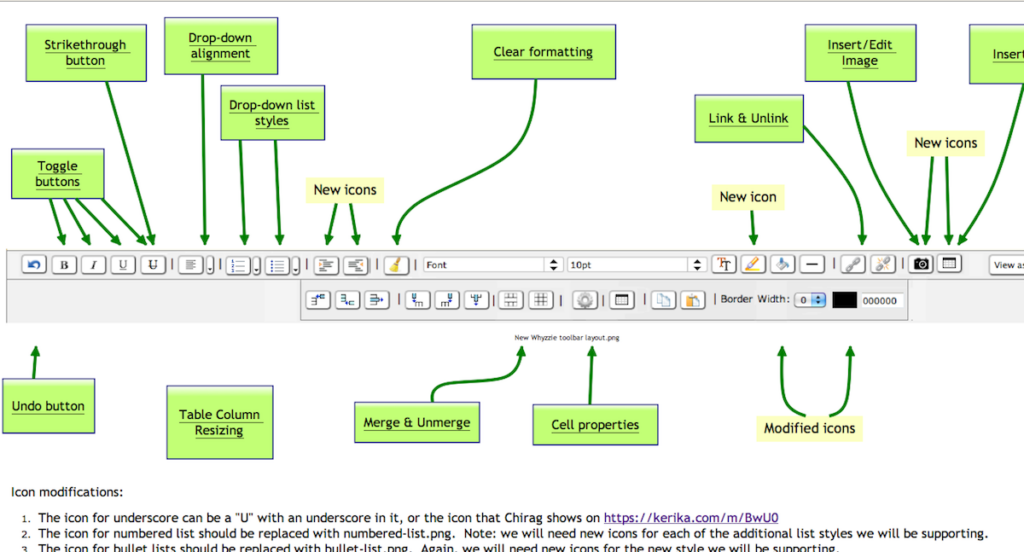
Example of using Kerika to design a user interface


This picture shows an Idea Page that we used to share ideas between the designers, users and developers about how the text block feature could be improved.

  • In the middle of the Idea Page, we have a mockup of a new text block toolbar, to replace the existing Whyzziwig toolbar.
  • Above it are various pages that define the working of each button: inside each of these sub-pages we have small blocks of text that provide the detailed requirements for a particular button, as well as design notes from the developers and test data from the QA team.
  • Towards the bottom you can see a larger text block contain additional notes about the design.

Using text blocks in this manner, to capture and share our ideas and designs, we have reached that ultimate state of perfect collaboration: even though the Kerika team is distributed between Bellevue and Issaquah in Washington State, and Gujarat and New Delhi in India, we have zero emails being sent within the team!

This is the power of a glassbox document: the ability to sharply increase productivity and shared understanding of requirements and design, by putting text directly on an Idea Page instead of hiding it inside a conventional document (which we would call a “blackbox document”).

Big improvements in usability with our latest version!

We rolled out our latest version over the weekend, and it features some big improvements in usability. As usual, feedback has come in from all sources, and is always welcome, but for this particular version we need to acknowledge the particular contributions of Alexander Caskey, Barry Smith, Seaton Gras, Andrew Burns, and Travis Woo.

We were able to incorporate most of the improvements that were identified, although one significant one couldn’t make it in this particular release. (That’s to do with providing a project-centric view, and we will talk about that in a separate blog post.)

So, here’s the bundle of goodness that is Kerika today:

  1. There are fewer buttons on the Toolbar, and we have made them more clearly visible.
  2. We combined the old Team and Share buttons into a single Share! button, since “sharing” and “managing a team” are very closely related activities.
  3. We have also dropped the old Join! button that let people ask to join projects owned by other users. This button apparently had little practical use, and dropping it helped simplify the overall user interface.
  4. The Preferences button has been moved: it is now part of the “Manage Account” drop-down menu. We have also implemented something we call “implied preferences”: now, when you set a particular style preference, such as a font style or color, Kerika assumes that this is your new preference going forward (until you change it something new in the future).
  5. We simplified the user interface by completely hiding buttons and menu options that are unavailable. For example, if you are viewing a page where you don’t have permission to make changes, the drawing toolbar on the left disappears.
  6. We have made some extensive improvements to the formatted text feature (the one that you access with by pressing the “T” button on the drawing toolbar). When you are creating or modifying a block of formatted text, the toolbar for this now appears above the canvas area, where it doesn’t get in your way, and the drawing toolbar is temporarily hidden.
  7. We have hugely expanded the selection of fonts and colors that are available, and made it much easier to change the appearance of several items on a page at the same time.
  8. A “help bar” appears when you are viewing an account to help guide you.
  9. We have added more pricing levels to support smaller teams.
  10. We have made numerous fixes to the feature that produces snapshots (thumbnail pictures) of your project pages. We got most of the kinks out; there are a small handful that we are working on this week.

We will be continuing to work on usability: over the next several weeks we will be making some changes to support a “project-oriented view” for you, as well as improvements that will make Kerika more tablet-friendly.