The latest version of Kerika, hot off the presses, contains our biggest innovation yet: if you have pages contained within pages, these will now show up as small snapshots.
Here’s an example of a set of projects, as viewed from the My Projects page of an Account:

Projects can now be viewed as little thumbnails: this lets you see, at a glance, what’s inside a particular project!
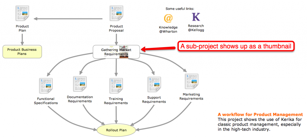
This feature extends all the way inside a project that consists of a series of nested pages. Take, for example, the Product Management page shown above: if you open it up, you will see that it contains some sub-projects within it, and these sub-projects – which have their own pages – can also be viewed as thumbnails:
This feature is probably the coolest innovation ever! It took a really long time for us to build, since we were working on this while doing all the other usability improvements, bug fixes and new features we have delivered over the past few months, and we think it will improve the overall usability of Kerika in a very big way.
There are all sorts of side-benefits to this feature:
- Now, you can upload a snapshot of the project to LinkedIn and Facebook along with your comments; the picture will contain a live link to your project.
- We have made it possible for you to embed a snapshot of a Kerika page in your own website or blog, using the Share! button that’s now more powerful than ever.
These snapshots of pages are automatically updated whenever a member of your project team makes a change to the project: we wait a couple of minutes after the last change has been made before producing a new snapshot to avoids sending you a flurry of new images.
There are also two new ways for you to embed either a Kerika page, which you can use as a regular website page, or the entire Kerika application, in your own website or blog. (This is a big enough topic to deserve it’s own blog post.)
And there’s more to our latest version!
- You can see the page URL of any project at any time (unless you are using Internet Explorer which continues to lag in its support for the HTML5 standard.)
- When you upload documents to a project page, they are now stored in your own Google Docs account, not the Google Docs account of the Project Leader. This is a big change, but one that was necessary to allow the use of the same document in multiple projects. Previously, we passed ownership of the document to the Project Leader, but this meant that ownership could pass through several people’s hands if the same document was used in multiple projects.
- The browser’s Back button (and the keyboard backspace key) work now! Yeah, it took us a while to get this working, but there were some serious hurdles that we had to overcome first, relating to the way different browsers support HTML5. More on this in a subsequent blog post.
- We have added a new diamond shape to help you draw flowcharts. We are not keen to add a lot of shapes; we want to keep the Kerika user interface clean and uncluttered, but we felt that a diamond shape could really help with flowcharts so we have added our first new shape in six months!
- Pages now automatically refresh if the application detects that there was a problem connecting to the server. The old dialog box that used to pop-up asking you to refresh your browser – which we found as annoying as you did – has gone away.
- You can now add a Twitter feed to a page by just providing “@name” as the URL. Adding Twitter feeds to Kerika pages is becoming more popular with our users, so we made the process of using the Magic Plus button simpler: just enter “@kerika”, for example, when you use the Magic Plus button to add content from the Internet and you will get our Twitter feed added to your Kerika page.
- Speaking of which, the Magic Plus button got even more magicky: now you can add content from dozens of third-party sources to a Kerika page. (You can see a handful of them listed on our website, but don’t be shy: just add any kind of URL and see if Kerika can’t automagically figure out how best to show it on your project pages.)
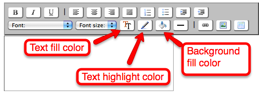
We also spent some time improving our text blocks, after seeing just how popular this feature was becoming with our users:
- We have better icons for the buttons; the old ones weren’t as intuitive as they could have been.
- We have added a new background fill color so that you can have even fancier text blocks.
We have done a ton of usability improvements and bug fixes, as usual, and we will continue to do so in the future…
- One usability improvement was to “undo” a previous improvement: we had made a change in our last version that we thought was a good idea, but it turned out that everyone liked it, even us, so we have taken that out. Now, when you resize an item on your page using the grab handles, the item resizes in just one direction rather than in all directions.
- We made it easier to add large (high-resolution) pictures to your Kerika pages. Previously, high-res pictures would appear initially with full resolution and crowd out everything on the canvas. Now, pictures appear with a maximum initial size of 640×480 pixels, and you can, of course, resize it to be larger if you like.
Finally, we have revamped our website completely and would love to get your feedback. We are featuring sample projects on our home page, and the Example pages.
We want to feature your work on our site! Create projects that are open to the public, that show your skills and share your knowledge, that related to open-source, advocacy, political action, interests in hobbies and sports… It’s all good.

