For our extensive redesign of Kerika we used the Sketch design app for the first time, transitioning way from our earlier use of Adobe’s Creative Suite.
Here’s our design effort, by the numbers:
- We created a total of 937 individual screen layouts, all of which were high-resolution and pixel-perfect.
- Each screen was designed for 1680×1050 pixels, which is the resolution of a 21″ desktop monitor although each design was subsequently tested on a 1400×800 laptop screen as well.
- Every element on every screen was laid out to its precise final size and spacing, to create a photo-realistic view of the design.
- We exclusively used vector graphics so we could scale our views for different devices and resolutions without any loss of resolution.
- Every screen was mocked using real data, rather than lorem ipsum-style fake text, so we could get a more realistic idea of how much space actual cards, columns, etc. would take.
- We used realistic storylines for all scenarios: user personas were developed and used consistently, so that, for example, the same person appeared as Board Admin on all screens.
- Every interaction between different features was considered simultaneously, so that we could guard against edge cases where the design might clash or fail when multiple user conditions were true at the same time.
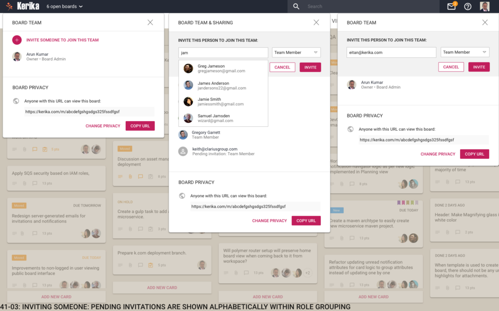
Here’s an example of a screen mockup:

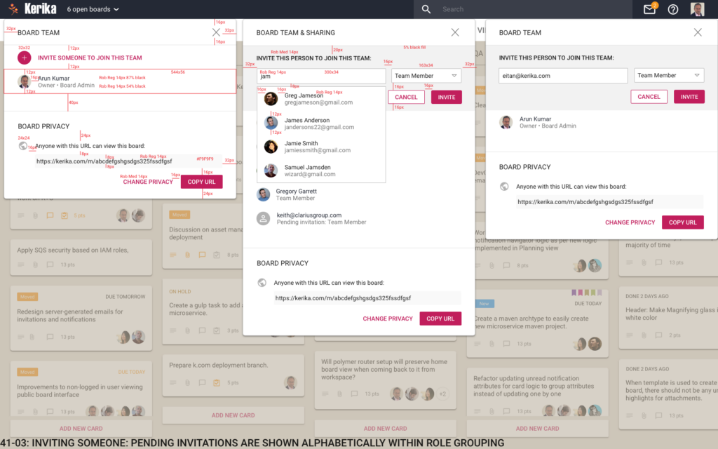
Here’s the same screen design, with dimensions marked as redlines:

Extensive use of symbols (repeating objects in Sketch) helped us ensure that we had consistency across all 937 designs, simultaneously.
We exported our icons using the Scalable Vector Graphics (SVG) format, rather than PNG or JPEG, to ensure there was no loss of resolution when we used these icons in the Kerika app.
Over 1.5 years, we went through 35 complete iterations of the design, where nearly all 937 screens were changed as we explored different concepts.
And, no, we aren’t done yet…