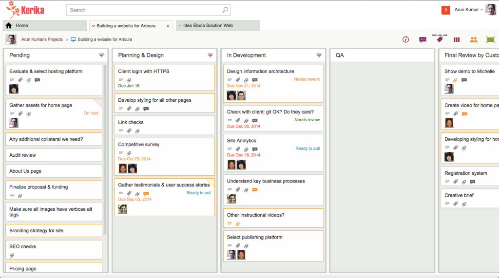
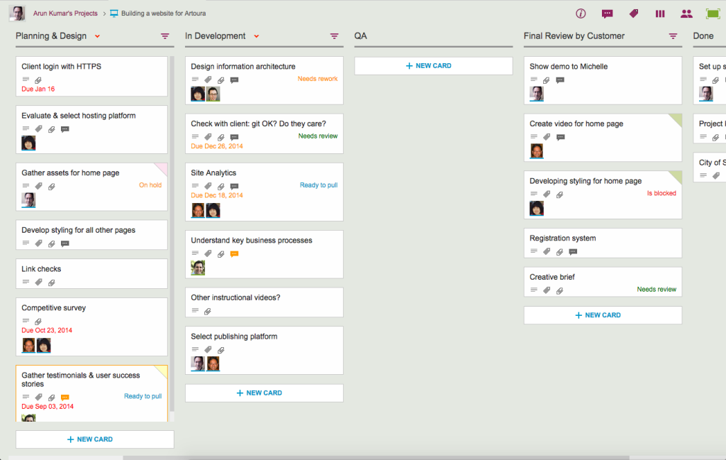
We have been hacking away at the application chrome within Kerika, removing some of the purely decorative elements that were starting to crowd out the user’s critical view of data.
Application chrome is like Kudzu: if you are not careful, what seemed like a nice-looking decoration on one part of the screen can quickly grow to overwhelm the application.

Here’s a before-and-after view of Kerika:

And here’s the same board, viewed with less application chrome, which allows the cards on the boards to stand out more:

This wasn’t just an aesthetic decision, although we are pleased with the new, cleaner appearance of Kerika: it was actually essential for our development of the new Planning View in Kerika, which lets you easily view a Task Board or Scrum Board from the perspective of Due Dates.
For the Planning View to work with workdays, it became essential to show more columns at a time, more of the time: showing at least 5 columns on most laptops became an essential requirement, and we could not achieve that solely by shrinking the width of cards — we also needed to remove the column chrome so that the board would not appear so crowded.