Vimeo is really nice: great UI, much less cluttered than YouTube.
We are putting up our videos there now.

Vimeo is really nice: great UI, much less cluttered than YouTube.
We are putting up our videos there now.
Cool! We just got our application approved, and now you can download Kerika from the Google Apps Marketplace.
The process was relatively smooth, and we are particularly impressed by the responsiveness of the Google team that deals with feedback from users — turnaround to our questions was just a few hours.
We will have a longer blog post soon with details.
A great article from the Wall Street Journal on which social media channels have the most potential to help small businesses: a survey they did resulted in just 3% picking Twitter as the most effective tool.
41% picked LinkedIn, 16% picked YouTube, and 14% picked Facebook. Google+ came in at 7%.

This matches our own sense for what works, and doesn’t, although the 7% that Google+ grabbed seems surprisingly high. Is this because of the increasingly tight integration that Google is enforcing between their search engine results and your usage of Google+? We haven’t seen any benefits at all from our Google+ efforts, and remain frustrated that we still don’t have a custom URL like plus.google.com/kerika…
Jim Collins, acclaimed author of Build to Last and other well-received books, wrote an interesting blog post about 10 years ago on the importance of creating a Stop Doing list.
Mr. Collins emphasized the importance of deciding not to continue doing something any longer as key to successful prioritization:
A great piece of art is composed not just of what is in the final piece, but equally important, what is not. It is the discipline to discard what does not fit — to cut out what might have already cost days or even years of effort — that distinguishes the truly exceptional artist and marks the ideal piece of work, be it a symphony, a novel, a painting, a company or, most important of all, a life.
He cited the example of Darwin Smith of Kimberly-Clark making the critical decision to sell off the company’s paper-mills, which provided the bulk of the company’s revenues and had been in existence for 100 years (!), in order to focus on the new consumer business of paper towels.
This article has inspired us to create a new task board template called “Weekly Prioritization”: it lets you organize your work in a different way from the traditional “To Do / In Progress / Done” taxonomy of Kanban, by using columns organized as:
Let us know how useful this proves to you! (Hat tip to Eitan Nguyen for the suggestion…)
And, as usual, we will continue building new process templates to help our disparate users with their projects.
We are moving to a simpler pricing scheme for Kerika:
Three key changes with our new pricing:
Our new pricing will continue to be very competitive, with tremendous value for your money because:
All of our competitors are offering very complicated pricing schemes that limit your freedom to create and reconfigure projects as needed. But not us.
And, as before, we will continue to use Google Checkout for our billing, which means we will never see or store your credit card information.
Along with our best wishes for this holiday season, we have a small present to put under the tree as well: a new version of Kerika will be available on Christmas Day! This new version will come with:
There are also usability tweaks:
What we are working on next:
Thanks again for all your support: the very encouraging feedback we have been getting from our users continues to fuel our efforts!
This Thanksgiving holiday, we have good cause to be grateful to all the folks who gave us detailed feedback on our new task management software, and helped us identify about 25 different improvements that we plan to make over the next week covering areas such as:
We will be updating Kerika next week, and will continue to release new versions every two weeks, and over the next month we plan to market and publicize the software more.
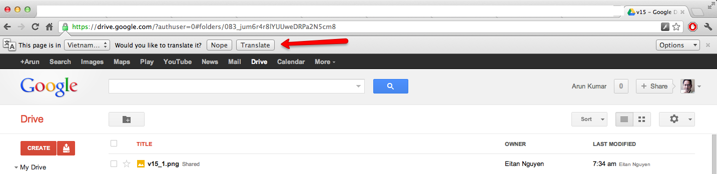
An odd problem that we cannot quite figure out: every once in a while Google’s Chrome browser will tell the user that the application is written in Indonesian, and then offer to do a translation.
We cannot figure out what’s going on with this: all of the code is written in Javascript and Scalable Vector Graphics (SVG), so why would Chrome consider it to be an Indonesian page?
The problem must lie with Google Chrome itself: now, we are noticing that it will sometimes report that Google Docs is written in Vietnamese, as this screenshot shows!
You will have a new version of Kerika tomorrow, with a bunch of great new features. One big improvement is in Kerika’s integration with Google: we are upgrading to Google’s newer, better authentication system, so you will be asked to sign-in through Google again as if you were a brand new user — but don’t worry, none of your old projects or data are affected in any way by this change! The new sign-in process consolidates in one place all the permissions that Kerika requests with respect to your Google account; they include:
There’s a long list of benefits that come with the new version of Kerika:
Thanks for your continued support of Kerika, and for providing feedback on how we can improve the product. There’s more good stuff coming your way, so keep collaborating…
Sometimes you have to admit that your bright ideas just didn’t turn out as well as you liked…
One such bright idea was to have Idea Pages show thumbnails of their contents when viewed from their parent pages. Here’s an example of this works in practice:
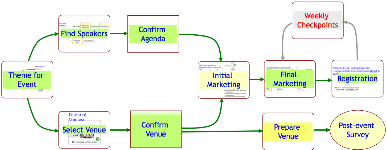
A great idea in theory; not so great in practice…
The original goal was two-fold:
In practice, however, the effect of these thumbnails showing through all the time was a splotchy, rather ugly effect. To remedy this, we are adopting a new mechanism that we hope will continue to meet our two goals: with our latest version, any item on an Idea Page that contains another page will appear with it’s text/label underlined, like this:
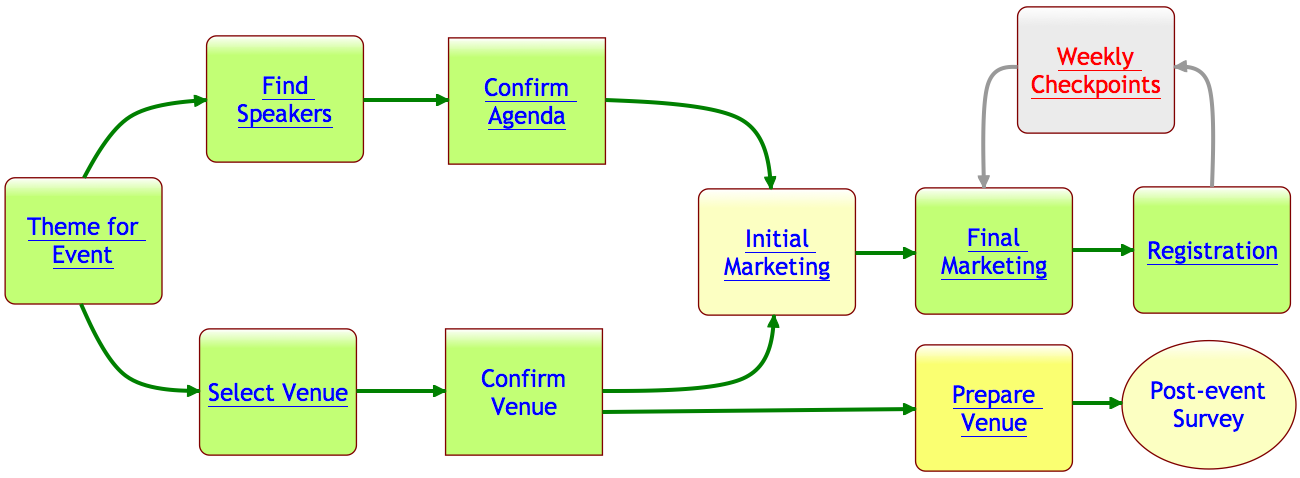
As you can see, items that contain pages now appear with their text labels underlined. If you move your mouse over a shape that has underlined text in its label, you see a thumbnail appear as before:
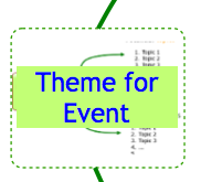
Selecting the shape now provides a green “+” button: this lets you open the page contained within that shape.
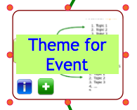
This new green “+” button also appears on shapes that don’t contain any pages within them: in that case, clicking on the “+” button lets you create a new page that is contained within that shape.
In effect, the old double-click mouse operation has been replaced with a green “+” button that appears when you select a shape with a single mouse click.
We hope you find these changes helpful; we earnestly seek your feedback!