Our newest update to Kerika serves up a rather long list of changes; the two big areas for improvement were:
- We have updated our integration with Google Apps Marketplace to use OAuth 2.0, since Google is retiring its OAuth 1.0 implementation.
- We have made a bunch of improvements for using Kerika on iPads, with the Safari or Chrome browsers. (We still need to work on Android tablets, which, unfortunately, present too much variety…)
The OAuth 2.0 upgrade and iPad improvements are described in previous posts; here we want to highlight some of the other changes and improvements we made with this new version:
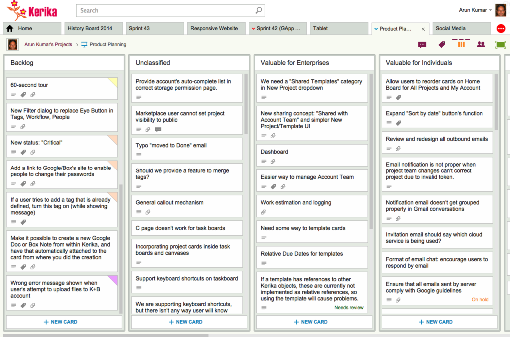
- We have changed the way colors show on cards, on Task Boards and Scrum Boards to make them more usable:
In addition to being less distracting, this new design will enable us to expand the palette of colors we can offer: the old design restricted us to only the lighter pastel colors.

- We have redesigned our “Max Canvas” view so that it provides the most useful display, when you need the most space available to view a large board. In particular, you can now access Search even when you are in the Max Canvas view.We have improved security, by implementing secure cookies.
- We have updated a whole bunch of icons, particularly for the canvas (Whiteboard) feature, to make our styling more consistent with the Metro design language we have adopted.
- We added some subtle animation effects to improve usability. (So subtle, in fact, that you might not even notice them if you are an existing Kerika user, which is just what we want.)
In terms of infrastructure and other under-the-hood improvements, we have expanded our use of JUnit automated tests and done a bunch of bugs fixes, as usual.
There’s a lot of improvements being done on Kerika, and at a very fast rate. Make sure you subscribe to our blog to keep up!