One cool feature of Kerika is that you can get a 6AM email @ndash; local time, no matter where you are @ndash; that summarizes all the tasks that are overdue for you, due today, and due tomorrow.
And, if you are a Project Leader on any team, your task summary email can also include all the items that are overdue, due today and due tomorrow across the entire team @ndash; even if you are not assigned to those cards. (It’s an easy way for Project Leaders to plan their day.)
Now, these emails got a little smarter: if you move a project to Trash that still has outstanding due dates on cards, these are no longer included in your task summary email.
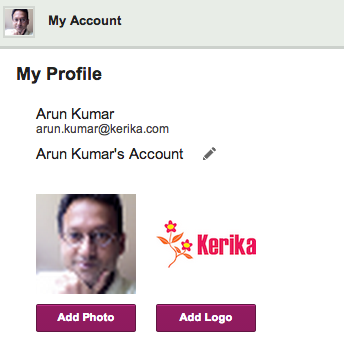
We have always offered all users, including people with the free Standard Accounts, the ability to customize their accounts, and now we are making that a little easier.
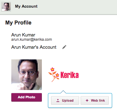
For most people, the most convenient way to grab a photo or company logo is from a Web site, and that’s possible now when you customize your account.
When you click on the Add Photo or Add Logo buttons, you will now have the option to upload an image from your local computer, or grab it from a website:
A few weeks ago we introduced a new feature: if you included a URL reference in a card’s details, attachments or chat, we would fetch that Web page’s title and show that, instead of just the “raw URL”.
This turned out to be a really helpful feature, and so we are expanding it in our next version by adding logic to handle a wider variety of URLs: the new logic should make it easier to have smart references to URLs show up in your cards even when these URLs are pointing to obscure Web sites, Intranet sites, etc.
One of our oldest features has outlived it’s usefulness…
(No, we didn’t actually shoot this dog. Or any other dog.)
We have something we call the “Render Server”: it’s a separate server from the rest of Kerika, and it’s sole purpose has been to create thumbnail images of Whiteboard projects.
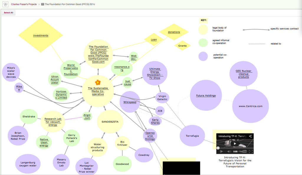
This feature was originally built to make it easier for people who created rich, layered Whiteboards — boards where canvases are contained with other canvases, like the amazing Foundation for Common Good Whiteboard project created by Charles Fraser‘s team (in the UK, and worldwide) which looks something like this:
Foundation for Common Good
This is just a partial view of the top-level of a series of canvases, layered within each other to create a rich, multi-media world.
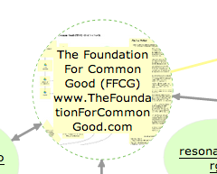
The Render Server helped people understand that some shapes on a canvas contain other canvases within them: for example, if you hovered your mouse over one of the circles on this canvas, you could see — somewhat dimly — a thumbnail of the canvas that was contained within that page:
Showing layered pages
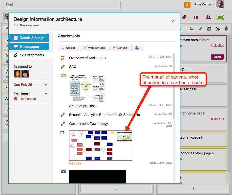
This feature was also used when you added canvases to cards on Task Boards and Scrum Boards: the card details dialog would show a thumbnail of the canvas, like this
Thumbnail image of a canvas attached to a card
This feature was cool, and made for great demos, but it was ultimately not all that useful in a practical sense.
(And that’s true for a lot of cool ideas: things that make for great demos don’t always provide great utility in regular use.)
The thumbnails were too small to be of much use on Whiteboards, and when shown on card details for Task Boards and Scrum Boards they just took up too much space.
So, it’s buh-bye to the Render Server: a cool idea, whose time seems to have passed.
(No, really: we didn’t shoot the dog! We promise!)
Our next update to the Kerika software, scheduled for release this weeekend, will have a bunch of minor styling updates — over a hundred styling changes, in fact.
Most of these are fairly subtle; it’s quite likely you will not notice over 90% of them at all, because this new release is really a UI cleanup effort rather than a big feature release.
Over the past couple of years Kerika had acquired some “UI crud”: little inconsistencies in the fonts, colors, and interactions that had build up over time as you release new features, and we have been releasing new functionality every 4-6 weeks for over 3 years now. It’s like barnacles on an otherwise beautiful wooden boat…
(Not us, but somebody else, polishing somebody else’s boat.)
For example, we found there were minor variations in shades of grey throughout the app: a light-grey shading in one place was off by an octect or two from a light-grey shading in another place. A tooltip was missing from one button here or there, or a tooltip wasn’t phrased as well as it could have been.
Taken individually, these are very trivial indeed — and, unless you examine the entire UI with a magnifying digital color meter, like we did, you wouldn’t have found these tiny inconsistencies, but they can have a cumulative effect that makes the UI seem vaguely fuzzy. (Just like barnacles, if left un-scrapped, can slow down even the most beautiful boat.)
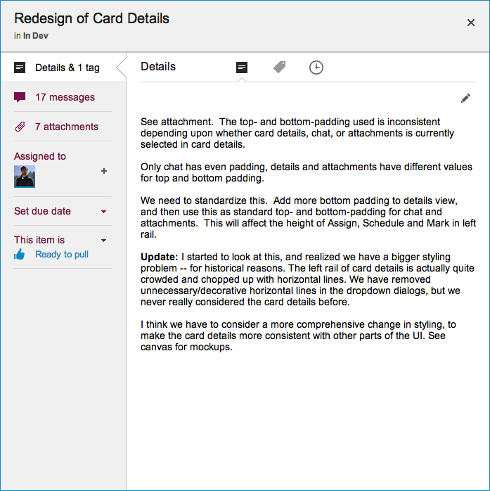
The most visible change we made is the card details display: what you see when you open up a card on a Task Board or Scrum Board
New Card Details dialog
This display is cleaner than what we used to have: it has a more consistent appearance with the rest of the Kerika user interface, and gives equal prominence to all the user interface elements within this dialog — because all of these elements are, in face, equally important to users. Our previous design gave undue prominence to Details, Attachments and Chat, which reflected nothing more than the historical evolution of the Kerika software; now, everything about a card is equally accessible.
The layout is also a lot cleaner: unnecessary decoration has been eliminated, and the overall style is more “flat” (i.e. in keeping with Microsoft’s Metro/Modern design styling, which even Apple has now adopted for iOS 7).
We currently have a function to let you Cut/Copy and then Paste a project from one account to another, but it’s starting to look like this is a bad idea because it is very difficult to implement cleanly.
The underlying problem is that a project is more than a collection of cards: it is also part of a network of people relationships, connections to other projects, etc., and these can’t all be moved cleanly from one account to another.
For example, consider a series of projects that are organized as Scrum Boards, linked to a shared Backlog within one account. If we copy and paste one of these projects to another account, what exactly should happen to that Backlog? It’s not an easy matter to simply copy the entire Backlog over as well, to the new account — that may not be the most sensible outcome in all, or even most, circumstances.
Consider an even more basic problem: a project has a bunch of folks working on it today. If you copy and paste the project to another account, what should happen to this team? These folks may not have previously been part of the new account’s team: they would have to get invited to join projects in that account, and very likely the new account’s owner would have to upgrade her account to support the larger team size.
There a bunch of conundrums like this to work through, and it’s not clear that this is even worth the considerable effort it would take to create a bullet-proof solution – how often, after all, do people need to move a project from one account to another?
If the answer is “not very often”, then it’s probably better for us to remove this functionality, rather than leave users with a less-than-great experience…
Every card, every canvas, every board in Kerika has a unique URL.
This makes it really easy to link items together, by using the URL in a card’s chat or description. And, with our latest version, Kerika makes this even easier by showing the title of the other card. Check out this quick tutorial video:
We have added a couple of new features related to dates:
Every card in the Done column, of a Task Board or Scrum Board, will show the date on which the card was marked as done: this makes it easy to see, at a glance, when work was completed on a project.
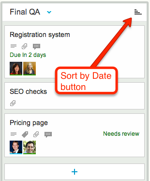
Cards that have dates assigned to them can get sorted by date.
If a column contains any cards with dates assigned to them, a “Sort by Date” button appears at the top of the column:
Sort by Date button
Clicking on this button will sort the cards that have dates:
Only cards with dates are affected: if a column contains some cards that don’t have dates, these are not affected.
You can sort in ascending or descending order.
This is a useful feature for date-driven projects, but if you are working in a pure Kanban or Scrum team, you might want to stick with (manually) sorting dates by priority, which the highest priority items at the top of the column.
Jakob Nielsen, of the Nielsen-Norman group, is an old hand at Web usability – a very old hand, indeed, and one whose popularity and influence has waxed and waned over the last two decades.
(Yes, that’s right: Mr. Nielsen has been doing Web usability for 2 decades!)
Kerika founder, Arun Kumar, had the good fortune of meeting Mr. Nielsen in the mid-90s, when he was just embarking upon his career as an independent consultant. The career choice seemed to have come from necessity: Mr. Nielsen has been working in the Advanced Technology Group at Sun Microsystems, and they had recently, with their usual prescience, decided to disband this group entirely leaving Mr. Nielsen unexpected unemployed.
(This was before Sun concluded there was money to be made by re-branding themselves as the “dot in dot com“. As with so many opportunities in their later years, Sun was late to arrive and late to depart that particular party.)
It must have seemed a treacherous time for Mr. Nielsen to embark upon a consulting career in Web usability, back in the mid-90s, when despite Mosaic/Netscape’s success a very large number of big companies still viewed the Internet as a passing fad. And Mr. Nielsen, from the very outset, opposed many of the faddish gimmickry that Web designers, particular Flash designers, indulged in: rotating globes on every page (“we are a global company”, see?) and sliding, flying menus that made for a schizophrenic user experience.
Despite the animus that Flash designers and their ilk have directed towards Mr. Nielsen over the past decade – an animus that is surely ironic given how Flash has been crumbling before HTML5 – his basic research and their accompanying articles have stood the test of time, and are well worth re-reading today.
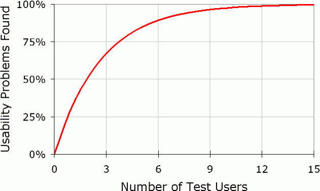
Here’s one that directly matches our own experience:
Elaborate usability tests are a waste of resources. The best results come from testing no more than 5 users and running as many small tests as you can afford.
We rolled out our latest version over the weekend, and it features some big improvements in usability. As usual, feedback has come in from all sources, and is always welcome, but for this particular version we need to acknowledge the particular contributions of Alexander Caskey, Barry Smith, Seaton Gras, Andrew Burns, and Travis Woo.
We were able to incorporate most of the improvements that were identified, although one significant one couldn’t make it in this particular release. (That’s to do with providing a project-centric view, and we will talk about that in a separate blog post.)
So, here’s the bundle of goodness that is Kerika today:
There are fewer buttons on the Toolbar, and we have made them more clearly visible.
We combined the old Team and Share buttons into a single Share! button, since “sharing” and “managing a team” are very closely related activities.
We have also dropped the old Join! button that let people ask to join projects owned by other users. This button apparently had little practical use, and dropping it helped simplify the overall user interface.
The Preferences button has been moved: it is now part of the “Manage Account” drop-down menu. We have also implemented something we call “implied preferences”: now, when you set a particular style preference, such as a font style or color, Kerika assumes that this is your new preference going forward (until you change it something new in the future).
We simplified the user interface by completely hiding buttons and menu options that are unavailable. For example, if you are viewing a page where you don’t have permission to make changes, the drawing toolbar on the left disappears.
We have made some extensive improvements to the formatted text feature (the one that you access with by pressing the “T” button on the drawing toolbar). When you are creating or modifying a block of formatted text, the toolbar for this now appears above the canvas area, where it doesn’t get in your way, and the drawing toolbar is temporarily hidden.
We have hugely expanded the selection of fonts and colors that are available, and made it much easier to change the appearance of several items on a page at the same time.
A “help bar” appears when you are viewing an account to help guide you.
We have added more pricing levels to support smaller teams.
We have made numerous fixes to the feature that produces snapshots (thumbnail pictures) of your project pages. We got most of the kinks out; there are a small handful that we are working on this week.
We will be continuing to work on usability: over the next several weeks we will be making some changes to support a “project-oriented view” for you, as well as improvements that will make Kerika more tablet-friendly.