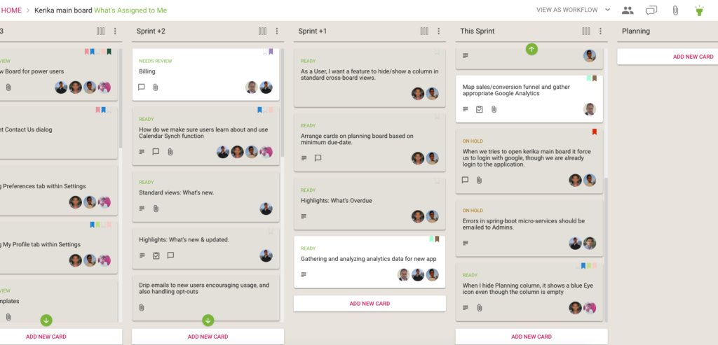
We really like the Tasks feature that we introduced recently: this has significantly cut down on the number of cards that we have to track on boards, since many items can be easily captured, assigned and scheduled as tasks rather than independent tasks.
This means we have a better, epic-oriented view of our boards; we don’t get lost in the weeds.
However, the first implementation of the styling could do with some improvement, so that’s what we did:

This makes it easier to see the names of people assigned to cards, and the due dates, more easily.
By the way, it took a surprising amount of experimentation before we settled on these colors: in Kerika’s design every color is supposed to have a particular meaning, so that colors appear in a consistent context in every instance.
For example, if we use blue to indicate a clickable link — like we do on the card details left tab, to let you switch between Tasks, Attachments, Chat, etc. — we can’t use blue anywhere else where it wouldn’t be clickable.
So, if blue is clickable in one place, it must always be clickable everywhere else.
This is easy enough, but we also have rules about using colors consistently across actions or displays that seem related, again to minimize the learning effort needed by new users.
Our green is used for Highlights in a consistent way:

The breadcrumbs includes the suffix “What’s Assigned to Me” in green, the Highlights button is green to indicate that it is in use, and a green button is used to indicate that items matching the highlight are out of view.
If we are rigorous about this, there is an internal consistency about the Kerika user experience that makes it easier to learn. But it takes a lot of discipline.
So if consistency applies a bunch of constraints in our choice of colors, so do legibility and color-blindness: we have to be careful to avoid using color combinations like red and green that are difficult for some people to distinguish. (About 8 percent of males, and 0.6 percent of females, are red-green color blind in some way or another, whether it is one color, a color combination, or another mutation.)
All of this means that it isn’t easy to pick a new color when we design!