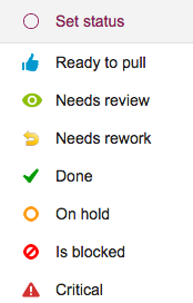
At the time we added “In Progress” as a new status value, we also removed the “Done” status, mostly because the drop-down list of status choices was becoming rather long — and “Done” was not quite like all the other choices that we were presenting for marking a card’s status.
This is what the old choices looked like:
And this is what the new status choices look like:
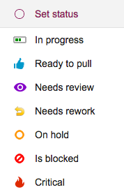
There are two small UI tweaks here that we made:
- A purple color is now used for “Needs review” — this previously was green, but green was really the best choice for “In Progress”, and we didn’t want to use the same color for two different states.
- The icon for “Critical” has been changed to look like a fire: that’s because we want to reuse the old triangle icon in the future for a great new feature that we are still brainstorming — a way to mark certain cards as “troubled”.