When we first added the ability for you to add a list of tasks to a card on a Task Board or Scrum Board, our expectation was that these tasks would be short and to the point: maybe just a few words long.
And to make the display of tasks neat and tidy inside a card’s details view, we truncated long tasks to show just two lines worth. We figured this was a reasonable restriction that would make the layout look better, and wouldn’t actually inconvenience anyone since we really didn’t expect people to create very complex tasks, that might take more than one sentence to spell out.
Well, that turned out to be a bad assumption: the tasks feature turned out to be far more popular than we expected, and we soon started getting complaints from people that didn’t like seeing their tasks get truncated to two lines.
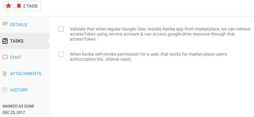
We have fixed that with our latest update to Kerika: now, all tasks will show fully, no matter how long they are. Here’s an example:

In the example shown above, the first task is long enough to spill out over three lines, and all three lines are shown.
So, there you go: tasks became a little more flexible!