If you are still using Windows 7, please use Chrome or Firefox instead of Internet Explorer 11 (or, worse yet, an even older version of Internet Explorer).
We are not in a position to support Internet Explorer on Windows 7 anymore: for one thing, we don’t have any PCs running Windows 7 anymore. And Microsoft itself has stopped selling Windows 7 several years ago, and mainstream support ended two years ago.
We realize that some of our enterprise customers are forced to stay with Windows 7 because of legacy systems that don’t work well with newer versions of Windows, but supporting Windows 7 is not something we are in a position do, or have any interest in pursuing.
With our big UI redesign, launched a couple of weeks ago, we have started using lazy loading of cards in an effort to improve performance, particularly with very large boards.
Background:
Most Kerika boards tend to be small, or moderate: up to 100-200 cards in size. A few users, however, have very large boards: several thousand cards in size!
And this is not because we have users who are tracking thousands of work items simultaneously; it’s just that some users have been continuously using the same board for years to track all their work.
For people who use the same board over several years, the number of items in the Done or Trash columns can eventually number in the thousands. Displaying such large boards was already difficult in our old architecture: we had underestimated how many cards some boards might contain, so our old design downloaded all the cards on a board every time it was opened, and then created a DOM for each card!
This meant that, for very large boards, the browser had to create thousands of DOMs before it could even display the board. This was obviously not a sustainable model.
What we did:
With our redesign, we have laid the groundwork for a better architecture using two related concepts in lazy loading:
For columns that we anticipate being very large — the Done, Trash and Backlog columns for Task Boards and Scrum Boards — the browser now fetches only a small number of cards, say 10-20, from the server. (With our old design the browser would fetch every card, for every column.)
Fetching fewer cards means the amount of traffic between the browser and the server decreased dramatically, but it didn’t solve the performance problem by itself. We also changed our browser code to reuse DOMs instead of creating new DOMs. By reducing the total number of DOMs created and maintained within the browser by the Kerika app, we are able to reduce Kerika’s overall browser footprint while significantly improving performance.
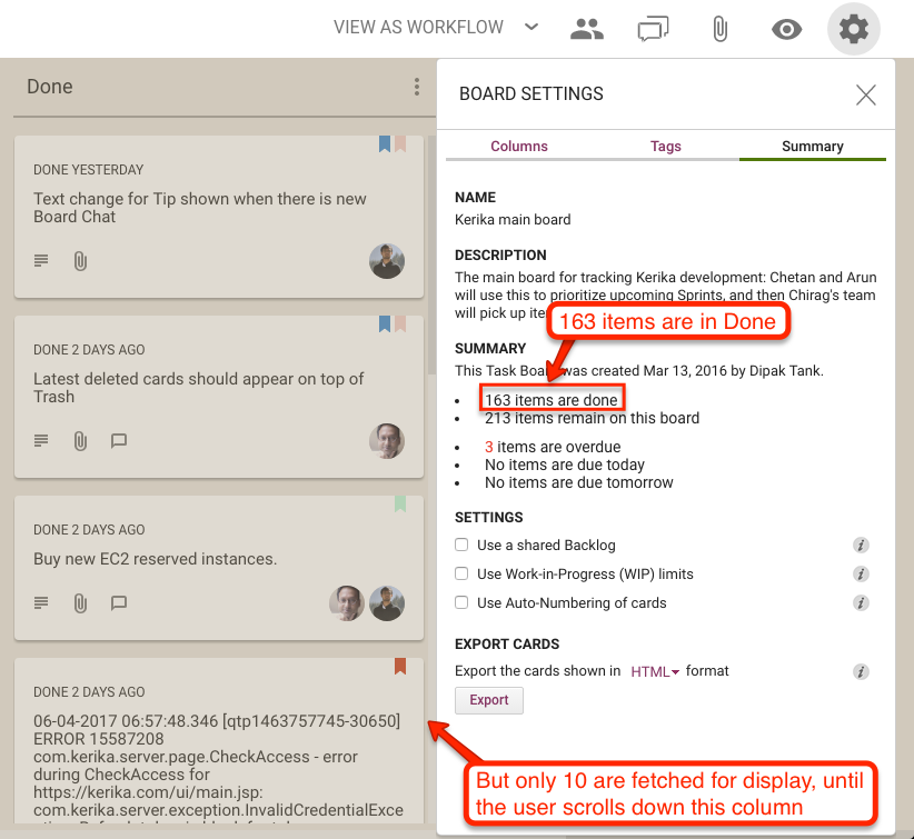
Here’s an example of lazy loading of the Done column:
Lazy loading of Done column
On this board, the Done column contains 163 cards, but when the board is opened only 10 are shown. Since these are the 10 most recently done cards, this works great for most users, most of the time.
If the user really wanted to see something that was done a long time ago, they can simply scroll down the Done column, as they would have with our old design as well.
As a user scrolls down, more cards are fetched automatically from the server. Slightly more cards are fetched from the server than are likely to be displayed, e.g. the browser may fetch 15 cards from the server even when it expects to display only 10.
This helps avoid the perception of delay when the browser needs to fetch more cards, since it will already have 5 more cards stored in memory to show as the user begins scrolling, giving it time to fetch another 15 before the user has finished scrolling.
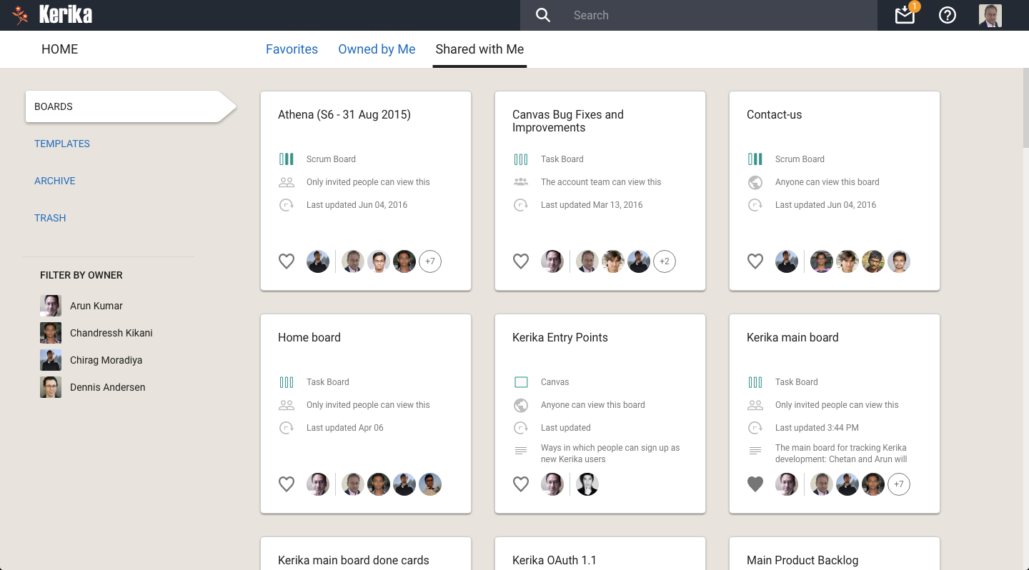
We also decided to use lazy loading on the Home page: with our new design we display more information about the state of each board than we did previously, and the cards themselves are much larger than before. This means we are unlikely to show the full set of boards to any user at any time, so lazy loading is a natural choice for this view.
Lazy loading of Home
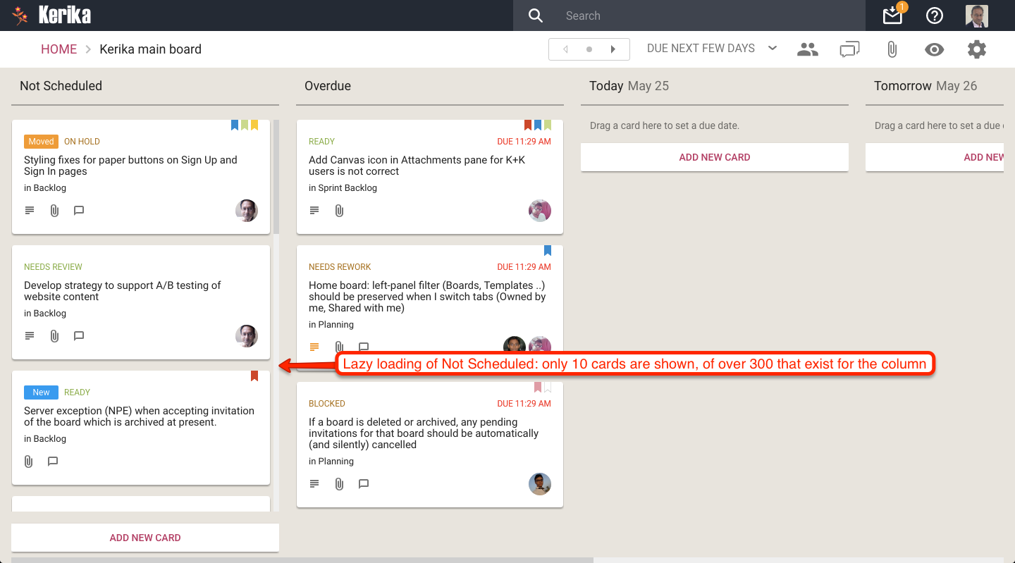
Finally, with our most recent update (launched two days ago), we have extended our use of lazy loading to include the Not Scheduled column in the Planning Views, where you can pivot your view of a Task Board or Scrum Board to see all the cards organized in terms of due dates.
Here’s an example of a board where there are a very large number of unscheduled cards:
Lazy loading of Not Scheduled
The Not Scheduled column only fetches and displays 10 cards at a time even though there are over 200 cards that are not scheduled. Since the browser (on this laptop) can only show 3-4 cards at a time, there isn’t any point in fetching all 200 cards: just fetching and displaying 10-15 at a time does the trick!
For our extensive redesign of Kerika we used the Sketch design app for the first time, transitioning way from our earlier use of Adobe’s Creative Suite.
Here’s our design effort, by the numbers:
We created a total of 937 individual screen layouts, all of which were high-resolution and pixel-perfect.
Each screen was designed for 1680×1050 pixels, which is the resolution of a 21″ desktop monitor although each design was subsequently tested on a 1400×800 laptop screen as well.
Every element on every screen was laid out to its precise final size and spacing, to create a photo-realistic view of the design.
We exclusively used vector graphics so we could scale our views for different devices and resolutions without any loss of resolution.
Every screen was mocked using real data, rather than lorem ipsum-style fake text, so we could get a more realistic idea of how much space actual cards, columns, etc. would take.
We used realistic storylines for all scenarios: user personas were developed and used consistently, so that, for example, the same person appeared as Board Admin on all screens.
Every interaction between different features was considered simultaneously, so that we could guard against edge cases where the design might clash or fail when multiple user conditions were true at the same time.
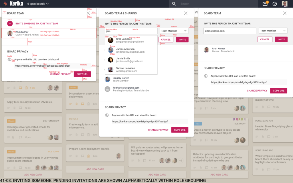
Here’s an example of a screen mockup:
Inviting someone
Here’s the same screen design, with dimensions marked as redlines:
Inviting someone (Markup)
Extensive use of symbols (repeating objects in Sketch) helped us ensure that we had consistency across all 937 designs, simultaneously.
We exported our icons using the Scalable Vector Graphics (SVG) format, rather than PNG or JPEG, to ensure there was no loss of resolution when we used these icons in the Kerika app.
Over 1.5 years, we went through 35 complete iterations of the design, where nearly all 937 screens were changed as we explored different concepts.