Building a great user experience is rarely the result of big, bold actions: more often it is the cumulative gain of a large number of very small tweaks we make to our user interface design.
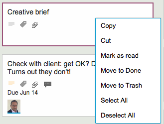
Here’s an example: the right-click menu, when you click on a card on a Task Board or Scrum Board, used to look like this…

This menu is a little crowded, and one irritating source of errors was that people would sometimes click on one of the Move choices (Move to Done, Move to Trash or Move to Backlog) when they intended to do click on one of the others choices instead.
The irritation came from the fact that these Move operations had a much bigger impact than the others: for example, if you accidentally cut a card, you can reverse that operation by selecting the cut cards once more, which would effectively “undo” the cut.
But, if you move a card to Trash or Backlog, it was a lot more hassle to get it back: you had to make sure the Trash or Backlog was currently being displayed — and in many large boards these columns are routinely hidden from view by the user — and then find and drag that card back to where it was.
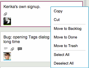
So, here’s our small UI tweak to reduce the chances of this error:

A simple visual cue, in the form of grey horizontal separator lines, helps remind the user that some of these right-click mouse operations are “more significant” than others, by creating a visual segregation of these options from others.
A simple UI tweak that helps reduce errors by our users, and one that adds up to a great user experience!