Category Archives: Usability

Posts related to product design, user experience and usability

More ways for Project Leaders to get smart email notifications when changes take place on your projects

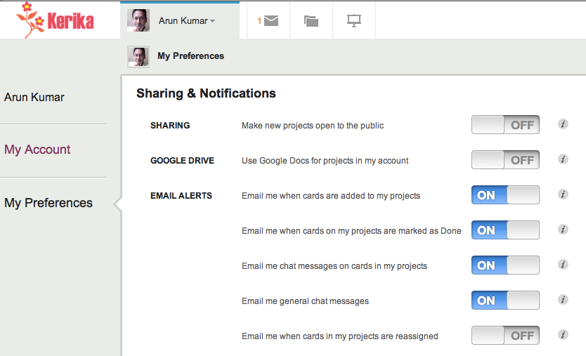
We are adding a bunch of new ways in which Project Leaders can choose to get email notifications when there are important changes taking place on their project boards; these include the following:

  • Email me when cards are added to my project: if new cards are added to a board where you are one of the Project Leaders, you can get an email notification. By default, this is turned ON: it’s a useful way for Project Leaders to know when the work expected of the team, particularly in Scrum projects, is increasing. (Team Members never get emailed when new cards are added.)
  • Email me when cards on my projects are marked Done: if any cards are moved to the Done column on a Task Board or Scrum Board, the Project Leaders can get notified by email. By default, this is also turned ON. (And Team Members never get emailed.)
  • Email me chat messages on cards in my projects: this is actually a two-part change that we are making. Previously, everyone who was part of a project got an email if there was any chat on a card. Now, this is more targeted:
    • If a card is assigned to one or more people, chat messages are emailed only to the assigned people. This reduces the overall volume of emails sent by Kerika by targeting only those folks who care the most about a particular card.
    • If a card isn’t assigned to anyone, chat messages are sent to everyone who is part of the team. Here, our assumption is that if you are writing a message about an unassigned card, you would like to get everyone’s attention with that message. For example, you might be suggesting a path forward for an unassigned card, or calling attention to an issue that isn’t assigned to anyone to fix.
    • Project Leaders can choose to be part of the chat notifications for all cards, even if they aren’t assigned to these cards, and this is a new preference setting that we have created with a default value of Off. So, if you are a Project Leader that would like to know about each and every chat message on your project boards, you could turn this preference On.
  • Email me general chat messages: this refers to chat that takes place on the board itself, that isn’t tied to any particular card. Chat that takes place on the board itself is usually intended for the entire team, so this preference setting applies to Project Leaders and Team Members. By default, this is turned On.
  • Email me when cards in my projects are reassigned: when a card is reassigned, i.e. an old team member is taken off a card, or a new person added, everyone affected by the change is notified by email: the people who were formerly assigned the card, and the new people. This is an easy way for you to know when someone expects you to handle some new work, or, conversely, if someone else is now expected to do the work that had previously been assigned to you. We have added a new preference setting for Project Leaders to be told, by email, when cards are reassigned: this is an easy way for you to know that your team has self-organized itself to handle its work differently.

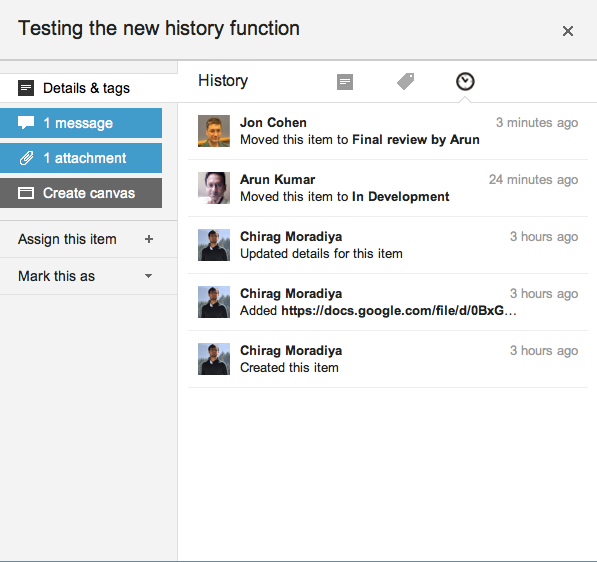
All these changes means that your Preferences page, which is always found at https://kerika.com/preferences, now looks like this:

Your new Kerika preferences page

We have been using these new features internally for the past couple of weeks, and have found them to be really useful!

Card history on project boards in Kerika

The next release of Kerika will include a bunch of bug fixes and usability improvements, as usual, but a big new feature that we hope you will find useful is Card History: every card will contain a succinct history of everything that’s happened to it, since it was created.

Here’s an example:

Card history
Card history

Our implementation of this new feature is actually kind of clever, under the covers (of course!): rather than log every action immediately we wait a little to see if the user changes her mind about the action.

So, for example, if a user moves a card to Done, and then moves it back to another column soon afterwards, the Card History doesn’t show the intermediate action since the user clearly changed her mind about whether that work item was actually done or not. In other words, the system is forgiving of user errors: an important design principle that we have tried to adopt elsewhere as well.

Because the Kerika user interface makes it so easy to make changes to your task board, a built-in delay in the history is necessary to avoid creating a “noisy” or “spammy” history.

From a technical perspective, the most interesting aspect of creating this new feature was that we expanded our infrastructure to include Amazon’s DynamoDB.

DynamoDB is a fast, fully managed NoSQL database service that makes it simple and cost-effective to store and retrieve any amount of data, and serve any level of request traffic. This is our first foray into using NoSQL databases; up to now we had been exclusively using MySQL.


The most baffling shortcoming of Apple’s Maps

Of all the many shortcomings of Apple’s Maps program, the one that we find most baffling is that it doesn’t seem to use GPS for its most basic function: looking up an address.

Here’s an example: we make an appointment in our (Apple-made) Calendar program on our (Apple-made) iPhone, that references the local office of one our users.

The original calendar entry

In King County, Washington, every address is based upon a giant coordinate system, so it isn’t really necessary to specify the city of an address. The “NE” in the street name refers to “North East”, not Nebraska, and no one in King County would ever think of looking up a street address by first considering Nebraska as a possibility. And, yet, that’s precisely what Apple’s Maps program suggest: rather than using the GPS that’s built into every Apple iPhone ever made, it assumes that our next appointment is probably 15 states away, rather than 15 minutes away by car:

Apple Maps

Google’s Maps program, on the other hand, is very much GPS-aware, and the suggestions it offers are locations that are closest to where the phone is, not furthest away:

Google Maps

Why on earth (no pun intended) would Apple produce a map program for its phones that doesn’t make use of the phone’s most important feature — it’s ability to know where it is?

Our new version adds Tagging

As Kerika gets adopted by larger teams, working on larger and more complex projects, we have seen an increasing need to create filtered views of projects.

To make this easy, in the usual Kerika style, we are adding Tagging as the main new feature in our next release. This video will give you a quick overview of how tagging works in Kerika:

The concepts behind tagging are simple:

  • Every project board can have its own set of tags, and tags can also be added to templates if you want them to be part of your regular workflow.
  • Every Project Leader and Team Member can add new tags, apply tags, or remove tags.
  • A quick filter capability lets you easily see which items on a board match specific tags.
  • If you are working on a Scrum board, tags are integrated with your Backlogs: bringing a card in from a Backlog will automatically add the tags for that card to your current project board.
  • Tags are always converted to lower-case, and are not case-sensitive: i.e. “Server” becomes “server”. You cannot add duplicate tags to a board, so, for example, you can’t have “Server” and “server” as tags within a board since they are both considered the same.

There are a bunch of other improvements in the new version, of course, but tagging is the one you will see right away! Let us know what you think…


How Kerika integrates with your Google Contacts

When you sign up for Kerika, using your Google ID, you get sent to an authorization screen where Google asks whether it is OK for Kerika to access some of your Google-related information. One part of this involves access to your Google Contacts.

We often get queries about this, so we thought we would clarify something that’s really important: we don’t use your Google contacts to spam your friends and coworkers!

The Google Contacts are used for one reason only: to provide an auto-completion of names and email addresses when you are adding people to a project team. Here’s a simple illustration:

Adding people to a project team

To add people to a project team, you would click on the People button, which appears on the top-right corner of the Kerika application, and this would show a display similar to the example above, where all the members of your project team are listed (along with their roles). To add a new person, you would click on the +Member link at the top, and then start typing in a name or email address:

Enter a name or email address

As you type in a name or email address, we pass on this string to Google which tries to match it up with entries in your Google contacts. These entries start showing up immediately, and get filtered progressively as you type in more characters:

Matching names against your Google Contacts

This matching of names and emails is done by Google, which means Kerika never has direct access to your Google Contacts!

This auto-completion is a handy feature: it eliminates a major source of errors, which is mistyping email addresses. This means that the chances of you inviting the wrong person to your project are much lower!


Making sure you never miss a project update

In addition to the styling changes we have made, we have also been working to make sure you always have easy access to your project updates, by improving and extending the onscreen notifications you get from Kerika. There are a whole bunch of improvements in our newest version:

  • Kerika reminds you when you are hiding a column on a task board: using the Workflow button, you can always personalize your view of a task board, hiding some columns if they are not of interest. Now, Kerika makes sure you don’t forget that you have some columns hidden, by showing a small indicator above the Workflow button:

    Indicator that you are hiding some columns on your task board
    Indicator that you are hiding some columns on your task board
  • And, if there are updates to cards on columns that you are hiding, these will never get missed:
    Updates on cards that I am not viewing
    Updates on cards that I am not viewing

    Clicking on the Workflow button will show you clearly which hidden columns have updates:

    Updates on hidden cards
    Updates on hidden cards

    In the example above, the “This Sprint” and “In Development” columns are currently hidden from view, and there are updates to cards on the “In Development” column.

  • If you have several projects underway, Kerika makes it easier than ever to know which of them have updates that you haven’t seen. This is done in two places in the user interface: first, your project tabs show orange indicators when there are unread notifications:
    Updates are highlighted on project tabs
    Updates are highlighted on project tabs

    And, when you are browsing your list of projects, you see orange highlights on the project cards as well, to let you know there are unread updates:

    Updates are highlighted on project cards
    Updates are highlighted on project cards
  • And, finally, a new feature makes it easy for you to find updated cards within columns, which is especially useful when you are dealing with a lot of cards, e.g. in a Product Backlog:

    Finding the next updated card in a column
    Finding the next updated card in a column

As with all our product improvements, the Kerika team has been testing the changes extensively by “dogfooding” the software: we use Kerika for all of our work, and we have been very pleased with these improvements which have really improved our own team productivity!


A cleaner look to Kerika: more open, more fun, and with clearer highlights

We have some styling changes in our latest version of Kerika, which we think makes the user interface seem more open and inviting, and makes it even easier to see highlights and notifications.

The new styling is something that we had been mulling over for a while: a number of users had said that the old styling was a little “too grey” (our thanks to Yakup Trana for being among the earliest to provide this feedback). The new styling essentially reverses the old look of grey cards on a white background.

The new look for your project cards is like this:

New look for project cards

The cards are easier to read, and more clearly defined. (We have also tweaked the color of the grey border around the cards, to make it slightly darker which makes for a crisper look.) A lot of the old horizontal lines have been removed as well, which makes for a cleaner look. By contrast, this is the old styling:

Old view of project cards

The contrast between the two is quite dramatic: the new Kerika is a lot cleaner and more inviting!

The new look for your task cards is like this:

New view of task cards

Task cards are easier to read, and the important highlights and notifications are also more crisply delivered. Here, by contrast, is the old Kerika styling:

Old view of task cards

Once again, a dramatic contrast, and clearly for the better! We have been testing this new styling within the Kerika team for the past 3 weeks, and have been continually tweaking it on a daily basis. We now feel it is the best we can do! Let us know what you think.

Google Plus doesn’t seem to like TIFF files; Mac’s Grab and Preview utilities are more annoying than ever…

We just encountered a weird bug in Google+: after being prompted over several days to upload a larger image as our cover photo, we decided to get a larger screenshot of the Kerika application.

On a Mac, there are several ways of doing this, but the most direct way is to use Mac’s Grab utility. This utility used to be a lot easier to use before Mountain Lion’s “improvements”: now, Grab disappears after you switch to another application, using the Cmd-Tab keys, which is really annoying because you have to relaunch it all the time.

But, that isn’t really our main beef right now… One long-standing annoyance of Grab is that it saves files in the TIFF format. We have no idea why: TIFF seems like a really ancient format these days.

If you try to upload a TIFF file to Google+, however, the file shows up inverted for some reason. This seems to be a weird bug on Google’s part: TIFF files, alone, are being inverted when they are uploaded.

To get around this, you have to save your TIFF-based screenshot as a PNG file (or JPEG, but then you have to make sure you don’t lose resolution in the process). This means opening the TIFF file in your Mac’s Preview utility, and then trying to save that as a PNG file.

Saving a file as a different type used to be simple with the old Preview, but no more: another one of Apple’s annoying “improvements” has been to eliminate the “Save As…” option from Preview’s File menu. So, you have to do something completely counter-intuitive: you need to duplicate the file, using the Duplicate option of the File menu, and then close that new window. Closing the new window alarms Preview enough to prompt you to save the file, at which point you are finally presented with a dialog box that lets you select the file type you want.

And then it’s back to Google+ to upload your new PNG screenshot…

Google and Apple are considered the leaders in usability, so there we have it: this is the state of the art!

The right way to do a right-click

There was a debate recently, within the Seattle Tech Startups email forum, about the pros and cons of offering a right mouse-click option within Web applications.

The right-mouse click is, of course, a desktop paradigm, so the question is: when, if ever, is it a good idea to supersede the browser menu with your own right-click menu?

Here’s where we stand on this issue:

  • Our users want it, overwhelmingly. Because Kerika’s user interface is consciously designed to mimic a desktop application, with simple mouse gestures for dragging cards across a project board or drawing on a canvas, our users naturally expect to have a right-click menu available.
  • Our menu options are better than the browser defaults. The browser defaults are generic, of course, and have little value in the context of the Kerika application. For example, a commonly used browser action might be to select some text and then search for that on the Web. Within the Kerika application, this isn’t a particular useful or commonplace action. If you want to search for something related to a project, you probably want to search within Kerika itself, rather than the entire Web.
  • The right-click menu is always supplemental, never central. We don’t offer anything on a right click menu, in any scenario, that isn’t also available through more explicit buttons or menu options. The right-click menu offers faster actions to commonplace actions, based upon user context, and it is designed for “power users” who want to absolutely minimize their mouse actions. For everyone else, regular menus and buttons offer all of Kerika’s functionality in a more explicit manner.
  • The right-click menu is always contextual, never generic. If you are going to take over the right-click, make it count: don’t offer a generic set of actions, but instead offer a highly tailored, context-sensitive menu of actions. For example, if you are working with shapes on a canvas, the right-click menu offers fast access to changing the appearance of the objects. But if you are working with Web links on a canvas, the right-click menu offers a different set of choices, like switching between a bookmark and an embedded view.
  • The right-click belongs on tablets, too. Something that’s often overlooked in this debate is that the right-click menu is easily accessible on iPads, too: a “long tap” acts as a right-click, so there’s no reason to not make use of that function.

What do you think? Let us know

Another week, another update: this time, it’s mostly styling (and better user management)

We are trying to get back to a faster rhythm of releases. Our goal is to have releases within 3 weeks: we want to complete our development and QA within 2 weeks, and then use the third week for “dogfooding” the software.

(As you might expect, we are fervent users of Kerika! Everything related to our business is done using Kerika project boards, and to make sure we are putting out the best possible product, we use a daily build of the software on a test server. This keeps us firmly on the bleeding edge of our own software development: it means that we get to try out our software in a real-life scenario — one that is absolutely mission-critical for the company! — before we pass it on to our users.)

Our newest version, released today, contains a number of under-the-hood fixes that will help us manage our growing number of users. And, we are happy to report, our users are indeed growing: we are adding new users in March at twice the rate we did in February!

From your perspective, it’s mostly some styling and minor user interface changes that will be visible. We have a better way to expose the Cut, Copy, Paste and Delete functions for cards, having heard from too many users that they couldn’t easily figure out how to delete projects, we have more uniform use of colors, and there is a right-click menu for dealing with project cards as well as task cards.

The more uniform use of colors is a step towards a larger update/refresh of our look-and-feel. We have been hearing from users that our user interface is “too grey”, and we are working on that issue. We are also looking at improved notifications, both onscreen and through emails. Stay tuned!