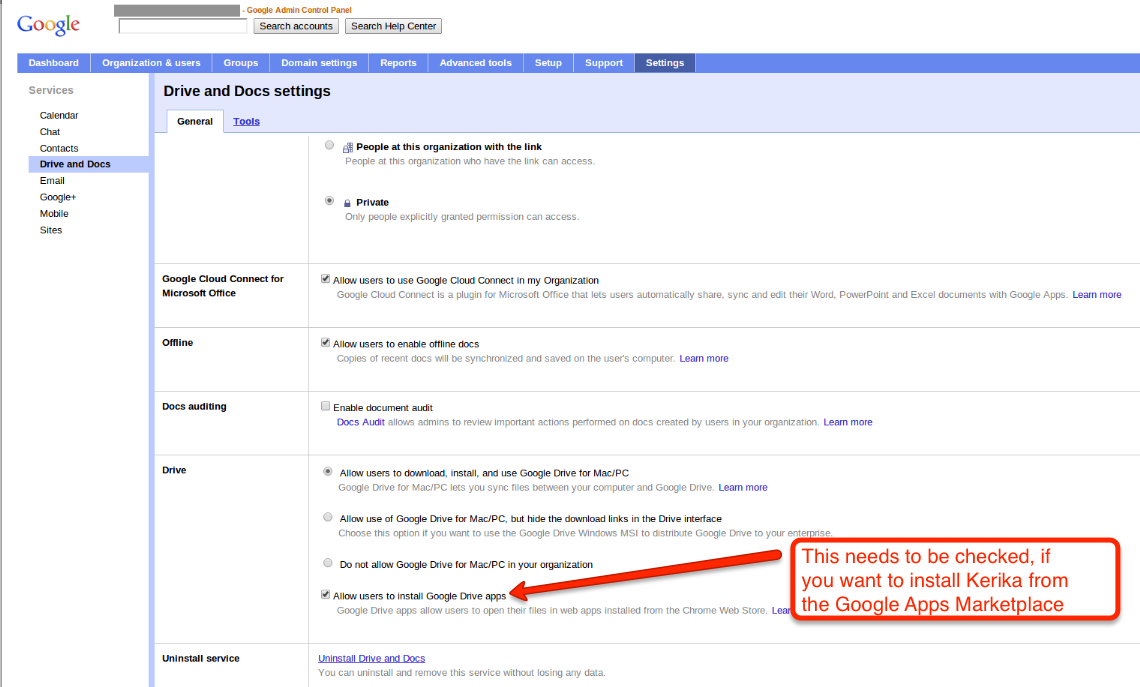
If your organization is using a premium edition of Google Apps (i.e., a paid version of Google Docs), then you can install Kerika from the Google Apps Marketplace. This can be done by any user within your Google Apps domain, provided this checkbox is checked (click on the image below to see a larger version):
Allowing users to install Kerika from the Google Apps Marketplace
This checkbox is usually checked — that’s the default setting, anyway — but some domain administrators may have turned off the ability of individual users to add Google Apps on their own initiative. If this is the situation with your organization, please contact your IT department and ask them to install Kerika for you. Or, you can always just sign in at Kerika.com or install it from the Chrome Web Store.
Our next release is mostly about improving our Google Drive integration: we are making it a lot easier for you to manage your Google Docs from within Kerika itself, so that your content has a very useful “contextual layer” on top! Here are some of the improvements we be rolling out this weekend:
The file organization inside your Google Drive will be a lot more streamlined: a single, top-level folder called “Kerika.com” will have subfolders for each account to which you have access.
Better synching between Google Drive and your Kerika projects:
If you rename a file that’s attached to a Kerika card, that new name will show up in your Google Drive as well.
If you rename a file in Google Drive, that new name will show up in your Kerika cards.
If you delete a file that’s attached to a Kerika card, that file will get moved to the Trash in your Google Drive as well.
File sharing within your Google Drive will be done at the Kerika project folder level, which means faster performance and a cleaner interface.
Duplication of file folders will be eliminated.
Content that is attached to cards can be renamed easily: if you rename a file that you attached to a card, this new name will show up in your Google Drive as well, and you will be able to easily rename Web links as well.
We are also improving the Kerika experience on iPads and cellphones: as before, you can access Kerika right from the Safari browser (or Chrome, if you prefer), without having to download any special apps, and we are adding:
Better support for “double-tapping”, similar to doing a double click on a desktop.
Better support for phones.
Improved performance.
General improvements to the user interface willinclude:
A new set of tutorial videos, all under 2 minutes in length, to help you get more out of Kerika.
Cut-and-paste of entire projects.
Any URLs that are referenced inside cards or on chat messages will appear as clickable links.
Content inside chat messages can be easily copied.
A cleaner way to customize the workflow for your project.
A cleaner layout of icons on cards.
Some cool animation effects that make it easier to understand how canvases work, particularly if your projects contain multi-layered canvases (where one canvas contains several others).
A new to mark cards as “Needs rework”.
And, a final note: this version has taken quite a bit longer (4+ weeks) that our previous versions, largely because we allowed “feature creep” to happen… We kept adding usability tweaks to the release, particularly with respect to the iPad experience, and that chewed up a whole week. We need to guard more closely against feature creep for our next release.
Coming up: we are adding tagging as a new feature, which will make it easier to create quick filtered views of large projects!
It happened mysteriously, but we suddenly seem to have a short, sensible URL for the Kerika page on Google+: it’s http://plus.google.com/s/kerika, which is a huge improvement on https://plus.google.com/110330426240622128664/posts.
We have no idea why, or when exactly, Google decided to give us a reasonable URL, but we are certainly glad it happened.
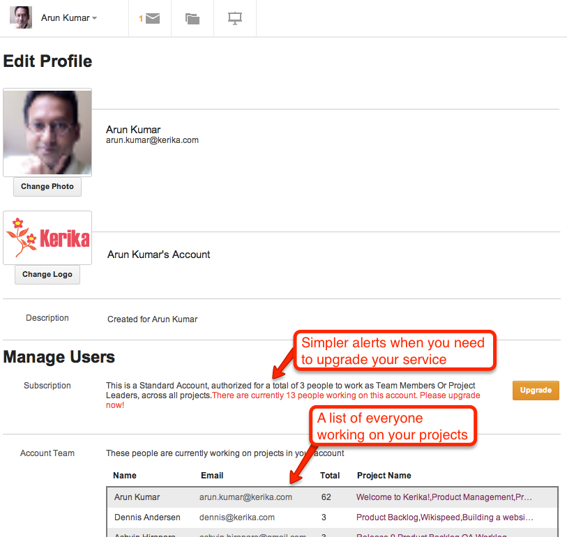
Your Kerika Account Team consists of you (the Account Owner), and all the people you have added as Project Leaders or Team Members, across all your projects. Each person is counted just once, regardless of how many projects that person works on, and Visitors are not counted at all.
When you sign up as a new Kerika user, you get set up with a free Standard Account, which lets you have up to 3 people in your Account Team — and that includes you, as the Account Owner.
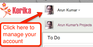
As your projects get larger and you add more people to your teams, you will need to upgrade your account to a paid Professional Account, which you can do within the application itself. Here’s how you can manage your account team, and the type of account you have with Kerika: click on your name or photograph, which appears in the top-left corner of the Kerika application.
Accessing your Kerika Account
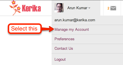
This will show you a menu of actions:
Getting to your Account details
From this menu, select Manage my Account and you will see your Account screen, right inside the Kerika application. It looks like this:
Your Account status and Account Team
If your account is currently over its allowed size, you will see an alert here. (In the example above, the account shown is authorized for 3 users, as a free Standard Account, but is currently hosting 13 users).
Below this alert is a list of everyone who is part of your Account Team. If you want to reduce the size of your Account Team, perhaps to account for changes in your organization, or perhaps simply to reduce your use of the Kerika service, you can remove people easily by selecting them from this list.
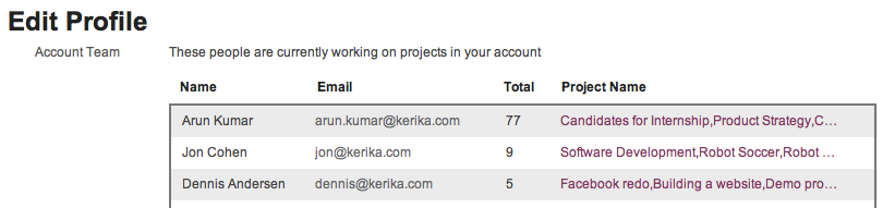
Your Account Team
Hover your mouse over that entry in the list of Account Team members, and you will see a full list of all the projects that person is working on:
All the projects someone is working on
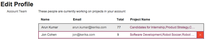
To remove someone from your Account Team, click on the “x” button at the right end of the listing:
Removing someone from Account Team
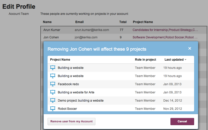
Before the person is actually removed, you will see a warning message that reminds you which projects will be affected:
Warning before removing someone from Account Team
If you are sure, go ahead and click on the Remove user from my Account button on the bottom left of this warning. (We have deliberately put it there, so you don’t click on it by accident.)
Removing someone from your Account will remove that person from every project where they are working, and this is will immediately affect your Account Team size.
My definition of a depression-era mentality wouldn’t be of a company investing a pair of tens over two years. [“tens” refers to $10 billion.]
On Einhorn’s lawsuit and Apple’s Proposal 2:
You’re not gonna see us do campaign mailing, you’re not gonna see a “yes on 2” in my front yard. This is a waste of shareholder money, it’s a distraction, and it’s not a seminal issue for Apple.
On innovation:
If there was a formula, a lot of companies would have bought their ability to innovate…
Consumers want an elegant experience where the technology flows to the background
These skills, this isn’t something you can just go write a check for. This is decades of experience
On specs:
Do you know the speed of an AX processor? You probably don’t. Does it matter? You want a fantastic experience
On iPad market share:
I have no idea what market share is, we’re the only company that really reports the units we sell.
On cannibalization:
I think if a company ever begins to use cannibalization as a primary or even a major factor of what products to go to, it’s the beginning of the end.
On iPad Mini:
I think this is gonna be the mother of all markets.
On the value of Apple Stores:
The tablet was ingrained in their mind as this heavy thing the Hertz guy held. But our store is the place to go and discover and try it out and see what it can do.
On being a good corporate citizen:
I’m very proud that we’re out front, that we have a spine on supply responsibility.
The process was relatively smooth, and we are particularly impressed by the responsiveness of the Google team that deals with feedback from users — turnaround to our questions was just a few hours.
We will have a longer blog post soon with details.
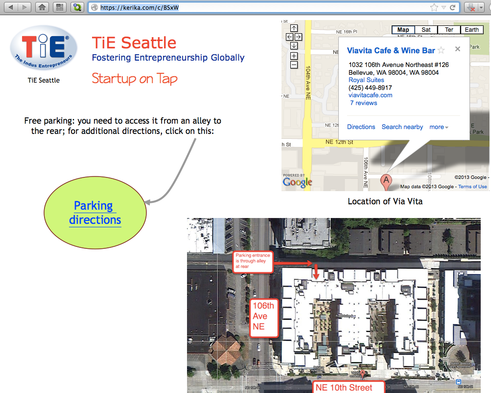
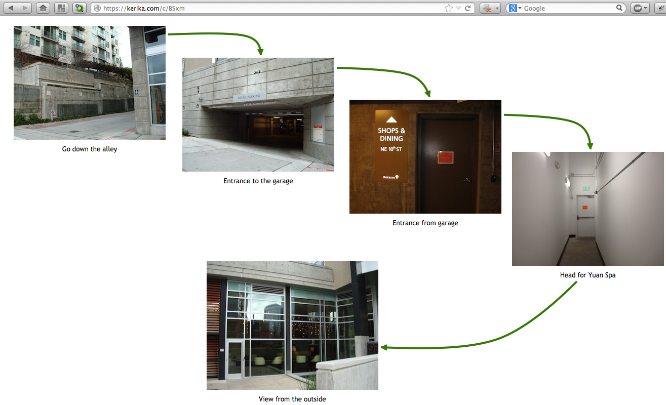
This page is also a great example of you can create pages within pages: just click on the “Parking Directions” shape, and you get taken to another page that’s organized as a picture board:
Example of a picture board
Publishing these web pages is easy and instantaneous: just take the URL of your Kerika project page, and replace the “/m/” in the middle with “/c/” and you will have a real-time Web page that anyone can access, from anywhere, even if they don’t use the Kerika software.
(In this example, the project page is at kerika.com/m/BSxW, and the published page is at kerika.com/c/BSxW)
Want to learn more about how to create these great canvases? Check out this video.
We are now listed in the Chrome Web Store (and, hopefully, soon in the Google Apps Marketplace as well). If you are using Chrome, it’s a handy way to get it installed as part of your browser’s app.
Try it out today — even if you are already a Kerika user! (You will be sent to the account you already have.) And, please rate and review the app as well.
Our latest version includes a bunch of usability improvements, as usual, but the biggest changes are to the billing mechanism and account management:
Billing: we have updated and simplified our pricing: users told us that the old multi-level pricing was a little complicated, so we have a simpler offer of $10 per user per month for Professional users.
You can still start off with a free Standard Account which lets you share your projects with two other people, and if your team is small enough — or you are using Kerika for personal task management only where you don’t have a need to share your projects with others — you will be able to stay with the free Account.
Once your account team becomes larger, you can upgrade to a paid Professional Account which will let you add as many users as you like, at a flat rate of $10 per user per month.
If you are working on an academic or nonprofit project, you can request free service which lets you have a team of up to 10 people.
Billing is done on an annual basis (our users told us that was preferable to monthly renewals, since it was easier for businesses to make annual decisions than to repeatedly make monthly approvals), and you can cancel or reduce your subscription at any time and get a prorated refund.
Account Management: it’s easier now to see all the users who are part of your account, and to remove someone from all your projects.
Easier to manage your account
We made it easier to use templates when setting up new projects: now, you can easily browse your personal library of process templates, templates created by coworkers, and templates provided by Kerika and easily set up a new project.
Even better support for distributed teams: we made a bunch of usability tweaks to the notifications you get when coworkers make changes.
We have added more content to our website and generally improved its layout. Over the coming days we will be adding more tutorial videos, in addition to the one we already have on how to use Kerika’s unique real-time collaboration canvases.
And, speaking of the canvas, we have added some cool animation effects that will help you navigate when you have canvases nested inside each other!
Our thanks to everyone who has been giving us feedback!
Next up: Kerika will be available from the Google Apps Marketplace and the Chrome Web Store.