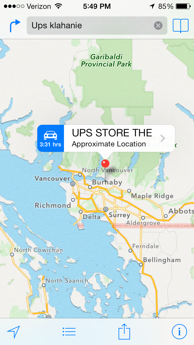
Here’s a simple screenshot that shows why Apples iOS 7 Maps is more beautiful than ever, but still slightly insane… Here’s what happens if you search for “Ups klahanie”, while standing on Klahanie Boulevard in Issaquah, Washington: Apple suggests you go to a UPS store in Vancouver, British Columbia. In other words, it finds a suitable destination for you that’s in another country altogether.
Searching for the nearest UPS store
The basic flaw with iOS Maps, as we have noted before, is that it makes no effective use of GPS data even though the software was created for use only with iPhones, all of which, always, have had GPS capabilities. This has been
But this particular search provides a clue to what’s actually going in Apple’s servers: the word “Klahanie” means “outdoors” in the Chinook language, and the Chinook people can be found across several places in the Pacific Northwest region, beyond their origins in the lower Columbia River region (where Washington State borders Oregon).
So, somewhere in Vancouver the Chinook influence has also resulted in a local street being named Klahanie, and that’s triggered Apple’s Maps to serve up that absurd result (instead of the UPS store that was less than a mile away from where the search was being done).
Like every new law, every new product rollout, there are going to be some glitches in the sign-up process along the way that we will fix.
Consider that just a couple of weeks ago, Apple rolled out a new mobile operating system, and within days, they found a glitch, so they fixed it. I don’t remember anybody suggesting Apple should stop selling iPhones or iPads or threatening to shut down the company if they didn’t. That’s not how we do things in America.
HHS Secretary Kathleen Seblius added to the metaphor of Obamacare-as-iOS7, which seems to be gaining popularity in the White House:
“Everyone just assumes ‘Well, there’s a problem, they’ll fix it, we’ll move on,’ said Ms. Sebelius. “And like many of their customers I put the ‘new’ new system on my phone and went on my merry way, but it was just a reminder that we’re likely to have some glitches. We will fix them and move on. Is this a sign that the law is flawed and failed? I don’t think so. I think it’s a sign that we’re building a piece of complicated technology, we want it to work, we want it to work right. We’ve got an incredible team working 24/7 to do just that.”
So is rolling out a new healthcare system like rolling out a new tech product? Not in these ways:
A tech company wouldn’t announce a new product 3 years in advance, with a fixed, immovable launch date and then bet the company on that launch. (Unless that company is Blackberry.)
A too-be-launched-in-3-years product wouldn’t have its specifications laid out in such minute detail, in public, and then frozen with no hope of adapting to changing circumstances.
A soft launch would precede the hard launch: just like iOS7 went into beta for several months with a select group of trained developers, Obamacare would have had its own “beta citizens.”
A beta product would be backed up by an Agile methodology, so that a fast cycle time would support quick updates and bug fixes. Yes, the State of Washington has embraced “lean government”, but has the rest of the US?
Unless governments become as agile as the best tech companies, we should perhaps not model major policy changes on product launches.
Our apologies to anyone who was affected by this bug: the email scheduler we built (about a month ago) had a bug that caused CPU utilization to periodically spike all the way up to 100%, and this in turn caused the server to temporarily freeze. We have fixed this bug, thanks in part to a couple of intrepid users, from Poland and the UK, who gave us some important clues.
By way of background: we have a scheduler program that runs periodically on the Kerika server doing various daily tasks. One such task is resending invitations that have not yet been accepted (or rejected, as the case may be); another task is providing a daily summary of each user’s outstanding tasks.
The resending of invitations takes place at a fixed time, but the creation of the daily summary is more complex, since the system sends each user his/her daily summary at 6AM based upon that user’s last known location. This means, for example, that a user based in Seattle would get his daily summary sent at 6AM Pacific Time, and a user based in India would get her summary sent at 6AM Indian Standard Time.
The bug: there was some overly complex SQL queries being used by the scheduler that was causing the server’s CPU consumption to spike all the way up to 100%. In effect, when the scheduler did one of these complex queries, nothing else could move on the server, and the result was an erratic user experience. Not good.
Why it wasn’t found before: because the scheduler ran at different times during the day, based upon the geo-location/distribution of our users, the behavior was not observed in a consistent manner. As our user base grew, the spikes occurred at different times during the day, and we didn’t make the connection.
How it was fixed: the old, complex SQL queries were taking 3-4 seconds to execute; replacing them with a couple of simple queries cut the time down to 1-2 milliseconds. That’s a 2,000X improvement!
Lessons learned: avoid complacency, even for what look like simple, routine programming. Use a profiler. And always respond to user complaints within 24 hours or less, like we always have.
Adding files from your desktop to a card or canvas in Kerika is now easier than before: providing you are using Firefox, Chrome or Safari…
Internet Explorer 9, however, remains less elegant. And that won’t change until folks start moving off IE9 to IE10 (or, at a minimum, stop running IE9 in the dreaded “compatibility mode” which Kerika won’t support at all!)
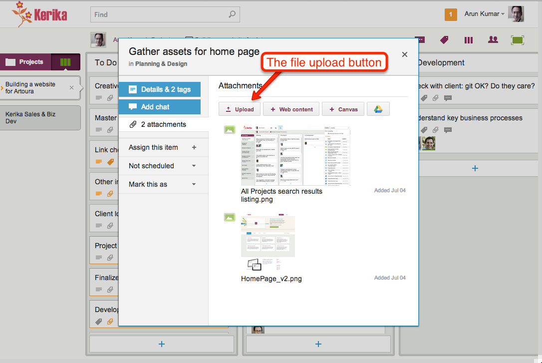
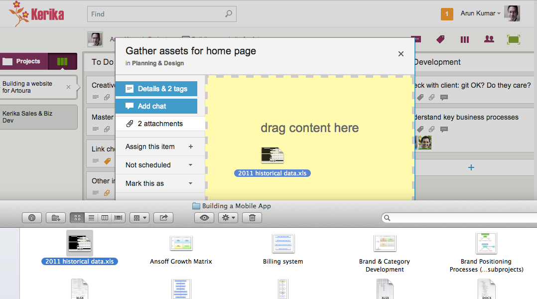
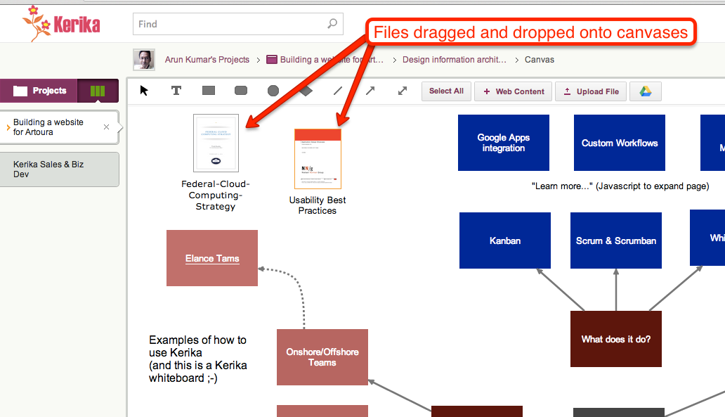
There are several ways you can add files to your cards or canvas, all of which result in the files being uploaded to your Google Drive and shared automatically, seamlessly with your project team members:
Use the upload button inside the card details display, like this:
Adding files using the File Upload button
Drag and drop a file onto a card details display, like this:
Dragging and dropping onto card details
Drag and drop a file onto a canvas, like this:
Files dragged and dropped onto canvases
Drag and drop a file onto a card on the task board itself, like this:
Dragging and dropping a file onto a task board
All of these work on Firefox, Chrome and Safari, but with Internet Explorer 9 only the first method works: you have to click on Upload button.
There isn’t much we can do about it, since Internet Explorer’s implementation of the HTML5 standard was so erratic… Sorry.
iOS 7 is a great improvement over iOS 6, but we are sorely disappointed that a very simple bug fix to the iOS Maps App and the Calendar App remains undone!
Here’s the problem: if you create a calendar entry and add an address in the “Location” field, for some bizarre reason the Calendar App does not recognize the full address.
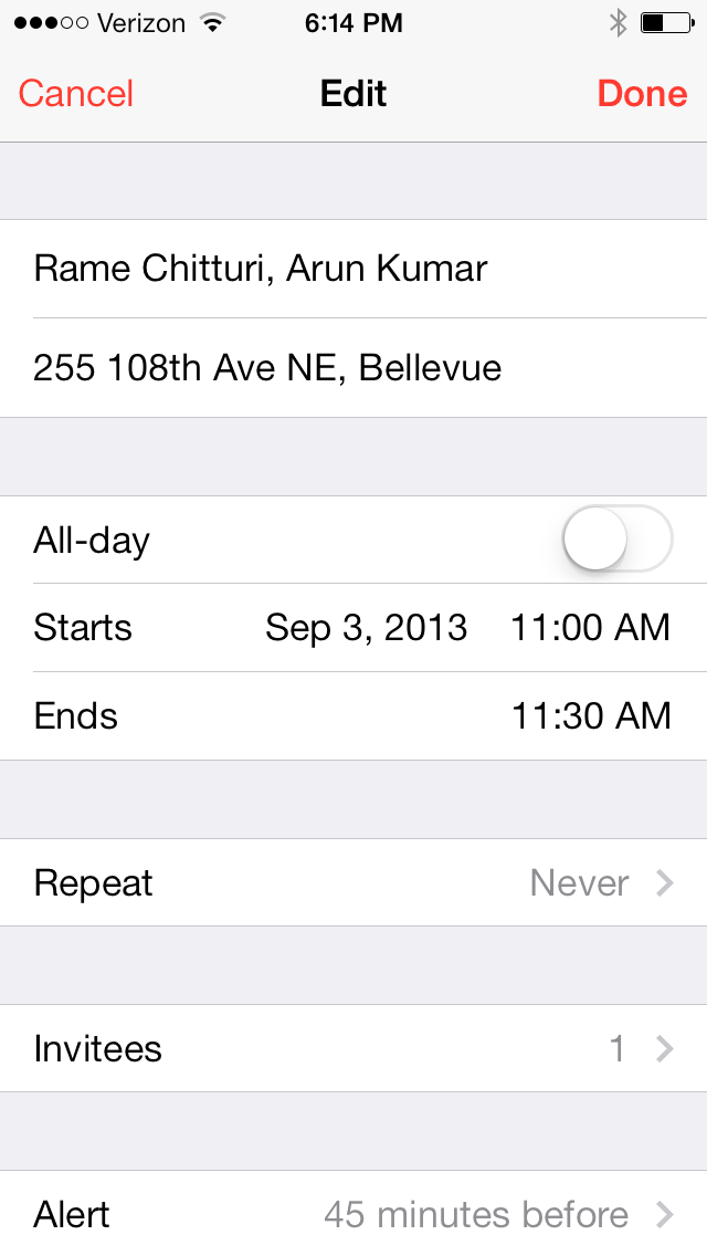
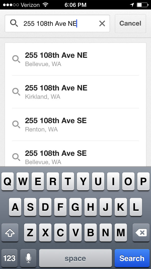
Here’s an example: a meeting between Rame and Arun is scheduled to take place at 255 108th Ave NE in Bellevue, Washington (which, by the way, is a well-known local office building known as the Civica Center). When you create the calendar entry, you can type in the full address like this:
Creating a calendar entry in iOS Calendar
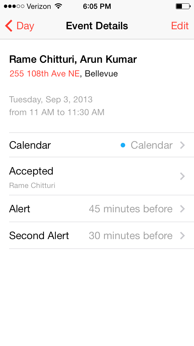
But when you are viewing the calendar entry, the Calendar App only recognizes “255 108th Ave NE” as a clickable link: everything after the comma, in this case “, Bellevue” has been ignored.
Viewing a calendar entry in iOS Calendar
That’s bug #1: a simple bug, which could be solved simply by adding some logic to read the rest of the text string after the comma since the entire field is a “location” anyway!
Now we come to the iOS bug, which is far more irritating — and, indeed, baffling considering that the Maps App was designed specifically for mobile devices with built-in GPS capabilities!
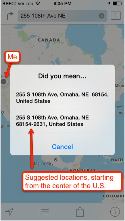
If you click on the “255 108th Ave NE” link within the Calendar App, e.g. to get driving instructions for getting to this location, the Maps App completely ignores your current location!
Instead, it starts, very bizarrely, with the center of the continental United States and offers suggestions in Omaha, Nebraska (about 1,000 miles away from the current location of the phone, as you can see from the blue dot in the upper-left corner):
Why would a Maps App designed specially for a mobile phone ignore the value of the user’s current location, and start off by suggesting locations that are hundreds of miles away?
Google Maps, in contrast, doesn’t have this problem. If you copy-and-paste just the “255 108th Ave NE” string into the Google Maps app, it wisely starts off by suggesting the closest locations, not the ones that happen to be closest to the center of the continental United States:
Suggestions from Google Maps
A problem that seems so simple to fix, and yet it persists one year after Apple’s Maps was introduced…
LinkedIn’s “endorsements” feature was an interesting innovation when it first came out, last year, but the way it has been implemented isn’t great, and it runs the risk of becoming a devalued currency.
LinkedIn is too aggressive in soliciting endorsements. With old-fashioned recommendations, you had to do some work – and, more importantly, your best contacts had to do even more work – in order to get a written recommendation.
LinkedIn takes away all of that work by throwing up a splash screen whenever you log in to their site that very persistently solicits endorsements on behalf of everyone you know. First you are prompted to endorse 4 people, and if you do that, you are again prompted to endorse another 4 people. And so on, ad infinitum. It’s like being trapped in an infinite loop: even after you have endorsed a contact for a few skills, you are asked if that person has yet more skills.
It’s one thing to make a feature accessible and easy to use; quite another to push it down everyone’s throat, devaluing your currency in the process.
The other, more subtle problem with LinkedIn’s endorsements is that the data appear highly structured but are, in fact, not really normalized. Take a look at this graph which shows the endorsements given to Kerika’s CEO (Arun Kumar):
Arun Kumar’s LinkedIn endorsements
The long tail is immediately apparent: of the 35 categories of skills representing a total of 251 endorsements, the top 5 skills provide 55% of all endorsements.
The long tail of LinkedIn endorsements
Several categories could be combined quite easily: for example, Board of Directors and Board of Directors Experience are surely the same thing?
What should we do with this long tail: a tail that grows longer by the week?
Yes, another update to Kerika! You can now set Due Dates on cards, and get a personalized email summary each morning of all the work items assigned to you that are due today, tomorrow and are overdue.
We implemented Due Dates in a smart way, in keeping with our focus on distributed teams: the system automatically adjusts for people working across multiple timezones. You can read more about this on our blog.
Your personalized work summary is sent at 6AM every day, adjusting automatically for your timezone, to help you organize your day. We think it is a really handy feature, but you can turn it off if you like by setting your user preferences.
Managing your Inbox and your Sentbox (all the invitations and requests that you have sent out, that haven’t been acted upon yet) are both simpler now: there’s a separate blog post describing that as well.
There are a bunch of other usability improvements as well: you will continue to see more over the next few weeks. Thanks for your support: please continue to help us improve Kerika by providing your feedback!
We are improving our “smart display” of dates and times, to make sure they are as easy for users to comprehend as possible.
(At this point you might well be wondering: “why is this a problem in the first place? Don’t people know how to read dates or times?”)
The underlying problem we are trying to solve is that “relative time” is more useful than absolute time, if you are dealing with a short time span.
For example, the word “Yesterday” has much more cognitive value than July 19, 2013 (which is also “yesterday”, as of the time this blog post is being written). “Yesterday”, “today”, “tomorrow”, “two hours ago”, “recently”, etc. are all very powerful ways to convey a sense of how far away a particular event is from the current moment.
But, as one of users – Carlos Venegas, from Lean Office Innovation – recently pointed out, this works best for short periods of time: for example, it is helpful to know something that happened “2 days ago”, but much less helpful to be told that something happened “12 days ago”. In the latter case, the cognitive advantage of using relative time disappears and quickly becomes a burden for the user: 12 days ago is too far in the past, and now the user has to do some mental calculation to arrive at the more useful value of “June 10, 2013”.
This issue became more pressing when we built the Due Dates feature, because time doesn’t have an absolute value when you are dealing with a distributed team. For example, the Kerika team is distributed between Seattle and India: a time difference of 12.5 hours in the summer, and 13.5 hours in the winter.
This time difference is large enough to make terms like “today” ambiguous: depending upon when you are talking with your cross-border colleagues, you may have very different ideas of when “today” ends.
To address this, we made our Due Dates feature smart: it automatically adjusts for timezone differences, so that when someone in India marks an item as due “today”, Kerika ensures that people in Seattle understands what that means in terms of Pacific Time.
We also are improving our display of relative time, using a more detailed algorithm:
First of all, any time reference that is more than 3 days away is shown in absolute values: e.g. “July 15”, rather than “7 days ago”.
The concepts of today, tomorrow, and yesterday are preserved: the system figures out what timezone you are located in, and uses these terms in a smart way.
If an item is due by the end of the day, the time is shown using your current timezone: e.g. “11:30AM PST” rather than just “today”, for an item that is supposed to be done by the end of that day in India. This removes misunderstandings that would otherwise exist across timezones.
As you get closer to a time, the display gets more precise: anything due within the next hour is displayed in minutes, e.g. “45 minutes”.
As you get very close, the display gets a little vaguer, because of the greater uncertainty about when something might actually happen. So anything that’s two minutes away is marked as recently.
All of this makes for a very smart display of time, while keeping the user interface very simple: users set dates using a simple calendar control, without having to worry about the details of where others on the team are currently located, and how they might perceive these values!
With our next release (next week), you will have the ability to set Due Dates on cards; this is how it’s done:
Example of setting a Due Date on a card
The concepts are very simple, yet very elegant and powerful:
By default, all cards are “Not scheduled”, which means no Due Date has been set. Of course.
When you open up a card, you will find a new menu/button that lets you set a Due Date.
Due Dates are presented using words where possible, e.g. “Due Today”, “Due 2 days” ago”, etc., since these are easier for people to grasp than actual numbers.
When you set a Due Date, Kerika automatically takes into account your location, so that coworkers in other timezones understand exactly what you mean by “Due Today” or “Due Tomorrow”.
For example, if someone in India sets a Due Date for July 19, they expect the task to complete by midnight, July 19, Indian Standard Time.
When someone in Seattle looks at that card, they will see that it is due by 11:30AM July 19, Pacific Daylight Time. In other words, Kerika automatically adjusts for the 12.5 hours timezone difference that exists (during the summer) between Seattle and India.
Due Dates are presented right on the card when you are looking at a task board, and hovering over the date with your mouse will show the exact time:
Seeing the Due Date time on a card
In this example, the card was due three days ago, at 5PM Pacific Daylight Time.
All of this is done automatically and behind the scenes, in keeping with Kerika’s unique focus on making collaboration easy for distributed teams.
Daily Email Summary
We are introducing a new user preference, set to ON by default, that lets you get a daily summary of your most pressing tasks:
The daily email that you get looks like this example:
Example of a daily email summary of your tasks
This daily email summary will get sent to you at 6AM every day, no matter where you are: Kerika figures out which timezone you are in, and sends you the email so that it’s the first thing you look at when you wake up!
When you are looking at a task board, you can easily spot the cards that are overdue – they are marked in red – and the cards that are due today – they are highlighted in blue. Here’s an example:
Due Dates are highlighted on task boards
This next release is an important step on our way to implementing a Dashboard! Stay tuned…
We have built a simpler way to handle invitations and requests in Kerika, part of a continued (indeed, never-ending!) push to improve usability. A quick recap of what invitations and requests are all about:
Invitations
Invitations are the messages you receive when someone wants to add you to a project team. If you have never worked with someone before, you need to accept their invitation to join a project – to establish a working or “buddy” relationship. This simple mechanism reduces the possibility of you getting dragged onto projects that you have no interest in, or getting involved with people you don’t know.
When you are invited to join a project, you get a (regular) email that looks like this example:
Example of an emailed invitation
After you have accepted an invitation from someone, it becomes easier for that person to add you to other projects: we call this an “auto-add”, where they can add you to another project without waiting for your to accept yet another invitation. This makes it easy for you to work with the same set of colleagues and friends without having to wait for them to accept one invitation after another. So, if you are “auto-added” to a second project, you get a notification email that looks like this:
Example of an email sent when you are auto-added to a project
Requests
Requests can be made in a couple of different ways:
You might want to upgrade your role on a project, where you are not the Project Leader or Account Owner. For example, you might be a Visitor on a project, with read-only privileges, who wants to become a full-fledged Team Member. In that case you can easily request an upgrade in your role by using the Project Team dialog box, which is found in the upper-right corner of the Kerika application. Here’s an illustration of how that’s done:
Requesting an upgrade in role
In this example, Betty is currently a Team Member on the project, and is requesting an upgrade to Project Leader. This request for an upgrade in role gets sent to whoever is currently a Project Leader, and the email sent looks like this:
Email sent when someone requests an upgrade in role
The other type of request is made when a Team Member wants to add someone else to a project team: this will automatically trigger a request sent to the Project Leader, who is asked for approval since it is Project Leaders who ultimately control who gets to be on the project team. The email sent to the Project Leader looks like this:
Email sent when a Team Member wants to add someone to a project team
What’s new: the Inbox
The email aspect of invitations and requests isn’t changing – although we are looking at ways to reduce the odds of these emails getting trapped by spam filters. What is changing is the way you can access invitations and requests from within the Kerika application itself: we have simplified the user interface to look like this:
The total number of invitations and requests you have outstanding
The old envelope icon is being replaced with an orange square that contains the total number of outstanding (pending) invitations and requests you have: in the example above, this is 6.
Clicking on the orange square will bring up a compact display of all your pending invitations and requests organized into an “Inbox” and a “Sent” list:
Example of Inbox
In the example above, there are 4 items pending in the Inbox; from top-to-bottom, they are:
Betty has “auto-added” Arun to the Marketing Review project; Arun’s gotten a notification to that effect. He can open this project by clicking on the Open Project button, which will remove this item from his Inbox.
Betty has a request to invite Sean to the Build a website project. Since Betty is only a Team Member, her invitation has triggered an request for the Project Leader (Arun, in this case) to approve her invitation. If Arun approves Betty’s request, her invitation to Sean will get sent automatically by the system.
Betty wants to upgrade her role in the Build a website project from Team Member to Project Leader; this request has gone to Arun who is one of the current Project Leaders. (Maybe Betty wants to be able to add people more easily to this project, without having to wait for Arun’s approval…)
Susan has invited Arun to join the Getting Started project as a Team Member.
What’s new: the Sentbox
Clicking on the Sent link would bring up a list of all of Arun’s pending invitations and requests:
Example of Sentbox
In the example above, this includes:
A request made to Betty to upgrade Arun’s role in the Getting Started project from Team Member to Project Leader.
An invitation to rika@kerika to join the Release 29 project.
The great thing about the Sentbox is that it lets you pull back (i.e. cancel) an invitation or request that you may have made in error, or where you have subsequently changed your mind.
For example, you may have typed in someone’s email address incorrectly when you were adding them to your project – although Kerika’s seamless integration with Google Contacts makes that less likely! – and you would naturally want to cancel that invitation (quickly) before it gets accepted by the wrong person.
To learn more about people and roles in Kerika’s project teams, check out this video: