The right way to do a right-click

There was a debate recently, within the Seattle Tech Startups email forum, about the pros and cons of offering a right mouse-click option within Web applications.

The right-mouse click is, of course, a desktop paradigm, so the question is: when, if ever, is it a good idea to supersede the browser menu with your own right-click menu?

Here’s where we stand on this issue:

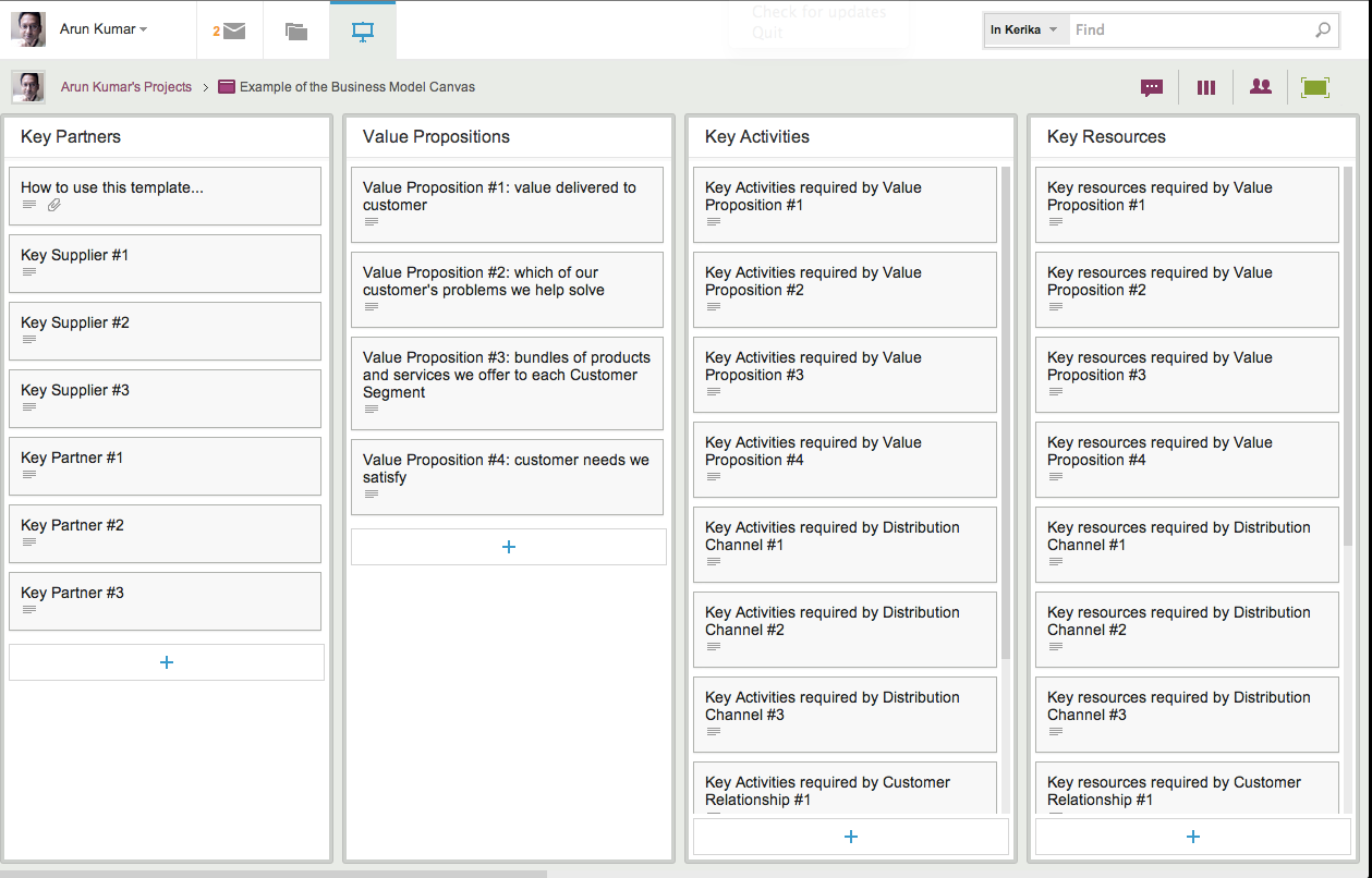
  • Our users want it, overwhelmingly. Because Kerika’s user interface is consciously designed to mimic a desktop application, with simple mouse gestures for dragging cards across a project board or drawing on a canvas, our users naturally expect to have a right-click menu available.
  • Our menu options are better than the browser defaults. The browser defaults are generic, of course, and have little value in the context of the Kerika application. For example, a commonly used browser action might be to select some text and then search for that on the Web. Within the Kerika application, this isn’t a particular useful or commonplace action. If you want to search for something related to a project, you probably want to search within Kerika itself, rather than the entire Web.
  • The right-click menu is always supplemental, never central. We don’t offer anything on a right click menu, in any scenario, that isn’t also available through more explicit buttons or menu options. The right-click menu offers faster actions to commonplace actions, based upon user context, and it is designed for “power users” who want to absolutely minimize their mouse actions. For everyone else, regular menus and buttons offer all of Kerika’s functionality in a more explicit manner.
  • The right-click menu is always contextual, never generic. If you are going to take over the right-click, make it count: don’t offer a generic set of actions, but instead offer a highly tailored, context-sensitive menu of actions. For example, if you are working with shapes on a canvas, the right-click menu offers fast access to changing the appearance of the objects. But if you are working with Web links on a canvas, the right-click menu offers a different set of choices, like switching between a bookmark and an embedded view.
  • The right-click belongs on tablets, too. Something that’s often overlooked in this debate is that the right-click menu is easily accessible on iPads, too: a “long tap” acts as a right-click, so there’s no reason to not make use of that function.

What do you think? Let us know

Another week, another update: this time, it’s mostly styling (and better user management)

We are trying to get back to a faster rhythm of releases. Our goal is to have releases within 3 weeks: we want to complete our development and QA within 2 weeks, and then use the third week for “dogfooding” the software.

(As you might expect, we are fervent users of Kerika! Everything related to our business is done using Kerika project boards, and to make sure we are putting out the best possible product, we use a daily build of the software on a test server. This keeps us firmly on the bleeding edge of our own software development: it means that we get to try out our software in a real-life scenario — one that is absolutely mission-critical for the company! — before we pass it on to our users.)

Our newest version, released today, contains a number of under-the-hood fixes that will help us manage our growing number of users. And, we are happy to report, our users are indeed growing: we are adding new users in March at twice the rate we did in February!

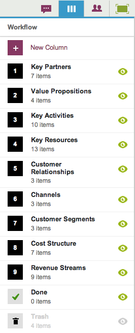
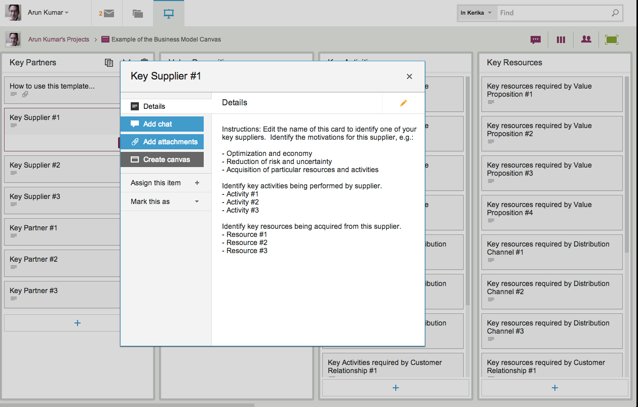
From your perspective, it’s mostly some styling and minor user interface changes that will be visible. We have a better way to expose the Cut, Copy, Paste and Delete functions for cards, having heard from too many users that they couldn’t easily figure out how to delete projects, we have more uniform use of colors, and there is a right-click menu for dealing with project cards as well as task cards.

The more uniform use of colors is a step towards a larger update/refresh of our look-and-feel. We have been hearing from users that our user interface is “too grey”, and we are working on that issue. We are also looking at improved notifications, both onscreen and through emails. Stay tuned!

A comprehensive template for implementing an Electronic Health Records system

With help from Paul Seville, MD, MBI, CSM, (who, by the way is a very impressive guy: experienced physician turned informatist!) Kerika is now offering a comprehensive process template for medical practices that need to implement an Electronic Health Records system: the template deals with all the stages of an EHR implementation, as recommended by the authoritative folks over at HealthIT.gov:

  • Stage 1: Assess Practice Readiness. This comes with 7 cards, representing the key work items needed to complete this stage.
  • Stage 2: Plan your Approach. 9 work items that include document templates for analyzing and mapping your practice’s current and future workflow.
  • Stage 3: Select or Upgrade to a EHR. 8 cards along with templates for evaluating vendors.
  • Stage 4: Conduct Training & Implement EHR. Checklists and templates for test plans for the implementation stage.
  • Stage 5: Achieve Meaningful Use. This is the most critical phase of implementing an EHR, of course, and we have cards for each of the 15 “Core Measures” and each of the 10 “Menu Measures” recommended by the government.
  • Stage 6: Continue Quality Improvement. This includes templates for conducting patient surveys.

This is the master process template for health informatics: over the coming days we will be providing more focused templates for each of the sub-projects involved in deploying an EHR: for example, templates for each of the Meaningful Use measures.

This project template includes a large number of document templates for the individual work items (e.g. a spreadsheet that you can use to evaluate EHR vendors). All document templates are available in Microsoft Office format as well through Google Docs.

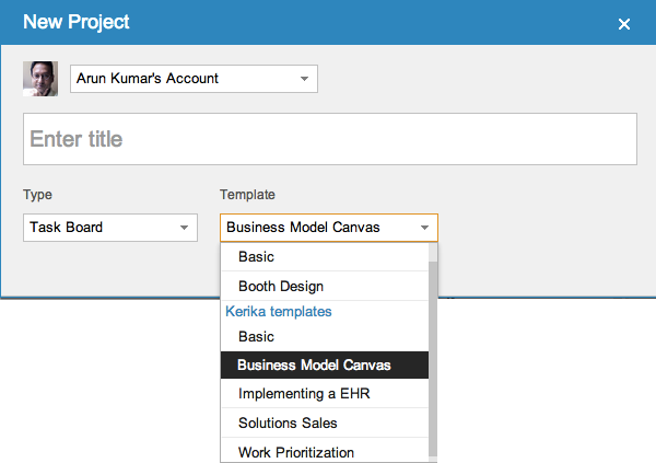
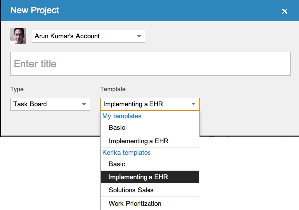
These templates are available to everyone, right now: when you start a new project, you will find “Implementing an EHR” among the choices for Task Board projects:

Selecting a process template

When you use a Kerika project template, you also get copies of all the document templates that are part of the project template. These are copied into your own Google Drive account, and can be shared with others on your project team.

Please let us know know what other templates you would like to see! (And our thanks to Dr. Seville for help with this particular template.)

Installing Kerika from the Google Apps Marketplace

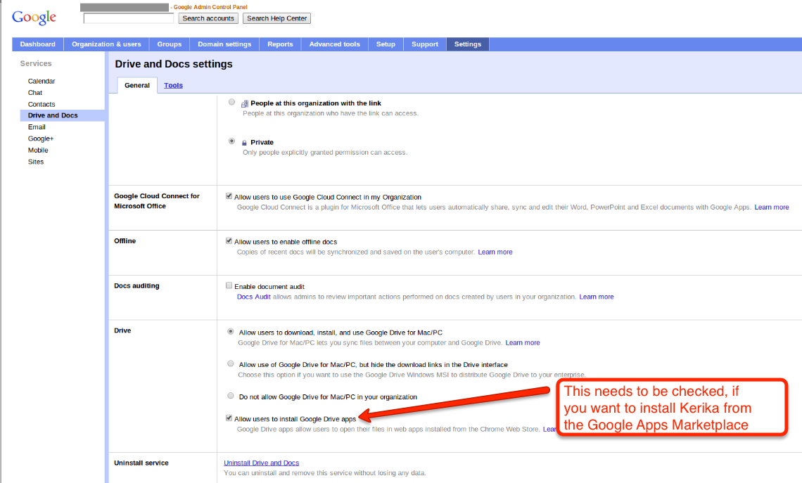
If your organization is using a premium edition of Google Apps (i.e., a paid version of Google Docs), then you can install Kerika from the Google Apps Marketplace. This can be done by any user within your Google Apps domain, provided this checkbox is checked (click on the image below to see a larger version):

Allowing users to install Kerika from the Google Apps Marketplace

This checkbox is usually checked — that’s the default setting, anyway — but some domain administrators may have turned off the ability of individual users to add Google Apps on their own initiative. If this is the situation with your organization, please contact your IT department and ask them to install Kerika for you. Or, you can always just sign in at Kerika.com or install it from the Chrome Web Store.

Our new version: even better integration with Google Drive, and even better tablet support

Our next release is mostly about improving our Google Drive integration: we are making it a lot easier for you to manage your Google Docs from within Kerika itself, so that your content has a very useful “contextual layer” on top! Here are some of the improvements we be rolling out this weekend:

  • The file organization inside your Google Drive will be a lot more streamlined: a single, top-level folder called “Kerika.com” will have subfolders for each account to which you have access.
  • Better synching between Google Drive and your Kerika projects:
    • If you rename a file that’s attached to a Kerika card, that new name will show up in your Google Drive as well.
    • If you rename a file in Google Drive, that new name will show up in your Kerika cards.
    • If you delete a file that’s attached to a Kerika card, that file will get moved to the Trash in your Google Drive as well.
    • File sharing within your Google Drive will be done at the Kerika project folder level, which means faster performance and a cleaner interface.
    • Duplication of file folders will be eliminated.
  • Content that is attached to cards can be renamed easily: if you rename a file that you attached to a card, this new name will show up in your Google Drive as well, and you will be able to easily rename Web links as well.

We are also improving the Kerika experience on iPads and cellphones: as before, you can access Kerika right from the Safari browser (or Chrome, if you prefer), without having to download any special apps, and we are adding:

  • Better support for “double-tapping”, similar to doing a double click on a desktop.
  • Better support for phones.
  • Improved performance.

General improvements to the user interface will include:

  • A new set of tutorial videos, all under 2 minutes in length, to help you get more out of Kerika.
  • Cut-and-paste of entire projects.
  • Any URLs that are referenced inside cards or on chat messages will appear as clickable links.
  • Content inside chat messages can be easily copied.
  • A cleaner way to customize the workflow for your project.
  • A cleaner layout of icons on cards.
  • Some cool animation effects that make it easier to understand how canvases work, particularly if your projects contain multi-layered canvases (where one canvas contains several others).
  • A new to mark cards as “Needs rework”.

And, a final note: this version has taken quite a bit longer (4+ weeks) that our previous versions, largely because we allowed “feature creep” to happen… We kept adding usability tweaks to the release, particularly with respect to the iPad experience, and that chewed up a whole week. We need to guard more closely against feature creep for our next release.

Coming up: we are adding tagging as a new feature, which will make it easier to create quick filtered views of large projects!

Managing your Account Team

Your Kerika Account Team consists of you (the Account Owner), and all the people you have added as Project Leaders or Team Members, across all your projects. Each person is counted just once, regardless of how many projects that person works on, and Visitors are not counted at all.

When you sign up as a new Kerika user, you get set up with a free Standard Account, which lets you have up to 3 people in your Account Team — and that includes you, as the Account Owner.

As your projects get larger and you add more people to your teams, you will need to upgrade your account to a paid Professional Account, which you can do within the application itself. Here’s how you can manage your account team, and the type of account you have with Kerika: click on your name or photograph, which appears in the top-left corner of the Kerika application.

Accessing your Kerika Account

This will show you a menu of actions:

Getting to your Account details

From this menu, select Manage my Account and you will see your Account screen, right inside the Kerika application. It looks like this:

Your Account status and Account Team

If your account is currently over its allowed size, you will see an alert here. (In the example above, the account shown is authorized for 3 users, as a free Standard Account, but is currently hosting 13 users).

Below this alert is a list of everyone who is part of your Account Team. If you want to reduce the size of your Account Team, perhaps to account for changes in your organization, or perhaps simply to reduce your use of the Kerika service, you can remove people easily by selecting them from this list.

Your Account Team
Your Account Team

Hover your mouse over that entry in the list of Account Team members, and you will see a full list of all the projects that person is working on:

All the projects someone is working on

To remove someone from your Account Team, click on the “x” button at the right end of the listing:

Removing someone from Account Team

Before the person is actually removed, you will see a warning message that reminds you which projects will be affected:

Warning before removing someone from Account Team

If you are sure, go ahead and click on the Remove user from my Account button on the bottom left of this warning. (We have deliberately put it there, so you don’t click on it by accident.)

Removing someone from your Account will remove that person from every project where they are working, and this is will immediately affect your Account Team size.


The best lines from Tim Cook’s Q&A at Goldman Sachs Conference

The transcript at the Wall Street Journal is extensive, and makes for great reading. Here are some of our favorite bits:

On whether Apple is too frugal:

My definition of a depression-era mentality wouldn’t be of a company investing a pair of tens over two years. [“tens” refers to $10 billion.]

On Einhorn’s lawsuit and Apple’s Proposal 2:

You’re not gonna see us do campaign mailing, you’re not gonna see a “yes on 2” in my front yard. This is a waste of shareholder money, it’s a distraction, and it’s not a seminal issue for Apple.

On innovation:

If there was a formula, a lot of companies would have bought their ability to innovate…

Consumers want an elegant experience where the technology flows to the background

These skills, this isn’t something you can just go write a check for. This is decades of experience

On specs:

Do you know the speed of an AX processor? You probably don’t. Does it matter? You want a fantastic experience

On iPad market share:

I have no idea what market share is, we’re the only company that really reports the units we sell.

On cannibalization:

I think if a company ever begins to use cannibalization as a primary or even a major factor of what products to go to, it’s the beginning of the end.

On iPad Mini:

I think this is gonna be the mother of all markets.

On the value of Apple Stores:

The tablet was ingrained in their mind as this heavy thing the Hertz guy held. But our store is the place to go and discover and try it out and see what it can do.

On being a good corporate citizen:

I’m very proud that we’re out front, that we have a spine on supply responsibility.